8 Easy Blue Dining Room Color Palette Ideas
Introduction
Blue is the denim of the interior design world. Just as a great pair of jeans anchors a high-end fashion look, a blue dining room provides the perfect foundation for everything from casual brunches to formal dinner parties. It is versatile, timeless, and universally flattering.
In my design projects, I often treat the dining room like a couture gown. It is one of the few spaces in the home where you can take a dramatic risk without overwhelming the daily flow of life. Whether you gravitate toward the deep, moody indigo of a tailored tuxedo or the airy, crisp cerulean of a summer resort dress, blue offers a spectrum of moods that few other colors can match.
However, selecting the right blue is tricky. The wrong undertone can turn a sophisticated space into a nursery or a cold, sterile box. In this guide, I will walk you through eight distinct palettes, breaking down exactly how to layer textures, metals, and woods to achieve a polished look. If you are looking for visual inspiration, we have curated a stunning Picture Gallery at the end of the blog post.
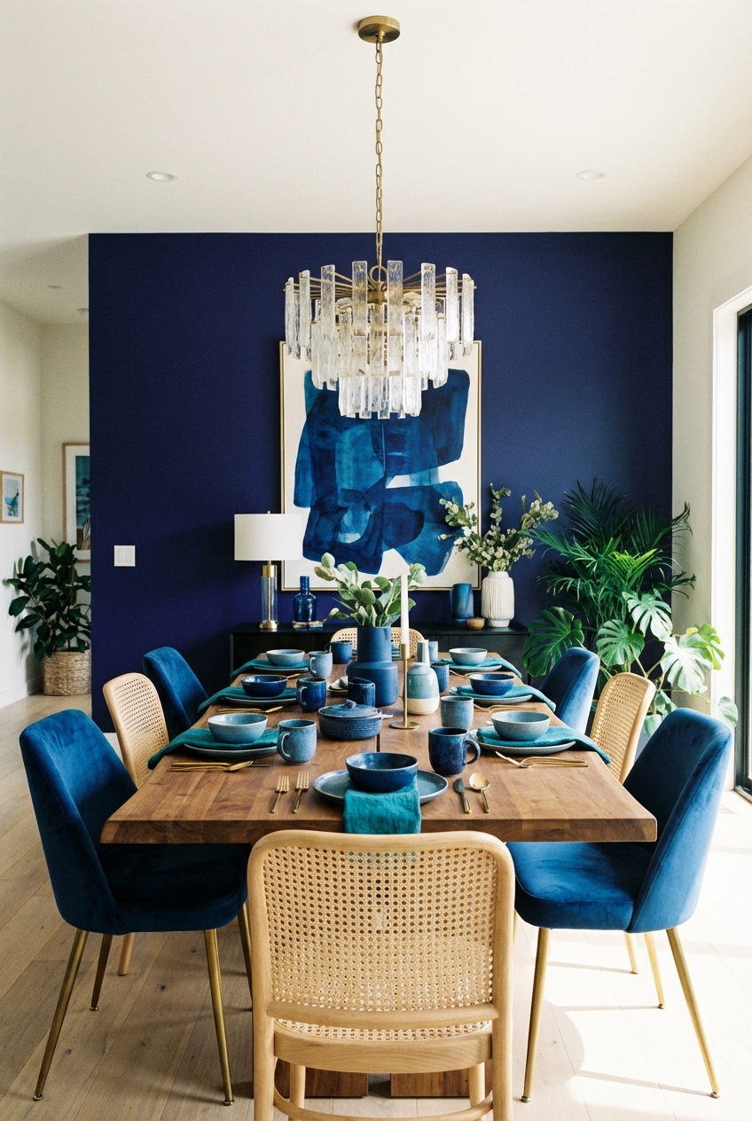
1. The Navy and Brass “Power Suit”
This palette is the interior equivalent of a sharp, navy double-breasted blazer with gold buttons. It is authoritative, classic, and undeniably expensive-looking. Navy blue walls create an intimate atmosphere, which is exactly what you want for a dining space. It draws the walls in slightly, encouraging conversation and making the table the focal point.
The Palette Breakdown:
- Dominant: Deep Navy (low Light Reflectance Value)
- Secondary: Warm Brass or Unlacquered Gold
- Accent: Cognac Leather or Rich Walnut Wood
Designer’s Note: The Lighting Factor
When you go this dark on the walls, lighting is not just functional; it is survival. A common mistake I see is pairing navy walls with a single, dim chandelier. The room ends up looking like a cave. You must layer your light. I always install sconces at eye level (roughly 60 to 66 inches from the floor) to wash the walls with light. This highlights the pigment in the paint and prevents the corners from disappearing into shadow.
What I’d Do in a Real Project:
I would color-drench the room. This means painting the baseboards, crown molding, and door casings the same navy as the walls, but changing the sheen. I use a matte finish for the walls to absorb imperfections and a semi-gloss or satin for the trim to reflect light. This creates a subtle textural contrast that feels very custom.
2. Powder Blue and Cream “Cashmere Blend”
If navy is the power suit, this palette is the soft, oversized cashmere sweater. It is calming, airy, and sophisticated without being stuffy. This look relies heavily on texture rather than high-contrast color. It is monochromatic and relies on the interplay of light and shadow to stay interesting.
The Palette Breakdown:
- Dominant: Soft Powder Blue or Pale Gray-Blue
- Secondary: Cream, Ivory, or Alabaster
- Accent: Bleached Oak or Ash Wood
Common Mistakes + Fixes
Mistake: The room feels too “sweet” or childlike.
Fix: Avoid pure white furniture. Pure white against powder blue reads as a nursery. Instead, use warm creams, oatmeal linens, and natural stones like travertine. You need “dirty” neutrals to ground the pastel and give it an adult edge.
Texture is Key
Since the colors are low-contrast, the fabrics must do the heavy lifting. I recommend upholstering dining chairs in a performance bouclé or a heavy linen. For the curtains, go for a double-width pinch pleat in a creamy wool blend. The visual weight of the fabric adds the luxury factor that the light color palette might otherwise lack.
3. Teal and Walnut “Mid-Century Silk”
This palette channels the vibrant energy of 1950s fashion and design. Teal is a complex color that sits between blue and green, offering a richness that feels vintage yet current. It pairs exceptionally well with warm, medium-tone woods like walnut or teak.
The Palette Breakdown:
- Dominant: Deep Teal or Peacock Blue
- Secondary: Mid-tone Walnut Wood
- Accent: Burnt Orange or Mustard Yellow (sparingly)
Designer’s Note: Scale and Proportion
Teal is a strong personality. To balance it, keep your furniture profiles sleek. This is not the place for slipcovered farmhouse chairs. Look for dining tables with tapered legs and credenzas with clean lines. The visual lightness of the furniture prevents the bold wall color from feeling oppressive.
Rug Sizing Logic
With such a specific color story, the rug needs to ground the space. I usually opt for a vintage or vintage-inspired Turkish rug that incorporates hints of the teal and the wood tone. Remember the golden rule of dining rugs: the rug should extend at least 24 to 30 inches past the edge of the table on all sides. This ensures that when a guest pulls out their chair, the back legs stay on the rug.
4. Slate Blue and Charcoal “The Wool Coat”
This is a masculine, moody palette that feels like a tailored wool trench coat in an urban setting. Slate blue has a significant amount of gray in it, making it a “neutral” blue. It is much easier to live with than a bright primary blue and works beautifully in homes with industrial elements like exposed brick or steel windows.
The Palette Breakdown:
- Dominant: Slate Blue (Gray-Blue)
- Secondary: Charcoal or Matte Black
- Accent: Polished Chrome or Nickel
Real-World Application
In a recent project for a bachelor’s city apartment, we used a slate blue textured wallpaper instead of paint. The texture added warmth to the concrete ceilings. We paired it with a black oak dining table and chairs upholstered in a gray wool flannel. The metal finishes were strictly cool tones—chrome and blackened steel.
Lighting Temperature
Be very careful with your light bulbs here. If you use warm LEDs (2700K or lower), the slate blue can turn muddy or greenish. I recommend a crisp 3000K bulb for this palette. It keeps the blue looking true to color and maintains the sharp, modern aesthetic.
5. Cobalt and Crisp White “The Resort Look”
Think of a trip to Santorini or the Hamptons. This palette is high-contrast, energetic, and undeniably fresh. It combines intense, saturated cobalt blue with stark, bright white. It is a bold choice that works best in rooms with plenty of natural light.
The Palette Breakdown:
- Dominant: Bright White (Walls)
- Secondary: Cobalt Blue (Accents/Textiles)
- Accent: Rattan, Wicker, or Jute
Styling Strategy
Unlike the other palettes where blue is on the walls, I prefer to use white on the walls here and bring the blue in through heavy accents. Imagine gloss white walls with blue velvet dining chairs, or a white table with a massive blue abstract painting.
The “High-Low” Mix
This look thrives on mixing casual materials with luxe finishes. I love pairing a high-gloss blue lacquered sideboard with a natural jute rug. The roughness of the jute cuts the formality of the lacquer. It is the interior design equivalent of wearing a silk blouse with denim cutoffs.
6. Duck Egg and Terracotta “The Boho Silk”
This is a complementary color scheme that sits opposite each other on the color wheel, creating a vibrant yet earthy vibration. Duck egg blue is a soft, green-blue that feels historical and established. When paired with the warmth of terracotta or rust, it feels curated and traveled.
The Palette Breakdown:
- Dominant: Duck Egg Blue
- Secondary: Terracotta, Rust, or Brick
- Accent: Antique Brass or Copper
Designer’s Note: Window Treatments
For this palette, I avoid heavy drapes. Instead, I use woven wood shades or bamboo blinds in a warm tone. This echoes the terracotta element and brings a natural texture to the windows. If you need softness, layer stationary linen panels in an oatmeal color over the blinds.
Flooring Considerations
This palette is particularly successful in homes with warm hardwood floors or Saltillo tile. If you have cool gray vinyl or tile floors, this palette will be difficult to pull off because the floor will clash with the warmth of the terracotta accents.
7. Midnight Blue and Emerald “The Jewel Box”
This is a fashion-forward, maximalist approach. We are mixing two deep jewel tones to create a space that feels enveloping and luxurious. It is not for the faint of heart, but when done right, it is breathtaking.
The Palette Breakdown:
- Dominant: Midnight Blue (almost black)
- Secondary: Emerald Green (Velvet usually)
- Accent: Crystal or Lucite
Materiality Matters
Because these colors are so dark, you need materials that reflect light to prevent the room from feeling dead. This is where velvet shines—literally. Velvet has a nap that catches the light. I would use midnight blue paint on the walls and ceiling, and then bring in emerald green velvet dining chairs.
The “Third Element”
To break up the darkness, you need a “sparkle” element. A crystal chandelier or a dining table with a glass top works wonders here. The transparency of glass or lucite allows the eye to travel through the furniture, making the room feel larger despite the dark walls.
8. Periwinkle and Lavender “The Avant-Garde”
This is a trend-driven palette that we are seeing more of in high-fashion editorials. It blends the boundaries between blue and purple. It is whimsical, creative, and very specific. This is for the client who wants their home to look like a gallery.
The Palette Breakdown:
- Dominant: Periwinkle Blue
- Secondary: Soft Lavender or Lilac
- Accent: Silver or Brushed Aluminum
How to Ground It
The danger here is looking like an Easter egg. To avoid this, you must introduce contemporary art and sharp, angular furniture. Avoid curved, romantic furniture which reinforces the “sweetness.” You want architectural shapes. A rectangular concrete table or metal cantilever chairs will give this soft palette the edge it needs.
Art Direction
I suggest large-scale black and white photography for the walls. The stark lack of color in the art provides a necessary resting place for the eye and creates a modern context for the pastel tones.
Finish & Styling Checklist
Once the paint is dry and the furniture is placed, the “polish” comes from the styling. Here is my checklist for finishing a blue dining room:
- The 30-Inch Rule: Ensure your chandelier hangs 30 to 34 inches above the table surface. In a dark blue room, consider a fixture with multiple bulbs to ensure adequate lumen output.
- Drapery Height: Hang curtains as close to the ceiling (or crown molding) as possible. This draws the eye up. In a monochromatic blue room, match the curtain fabric color to the wall color for a seamless, high-end look.
- Metals: Don’t be afraid to mix metals, but keep a dominant finish. If you have a brass chandelier, you can use matte black door hardware, but try to repeat the brass in a picture frame or candle holder.
- Greenery: Every blue room needs a green plant. The contrast between blue and natural green is biologically pleasing to the human eye. A large Fiddle Leaf Fig or an Olive tree in a basket works perfectly.
FAQs
1. Can I paint a small dining room dark blue?
Absolutely. It is a myth that dark colors make a room look smaller. In fact, dark colors blur the edges and corners of a room, creating an illusion of infinite space. It creates depth that white walls simply cannot achieve. The key is to commit—paint the ceiling the same dark blue to lift the visual height.
2. What is the best trim color for blue walls?
If you want a traditional, crisp look, go with a clean white like Benjamin Moore’s “Chantilly Lace.” If you want a modern, moody vibe, paint the trim the exact same color as the walls but in a Satin or Semi-Gloss finish. If you have a historic home, a soft gray or putty color on the trim can look very sophisticated against blue.
3. How do I choose the right blue paint?
Never trust the paint chip in the store. You must sample. Buy a sample pot and paint a large 2×2 foot square on two different walls in the room. Observe it in the morning, afternoon, and specifically at night with your artificial lighting turned on. Blue is notorious for turning purple or gray depending on the light source.
4. Is blue an appetite suppressant?
Color psychology does suggest that blue suppresses appetite, while red stimulates it. However, in a residential dining context, we are focusing on ambiance and conversation. A warm, rich blue creates a cozy environment that encourages guests to linger longer at the table, which is the ultimate goal of a dinner party.
Conclusion
Designing a dining room is about setting a stage for memories. Whether you choose the reliable “navy suit” or the daring “jewel box,” blue offers a versatility that allows your personality to shine through. It is a color that manages to be both grounding and expansive.
Remember that the paint color is just the beginning. The magic happens in the layering—the friction between the velvet upholstery and the sisal rug, the gleam of unlacquered brass against a matte wall, and the flow of the drapery. Approach your room with the same critical eye you would use to assemble an outfit. Balance the proportions, mix your textures, and don’t be afraid of the dark.
Picture Gallery


