8 Poetcore Shower Curtain Ideas with an Editorial Finish
There is a specific mood that permeates both the runway and the home right now, a longing for something tactile, romantic, and slightly melancholic. In fashion, we see it in the resurgence of oversized collars, billowing sleeves, and fabrics that feel lived-in and loved. In interior design, we call this “Poetcore.” It is the visual equivalent of a handwritten letter found in an antique desk or a rainy afternoon spent reading in a window seat. It rejects the sterile, high-gloss finish of modern minimalism in favor of something with a soul.
Applying this aesthetic to a bathroom can be tricky because bathrooms are inherently functional, wet, and often sterile spaces. The shower curtain becomes your primary vehicle for transformation. It is essentially a large-scale tapestry that sets the tone for the entire room. When I design a bathroom, I treat the shower curtain not as a bathroom accessory, but as window drapery. It requires the same attention to pleating, hardware, and textile quality that I would give to a living room setup.
To achieve an editorial finish, we have to look past the standard plastic-wrapped packages at big-box stores. We are looking for texture, weight, and history. If you are looking for visual inspiration, make sure to look at the Curated Picture Gallery at the end of this blog post for high-res examples.
1. The Romanticism of Raw Linen and Ruffles
Nothing defines the Poetcore aesthetic quite like linen. It is an ancient fabric that wrinkles beautifully, suggesting a relaxed elegance rather than messy neglect. For a shower curtain, you want a linen with a substantial weight—look for something in the 180 to 220 GSM (grams per square meter) range. This ensures it hangs heavy and straight rather than billowing uncontrollably when the air conditioner turns on.
The “ruffle” here shouldn’t be a tight, juvenile frill. We are looking for a deep, languid ruffle at the bottom hem or a “header” ruffle at the top. This mimics the cuffs of a Victorian poet’s blouse. The key is in the color palette: unbleached oatmeal, soft ivory, or a very pale, dusty rose. These colors absorb light rather than reflecting it, creating that cozy, candlelit atmosphere.
Designer’s Note: The Puddle Effect
One lesson I always teach my junior designers is that standard shower curtains are too short. A standard curtain is 72 inches. Most ceilings are 96 inches or higher. If you hang a 72-inch curtain, you cut the room in half visually.
To get the Poetcore look, the fabric should “kiss” the floor or break slightly (about 1 inch of fabric on the floor). This means you likely need a curtain that is 84 to 96 inches long. If you can’t find a waterproof shower curtain in this length, buy a regular linen window curtain panel and use a separate waterproof liner behind it.
2. Toile de Jouy: The Narrative Backdrop
Toile de Jouy is a classic French pattern depicting pastoral scenes, often in a single color like blue, charcoal, or red against a white background. It is storytelling on fabric. In a fashion context, we’ve seen Dior reinvent this time and again. In the bathroom, a Toile shower curtain acts as a mural. It provides instant architecture and history to a plain white rental bathroom.
When selecting a Toile for this aesthetic, avoid bright, primary colors. You want a “faded” look, as if the fabric has been hanging in a French chateau for fifty years. Charcoal grey on off-white is particularly effective for a moody, intellectual vibe. It pairs exceptionally well with unlacquered brass hardware, which will patina over time to match the vintage feel of the print.
Common Mistakes + Fixes
- Mistake: Using a busy wallpaper with a Toile shower curtain.
- Fix: Toile is the star. If you use a Toile curtain, keep the walls painted in a solid, muddy neutral color (like a mushroom grey or soft cream). Let the curtain be the only pattern in the room to avoid visual chaos.
3. Dark Academia: Moody Florals and Velvet
If your version of Poetcore leans more toward “tortured artist in a dark study,” you need to explore moody florals or even velvet. Think of the still-life paintings of the Dutch Masters—dark backgrounds with exploded florals in ochre, burgundy, and forest green. This style brings immense depth to a bathroom and turns the shower area into a focal point of drama.
Velvet is an unconventional choice for a bathroom, and I only recommend it for well-ventilated spaces with an excellent exhaust fan. However, a cotton velvet in a deep moss green or navy creates a sense of luxury that is unmatched. It absorbs sound, making the bathroom feel quieter and more private. If you choose velvet, it must be a “dry” velvet, not a shiny crushed velvet, which looks cheap.
What I’d Do in a Real Project:
If I were styling a moody floral curtain, I would strictly control the lighting. Bright 4000K (daylight) bulbs will kill the mood and make the print look garish. I would swap all bulbs for 2700K (warm white) and, if possible, install a dimmer switch. The goal is for the bathroom to feel like a sanctuary, not an operating room.
4. The Art of the Scalloped Edge
Scalloped edges are having a major moment in both fashion and interiors. They add a touch of whimsy and softness that rigid, straight lines cannot achieve. A white shower curtain with a navy or black scalloped edge is timeless, but for the Poetcore look, we want softer contrast. Think of a sage green curtain with a cream scallop, or a blush pink with a terracotta trim.
The scallop detail references the collars of vintage blouses and the trim of antique handkerchiefs. It feels handcrafted. This is an excellent choice for smaller bathrooms because it adds detail without overwhelming the space with a heavy pattern. It feels light, airy, and feminine without being overly sweet.
Practical Rule of Thumb: Width Requirements
A shower curtain should never look like a flat sheet when closed. It needs volume. The rule of thumb for fullness is 1.5 to 2 times the width of the opening.
If your tub opening is 60 inches wide (standard), your curtain needs to be at least 90 inches wide to have nice pleats when closed. Since most standard curtains are only 72 inches wide, I almost always use two panels. This creates a center opening like a theatrical stage curtain, which is much more elegant.
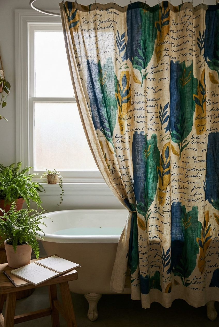
5. Typography and Script: The Literal Interpretation
Poetcore, at its heart, is about the written word. We can translate this literally into the design through typography. I am not talking about generic “Live Laugh Love” text. I am referring to fabric that features script looking like handwritten letters, ink blots, or passages of old text printed onto linen. This mimics the aesthetic of parchment paper.
Alternatively, you can achieve this look through monogramming. A plain, high-quality white duck cotton curtain with a large, embroidered monogram in a serif font feels bespoke and expensive. It suggests that the home has a lineage. Place the monogram in the center of the curtain or, if using two panels, on the leading edge of each panel.
Styling Lesson: The Rod Matters
You cannot hang a beautiful, script-printed curtain on a cheap white tension rod. The hardware must match the aesthetic.
I recommend a French return rod. This is a curtain rod that curves back to the wall on both ends, blocking light gaps and looking seamless. If you are renting and must use a tension rod, buy a cover for it or source a high-end tension rod in an antique bronze or matte black finish.
6. The “Double-Layer” Editorial Drapery Hack
This is perhaps the most important secret to achieving an editorial finish. In high-end design, we rarely use a “shower curtain” from the bath section. We use window treatments. The selection of fabrics in the window section is vastly superior to the bath section. You will find pinch-pleat headers, heavy woven cottons, and intricate textures that simply don’t exist in the waterproof aisle.
To execute this, you install a double rod or two separate tracks. The inner rod holds a high-quality, mold-resistant liner (I prefer fabric liners over plastic ones as they wash better). The outer rod holds your decorative “drapery.” This allows you to use a heavy tapestry, a vintage lace panel, or a raw silk blend that adds incredible texture to the room.
Fabric Constraints for Bathrooms
- Avoid: 100% Silk (waterspots instantly), Rayon (shrinks and warps with humidity).
- Choose: Linen (dries fast, antimicrobial), Cotton Percale (crisp, washes easily), Polyester blends that mimic natural fibers (durability).
Finish & Styling Checklist
The curtain is the centerpiece, but the “Poetcore” look relies on the supporting cast. If you hang a stunning linen curtain but leave a neon green toothbrush on the counter, the illusion breaks. Use this checklist to finish the space.
- The Rings: Ditch the plastic “C” rings. Use metal roller rings that glide smoothly. For a true editorial look, use curtain pin hooks attached to the back of the curtain so the rings are barely visible.
- The Towels: Swap bright colors for waffle-weave towels in earth tones or pure white. The texture of waffle weave complements the linen curtain perfectly.
- The Rug: Avoid the small, fuzzy “contour” mats that hug the toilet base. Instead, use a vintage Turkish runner or a flat-weave cotton rug measuring 2×3 or 3×5 feet. It anchors the room.
- The Scent: Scent is part of design. A diffuser with sandalwood, cedar, or rose notes reinforces the romantic aesthetic.
- The Accessories: Decant your soaps into amber glass bottles. The amber glass creates a vintage apothecary feel that aligns with the moody, academic vibe.
FAQs
Can I use a regular linen curtain in a bathroom without it getting moldy?
Yes, but ventilation is key. Linen is naturally antimicrobial and dries quickly, which actually makes it a great choice. However, you must use a waterproof liner on the inside. Never let the linen soak up standing water. After a shower, keep the curtain drawn closed (flat) so it can air dry; bunching it up while wet promotes mildew.
My bathroom is tiny and has no window. Will a dark curtain make it look smaller?
Technically, yes, dark colors absorb light. However, in a small powder room or bath, I often lean into the darkness. Trying to make a windowless room look “bright” often fails and feels artificial. Embracing a moody, dark floral curtain creates a “jewel box” effect. It feels intentional and cozy rather than small and cramped.
How high should I hang the shower curtain rod?
Standard placement is right above the shower surround (about 75-78 inches). This is too low for an editorial look. I recommend installing the rod as high as possible—usually 3 to 6 inches below the ceiling. This draws the eye up and makes the ceilings feel taller. Just ensure your curtain is long enough (96 inches usually) to reach the floor.
Conclusion
Adopting the Poetcore aesthetic in your bathroom is about prioritizing mood over pure utility. It is about creating a space that feels soft, welcoming, and a little bit removed from the frantic pace of the modern world. By treating your shower curtain as a piece of significant drapery—focusing on fabric quality, length, and hardware—you elevate the entire room from a sanitary station to a personal sanctuary.
Remember that the most beautiful interiors feel collected, not purchased in a single trip. Don’t be afraid to mix a vintage rug with a new linen curtain, or to repurpose a bedroom drapery panel for your tub. The goal is a room that feels like it belongs to a character in a story—your story.
Picture Gallery


