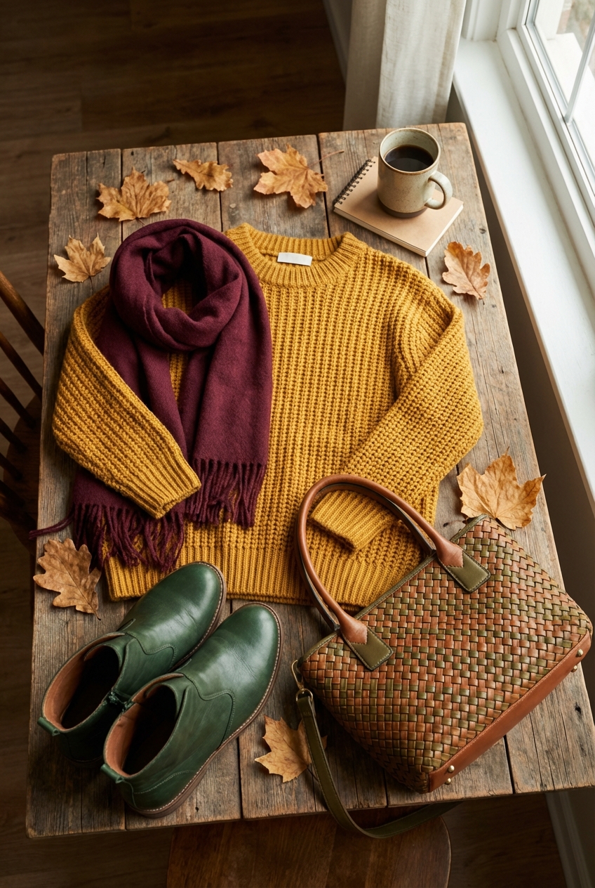
Autumn Color Palette Incorporating Mustard Wine And Forest Green
As a fashion expert, I view the transition from summer to autumn not just as a change in weather, but as a total shift in textural storytelling. Just as we trade linen sundresses for cashmere knits and structured wool coats, our interiors crave a similar layering of richness and warmth. There is a specific trio that dominates the runway and the home this season: the sophisticated interplay of mustard, wine, and forest green.
This palette works because it mimics the natural world while offering the weightiness required for high-end interior design. Forest green acts as the grounding neutral, much like a classic trench. Wine adds the dramatic, romantic flair of a silk evening gown. Mustard provides the sharp, acidic pop of a statement accessory that keeps the look from feeling too somber or traditional.
If you are ready to curate your home with the same precision you apply to your wardrobe, this guide breaks down exactly how to execute this look. For visual inspiration on how these colors come together in real spaces, I have curated a stunning Picture Gallery at the end of this blog post.
The 60-30-10 Rule: Balancing the Trio
In fashion, you rarely wear three bold colors in equal amounts; you choose a dominant hue and accent with others. The same logic applies to interiors through the 60-30-10 rule. This ensures the room feels cohesive rather than chaotic.
The 60% (The Foundation): Forest Green
I almost always recommend using Forest Green as the primary color. It is biophilic, meaning it connects us to nature, which has a calming effect on the nervous system. You can treat dark green as a neutral, similar to navy or charcoal.
The 30% (The Secondary): Wine / Burgundy
This is your upholstery or drapery color. It provides depth and absorbs light, creating a cozy, “enveloping” sensation. It bridges the gap between the cool green and the warm mustard.
The 10% (The Accent): Mustard
Mustard is the jewelry of the room. It should be used sparingly—think throw pillows, a singular accent chair, or art. If you use too much, the room can feel energetic to the point of anxiety.
Designer’s Note: The “Mud” Factor
A common issue with this palette is selecting shades that are too “muddy” or desaturated. When placing swatches together, ensure the mustard has a golden radiance rather than a brown undertone. The wine should lean purple-red rather than brick-red to maintain that luxurious jewel-tone aesthetic.
Living Room Styling: Layering Textures and Scale
The living room is where this palette shines most comfortably. The key here is texture. Flat cottons in these colors can look cheap or dated. You need materials that catch the light differently to create dimension.
Sofa and Seating
If you are investing in a new sofa, a forest green performance velvet is a showstopper. Velvet adds a sheen that breaks up the heaviness of the dark color. If you have kids or pets, look for “commercial grade” rub counts (over 50,000 double rubs) or solution-dyed acrylic fabrics that mimic velvet but clean with bleach.
For the accent chairs, this is where I love to bring in the mustard tone. A leather club chair in a cognac-mustard finish is timeless. Leather ages beautifully and adds a masculine edge to the romantic wine tones you will introduce elsewhere.
Rug Sizing and Placement
A common mistake is buying a rug that is too small. For a luxury look, the rug must slip under the front legs of the sofa and the accent chairs by at least 6 to 8 inches.
Small Rooms: A 5×8 rug is almost always too small. Start with an 8×10.
Large Rooms: Go for a 9×12 or larger.
Color Strategy: A vintage-style Persian or Oushak rug often contains all three colors (green, wine, gold) in intricate patterns. This acts as the “unifier” for the solid furniture pieces.
Common Mistake + Fix: The “Dark Cave” Effect
Mistake: Using dark green walls and dark furniture without adequate lighting.
Fix: Layer your lighting. You need ambient light (overhead), task light (reading lamps), and accent light (art lights). Aim for 3000K LED bulbs; 2700K is too yellow for mustard, and 4000K is too blue for wine.
The Dramatic Dining Room: Paint and Lighting
Dining rooms are the perfect candidates for high drama because you typically spend time there in the evening. This is the space where I often recommend “color drenching.”
Color Drenching Walls and Trim
Paint the walls, baseboards, crown molding, and even the ceiling in a deep Forest Green or Merlot. By removing the white trim lines, you make the ceilings appear higher and the room more expansive. It creates a jewelry-box effect that is incredibly chic for dinner parties.
Lighting Height and Scale
With dark walls, your chandelier becomes the focal point.
Height: The bottom of the fixture should hang 30 to 36 inches above the table surface.
Width: The fixture should be roughly one-half to two-thirds the width of the table.
Finish: Unlacquered brass or antique gold fixtures pop beautifully against dark green and wine backgrounds. The gold tones in the metal echo the mustard accents in the room.
Table Linens and Chairs
If you paint the walls green, upholster the chairs in a wine-colored fabric. Use mustard for the napkins or a table runner. This tri-color separation keeps the elements distinct.
What I’d Do in a Real Project:
If I were designing a rental dining room where painting isn’t an option, I would hang floor-to-ceiling velvet drapes in Forest Green. I would ensure the curtain rod is mounted 4 to 6 inches above the window frame and extends 10 inches out on either side. This tricks the eye into thinking the window is massive and maximizes light.
The Moody Bedroom Sanctuary
In the bedroom, we want to dial back the energy of the mustard and lean into the restorative properties of green and the warmth of wine.
Bedding Layers
Start with crisp white sheets. High-end hotels use white for a reason—it signals cleanliness. Layer a forest green duvet at the foot of the bed. Add two euro shams (the large square pillows in the back) in a wine-colored silk or linen.
Use a lumbar pillow in a muted mustard tone. This maintains the palette without overwhelming your line of sight when you are trying to relax.
Nightstands and Proportions
If your bed frame is a dark wood or upholstered in a dark fabric, choose lighter nightstands to provide contrast. A burl wood nightstand brings in those golden, mustard-like natural tones without using paint.
Height Rule: Your nightstand should be level with the top of your mattress, give or take 2 inches. Anything lower looks cheap and is hard to reach.
Designer’s Note: Lighting the Bedroom
Avoid overhead “boob lights” at all costs. Install sconces on either side of the bed. If you are renting, use plug-in sconces with cord covers painted to match the wall. This clears up nightstand space and offers a sophisticated hotel vibe.
Kitchens and Entryways: Small Pops vs. Big Commitments
Kitchens and entryways are high-traffic utility zones. Here, we have to balance durability with aesthetics.
The Green Cabinet Trend
Forest green cabinetry is a massive trend that has staying power. It pairs beautifully with marble countertops and brass hardware. If you are renovating, consider green for the lower cabinets or the island, keeping the uppers white or natural wood to keep the room airy.
The Runner Rug
The easiest way to introduce this palette in a kitchen or hallway is a runner rug. Look for a vintage Turkish runner that features faded reds (wine) and olives (green).
Walkway width: Ensure you leave 3 to 4 inches of floor visible on either side of the runner. Do not let it run wall-to-wall.
Entryway Styling
Paint the inside of your front door a deep Wine color. It hides scuffs and fingerprints better than white and creates a stunning first impression. Place a console table with a large mustard ceramic lamp. The lamp acts as a sculptural element.
Common Mistake + Fix: Cluttered Surfaces
Mistake: Trying to add the color palette through too many small “knick-knacks” (candles, vases, figurines).
Fix: Apply the “Cantaloupe Rule.” Avoid decor items smaller than a cantaloupe. Fewer, larger statement pieces in your color palette look more expensive and less cluttered.
Bringing the Outdoors In: Landscaping & Exterior Touches
This palette is naturally derived from the autumn landscape, so extending it to your exterior is seamless.
Front Door and Porch
If your house siding is neutral (white, gray, or brick), a Forest Green or Deep Wine front door is classic.
Hardware: Swap out standard silver hardware for heavy brass. The gold tone against the dark paint is the “mustard” element of the exterior.
Container Gardening
Use glazed ceramic pots in Forest Green. They look far more expensive than terracotta or plastic.
Plantings: Fill them with ornamental kale (green/purple) and deep burgundy mums.
Trailing element: Add “Creeping Jenny” for a bright, chartreuse-mustard spill over the side of the pot.
Designer’s Note: The Rule of Three
When arranging planters on a porch, group them in odd numbers (1, 3, or 5). Vary the heights. A tall green pot, a medium wine pot, and a low mustard bowl create a balanced vignette.
Finish & Styling Checklist
Use this checklist to ensure you are executing the look like a pro.
Check the Undertones: Do your swatches look good in natural daylight and evening artificial light?
Apply the 60-30-10 Rule: 60% Green, 30% Wine, 10% Mustard.
Texture Audit: Do you have at least three different textures in the room (e.g., velvet, wood, metal, wool)?
Rug Size Check: Are the front legs of your furniture sitting on the rug?
Curtain Height: Is the rod mounted at least halfway between the window frame and the ceiling?
Lighting Temperature: Are all your bulbs 3000K for a warm, inviting glow?
Edit the Accessories: Have you removed items smaller than a cantaloupe that clutter the space?
* Greenery: Have you added a real plant? Even in a dark palette, fresh green life is essential.
FAQs
1. Will painting my walls dark Forest Green make the room look smaller?
Not necessarily. Dark colors tend to blur the edges of a room, which can actually make the space feel expansive and infinite, especially in the evening. The key is painting the trim the same color as the walls to reduce visual breaks. Mirrors also help bounce light around a dark room.
2. Can I use this palette in a coastal or beach home?
It is difficult. This palette is inherently heavy and autumnal. Coastal design relies on light, airy, bleached tones. If you love these colors but live at the beach, use much paler versions: Sage Green, Dusty Rose, and Pale Ochre.
3. I’m a renter. How can I use this palette without painting?
Focus on textiles and art. A large area rug covering most of the floor sets the foundation. velvet floor-to-ceiling curtains cover white walls. Oversized art prints featuring these colors can dominate the visual field without requiring paint.
4. What metal finish goes best with Mustard, Wine, and Green?
Unlacquered brass, antique gold, or polished nickel. Avoid chrome or matte black, as they can look too harsh or modern against these heritage colors. Gold tones naturally complement the mustard and warm up the cool greens.
5. Is this palette kid-friendly?
Yes, surprisingly so. Forest green and Wine are dark enough to hide stains from juice, markers, and dirt. Mustard is the only risk factor, which is why we use it for accents like throw pillows (which can be easily replaced or washed) rather than the main sofa.
Conclusion
Embracing the autumn palette of mustard, wine, and forest green is a bold sartorial choice for your home. It moves away from the safety of “greige” and steps into a world of character, depth, and sophistication. Just as you layer a look for Fashion Week, layer your home with these rich hues, focusing on texture, scale, and lighting.
Design is not just about how a room looks; it is about how it feels. This trio feels grounded, enveloped, and undeniably luxurious. Trust your eye, stick to the design rules outlined above, and do not be afraid to commit to the drama.
Picture Gallery


