Introduction
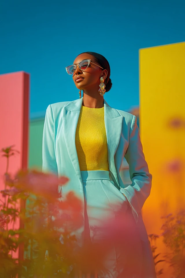
There was a moment recently when I stood in front of my closet, contemplating a new outfit for an important meeting. I gravitated towards a soft pastel pink dress, its shade reminiscent of a nostalgic Barbiecore vibe that’s been captivating fashion enthusiasts globally. Instantly, I felt an uplifting surge of confidence, as if the gentle hues whispered empowerment and joy. That day, I realized how profoundly pastel shades, entwined with the Barbiecore trend, go beyond mere aesthetics—they influence how we perceive ourselves and how others perceive us. For many, these colors evoke a playful yet sophisticated energy, making them the perfect palette for anyone aiming to blend whimsy with professionalism.
Barbiecore pastels have surged in popularity not just because of social media’s influence but because they tap into deep psychological responses connected to color and identity. From soothing lavenders to soft baby blues and mint greens, these hues create an aura of warmth and approachability, which is invaluable in both personal and professional settings. Yet, wearing pastel shades confidently requires understanding their nuances—how they interact with your skin tone, body silhouette, and the occasions they’re suited for. It’s a delicate balance of psychology, style strategy, and personal expression.
In this comprehensive guide, I’ll draw from my academic background in fashion design and color psychology to demystify Barbiecore pastel hues. Together, we’ll explore foundational concepts, emotional impacts, body type considerations, current trends, and practical tips. Whether you’re a fashion novice or a style aficionado, this post empowers you to embrace pastels thoughtfully, enhancing your wardrobe and your well-being. Let’s embark on this colorful journey that promises to transform how you dress to impress—with charm, confidence, and authenticity.
Foundational Concepts
To truly appreciate Barbiecore pastel hues, it’s essential to grasp several foundational concepts that influence both fashion trends and personal style decisions. First and foremost is the science of color psychology. This discipline explores how colors impact mood, cognition, and behavior. Pastels, with their muted tones and low saturation, generally evoke feelings of calmness, softness, and openness. Unlike bold, saturated colors, pastels have a subtle yet powerful impact, making them ideal for creating approachable yet memorable outfits.
Closely linked to color psychology is the art and science of trend forecasting. Fashion forecasters analyze consumer behavior, cultural shifts, and technological innovations to predict upcoming trends. The resurgence of Barbiecore—a style inspired by the iconic doll’s signature pastel shades and retro aesthetics—is one such movement. It reflects a societal desire for nostalgia, comfort, and optimism, especially in times of uncertainty. Understanding these forces helps you make style choices that are both fashionable and personally resonant.
Another critical concept is dressing to impress, which extends beyond surface-level appearance. Dressing strategically with pastel hues means leveraging their psychological effects to project qualities such as confidence, creativity, and approachability. For example, a pale lavender blouse paired with tailored pants can signal professionalism infused with a fresh, creative edge. It’s about intentionality—knowing why you wear what you wear and how it supports your goals.
To illustrate, I recall working with a client who felt invisible in her corporate environment. We introduced pastel accessories and blouses into her wardrobe, carefully matched to her skin tone and personality. Within weeks, she reported receiving more positive attention and feeling more engaged at work. This real-life example underscores how foundational fashion concepts intertwined with psychological insight can elevate personal style and interpersonal outcomes.
Picture Gallery

Color Psychology & Emotional Impact
Colors are powerful communicators—they speak volumes before you even say a word. Scientific studies on first impressions consistently highlight how color influences perception. Pastel hues, in particular, carry unique emotional and cognitive connotations that can shape how you feel and how others respond to you.
For instance, pastel pink, emblematic of the Barbiecore aesthetic, often evokes nurturance, compassion, and calmness. Research indicates that pink tones can lower aggressiveness and encourage feelings of warmth and nurturing. Wearing pastel pink can create a perception of friendliness and openness, making it effective in social or collaborative environments.
Similarly, pastel blues promote tranquility and trustworthiness. In corporate settings, a light blue shirt or blouse can make you appear more reliable and composed, which is crucial during negotiations or presentations. Pastel greens connect us to nature and renewal, stimulating feelings of balance and freshness—excellent for casual or creative workspaces.
Moreover, first impression science reveals that color choices can influence perceived competence and sociability. Pastels strike a balance—they’re softer than bold primary colors, reducing perceived harshness, yet more engaging than neutral tones, preventing invisibility. This emotional impact makes pastel hues invaluable tools in dressing to impress strategically.
It’s also important to understand cultural and individual differences in color perception. While pastels generally evoke positivity in Western societies, nuances exist. Knowing your audience and personal associations ensures your outfit communicates your intended emotional message.
Personal Style & Body Type Considerations
Barbiecore pastels are versatile but require tailoring to your unique body type, complexion, and personal style to maximize their impact. Choosing the right silhouette, fabric, and hue can enhance your natural features while boosting confidence.
Body Type Styling Tips
- Hourglass: Emphasize curves with fitted pastel dresses or wrap tops in soft pinks or lilacs. Lightweight fabrics like silk or satin enhance femininity.
- Pear-Shaped: Draw attention to your upper body with pastel blouses paired with darker bottoms or high-waisted skirts. Mint and powder blue tones work beautifully here.
- Apple-Shaped: Opt for pastel A-line dresses or tunics in colors like blush or pale lavender, which provide structure without clinging.
- Rectangle: Create curves with ruffled pastel tops or layered looks combining pastel hues with neutral textured fabrics.
- Inverted Triangle: Balance broad shoulders with soft pastel skirts or wide-leg pants and subtle pastel accessories.
Complexion & Hue Matching
Your skin tone plays a vital role in picking the right pastel shade. A quick test: the color that makes your complexion glow without washing you out is your ideal pastel.
- Cool Undertones: Look for pastel blues, lavenders, and icy pinks.
- Warm Undertones: Embrace peaches, mint greens, and creamy yellows.
- Neutral Undertones: You have flexibility; try soft lilac, powder pink, or pale aqua.
Checklist: Which Pastel Hue Fits You Best?
- Do cooler shades tend to brighten your complexion? Yes → Lean pastel blue/lilac.
- Do warmer shades enhance your natural glow? Yes → Try mint green/peach.
- Are you drawn to playful, youthful vibes? Try pastel pink or soft yellow.
- Do you prefer understated tones? Opt for muted pastel grey or beige.
Current Trends & Timeless Classics
The Barbiecore pastel aesthetic has manifested in several compelling trends that blend nostalgia with modernity. Key trending pieces include oversized blazers in soft pink, tiered pastel dresses, pastel knit sets, and statement accessories like handbags and shoes in candy-inspired hues. Designers often incorporate iridescent or pearlescent finishes, adding futuristic flair without compromising softness.
Pair these trends with timeless classics to create outfits that withstand seasonal shifts. For example, a pastel cashmere sweater layered over a crisp white button-down is both trend-savvy and eternally elegant. Pair pastel skirts with neutral trench coats or denim jackets for balanced, wearable looks.
Color-blocking pastel textures with neutrals such as camel, white, or grey enhances versatility. Even incorporating pastel hues subtly—like a lavender scarf or baby blue earrings—can nod to trends without overwhelming your personal style.
As trends evolve, investing in quality fabrics and well-fitting silhouettes ensures your pastel pieces remain chic and flattering over time, marrying current style waves with enduring wardrobe architecture.
Practical Tips & Recommendations
Navigating pastel fashion successfully involves more than picking pretty shades. Here are practical strategies for shopping, wearing, and caring for Barbiecore pastel hues.
- Shopping: Opt for pieces that complement your lifestyle—whether statement pastel dresses or subtle pastel accessories. Choose fabrics like cotton, silk, and cashmere for comfort and durability.
- Wardrobe Maintenance: Pastels can be prone to staining and fading. Wash delicately according to garment care labels. Store them away from direct sunlight to preserve vibrancy.
- Layering: Build dimension by mixing pastel shades or pairing pastels with neutrals and textures. Layer a pale pink blouse under a beige sweater or a lavender jacket over a white tee for visual interest.
- Accessories: Experiment with pastel handbags, shoes, or jewelry to add pops of color without overwhelming an outfit. Accessories allow safe and budget-friendly experimentation with Barbiecore hues.
- Color Combos to Try Now: Mint green with soft grey, blush pink with cream, powder blue with navy, or lavender paired with white—all evoke freshness and sophistication.
Remember, confidence is key. If a pastel piece feels intimidating, start small and build your pastel portfolio gradually. Mix and match until you find your perfect pastel rhythm.
FAQs
- Q: How can I find my signature pastel color?
- A: Experiment with different pastel shades in natural light to see which hue complements your complexion and personality. Consider professional color analysis or trusted feedback from friends.
- Q: Are pastel hues suitable for professional settings?
- A: Absolutely. Opt for well-structured pastel garments like blazers, blouses, or tailored trousers, and pair with neutral basics to maintain a polished look that commands respect.
- Q: How do I update my wardrobe with pastel tones on a budget?
- A: Start with affordable accessories, scarves, or faux jewelry in pastel colors. Thrift shops and online sales can also offer great deals on pastel apparel.
- Q: Can pastel colors work year-round?
- A: Yes. Lighter pastels are ideal for spring and summer, while richer pastel tones and layering can transition well into fall and winter.
- Q: How can I create a pastel capsule wardrobe?
- A: Choose versatile pastel staples like a blush pink blouse, lavender sweater, mint green pants, and neutral basics. Focus on mix-and-match potential and complementary accessories.
Conclusion
Barbiecore pastel hues redefine what it means to dress to impress, melding color psychology, fashion forwardness, and personal expression into an inspiring style narrative. By understanding the vibrant emotional language of pastels and tailoring them to your body, complexion, and lifestyle, you open doors to newfound confidence and nuanced self-presentation. Trends may ebb and flow, but the qualities embodied in pastel tones—warmth, approachability, and joy—remain timeless.
I encourage you to experiment boldly yet mindfully, integrating Barbiecore pastels into your wardrobe in ways that feel genuine and exciting. Share your pastel styling stories, ask questions, and subscribe for more insights that empower your fashion journey. Here’s to embracing your most colorful, confident self—one pastel piece at a time.