Bold Animal Prints For Safari Themed Events
When I attend the shows in Milan or Paris, I am constantly reminded that great style is not just about the clothes we wear; it is about the environments we create. Hosting a safari-themed event is the perfect opportunity to merge high fashion with high-end interior design. It allows us to channel that vintage Yves Saint Laurent energy—sophisticated, adventurous, and incredibly chic.
However, walking the line between elegant “Old Hollywood Safari” and a children’s birthday party is surprisingly difficult. The secret lies in treating your venue like a well-curated living room. We must use animal prints as neutral foundations rather than loud accents, layering them with organic textures like jute, linen, and unlacquered brass.
In this guide, I will walk you through exactly how I approach styling these events, from the architectural layout of the furniture to the precise scale of the prints. For visual inspiration on how to execute these concepts, check out the Picture Gallery at the end of the blog post.
Defining the Palette: Elevated Neutrals and Materials
The biggest misconception about safari themes is that you need bright oranges and yellows. To achieve a luxury fashion look, we actually want to strip the color back. Think of a neutral capsule wardrobe. The goal is to let the textures and the animal prints do the heavy lifting.
Start with a base of warm earth tones. I usually opt for hues like sand, taupe, terracotta, and olive green. These colors ground the space and prevent the animal prints from feeling chaotic. If you are renting furniture or styling your own home for the event, look for wood finishes in walnut or white oak. Avoid reddish woods like cherry, which can make the theme look dated.
Materials matter just as much as color. In high-end design, we focus on tactile experiences. Incorporate natural woven elements like rattan chargers, seagrass rugs, or bamboo chairs. These materials provide the “bone structure” of the design, allowing the bold prints to act as the “accessories.”
Designer’s Note:
The most common mistake I see is the overuse of gold. While metallic accents are beautiful, too much shiny gold leans towards “Vegas glitz” rather than “Safari Lodge.” Swap high-gloss gold for antique brass or matte black metals. This creates a more authentic, traveled look that feels expensive and curated.
Scaling Prints: The Golden Ratio of Pattern Mixing
Mixing prints is an art form in fashion, and it is a science in interior design. You cannot simply throw a zebra rug next to leopard print cushions and hope for the best. The key to successful pattern mixing is varying the scale.
If you choose a large-scale print, such as a zebra hide rug with wide stripes, your secondary patterns must be smaller. For example, if the rug is the “hero” piece, the throw pillows should feature a tight, small-scale cheetah spot. This prevents the eye from getting confused and allows each piece to stand out.
I generally follow a 60/30/10 rule for print mixing at events:
- 60% Solids: The majority of your large items (sofas, tablecloths, drapes) should be solid, textured neutrals.
- 30% Hero Print: This is your main animal print, usually on a rug, a statement chair, or a table runner.
- 10% Accent Print: A smaller, contrasting print used on napkins, small vases, or coasters.
Common Mistake + Fix:
Mistake: Using two prints of the same size (e.g., a medium zebra stripe next to a medium tiger stripe). This causes visual vibration and makes the room feel cluttered.
Fix: Ensure one pattern is at least three times larger than the other. If you are unsure, remove the second print and stick to a solid texture instead.
Textiles and Linens: Dressing the Table
When I style a dining table for a safari event, I treat it exactly like I am dressing a model. We start with the undergarments (the tablecloth), add the outfit (the plates and napkins), and finish with jewelry (glassware and cutlery).
Avoid shiny polyester satin at all costs. It reflects light poorly and looks cheap in photographs. Instead, source 100% heavy-weight linen. The natural wrinkles in linen add to the relaxed, organic vibe of a safari lodge. A raw-edge linen napkin in oatmeal or charcoal is infinitely more chic than a perfectly starched white one.
If you want to introduce animal prints here, do it sparingly. A leopard print charger plate under a simple white dinner plate is stunning. Alternatively, use solid plates and chargers, but tie the napkins with a small strip of faux snakeskin leather or a horn napkin ring.
Measurements to Know:
- Napkin Drop: If you are using a tablecloth, aim for a drop of 10 to 12 inches on all sides. This looks generous and luxurious without pooling on the floor where guests might trip.
- Elbow Room: Give your guests space. Allow at least 24 inches of width per table setting. Safari chairs are often wider than standard banquet chairs, so you may need to reduce the guest count per table to ensure comfort.
Furniture Layout: Creating the “Lodge” Atmosphere
The layout of your event space dictates the energy of the party. For a safari theme, we want to emulate the layout of a luxury game reserve lodge. This means creating intimate conversation zones rather than pushing all the furniture against the walls.
If you are styling a lounge area, use a “floating” layout. Place a large area rug (animal print or jute) in the center of the zone. All front legs of the seating furniture should rest on the rug. This anchors the space. A classic layout involves two sofas facing each other with a coffee table in between, or a sofa flanked by two statement chairs.
For the chairs, look for “Peacock” chairs or leather “Butterfly” chairs. These have distinct silhouettes that scream high fashion. If you are using a standard sofa, drape a faux fur throw over the back to soften the lines.
Clearance Rules of Thumb:
- Coffee Table Distance: Place the coffee table 14 to 18 inches from the sofa. This is close enough to set down a drink but far enough to walk through.
- Walkways: Main traffic paths should be at least 30 to 36 inches wide. If you have servers carrying trays, aim for 48 inches to prevent accidents.
- Rug Sizing: Never use a postage-stamp rug. For a standard conversation area, an 8×10 foot rug is the minimum. A 5×7 rug will make the furniture look like it is floating away.
Lighting and Ambiance: The Golden Hour Effect
Lighting is the makeup of interior design. You can have the most expensive furniture in the world, but if you light it with cold, fluorescent bulbs, it will look terrible. For a safari theme, we want to recreate the “Golden Hour” on the savanna.
Focus on warm, low-level lighting. Avoid relying on overhead ceiling lights, which cast unflattering shadows. Instead, use floor lamps, table lamps, and an abundance of candlelight.
Lanterns are a staple for this theme. immense, oversized lanterns placed on the floor in clusters of three (varying heights) create drama in corners or entrances. Use LED pillar candles inside for safety, but choose the ones with a “melted” edge and a warm 2700K color temperature to mimic real flame.
Designer’s Note:
If you are hosting outdoors or in a tent, string lighting is essential. However, ensure the bulbs are “warm white” or “amber.” Cool white string lights look clinical and will kill the mood instantly. If you are indoors, swap your standard bulbs for “Edison” style bulbs where the filament is visible. The amber glow creates instant atmosphere.
The Flora: Landscape Integration and Floral Design
In landscape design, we talk about “borrowed views.” Even if you are indoors, you want to borrow the aesthetic of the jungle or savanna. However, we must be specific about the botany. A bouquet of roses does not fit a safari theme.
Focus on structural greenery. Monstera leaves, large palm fronds, and dried pampas grass are your best friends. These plants have architectural shapes that hold their own against bold animal prints. Dried florals are particularly trendy in high-end fashion right now; they add texture and that sun-baked color palette we discussed earlier.
For centerpieces, avoid tall, dense arrangements that block eye contact across the table. Keep florals low (under 12 inches) or go extremely high (over 24 inches) using thin vases so guests can see through them.
Potting and Vessels:
Do not overlook the container. A plastic pot ruins the illusion. Use terracotta pots with a patina (you can fake this by rubbing yogurt on them a few weeks prior to age them, or buy pre-aged), woven baskets, or heavy brass urns.
Finish & Styling Checklist: What I’d Do in a Real Project
If I were hired to design this event for a client tomorrow, this is the checklist I would run through before the first guest arrives. It ensures the space feels finished, practical, and fashion-forward.
The “What I’d Do” Checklist:
- Check the Rug Pads: A bunching rug is a trip hazard and looks messy. I always use a thick felt rug pad. It makes the rug feel more expensive underfoot and keeps it perfectly flat.
- The “Sit Test”: I sit in every single seat. Is the sun in my eyes? Is the table too far away for my drink? Is the tag on the pillow showing?
- Layer the Scents: A room should smell as good as it looks. For safari, I use diffusers with notes of sandalwood, cedar, or leather. Avoid sweet florals or vanilla.
- Dim the Lights: I set all dimmers to 50-70%. If a light doesn’t dim, I likely won’t turn it on.
- Texture Check: I do a quick scan to ensure I have at least three distinct textures in every view (e.g., leather, wood, linen). If an area looks flat, I add a throw blanket or a basket.
FAQs
Can I mix animal prints with other patterns like stripes or florals?
Yes, but proceed with caution. Geometric tribal prints or simple stripes work well with animal prints because they share a similar visual language. Florals are much harder to pull off. If you want to mix, keep the color palette strictly monochromatic (e.g., black and white zebra with black and white stripes).
How do I make animal prints look expensive, not tacky?
The difference is usually in the material. Avoid “printed” fabrics where the pattern is just stamped onto thin cotton. Look for woven fabrics (jacquards) or faux furs that have pile and texture. Real hide rugs (or high-quality faux hides) always look more premium than a rectangular rug with a picture of a zebra on it.
What is the best way to handle a small space with bold prints?
In a small room, bold prints can actually make the space feel larger if used correctly. One large statement piece, like a wallpapered accent wall or a large area rug, anchors the room. Avoid cluttering the space with many small animal print knick-knacks, which creates visual noise and shrinks the room.
Is this theme appropriate for kids and pets?
Absolutely. In fact, this is one of the most forgiving themes. Natural textures like jute and wool hide stains well. Distressed leather only looks better with scratches and wear. Just ensure you are using performance fabrics (like Crypton or Sunbrella) for the upholstery if you expect spills.
Conclusion
Styling a safari-themed event is about restraint and intentionality. It is about channeling the spirit of adventure through the lens of high fashion. By focusing on natural materials, proper scale, and warm lighting, you can create an environment that feels transportive rather than theatrical.
Remember, you are the editor of the space. Just as you would edit an outfit before leaving the house, edit your room. Take one thing away if it feels cluttered. Trust your eye, stick to the neutral palette, and let the bold prints speak for themselves. The result will be an event that is timeless, elegant, and undeniably wild.
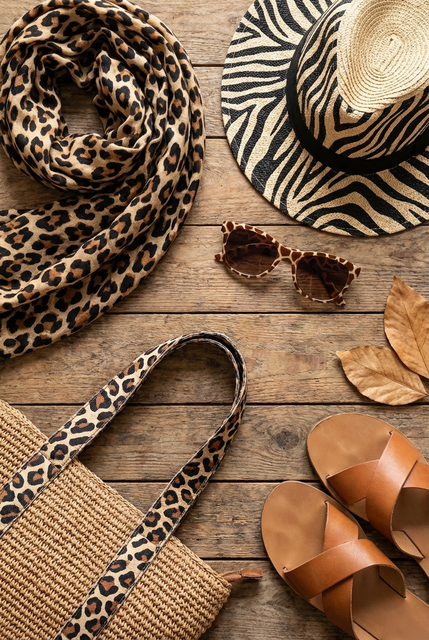
Picture Gallery


