Bold Red And Purple Color Ideas For Statement Tops
For years, traditional fashion rules dictated that red and purple were enemies. We were told they clashed, that they were too visually vibrating to sit next to one another, or that the combination was reserved strictly for the “Red Hat Society.” As a high-end stylist, I am here to tell you that those rules are obsolete. When styled correctly, red and purple create one of the most luxurious, sophisticated, and high-energy color blockings available in a modern wardrobe.
The secret lies in the undertones and the fabric quality. A statement top in this color palette is not for the wallflower; it is for the woman who wants to command the room. Whether you are pairing a crimson silk blouse with an aubergine skirt or looking for a knit that weaves both threads together, this combination signals confidence and high-fashion literacy. It is a favorite on the runway because it reads as intentional and artistic.
In this guide, I will walk you through exactly how to execute this bold pairing without looking like a costume. We will cover color theory, fabric choices, and the specific accessories needed to ground the look. If you are looking for visual inspiration, we have curated a stunning Picture Gallery at the end of the blog post to spark your creativity.
1. Mastering the Color Wheel: Analogous Harmony
To pull off a red and purple statement top, you have to understand why it works. On the color wheel, red and purple are neighbors. This creates what we call an “analogous” color scheme. Unlike complementary colors (like red and green) which create high contrast, analogous colors create a sense of harmony and flow. However, the success of your outfit depends entirely on temperature.
You must determine if your red is cool (blue-based) or warm (orange-based). A cool red, like cherry or burgundy, naturally contains blue tones. Therefore, it pairs effortlessly with violet, plum, and indigo. This is the safest and most elegant entry point for this trend. The colors melt into each other.
Designer’s Note: The Temperature Trap
The most common mistake I see is mixing a warm, orangey-tomato red with a cool, icy lavender. This creates visual friction that looks accidental rather than styled. If you choose a warm, poppy red, pair it with a warm, reddish-purple like magenta or orchid. Keep cool with cool, and warm with warm.
When selecting a statement top, hold it up to your face in natural light. If the red makes your skin look sallow, it likely clashes with your undertone. Once you find the right red, the purple accents serve as the supporting actor, deepening the visual interest without overpowering your complexion.
2. The Silhouette: Structure vs. Drapery
Because the colors are so loud, the silhouette of your top needs to be deliberate. You generally have two paths: strict structure or fluid drapery. Avoid pieces that are both tight and frilly, as the bold color combined with fussy tailoring can look cheap.
For a power look, seek out architectural tops. Think of a structured blazer-top in oxblood with sharp shoulders, or a heavy cotton poplin shirt in scarlet. These stiff fabrics hold the dye with high saturation and create a clean line. This prevents the colors from looking messy. Structure commands authority.
Alternatively, go for fluid drapery. A silk camisole or a chiffon blouse in varying shades of violet and crimson allows light to filter through the fabric. This creates dimension. When the fabric moves, the colors shift, making the outfit look expensive and dynamic. This is perfect for evening wear or creative office environments.
Common Mistake: The “Too Much” Factor
Avoid statement tops that have both bold color blocking and excessive embellishment like sequins, ruffles, and oversized buttons. Let the color be the decoration. If you have a red and purple print, ensure the cut of the shirt is simple, like a classic button-down or a sleek turtleneck.
3. Fabric Choice: The Anchor of Quality
In high-end fashion, material is everything. This is doubly true for bold colors. Cheap synthetic fabrics like low-grade polyester often have a plastic sheen that reflects light poorly. This can make red look like a fast-food uniform and purple look like a Halloween costume.
Natural fibers absorb dye differently. Wool and cashmere are excellent for this color combination because they absorb light, resulting in a rich, deep, matte color payoff. A burgundy and plum cashmere sweater looks infinitely more luxurious than an acrylic blend. The matte texture grounds the vibrant hues.
Silk and satin, on the other hand, reflect light. If you choose a satin top in this palette, be aware that it will act as a highlighter. It will visually expand the area it covers. If you are busty and want to minimize that area, opt for a matte crepe fabric. If you want to accentuate your upper body, a high-shine silk is your best friend.
What I’d Do in a Real Project:
If styling a client for a winter event, I would source a heavy-weight silk velvet top in deep aubergine. The velvet catches the light in a way that creates natural highlights and lowlights. I would pair this with a matte red lip. The texture contrast is sophisticated and tactile.
4. Grounding the Look: What to Wear on the Bottom
You have the statement top, but the outfit falls apart if the bottom half doesn’t make sense. The biggest question is: do you neutralize or commit to the color block?
Option A: The Neutralizer
If you want the top to be the sole focus, denim is the ultimate neutralizer. A medium-wash, straight-leg jean creates a cool, “French girl” vibe that dresses down the intensity of the red and purple. Avoid black bottoms if the top is very dark (like maroon and eggplant), as the outfit can become a “black hole” where details get lost. Instead, try charcoal grey or camel trousers.
Option B: The Full Commit
For a high-impact look, pull one of the colors from the top and repeat it on the bottom. If you are wearing a color-blocked top that is 70% red and 30% purple, wear purple trousers. This flips the ratio and balances the body. This is a very editorial look that works well for gallery openings, fashion events, or parties.
Key Measurement Rule:
Pay attention to where the hem of the top hits. If you are wearing a voluminous bold top, keep the bottoms slim (like a pencil skirt or cigarette pant). If the top is fitted, you can afford volume on the bottom (like wide-leg trousers). Balance is key so the color doesn’t swallow you.
5. Accessorizing: The Rule of Metallics
Jewelry plays a pivotal role in bridging the gap between red and purple. Your choice of metal acts as the “temperature regulator” for the outfit.
Gold:
Gold warms up the palette. It looks stunning with tomato reds, magentas, and royal purples. It adds a regal, opulent feel. If you are going for a “rich” aesthetic, chunky gold hoops or a thick gold chain link necklace are the way to go.
Silver:
Silver cools the palette down. It works best with blue-reds (crimson) and blue-purples (violet/indigo). Silver creates a futuristic, modern, and sharp vibe. It is less traditional than gold and signals a more avant-garde approach to style.
The Shoe Dilemma:
Do not match your shoes to your top. Red shoes with a red and purple top can look too “matchy-matchy” and dated. Instead, opt for a nude shoe that matches your skin tone to elongate the leg, or a metallic shoe that coordinates with your jewelry. If you must do a dark shoe, a deep espresso or slate grey is softer and more chic than harsh black.
6. Beauty and Grooming: The Final Polish
When wearing a statement top near your face, your grooming must be impeccable. Red and purple reflect color onto the skin. If you have redness in your complexion (rosacea or blemishes), a red top will accentuate it. You must neutralize your skin tone.
Foundation and Concealer:
Ensure your skin looks even. You don’t need heavy coverage, but color correction is vital. Use a green-tinted primer if you are prone to redness to cancel it out before applying your base.
Lipstick Logic:
There is a debate on whether to match your lips to the red in your shirt. My professional advice? It depends on the texture. If the top is a solid block of red, a matching lip can look incredibly chic. However, if the top is a busy print, a matching lip can look overwhelming. In that case, opt for a sheer berry stain or a nude gloss.
Hair:
Keep hair off the collar if the top has a high neck or intricate details. A sleek low bun or a high pony allows the neckline to shine. If the top is a deep V-neck or scoop, loose waves help fill the negative space and soften the bold colors.
7. Transitioning Seasons: Year-Round Wearability
Red and purple are not just for fall. By adjusting the shades, you can wear this combination 12 months a year.
Spring/Summer:
Shift the saturation. Think lilac and strawberry. Or lavender and coral. These pastels maintain the red-purple relationship but add a dose of white to lighten the visual weight. Fabrics should be linen, cotton voile, or silk. A lilac linen button-down tucked into red shorts is a daring summer look.
Fall/Winter:
Deepen the shades. Merlot, oxblood, plum, and eggplant. These are the “jewel tones.” They look expensive and appropriate for cold weather. Heavy knits, leather, and wool are the textures of choice. A chunky purple turtleneck under a red wool coat is a classic winter pairing.
Designer’s Note: Longevity
Red dye is notorious for bleeding, and purple fades faster than most colors in the wash. Always wash these garments inside out in cold water, or better yet, dry clean high-investment pieces. A faded red top looks tired very quickly.
Finish & Styling Checklist
Before you walk out the door, run through this mental checklist. As a stylist, I use this on every client to ensure the look is polished, not chaotic.
- The Sit Test: Sit down in a chair. Does the top bunch up unflatteringly? Does the fabric pull tight across the buttons? Bold colors highlight fit issues more than black does. Ensure you have enough ease in the garment.
- The Lighting Check: Check your outfit in three lights: your bathroom (usually warm), near a window (daylight), and a dim hallway. Make sure the red and purple don’t muddy each other in low light.
- The Third Piece: If the outfit feels incomplete, add a “third piece.” This could be a blazer, a scarf, or a statement belt. This adds a layer of intention.
- Lint Roll: Dark purples and reds show lint, pet hair, and dandruff aggressively. Keep a travel lint roller in your bag.
- Undergarments: A red top often requires a nude bra, not a white one. A white bra will glow through thin red fabric. A nude tone that matches your skin disappears.
FAQs
Can I wear red and purple if I have red hair?
Absolutely. The old rule that redheads can’t wear red is a myth. The key is contrast. If you have bright copper hair, a deep plum or a cool burgundy will look stunning. Avoid reds that match your hair color exactly. The purple elements in the top will actually help separate the garment from your hair color.
Is this color combination appropriate for a wedding guest?
It depends on the dress code and the specific shades. A bright neon red and purple might be too distracting for a church ceremony. However, deep jewel tones (plum and burgundy) are perfectly appropriate for semi-formal or cocktail attire weddings. Avoid wearing “fire engine” red to a wedding as it is sometimes viewed as attention-seeking.
How do I mix prints with these colors?
If your top is a solid red and purple, you can introduce a print in your accessories, like a leopard print shoe (which acts as a neutral) or a snake print bag. If the top itself is a print, keep everything else solid. Do not mix a red/purple floral top with plaid pants unless you are extremely confident in maximalist styling.
What nail polish color works best?
You have two great options: a dark, vampy color (like almost-black rouge or deep bordeaux) or a very clean, sheer nude (like “ballet slippers”). Avoid bright blue, green, or yellow nails, as this introduces a tertiary color that will likely clash with the harmony you’ve built.
Conclusion
Embracing bold red and purple statement tops is an exercise in confidence. It shows that you understand color theory and aren’t afraid to take up space. By focusing on high-quality natural fabrics, perfecting the fit, and choosing the right accessories to anchor the look, you transform a risky color combination into a sophisticated signature style.
Fashion is meant to be fun, but it is also a language. This combination says you are bold, artistic, and refined. Start with a piece you love, perhaps a simple knit or a well-cut blouse, and experiment with the ratios until it feels like you. Trust your eye, check your lighting, and wear it with pride.
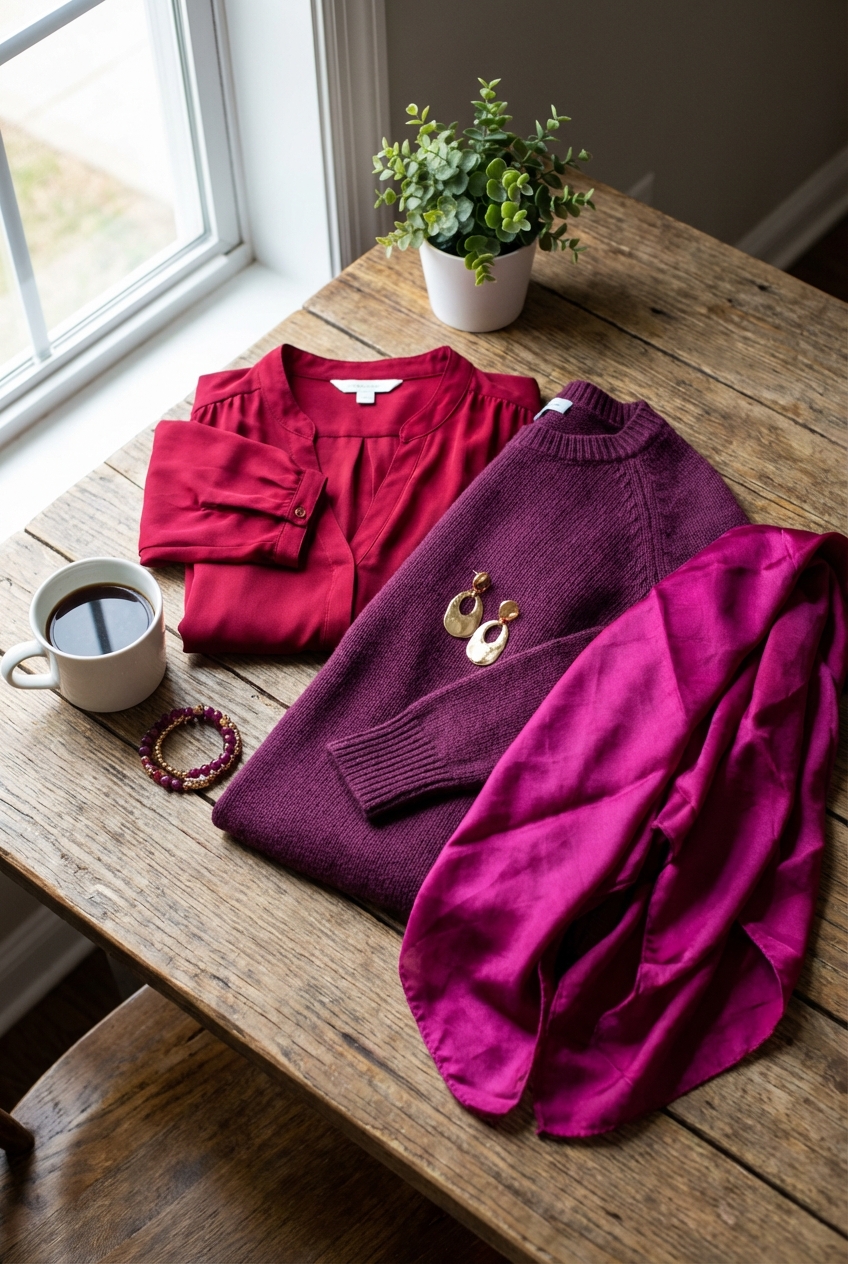
Picture Gallery


