Bold Red And Warm Beige For Striking Winter Coats
Winter fashion often falls into a trap of dull greys and standard blacks. While practical, these colors do little to lift the spirit during the darkest months of the year. My antidote to the seasonal slump has always been the strategic pairing of high-energy color with grounding neutrals.
Specifically, I am talking about the combination of bold red and warm beige. This duo balances the “look-at-me” confidence of crimson with the “quiet luxury” of camel and oatmeal tones. It is sophisticated enough for the boardroom but playful enough for a weekend brunch.
In this guide, I will break down exactly how to master this color story, from choosing the right undertones for your complexion to selecting fabrics that hold their shape. I have curated a comprehensive collection of visual examples to inspire your wardrobe, so please make sure to look at our Picture Gallery at the end of this blog post.
The Psychology and Balance of the Red-Beige Pairing
Understanding why this combination works is the first step to wearing it with confidence. Red is an activator; it commands attention and increases visual heart rate. Beige, conversely, acts as a palate cleanser. It provides a soft, expensive-looking backdrop that allows the red to shine without becoming overwhelming.
When styling these two for outerwear, you are essentially playing with visual weight. A solid red coat is a massive block of intense color. If you pair it with black, the contrast can sometimes look harsh or dated. Pairing it with beige softens the transition, creating a look that feels organic and approachable.
Designer’s Note: The Ratio Rule
In my years of styling editorial shoots, I lean on the 80/20 rule. Let one color be the protagonist and the other the supporting character.
Option A: A structural beige trench coat (80%) styled with a vibrant red scarf and red leather gloves (20%).
Option B: A statement scarlet wool coat (80%) worn over a monochromatic oatmeal sweater and trouser set (20%).
Trying to do a 50/50 split—like a red jacket with beige pants of equal visual weight—can sometimes cut the body in half. Lean into one dominant shade for a more cohesive silhouette.
Identifying the Right Undertones for Your Complexion
The most common mistake clients make is assuming “red is red” and “beige is beige.” This could not be further from the truth. If a coat makes you look tired or washed out, the cut isn’t the problem; the undertone is.
Understanding Warm vs. Cool Reds
Blue-Based Reds (Cool): These lean toward cherry, ruby, or crimson. If you have cool undertones (veins look blue, silver jewelry looks best), these reds will make your skin sing.
Orange-Based Reds (Warm): These lean toward brick, tomato, or poppy. If you have warm undertones (veins look green, gold jewelry looks best), these provide a healthy glow.
Navigating the Beige Spectrum
Beige is equally complex. A “greige” (gray-beige) can look muddy on warm skin, while a yellow-based camel can make cool skin look sallow.
Cool Beige: Look for taupe, stone, or sand. These pair beautifully with the sharp, icy contrast of a blue-based red.
Warm Beige: Look for camel, caramel, or oatmeal. These blend seamlessly with tomato reds and gold hardware.
What I’d Do in a Real Project
If I am styling a client who loves red but feels overwhelmed by it near her face, I flip the script. I would choose a classic camel wrap coat. Then, I would bring the red in via a lower element, like a red midi skirt peeking out from the hem, or red knee-high boots. This keeps the flattering neutral near the face while retaining the drama of the color combo.
Fabric Composition: Investing in Longevity
A winter coat is an investment piece. Unlike a trendy summer top, this item needs to withstand friction, precipitation, and daily wear. When shopping for red or beige coats, the fabric quality dictates how the color absorbs light.
The Wool Factor
Natural fibers absorb dye differently than synthetics. A 100% wool or cashmere coat in red will have a deep, rich saturation. A high-polyester blend often has a plastic-like sheen that makes the red look cheap.
For beige coats, texture is everything. Wool blends are prone to pilling, which is highly visible on light fabrics. High-quality wool, alpaca, or cashmere reflects light in a way that makes beige look creamy and luxurious rather than flat.
Common Mistakes + Fixes
Mistake: Buying a coat with a low natural fiber count (under 50% wool).
The Issue: You will freeze, and the coat will likely pill within a month. Synthetics trap body odors and don’t breathe.
The Fix: Aim for at least 70% wool or cashmere content. If budget is a constraint, look for vintage pieces with high fabric quality or vintage-inspired cuts in heavy-weight wool blends.
Silhouette and Scale: Finding the Right Fit
The visual impact of a red coat is significant, so the silhouette must be intentional. Because red expands visually (making objects look larger), a poorly fitted red coat can swallow you up.
The Structured Shoulder
For a bold red coat, I almost always recommend a tailored shoulder. A defined shoulder line provides structure that counteracts the intensity of the color. It says “power suit” rather than “bathrobe.”
The Relaxed Beige
Beige coats, particularly in camel shades, look incredible in softer, unstructured silhouettes. Think robe coats, wrap styles, or drop-shoulder cocoon shapes. The softness of the color complements the drape of the fabric.
Pro-Level Sizing Guide
Sleeve Length: The sleeve should hit exactly at the wrist bone when your arms are at your sides. If it covers your thumb, it looks ill-fitting (unless it’s a specific oversized design intent).
Hemline: If you are petite (under 5’4″), a coat that hits just above the knee elongates the leg. If you are tall, a maxi length adds drama.
Layering Room: Always try coats on while wearing your thickest winter knit. You should be able to cross your arms in front of you without the fabric pulling tight across the upper back.
Styling the Look: Layering Logistics
Once you have the coat, what goes underneath is crucial. The goal is to create a seamless transition between the bold outerwear and the outfit beneath.
The Monochromatic Column
One of my favorite styling tricks is the “Column of Color.” This involves wearing a single shade of beige from neck to toe—a turtleneck, trousers, and boots in the same oatmeal hue.
When you throw a red coat over this base, the result is incredibly chic. It elongates the body and lets the coat serve as the frame for the picture.
Mixing Textures
Winter fashion relies on texture to prevent boredom. If your coat is a smooth wool melt, ensure your layers provide contrast.
Pair a smooth red coat with a chunky beige cable-knit sweater.
Pair a teddy-texture beige coat with sleek red silk or leather accents.
Use leather gloves or a suede bag to break up the matte finish of wool.
Designer’s Note: The Shoe Connection
Your footwear anchors the look. If you are wearing a beige coat with red accents, a red boot can balance the visual weight. However, be careful with varying shades of red. If your coat is a blue-red and your boots are an orange-red, they will clash. When in doubt, match the shoe to the beige neutral or stick to black/brown leather.
Hardware and Accessories: The Finishing Touches
The hardware on your coat—buttons, zippers, and buckles—acts like jewelry. In the red and beige color scheme, the metal tone changes the vibe entirely.
Gold vs. Silver
Gold Hardware: This warms up the look immediately. Gold buttons on a red coat give a military or nautical nod. Gold on beige feels heritage and expensive. This is generally the preferred metal for this color story.
Silver Hardware: This creates a cooler, more modern, or industrial look. It works best with cool, taupe-leaning beiges and blue-reds.
Buttons Matter
If you find a perfect red coat but it has cheap-looking plastic buttons, don’t walk away. Buy the coat and spend $20 at a fabric store for high-end horn or metal buttons. Swap them out (or pay a tailor to do it). This small change can make a $150 coat look like a $1,500 designer piece.
Scarves and Bags
Avoid busy prints when you are already dealing with a bold color block. If you must use a print, a classic plaid or check that incorporates both red and beige is the sophisticated choice. It ties the two separate elements together intentionally.
Finish & Styling Checklist
Before you head out the door or finalize a purchase, run through this quick mental checklist to ensure the look is polished.
Check the Lighting: Look at the red fabric in natural daylight, not just store lighting. Does it make your skin look bright or grey?
The Lint Check: Red and beige wools are magnets for dark lint and hair. Keep a travel lint roller in your bag.
Fabric Friction: Ensure your bag strap isn’t rubbing against the coat fabric, which causes premature pilling on the shoulder.
The Sit Test: Can you sit down in the coat without the buttons straining? If they pull open, size up.
Hardware Harmony: Are your coat buttons, bag hardware, and jewelry in the same color family (gold/silver)?
* Hemline Coordination: If wearing a dress or skirt, it should either be shorter than the coat or significantly longer (midi/maxi). A skirt that peeks out just one inch below the coat looks unintentional.
FAQs
Q: Can I wear red and beige if I’m petite?
A: Absolutely. The key is scale. Avoid oversized, double-breasted coats that add too much bulk. Opt for a belted, single-breasted style in a bright red. Keep the outfit underneath monochromatic (all beige) to create a long vertical line that adds height.
Q: How do I keep a light beige coat clean in winter slush?
A: This is a practical concern. Look for coats where the beige is slightly darker (camel rather than cream). Treat the hem with a fabric protector spray before wearing. Also, consider a coat length that hits at the knee rather than the calf to avoid splash-back from boots.
Q: Can I mix patterns with this color combo?
A: Yes, but keep the pattern scale in mind. A leopard print (which is essentially black and beige) works wonderfully with a red coat. A classic Burberry-style check is also a natural fit. Keep the pattern to one item—like a scarf or a skirt—rather than mixing multiple prints.
Q: Is a red coat appropriate for the office?
A: Yes, provided the silhouette is tailored. A red trench or a structured wool coat is powerful and professional. A red puffer jacket or shaggy faux fur might be too casual for conservative corporate environments.
Conclusion
Embracing a bold red and warm beige palette for your winter outerwear is a declaration of confidence. It refuses to surrender to the drabness of the season. By selecting the right undertones for your skin, investing in quality natural fibers, and paying attention to the tailoring, you elevate your entire winter presence.
Fashion should be functional, but it should also bring you joy. A striking coat is the first thing people see when you arrive and the last thing they see when you leave. Make it memorable.
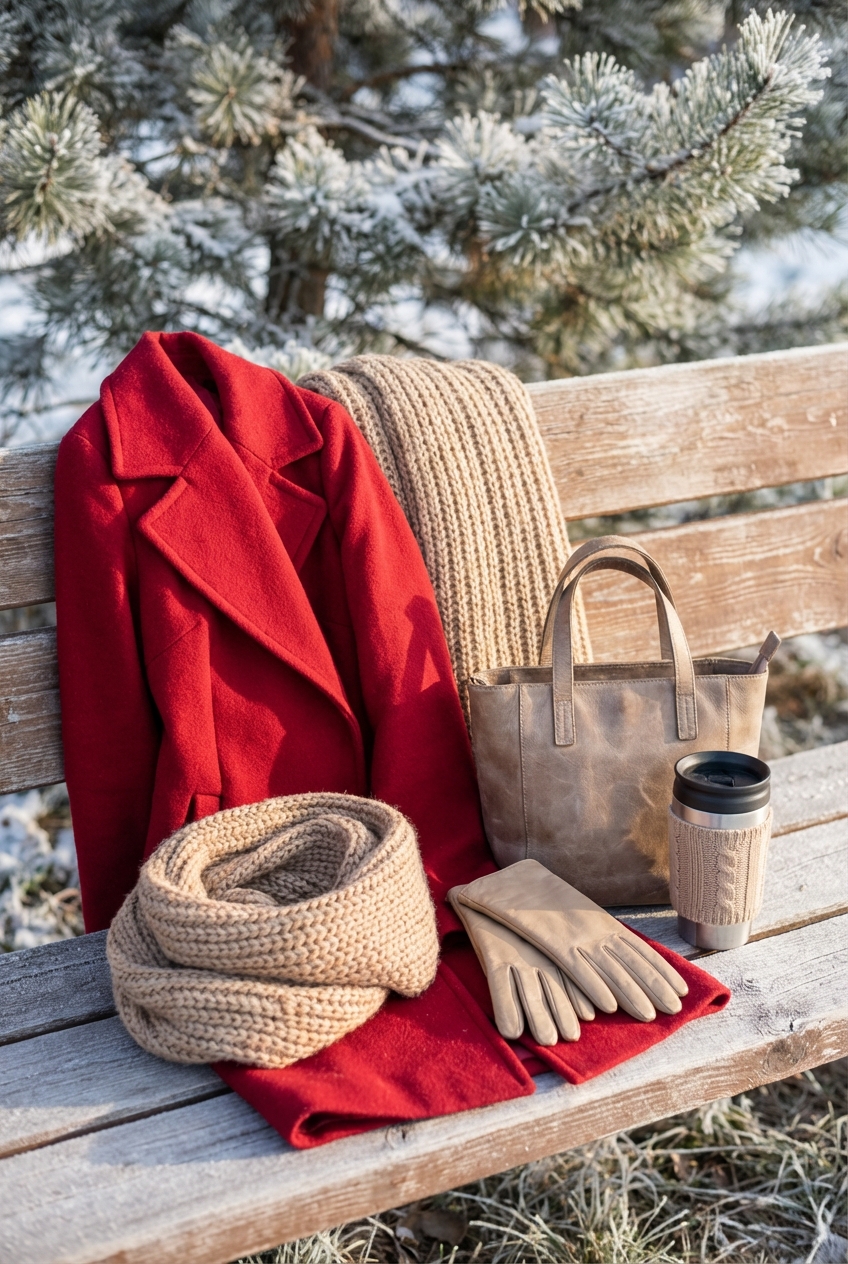
Picture Gallery


