Burnt Orange And Aqua Combinations For Bold Casual Looks A Vibrant And Eye Catching Pairing
In the world of high-end fashion, we often talk about the “power clash”—that deliberate pairing of two distinctive, assertive hues that somehow creates a perfect harmony. Just as you might pair a structured terracotta trench coat with a vibrant turquoise silk scarf to create an ensemble that feels both effortless and expensive, the combination of burnt orange and aqua in interior design offers that same level of sophisticated confidence. It is a look that suggests you travel, you curate, and you aren’t afraid to take up space.
This color duo works because it balances temperature perfectly. Burnt orange brings a grounded, earthy warmth reminiscent of aged leather and autumn leaves, while aqua injects a cool, refreshing energy that feels like a coastal breeze. When applied to interiors, this palette creates spaces that feel “bold casual”—rooms that look incredibly chic but invite you to kick off your heels and sink into the sofa. It is the architectural equivalent of a well-tailored linen suit paired with statement jewelry.
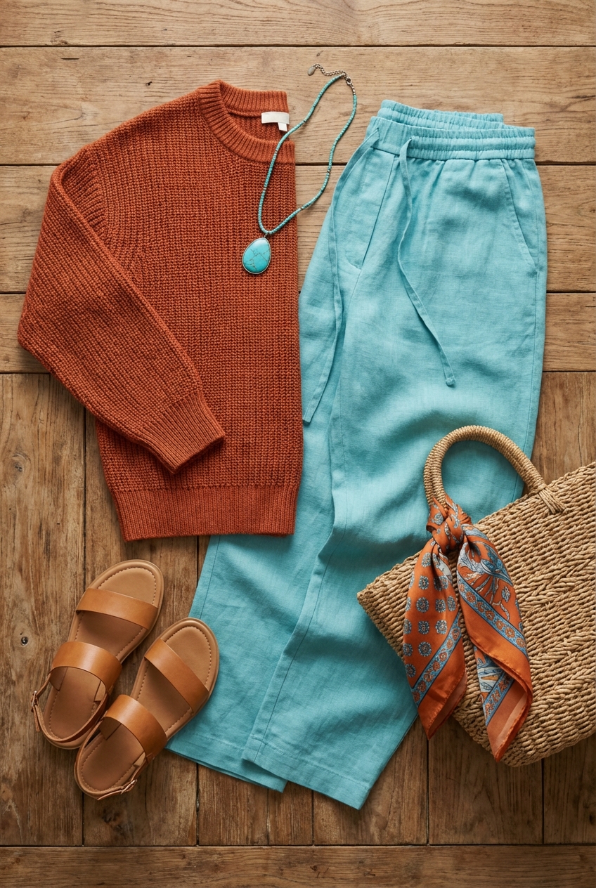
Throughout this guide, I will walk you through exactly how to translate this runway-ready palette into your living spaces with the precision of a seasoned stylist. We will cover everything from the scale of your furniture to the exact spacing of your accessories. If you are looking for visual inspiration to help you visualize these concepts, be sure to check out the curated Picture Gallery at the end of the blog post.
Understanding the Architecture of Color
Before we start buying throw pillows, we need to understand the structural foundation of this pairing. In fashion, we know that the cut of the garment matters as much as the color; in interiors, the “cut” is the balance and distribution of hues. Burnt orange and aqua are complementary colors, sitting opposite each other on the color wheel. This creates high contrast, which creates energy.
To keep this energy from becoming chaotic, one color must be the dominant “fabric” of the room, while the other acts as the accent. For a casual, grounded look, I usually recommend using burnt orange (in darker, rustier tones) as the anchor. Think of this as your neutral base—like a leather sofa or a wood-stained floor. The aqua then becomes the pop of brightness that lifts the visual weight of the room.
If you prefer a lighter, airier aesthetic, flip the script. Use aqua on the walls or large area rugs to create an open, sky-like atmosphere, and use burnt orange as the grounding punctuation marks. The key is never to use them in a 50/50 split, which can make a room feel like a sports team mascot. Aim for a 60-30-10 ratio: 60% neutral background (creams, whites, light woods), 30% burnt orange, and 10% aqua (or vice versa).
Designer’s Note:
The biggest lesson I have learned from styling lookbooks and living rooms is that “matching” is the enemy of style. Do not try to find an aqua vase that is the exact same hex code as your aqua rug. It looks cheap and catalog-bought. Instead, layer tonal variations. Use a teal velvet, a pale robin’s egg ceramic, and a vibrant turquoise glass. This creates depth and richness.
The Living Room: Tailoring the Layout
The living room is your primary display window. It is where this bold casual look shines brightest. When working with such distinct colors, your layout and furniture scale must be impeccable to avoid the room feeling cluttered.
Start with the sofa. If you are bold enough to choose a burnt orange velvet sofa, this is your statement piece—your “couture gown.” Because the color is heavy, the silhouette should be clean. Look for mid-century modern lines or low-profile Italian designs. If you have a rust-colored sofa, you need to ensure your rug is sized correctly to frame it.
Common Mistakes + Fixes:
Mistake: Using a rug that is too small, creating a “floating island” look where the furniture feels disconnected.
Fix: In a standard living room, aim for an 8×10 or 9×12 rug. The rule of thumb is that at least the front two legs of every major furniture piece (sofa and accent chairs) should sit on the rug. The rug should extend at least 6 to 8 inches past the ends of the sofa.
When introducing aqua, do it through accent chairs or heavy drapery. If you choose aqua curtains, ensure they are hung high and wide. The curtain rod should be mounted 4 to 6 inches above the window frame (or all the way to the ceiling molding) and extend 8 to 12 inches past the window on either side. This ensures that when the curtains are open, they don’t block the glass, maximizing natural light which is essential for making these colors pop.
For spacing, maintain a comfortable “conversation distance.” Place your aqua accent chairs no more than 8 feet away from the sofa. Your coffee table should be 14 to 18 inches from the edge of the sofa seat. This creates a cozy, intimate vibe that aligns with the “casual” aspect of our theme.
Materiality and Texture: The Fabric of the Home
In fashion, a monochromatic outfit works because of texture—mixing silk with wool, or leather with lace. The same applies here. A flat orange cotton pillow next to a flat aqua cotton sheet looks juvenile. To achieve a high-end look, you must mix materials that reflect and absorb light differently.
Burnt orange thrives in rich, tactile fabrics. Leather, suede, and heavy linen maximize the earthy qualities of the color. A cognac leather ottoman or a rust-colored bouclé armchair adds perceived value and physical comfort. These materials age well, developing a patina that enhances the casual aesthetic.
Aqua, on the other hand, looks stunning in materials that have a bit of sheen or translucency. Think velvet, silk, or glass. An aqua velvet throw pillow catches the light and adds glamour. Aqua glass lamps or vases bring an ethereal quality that balances the heaviness of the orange leather.
What I’d do in a real project:
If I were designing a rental apartment where painting walls isn’t an option, I would focus on “removable architecture.” I would layer a large, neutral jute rug (for texture) with a smaller, vintage Turkish kilim rug on top that features burnt orange and faded teal. I would use a slipcovered sofa in a heavy white canvas (durable, washable) and pile on pillows in deep rust velvet and aqua embroidery. This keeps the investment pieces neutral while using accessories to drive the color story.
Dining and Kitchen: A Feast for the Eyes
Bringing this palette into the dining area or kitchen requires a lighter touch. You want the space to feel appetizing, not overwhelming. Burnt orange is actually known to stimulate appetite, making it a classic choice for dining rooms, while aqua adds a clean, hygienic feel essential for culinary spaces.
For a dining room, consider a burnt orange wall treatment or wallpaper. If you go this route, keep the dining table wood tone natural and warm (walnut or white oak). Then, introduce aqua through the upholstery of the dining chairs or the table linens.
Lighting is critical here. To make burnt orange glow rather than look muddy, you need warm lighting. Avoid “daylight” or cool white bulbs which can turn aqua harsh and orange brown. Stick to LED bulbs with a color temperature of 2700K to 3000K. This mimics the warm glow of candlelight or sunset, which flatters both the room and the people in it.
Checklist for Hanging Dining Fixtures:
- Height: The bottom of your chandelier or pendant should be 30 to 36 inches above the table surface.
- Scale: The width of the fixture should be roughly one-half to two-thirds the width of the table.
- Dimming: Always install a dimmer switch. High-contrast colors need softer light in the evening to feel intimate.
The Bedroom: bold Serenity
Can you really use such a vibrant pairing in a room meant for sleep? Absolutely, but we have to adjust the saturation. In the bedroom, we move from “burnt orange and aqua” to “terracotta and mist.” Softening the shades keeps the bold identity but reduces visual stimulation.
I recommend using the aqua tone for the bedding or the wall color behind the bed. Blue spectrum colors are proven to lower heart rates and induce relaxation. A dusty aqua upholstered headboard is a sophisticated choice.
Use the burnt orange tones sparingly as grounding elements. A terracotta throw blanket at the foot of the bed, or bedside lamps with copper or ceramic bases in rust tones. This mimics the warmth of the sun rising over the ocean—a very natural, calming association.
Pro-Tip for Small Bedrooms:
If your room is small, avoid painting all four walls a dark burnt orange. It will close the room in. Instead, keep the walls a creamy white and use floor-to-ceiling aqua drapes. The vertical lines draw the eye up, making the ceiling feel higher, while the color adds the drama you want without the claustrophobia.
Outdoor Living: The Landscape Connection
One of the most natural places for this combination is the patio or sunroom. Landscape design naturally offers these colors: the green-blue of foliage and the burnt orange of terracotta pots or brick pavers.
To elevate your outdoor space, treat it like an extension of your indoor living room. Use “indoor-outdoor” rugs that define a seating area. A rug with a geometric pattern in rust and turquoise hides dirt well and anchors the furniture.
When selecting plants, look for foliage that compliments this scheme. Crotons have leaves that naturally bleed from green to yellow to bright orange. Ornamental grasses often dry to a beautiful rust color in the fall. Pair these with blue-glazed ceramic planters.
Durability Note:
For outdoor cushions, you must look for solution-dyed acrylic fabrics (like Sunbrella). High-contrast colors like orange and aqua will fade rapidly in direct sunlight if printed on cheap polyester. Solution-dyed fabrics have the color all the way through the fiber, like a carrot, rather than just on top, like a radish. This ensures your bold look stays bold for years.
Finish & Styling Checklist
Ready to execute this look? Here is your step-by-step checklist to ensure you stay on track and avoid impulse buys that don’t fit the vision.
- Define the Ratio: Decide immediately if you are Team Orange (warm base) or Team Aqua (cool base). Stick to the 60-30-10 rule.
- Audit Your Lighting: Check every bulb in the room. Swap anything over 3000K for a softer, warmer bulb to flatter the orange tones.
- Measure Twice: Before buying a rug, tape the outline on the floor. Ensure the front legs of the sofa will sit on it.
- Texture check: Do you have at least three different textures? (e.g., Wood, Velvet, Metal). If not, add what is missing.
- Metal Mix: Brass and gold look best with this pairing as they highlight the warmth of the orange. Avoid chrome, which can look too sterile against the rust tones.
- Greenery: Add live plants. The natural green acts as a bridge between the burnt orange and aqua, making the combination feel organic rather than artificial.
FAQs
Q: Can I use this color combination in a room with low natural light?
A: Yes, but be careful with the shade of orange. In dark rooms, burnt orange can look brown and muddy. Opt for a brighter, more vibrant tangerine tone and use plenty of lamps. Lean heavier on the aqua/teal shades to reflect what little light exists.
Q: What wood tones work best with orange and aqua?
A: Mid-tone woods like walnut, teak, and warm oak are ideal. They share the warm undertones of the orange. Avoid grey-washed woods or very dark espresso finishes, which can clash or make the room feel too heavy.
Q: Is this combination kid and pet friendly?
A: Surprisingly, yes. Burnt orange (rust) is excellent at hiding dirt and stains, much better than beige or white. If you choose performance velvets or textured weaves for the upholstery, it can take a beating. Aqua is better reserved for washable items like throw pillow covers or accessories that are out of reach.
Q: How do I transition this look for the holidays?
A: This palette transitions beautifully into fall—just add pumpkins and dried wheat. for Winter/Christmas, swap the bright aqua accents for deeper teal or peacock blue, and add heavy doses of metallic gold and evergreen branches. The orange acts as a festive red alternative.
Conclusion
Adopting a burnt orange and aqua palette is a declaration of style. It shows that you aren’t afraid of color and that you understand the delicate balance between warmth and cool serenity. It brings the curated energy of a fashion editorial into your daily life, proving that casual does not have to mean boring, and bold does not have to be overwhelming.
By following the rules of scale, texture, and lighting we have discussed, you can create a home that feels like a boutique hotel or a designer’s private residence. Remember that your home, like your wardrobe, should evolve. Start with the foundational pieces, layer in your textures, and don’t be afraid to experiment with the saturation until it feels uniquely yours.
Picture Gallery


