Color Themed Capsule Wardrobes Creating Cohesion Through Hue
Introduction
We have all stood in front of a closet bursting with clothes, only to feel the sinking realization that we have absolutely nothing to wear. This phenomenon usually isn’t a result of a lack of options, but rather a lack of cohesion. When we buy pieces in isolation—a blouse we loved on a mannequin, a skirt on sale, a coat that looked great on Instagram—we often end up with a disjointed collection that refuses to mix.
As a fashion stylist, I often walk into closets that look like a confetti cannon went off. The key to reclaiming your style and your sanity lies in color theory. By restricting your palette to a focused color-themed capsule, you actually unlock more outfit combinations. A cohesive hue strategy allows you to get dressed in the dark and still look polished.
In this guide, I am going to walk you through the architecture of building a color-first capsule wardrobe. We will look at undertones, fabric textures, and the specific ratios needed to make a limited wardrobe feel limitless. Be sure to scroll to the end of this post to view our inspiring Picture Gallery.
1. Establishing Your Core Neutrals and Undertones
Every high-functioning wardrobe is built on a foundation of neutrals. These are the workhorses of your closet that allow your accent colors to shine without overwhelming the eye. However, “neutral” does not just mean black or white.
To create a cohesive capsule, you must first determine your skin’s undertone. This is non-negotiable in high-end styling. If you have cool undertones (veins appear blue), your neutrals should be crisp: stark white, slate grey, charcoal, and black. If you have warm undertones (veins appear green), your neutrals should lean towards cream, camel, olive, and chocolate brown.
Once you pick your neutral lane, stay in it. Mixing a cool grey blazer with warm beige trousers can often look accidental rather than intentional. By keeping your foundational pieces—coats, trousers, and boots—in the same temperature family, everything will inherently match.
Designer’s Note: The “Three-Hue” Rule
I often see clients try to incorporate too many colors at once. For a capsule, stick to the Rule of Three:
- One Main Neutral: This takes up 50% of the capsule (e.g., Camel).
- One Secondary Neutral: This takes up 20% (e.g., Cream/Ivory).
- One Main Accent Color: This takes up 30% (e.g., Emerald Green).
2. The Art of Monochromatic Texture Blocking
One of the biggest misconceptions about color-themed wardrobes is that they are boring. People fear that wearing head-to-toe navy or all-cream will look like a uniform. The secret to avoiding the “uniform” look is texture.
When you remove high-contrast colors, you must replace that visual interest with tactile variety. In a monochrome look, a silk blouse tucked into wool trousers creates depth because the light hits the two fabrics differently. The silk reflects light, appearing lighter, while the wool absorbs it, appearing richer and deeper.
In a luxury wardrobe, we look for natural variances in fiber. I recommend mixing leather with knitwear, or denim with chiffon. If you are building a “Sage Green” capsule, a chunky sage knit sweater worn over a satin sage slip skirt is infinitely more chic than a cotton tee and cotton chinos in the exact same shade.
Common Mistakes + Fixes
Mistake: Trying to match colors perfectly across different brands.
Fix: Stop trying to match; aim to coordinate. A “perfect match” that is slightly off looks like a mistake. Instead, embrace tonal dressing where you mix varying shades of the same color (e.g., sky blue, cerulean, and navy).
3. Selecting Fabrics for Longevity and Flow
A capsule wardrobe relies on a high frequency of wear. Because you have fewer items, each piece is washed and worn more often. Therefore, the quality of the fabric is paramount. You simply cannot build a lasting capsule out of fast-fashion synthetics that will pill after three wears.
Focus on natural fibers that breathe and recover well. Merino wool, cashmere, cotton poplin, and linen are excellent choices. From a color perspective, natural fibers hold dye differently than synthetics. A polyester red blouse will often have a plastic-like sheen, whereas a silk red blouse has a glowing depth.
Consider the “drape” of your color choices. Darker colors can handle heavier, stiffer fabrics like structured denim or thick wool. Lighter colors, specifically pastels, often look more expensive in fluid fabrics like silk or rayon. A stiff, pastel pink coat can sometimes look juvenile, but a draped pastel pink trench looks sophisticated.
Real-World Project Checklist
When sourcing for a client’s capsule, I check these three durability factors:
- The Scrunch Test: Does the fabric wrinkle immediately? If it creates permanent creases in your hand, it will look messy by noon.
- Opacity Check: For light-colored capsules, place your hand inside the garment. If you can see your skin tone clearly, the garment is too thin and will require specific undergarments, reducing its versatility.
- The Hardware: Ensure zippers and buttons are substantial. Cheap hardware ruins the aesthetic of a tonal look.
4. The 5-4-3-2-1 Structure for Color Capsules
Structure is the antidote to chaos. When building your color-themed wardrobe, it helps to have a numerical framework to prevent over-buying in one category (like owning ten sweaters but no pants).
I recommend the 5-4-3-2-1 method, adapted for color cohesion:
- 5 Tops: Mix of base neutrals and your accent hue.
- 4 Bottoms: Mostly neutrals for versatility, perhaps one in your accent color.
- 3 Shoes: One heel, one flat, one sneaker/boot (match these to your neutrals).
- 2 Layers: Jackets or cardigans that tie the color palette together.
- 1 Signature Accessory: A bag or scarf that incorporates all colors in the palette.
For example, in a “Burgundy & Grey” capsule:
Your tops might be two white silk shirts, one grey cashmere sweater, one burgundy blouse, and one charcoal turtleneck. Your bottoms could be black tailored trousers, dark wash denim, a grey wool skirt, and burgundy wide-leg trousers. This creates over 30 unique combinations from just a handful of items.
5. Navigating Prints and Patterns
A color-themed capsule does not imply solid colors only. In fact, prints are the “glue” that can bind your neutrals and accents together. A well-chosen print can make disparate pieces feel like a set.
The rule of thumb for high-end styling is to choose timeless prints over trendy ones. Breton stripes, houndstooth, glen plaid, and understated florals are safe bets. The key is that the print must contain your capsule’s specific colors.
If your capsule is Navy, White, and Camel, a scarf or blouse featuring a camel and navy geometric print is invaluable. It bridges the gap. You can wear it with the camel trousers or the navy skirt. If you introduce a print with a random fourth color (like neon pink), you disrupt the cohesion and limit the item’s wearability.
What I’d Do in a Real Project
If I were building a capsule for a petite client, I would avoid large-scale floral prints in the accent color, as they can overwhelm the frame. I would instead opt for a micro-print or a vertical stripe in the accent hue to elongate the silhouette while maintaining color consistency.
6. Accessories as the Unifying Element
Accessories are often treated as an afterthought, but in a capsule wardrobe, they are the punctuation marks of your style sentence. The metals you choose—gold, silver, rose gold—play a massive role in color temperature.
If your capsule is warm-toned (browns, creams, rusts), gold hardware is the standard luxury choice. It harmonizes with the warmth. If your capsule is cool-toned (blacks, blues, greys), silver or white gold provides a clean, sharp finish. Mixing metals is possible, but it is advanced styling; for a cohesive capsule, sticking to one metal finish elevates the look.
Leather goods (belts, bags, shoes) should ideally match your base neutral. If your base is black, keep your leathers black. If your base is navy, opt for cognac or nude leathers, as finding a perfect navy leather match is notoriously difficult and often looks cheap if missed slightly.
Designer’s Note: The “Third Piece” Rule
To make a capsule outfit feel “finished,” always add a third piece.
- Piece 1: Top
- Piece 2: Bottom
- Piece 3: The element that adds polish (a blazer, a statement belt, a silk scarf, or a structured hat).
Without the third piece, an outfit often looks like you are still in the process of getting dressed.
Finish & Styling Checklist
Before you finalize your color-themed capsule, run your collection through this styling checklist. This is the exact mental process I use before signing off on a client’s closet revamp.
1. The “Sit” Test
Put on your trousers and skirts and sit down. Do they dig in? Do they ride up uncomfortably? A capsule wardrobe is worn on rotation; if an item is uncomfortable, you will subconsciously avoid it, breaking the capsule’s utility.
2. The Daylight Check
Take your accent colors into natural sunlight. Store lighting is deceptive. A “burgundy” might look purple in the sun, clashing with your “rust” items. Ensure the undertones agree in broad daylight.
3. The Silhouette Balance
Do you have a mix of loose and fitted items?
- Tight Top + Loose Bottom = Balanced
- Loose Top + Tight Bottom = Balanced
- Loose Top + Loose Bottom = Can look sloppy without tailoring
Ensure your capsule isn’t made entirely of oversized knits, or you will lack shape.
4. The Maintenance Reality
Be honest about your lifestyle. If you have small children or pets, a “Winter White” monochromatic capsule is a recipe for disaster. Opt for mid-tone neutrals like taupe or denim blue that hide stains better than stark white or black (which shows pet hair).
FAQs
Q: Won’t I get bored wearing the same colors every day?
A: Surprisingly, no. Most people actually find it liberating. When everything matches, you can focus on styling—rolling sleeves, layering jewelry, trying new tucks—rather than stressing over color coordination. You can always swap your “accent” color seasonally (e.g., blush in spring, burgundy in autumn) while keeping your neutrals constant.
Q: Can I do a capsule wardrobe if I love bright colors?
A: Absolutely. “Dopamine dressing” can be capsule-friendly. Your “neutral” doesn’t have to be beige. For a maximalist, leopard print or denim can act as a neutral. You could build a capsule around hot pink, orange, and denim. The rules of cohesion still apply: keep the temperatures (warm/cool) consistent.
Q: How much should I budget for a high-quality capsule?
A: This varies wildly, but the “Cost Per Wear” philosophy is essential. It is better to spend $200 on one pair of trousers you wear three times a week than $40 on five pairs you hate. Start by investing in the “Base Neutral” items (coat, boots, bag) as these take the most beating. Save budget on the “Accent” tops, which are easier to replace.
Conclusion
Building a color-themed capsule wardrobe is an exercise in intentionality. It asks you to stop buying for the fantasy life you think you should have, and start dressing for the real life you actually lead. By narrowing your focus to a specific palette, you actually expand your possibilities.
Cohesion creates calm. When you open your closet doors and see a harmonious row of fabrics that all speak the same language, the stress of the morning rush evaporates. You look pulled together because your wardrobe was designed to be together.
Start small. diverse your closet today and pull out everything in your favorite neutral and your favorite color. You likely already have the bones of a great capsule hiding in the chaos. With a little editing and a focus on hue, you can curate a closet that feels like a boutique.
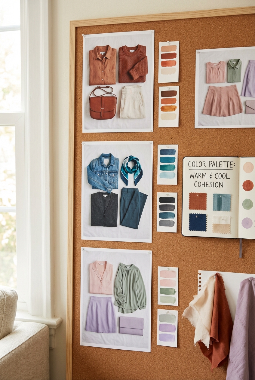
Picture Gallery


