Crisp White And Bright Red Outfits For A Timeless Look
Introduction
There is a specific kind of magnetism found in the combination of bright red and crisp white. It is a pairing that manages to be both classic and incredibly modern, evoking everything from the effortless chic of the French Riviera to the sharp tailoring of New York power dressing. As a stylist, I have seen this color duo transform a client’s demeanor instantly. White provides a clean slate and reflective light, while red injects energy and undeniable confidence.
I remember a consultation with a client who worked in high-end real estate; she was terrified of color but felt invisible in her usual beige suits. We swapped her neutral blouse for a structured crimson silk shell under a sharp white blazer. The change was physical. She stood taller, her complexion looked brighter, and she told me later that she closed her biggest deal of the year that afternoon. It wasn’t magic, but it was the power of visual psychology at play.
Mastering this look requires more than just throwing two colors together. It requires an understanding of undertones, fabric weight, and the correct proportions to ensure the outfit looks expensive rather than costumey. This guide will walk you through the technical aspects of styling this bold palette. We have curated a specific selection of examples to visualize these rules, so be sure to look for the Picture Gallery at the end of the blog post.
Understanding The Temperatures: Cool vs. Warm
The biggest mistake I see when clients attempt this color combination is mismatching the “temperatures” of the fabrics. Red is not just one color; it exists on a spectrum. You have cool reds, which have blue undertones (think cherry or cranberry), and warm reds, which have orange undertones (think tomato or poppy).
The same logic applies to white. “Crisp white” usually refers to a stark, cool bright white. However, you also have ivory, cream, and eggshell. To achieve a truly high-end look, you generally want to pair like with like. A blue-based cherry red looks most expensive when paired with a stark, optical white. This creates high contrast and sharpness.
Conversely, if you are drawn to a warm, orange-red, it often softens beautifully against a creamy off-white or ecru. Mixing a yellow-based cream with a blue-based red often makes the white styling piece look dirty or old rather than intentional. Before you buy, hold the garments up to natural light to identify the base tones.
Designer’s Note:
When styling for photography or events, I always recommend blue-based reds. They make teeth look whiter and generally pop more cleanly against digital camera sensors than orange-reds, which can sometimes bleed visually.
The Ratio Rule: Balancing Visual Weight
In design, we often talk about the 60-30-10 rule. In fashion, specifically with a bi-color palette like red and white, you need to decide on your dominant shade to avoid looking like a sports team uniform. Splitting your outfit exactly 50/50—like red pants and a white shirt—can cut your body in half visually.
My preferred approach for a sophisticated look is the 90/10 or the 70/30 split. The 90/10 approach uses one color as the canvas and the other as the accent. For example, an all-white linen suit (90%) styled with a bright red structured handbag and red lip (10%) is incredibly chic. It keeps the line of the body long and unbroken while drawing the eye to specific focal points.
The 70/30 split might look like a red midi dress (70%) with a white blazer thrown over the shoulders (30%). By allowing one color to dominate, you create a sense of intention. The dominant color sets the mood, while the secondary color provides the energy.
Common Mistakes + Fixes:
- The Mistake: Wearing a red top and white pants with a black belt and black shoes. This chops the body into too many horizontal segments.
- The Fix: Remove the black. Use a nude belt or a belt that matches the pants to extend the leg line. Keep shoes tonal (nude, white, or red) to maintain the vertical flow.
Fabric Matters: Elevating The Look With Texture
When you work with bright colors like red and stark neutrals like white, the quality of the fabric becomes the most noticeable element. Dark colors can hide cheap construction, but white and bright red expose everything. A cheap polyester red blouse will often have a plastic-like sheen that cheapens the entire outfit.
Focus on natural fibers. In the summer, look for crisp poplin cotton, heavy-weight linen, or silk. A white linen button-down has a natural texture that adds depth to the outfit, preventing it from looking flat. For the red components, suede and cashmere are secret weapons. Red suede absorbs light, creating a rich, deep color saturation that looks incredibly luxurious compared to shiny leather.
For winter styling, mix your textures to add warmth. A chunky cable-knit white sweater paired with a sleek red silk slip skirt creates a tension between “cozy” and “refined.” This contrast makes an outfit interesting without needing to add prints or patterns.
What I’d do in a real project:
- Tops: I look for 100% cotton poplin or silk crepe de chine.
- Bottoms: I prioritize lined wool trousers or heavy denim that isn’t see-through (essential for white pants).
- Third Piece: I often source boucle jackets which naturally blend shades of white and cream for texture.
Strategic Color Placement
Color placement is a tool for directing the viewer’s eye. As a general rule of thumb in styling, bright colors expand, while dark colors recede. However, bright red is an “advancing” color—it demands attention. White is a “reflecting” color—it highlights surface area.
If you are pear-shaped and want to balance your silhouette, place the bright red on your upper body to draw the eye upward. A red boat-neck blouse paired with a wide-leg white trouser creates a beautiful sense of balance. If you want to highlight your legs, a red tailored cigarette pant with a tucked-in white silk blouse is a power move.
Be mindful of where you place horizontal lines of contrast. If you are wearing a white dress with a red belt, that red belt will become the focal point of your waist. Ensure the belt sits at your natural waist (usually the smallest part of the torso) rather than lower on the hips, which can distort proportions.
Designer’s Note:
For petite clients, I usually recommend a monochromatic column of white (top and bottom) with a red trench coat or long cardigan worn open. The continuous white line adds height, while the red adds the drama.
Accessorizing: Metals and Leathers
The accessories you choose will dictate the final vibe of the outfit. With red and white, you are working with a high-contrast base, so your accessories act as the anchors.
The Metal Debate:
- Gold: Gold jewelry warms up the combination. It feels classic, nautical, and expensive. If you are wearing an orange-red, gold is almost mandatory to harmonize the warm undertones.
- Silver: Silver cools the look down. It creates a futuristic, sharp, and very modern aesthetic. Silver pairs best with blue-reds and stark whites.
Shoe Selection:
The biggest question I get is, “What color shoes do I wear?” Avoid black if you can, as it can feel too harsh against fresh white. Nude or skin-tone shoes are the safest bet as they elongate the leg. However, for a fashion-forward look, try metallics. A silver strappy sandal or a gold loafer acts as a neutral but adds a deliberate styling choice.
If you choose a red shoe, ensure it matches the tone of your red clothing exactly, or is significantly different (like a burgundy shoe with a bright red dress). A “near match” looks like a mistake.
Maintenance and Longevity
We cannot talk about white and red outfits without discussing the logistics of care. This is the highest-risk color combination in your wardrobe. One wrong move in the washing machine results in pink clothes.
The Laundry Rules:
Never wash your bright reds with your whites, even if you have washed the red item ten times before. Red dye is notoriously unstable. I recommend using “color catcher” sheets in your laundry loads as an insurance policy.
For white garments, you must keep them optical white. Over time, whites can yellow due to body oils or gray due to mineral deposits in water. Use a bluing agent (a liquid additive) occasionally to counteract yellowing. Avoid excessive bleaching, as chlorine can actually yellow certain synthetic fibers and weaken cotton.
Stain Management:
If you are wearing white pants, you must carry a stain remover pen. It is not a matter of “if” you will brush against something dusty, but “when.” For red wine or coffee on white, blot—never rub. Rubbing breaks the fibers and sets the stain deeper.
Finish & Styling Checklist
Before you walk out the door, run through this quick professional checklist to ensure your look is polished and cohesive.
- Check Opacity: Stand in bright natural light. can you see the pockets of your white trousers? Can you see your undergarments? If yes, you need nude (not white) seamless underwear.
- The Vein Test: Look at the veins in your wrist. If they look blue, stick to cool reds (cranberry). If they look green, stick to warm reds (tomato).
- The Third Piece: Does the outfit feel incomplete? Add a “third piece”—a blazer, a statement necklace, or a silk scarf tied to your bag.
- Edit The Red: If you are wearing a red dress, red shoes, and a red bag, remove one item. Replace it with white, nude, or metallic.
- Grooming Check: Bright red reflects onto the face. Ensure your concealer is blended well, as red can highlight redness in the skin. A little extra bronzer helps balance the brightness of a white top.
FAQs
Can I wear red and white to a wedding?
Generally, no. While the red is festive, wearing a significant amount of white to a wedding is a major etiquette faux pas in most cultures. It is better to save this high-contrast combination for brunches, showers, work events, or date nights.
Does red lipstick count as an accessory?
Absolutely. If you are wearing a simple white shirt and white jeans, a bold red lip acts as your primary accessory. It ties the look together without needing a scarf or statement jewelry. Ensure the undertone of the lipstick matches any red clothing you are wearing.
Can I wear off-white with bright red?
Yes, but it creates a vintage, softer aesthetic. Bright white is modern and sharp; cream is nostalgic and warm. If you wear cream, swap your red for a slightly deeper or warmer brick red for the best harmony.
What do I do if my red top bleeds onto my white pants during the day?
This usually happens with sweat or rain. If you get caught in the rain, try to keep the fabrics separated until you can dry them. If dye transfer happens, do not dry the garment. Keep it wet and treat it immediately with a color-run remover product specifically designed for dye transfer.
Conclusion
Embracing the combination of crisp white and bright red is a declaration of style confidence. It breaks away from the safety of all-black ensembles and offers a freshness that is unparalleled. Whether you are opting for a nautical-inspired striped boatneck or a full crimson power suit with a white silk camisole, the key lies in the details.
Focus on the temperature of your shades, the quality of your fabrics, and the balance of your proportions. When you get the technical elements right, the aesthetic takes care of itself. This pairing is timeless for a reason—it is bold, optimistic, and effortlessly elegant. Use these guidelines to experiment with your wardrobe, and you will find that this color duo works for you year-round.
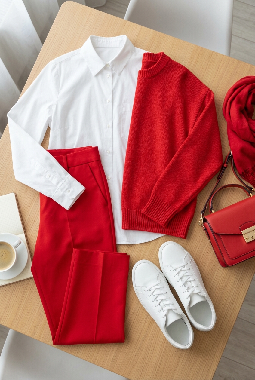
Picture Gallery


