Dressing With Color Psychology How Hues Influence Mood And Perception
I recall a specific Tuesday early in my career as a stylist when I woke up feeling absolutely drained. My instinct was to reach for my oversized gray cashmere sweater and hide from the world, but I had a high-stakes client presentation that afternoon. Instead, I forced myself to put on a structured, emerald green blazer.
The shift wasn’t just in the mirror; it was internal. Throughout the day, people responded to me with energy and engagement, and by the time the meeting rolled around, I felt alert, capable, and vibrant. That is the tangible power of color psychology; it is not just about how the world sees you, but about how you experience the world while wearing it.
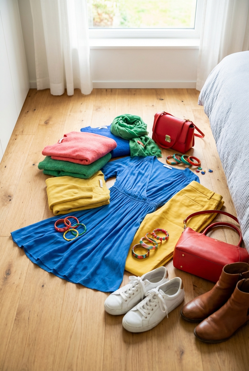
Clothing is the most intimate environment we inhabit, and the colors we drape over our bodies act as a filter for our emotions and interactions. If you are looking for visual examples of these palettes in action, take a look at the Picture Gallery at the end of this blog post to spark your imagination.
The Foundations of Color Temperature and Perception
Before we start dissecting specific shades, we need to understand the concept of visual temperature. Every color in your wardrobe emits a frequency that signals either warmth (inviting, energetic) or coolness (reserved, calming). Understanding where a garment falls on this spectrum is the first step to controlling the narrative of your outfit.
Warm colors, such as reds, oranges, and yellows, advance visually, meaning they make the wearer appear closer and more dominant in a space. These are your “action” colors. If you need to lead a room or draw attention to your face during a video call, warm tones are your most effective tool.
Cool colors, like blues, purples, and greens, recede visually. They create a psychological distance that can be read as professional, trustworthy, and calm. I often advise clients to wear cool tones when they need to de-escalate a situation or appear as a neutral mediator.
Designer’s Note: The Lighting Factor
What usually goes wrong: A client buys a stunning lavender dress that looked perfect in the boutique, but in the office fluorescent lighting, it makes them look sickly and tired.
How to prevent it: Artificial lighting changes color temperature. Incandescent bulbs warm up colors, while standard office LEDs cool them down (and can turn purples gray). Always check the color of a garment in natural daylight near a window before committing to the purchase.
Power Dynamics: Red, Black, and Navy
When the goal is authority, there is a reason we gravitate toward the “power suit” palette. Red is physically stimulating; studies show it can actually slightly elevate the viewer’s heart rate. It signals passion, aggression, and importance.
However, red requires careful calibration. A head-to-toe fire engine red look can appear confrontational in a conservative boardroom. In high-stakes negotiation settings, I prefer using red as a strategic accent—a silk scarf, a bold lip, or a handbag—rather than the main event.
Black is often the default for high-end fashion because it implies sophistication and glamour, but it also creates an emotional shield. It says, “I am in control, and I am impenetrable.” Navy acts as the softer, more diplomatic cousin to black. It commands the same respect but invites more collaboration, making it the superior choice for first interviews.
Common Mistakes + Fixes
- Mistake: Wearing harsh black near the face when you have low-contrast coloring or mature skin, which can emphasize shadows and fine lines.
- Fix: Break up the black with a lower neckline or a scarf in a flattering lighter shade (like cream, soft gray, or metallic) to bounce light back onto the face.
The Soothing Spectrum: Blues, Greens, and Neutrals
If your day involves high stress, a chaotic commute, or managing difficult personalities, dressing in the blue-green spectrum can act as a personal stabilizer. Blue is statistically the most universally liked color worldwide, which subconsciously signals to others that you are safe and approachable.
Green, specifically deeper forest tones or olive, is intrinsically linked to nature. It suggests growth, balance, and stability. I frequently style clients in olive green trench coats or trousers as a “new neutral” because it pairs seamlessly with everything while feeling less sterile than gray.
Neutrals like camel, beige, and taupe project luxury and ease. There is a psychological association between light neutrals and wealth because, historically, keeping light clothes clean required a lifestyle exempt from manual labor. Wearing a monochromatic oatmeal or cream outfit signals an “effortless” status.
What I’d Do in a Real Project: The “Bad News” Outfit
If I am styling a CEO who has to deliver difficult news to shareholders or staff, I avoid black (too grim) and red (too aggressive).
My Formula:
1. Color: Deep Navy or Charcoal. It shows authority without being severe.
2. Fabric: Matte wool or cashmere. No shine.
3. Fit: Perfectly tailored shoulders to show strength, but a softer silhouette elsewhere to show empathy.
Energy and Creativity: Yellow, Orange, and Pink
These are the hues of optimism. Yellow is the color of the sun and is arguably the most difficult color to wear well, but the payoff is high. It projects cheerfulness, intellect, and creativity. It is an excellent choice for creative pitches or networking events where you want to be memorable.
Orange combines the energy of red with the happiness of yellow. It is less aggressive than red but highly social. I love using burnt orange or terracotta in fall wardrobes; it feels warm and inviting without the “traffic cone” effect of bright orange.
Pink, particularly in deeper magenta or berry tones, is moving away from its “girly” stereotypes and entering the power dressing sphere. It represents compassion and nurturing but with an energetic edge. A hot pink blazer over a black column dress is a modern, confident statement.
Pro-Level Rule of Thumb: The 20% Rule
If you are intimidated by bright colors like yellow or chartreuse:
Keep the bright color to 20% of your outfit. Use it in shoes, a belt, or a top layered under a neutral jacket. This allows you to harness the psychological energy of the color without it overwhelming your complexion.
Fabric and Texture: How Material Changes Color
As a fashion expert, I cannot stress enough that color does not exist in a vacuum; it lives on fabric. The texture of the material dictates how the color is perceived by the eye because of how it absorbs or reflects light.
Shiny fabrics like satin, silk, or patent leather reflect light, making colors appear lighter and more vibrant. A black satin blouse will look silver-toned in the highlights and jet black in the folds, creating a high-contrast, glamorous look.
Matte fabrics like wool, cotton, suede, and velvet absorb light. This makes colors appear deeper, richer, and more solid. A red velvet dress will look far more intense and darker than a red silk dress. When building a monochromatic outfit (dressing in one color), mixing these textures is the secret to looking expensive rather than flat.
Designer’s Note: The “Black Match” Nightmare
What usually goes wrong: A client tries to pair black trousers with a black blazer from a different brand, and in the sunlight, one looks brown-black and the other looks blue-black.
How to prevent it: Never try to match blacks from different dye lots. Instead, intentionally mismatch textures. Wear the black wool trousers with a black silk blouse or a black leather jacket. The difference in texture makes the slight color variance look intentional.
Building a Cohesive Palette for Your Personal Brand
Defining a personal color palette is not about limiting yourself; it is about creating a wardrobe where everything works together. This reduces decision fatigue and ensures you always project a consistent image.
Start by identifying your three “Base Neutrals.” These are the workhorses of your closet—coats, trousers, bags, and shoes. Common combinations are Black/Gray/White, Navy/Camel/Cream, or Olive/Brown/Ivory.
Next, choose two to three “Accent Colors” that make you feel your best. These will be your tops, scarves, and statement dresses. By limiting your accents, you ensure that every new piece you buy will match at least 80% of what you already own.
What I’d Do in a Real Project: The Closet Audit
When I audit a client’s closet, I arrange clothes by color, not category.
The Checklist:
1. Identify the outlier: Is there a random bright purple shirt with tags on it? Why? (Usually, it doesn’t match anything else).
2. Check the skin reaction: Hold the garment under your chin in natural light. Does it make your dark circles disappear (good) or emphasize them (bad)?
3. Edit the duplicates: Do you need 15 navy sweaters? Keep the best 3 that differ in weight and neckline.
Finish & Styling Checklist
Before you walk out the door, run through this mental checklist to ensure your color choices are serving your goals for the day.
- The Mood Match: Does my color palette match my intention? (e.g., Navy for focus, Yellow for creativity).
- The Lighting Check: Have I checked the outfit in natural light to ensure the shades coordinate?
- The Texture Balance: If wearing one color, do I have at least two different textures (e.g., denim + silk)?
- The Third Piece: Does the outfit need a pop of contrasting color (belt, shoe, jewelry) to break up the silhouette?
- The Grooming Harmony: Does my makeup or grooming complement the color intensity? (e.g., a bolder lip with a washed-out beige outfit).
FAQs
Can I mix black and navy?
Absolutely. This used to be a fashion faux pas, but in modern high-end styling, it is considered very chic. The key is ensuring there is enough distinction between the two shades. Dark navy and black can look like a mistake; bright navy or midnight blue paired with black looks intentional and sophisticated.
Does wearing white really make you look wider?
Not necessarily. While white reflects light and can blur outlines, the silhouette and fit matter far more than the color. A well-tailored white blazer can be just as slimming as a black one. The trick is to ensure the fabric is thick enough to not be sheer and to wear the right undergarments to keep the lines smooth.
How do I wear color if I hate standing out?
Start with “colored neutrals.” Instead of bright red, try deep burgundy or oxblood. Instead of royal blue, try teal or slate. Instead of bright yellow, try mustard or ochre. These shades offer the benefits of color psychology without the high-voltage “look at me” effect of primary colors.
Is there a color that looks good on everyone?
Teal (a medium blue-green) is widely considered the universal donor of the color world. Because it sits right between warm and cool on the color wheel, it tends to flatter almost every skin tone and hair color. It is a safe, elegant bet for bridesmaids or group photos.
Conclusion
Mastering color psychology is one of the most effective ways to elevate your personal style and influence how you move through the world. It transforms getting dressed from a mundane chore into a strategic act of self-care and communication.
Remember that these rules are guidelines, not laws. The most important metric is how a color makes you feel. If a technically “wrong” color makes you feel invincible, wear it. Confidence is, after all, the most attractive hue you can wear.
Take the time to experiment with these combinations. Notice how your mood shifts when you swap gray for green, or how a meeting changes when you wear navy instead of beige. Your wardrobe is a tool—use it to paint the life you want.
Picture Gallery


