Introduction
One afternoon, while rifling through a vintage store’s racks, I stumbled upon a vibrant 90s jumpsuit that ignited memories of bold fashion statements and unapologetic self-expression. The color—an electrifying teal—radiated an energy that contrasted sharply with the muted palette of modern minimalist wardrobes. That moment arrived as a powerful reminder: the 90s embodied color experimentation, fearless pattern mixing, and an authentic embrace of personality through fabric.
However, reliving those vivid fashion days requires more than just replicating styles—it demands understanding the vibrancy and psychology behind color choices. Unlike fleeting trends, the jumpsuit’s color palette holds the key to transcending time, projecting confidence, and ultimately dressing to impress with intention. This topic matters because color is not just aesthetic; it fundamentally shapes how others perceive us and how we feel in our own skin.
As someone who has dedicated years to decoding the science of color psychology alongside fashion design, I cherish guiding readers in curating wardrobes that balance nostalgic charm with contemporary relevance. Today, we’ll dive deeply into the art of editing your 90s jumpsuit color palette—melding emotional intelligence, body awareness, and current trends—to empower you in making stylish, meaningful, and confidence-boosting choices.
Foundational Concepts
Before unpacking specific color palettes, it’s essential to ground ourselves in three foundational concepts: color psychology, trend forecasting, and dressing to impress.
Color Psychology
Color psychology explores how hues influence our emotions, behaviors, and perceptions. The psychology behind why red energizes, blue calms, or yellow sparks creativity goes beyond mere symbolism; it’s embedded in neurobiology and social conditioning. For example, studies show that warm colors can increase heart rates and feelings of excitement, whereas cool colors often promote tranquility and trustworthiness. This insight proves invaluable when selecting jumpsuit colors to express mood or desired impressions.
Trend Forecasting
Trend forecasting is a dynamic process often led by experts analyzing cultural shifts, technology, and market behaviors to predict which colors, styles, or fabrics will dominate seasons. The 90s were known for eclectic colors— from neon brights to earthy tones. Today’s stylists reimagine those palettes by layering modern sensibilities with vintage vibrancy, ensuring nostalgic pieces feel fresh, relevant, and wearable.
Dressing to Impress
Dressing to impress extends beyond societal approval; it centers on harnessing clothing to heighten self-confidence and forge positive first impressions. Research notes that color choice profoundly impacts judgment in professional and social contexts. Wearing the right palette can signal authority (like power blues), creativity (bold purples), or approachability (soft pastels). Understanding these nuances refines one’s jumpsuit selections to align with personal goals and environments.
Relatable story: I once advised a client aiming for a leadership promotion to swap her usual monochrome jumpsuits for deeper jewel tones. The resulting shift elevated her presence and boosted her self-assurance during a crucial board presentation.
Picture Gallery


Color Psychology & Emotional Impact
Colors are silent communicators, influencing emotions and perceptions subtly yet powerfully. When selecting a 90s jumpsuit, the palette isn’t merely about following trends but connecting to how color affects your mindset and how others perceive you.
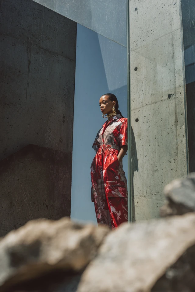
Red: Symbolizing passion and energy, red is a great choice for commanding attention in social gatherings or events requiring dynamism. It triggers alertness and can increase confidence, but should be balanced carefully to avoid overwhelming.
Teal and Turquoise: These cool, invigorating hues promote calmness and creativity, ideal for professional settings or artistic expressions. They evoke trustworthiness while remaining vibrant and distinct.
Neon Colors: Iconic to the 90s, neon pink, green, and orange stimulate feelings of excitement and fun. However, neon demands confidence to wear and is often best paired with neutral tones for balance.
Earth Tones: Mustard yellows, burnt oranges, and olive greens ground outfits, conveying warmth, reliability, and approachability. They suit casual or semi-formal occasions, aligning with natural palettes.
Black and White: Classic neutrals that provide contrast; black communicates sophistication and authority, while white exudes purity and simplicity. Both are essential to anchoring vibrant 90s palettes thoughtfully.
The science of first impressions highlights how color influences initial judgments. For example, a bright jumpsuit in a professional setting might suggest creativity but needs paired sleek tailoring to maintain formality. Choosing colors that positively align with the desired social or professional outcome elevates your style strategy dramatically.
Personal Style & Body Type Considerations
Choosing the right colors for your 90s jumpsuit goes hand in hand with honoring your body’s unique silhouette and complexion. Here are some insights and a quick checklist to help you edit your palette mindfully:
- Silhouettes: Loose, billowy jumpsuits often benefited from bold, block colors to create shape definition. For more fitted styles, color patterns or tonal gradients could highlight curves gracefully.
- Fabrics: Satin or silk enhances jewel tones, lending a luxurious shimmer, while cotton or denim looks great in primary or neon shades for casual wear.
- Complexions: Warm undertones glow in earthy reds, golden yellows, and olive greens, whereas cool undertones flourish with blues, purples, and emerald greens.
- Height: Vertical stripes or dark monochrome palettes elongate the figure, which can be combined with statement accessories for a bold 90s touch.
Quick Style Quiz:
Answering these questions will guide your color decisions:
- What mood or message do I want my jumpsuit to convey? (Confidence, creativity, calmness?)
- What are my natural undertones (warm, cool, neutral)?
- In what settings will I wear this jumpsuit most often? (Professional, social, casual?)
- Do I prefer standout neon shades or more subtle, earthy palettes?
- Which fabric finishes (matte, glossy, textured) appeal to me and suit my body type?
Answering honestly creates a tailored color palette that enhances confidence and style authenticity.
Current Trends & Timeless Classics
While the 90s jumpsuit color palette brims with neon intensity and saturated hues, today’s fashion landscape demands balance between trend and timelessness.
Trends: Currently, there is a resurgence of bold primaries—electric blues and reds—but reimagined with muted undertones or matte finishes for sophisticated appeal. Pastels from the 90s, such as soft lavender and blush pink, also resurface, perfectly catering to minimalists who want a touch of retro.
Timeless Classics: Black, white, denim, and earth tones remain evergreen. Integrating these into your jumpsuit collection provides flexibility and longevity. For instance, pairing a high-gloss black jumpsuit with a statement neon jacket capitalizes on both classic and trendy vibes.
Blending trend-driven color bursts with foundational neutrals or classics allows for a versatile wardrobe. This hybrid approach ensures your jumpsuit choices won’t become outdated quickly, supporting sustainable style investment.
Practical Tips & Recommendations
Ready to edit your 90s jumpsuit color palette thoughtfully? Here are actionable strategies to elevate your fashion game:
- Shopping Advice: When hunting for vintage or new jumpsuits, prioritize color condition—fade-free hues signal better quality. Use natural light to assess color vibrancy.
- Wardrobe Maintenance: Use gentle detergents for colored fabrics; avoid direct sunlight drying to prevent fading. Store darker jumpsuits folded to avoid discoloration.
- Layering: Combine jumpsuits with neutral-toned blazers, belts, or shoes to tone down high-energy colors without dulling personality.
- Accessories: Metallic accents—gold for warm palettes and silver for cool—can harmonize or contrast brilliantly with jumpsuit colors. Chunky 90s-style jewelry complements vibrant hues authentically.
- Color Combos to Try: Neon with beige/tan for balance, deep teal with mustard yellow for warmth, or monochrome lavender ensembles for subtle retro charm.
Visual aids such as color swatch images labeled “Electric Blue Jumpsuit” or “Mustard Yellow 90s Style” can help map and inspire your palette selections.
FAQs
- Q1: How do I find my signature 90s jumpsuit color?
- A1: Start by identifying your personal style goals and complexion undertones, then experiment with colors that feel authentic and boost your confidence. Document what consistently feels “right” in various lighting and settings.
- Q2: Can I update vintage jumpsuits with color without dyeing?
- A2: Absolutely. Use layering and accessorizing to complement or contrast existing jumpsuit colors, refreshing them without permanent alterations.
- Q3: How to incorporate 90s jumpsuits in capsule wardrobes?
- A3: Choose jumpsuits in timeless neutral hues like black, navy, or earth tones, then rotate statement pieces seasonally to maintain freshness yet maintain cohesion.
- Q4: Are there budget-friendly ways to trend-proof my jumpsuit collection?
- A4: Shop secondhand or focus on staple colors that never go out of style; use accessories and outerwear to inject trend-driven color periodically.
- Q5: What are the best jumpsuit colors to wear for professional impressions?
- A5: Deep jewel tones like sapphire or emerald, classic black, or calming blues signal competence and creativity while maintaining polish.
Conclusion
Editing your 90s jumpsuit color palette is more than a nostalgic nod; it’s a comprehensive exercise in self-expression, psychology, and style mastery. By interweaving the science of color psychology with practical body-type considerations and trend awareness, you craft outfits that amplify confidence and leave memorable impressions.
Remember, fashion thrives on experimentation, so allow yourself to explore bold shades and unexpected pairings. Your jumpsuit collection is a canvas waiting for you to express vitality, creativity, and timeless flair. I warmly invite you to share your color discoveries, style challenges, or favorite 90s inspirations in the comments below. Don’t forget to subscribe for more in-depth insights into fashion, color psychology, and dressing to impress.