Embracing Earth Tones Browns Greens And Rust In Modern Styles
Introduction
I often tell my clients that dressing a room is exactly like dressing yourself for a timeless editorial shoot. For years, the fashion world was dominated by cool greys and stark blacks, but look at the recent runways from Milan to Paris. We are seeing a massive resurgence of rich chocolates, deep moss greens, and vibrant terracotta rusts. These aren’t the muddy colors of the 1970s; they are sophisticated, layered, and incredibly grounding.
Just as a camel trench coat or a pair of vintage cognac boots never goes out of style, earth tones in the home provide a neutral base that feels expensive and intentional. When I transitioned my own living space from a cool monochrome to a warmer palette, the difference in mood was instant. The space felt like a warm embrace, sophisticated yet unpretentious, much like high-end knitwear.
In this guide, we are going to break down how to layer these hues without your home looking dark or dated. We will cover paint selection, fabric durability, and how to mix wood tones like a pro. Be sure to scroll to the bottom because I have curated a stunning Picture Gallery at the end of the blog post to visualize these concepts.
The Foundation: Why Brown is the New Black
For a long time, brown was considered “boring” in the interior design world, pushed aside for grey. However, in fashion, we know that brown leather, suede, and wool imply luxury. In your home, brown anchors the room. It adds visual weight that feels organic rather than industrial.
When introducing brown, avoid flat, one-dimensional colors. Think in terms of texture. A flat brown wall can look muddy, but a walnut wood slat wall or a chocolate velvet sofa looks rich. The goal is to create a “capsule wardrobe” for your living room where the base pieces are high-quality neutrals.
If you are renting or on a budget, start with wood tones. Vintage furniture is often made of teak, walnut, or mahogany. These warm woods naturally introduce brown without requiring a paintbrush. The secret is ensuring your wood tones talk to each other but don’t match perfectly.
Designer’s Note: The “Matchy-Matchy” Mistake
One of the biggest errors I see is buying a “bedroom set” where the nightstands, dresser, and bed frame are the exact same wood stain. This looks like a catalog, not a designed home.
- The Fix: Mix your wood grains. If you have dark walnut floors, try a lighter white oak coffee table.
- The Rule: Keep the undertones consistent. Warm woods go with warm woods; cool ashy woods go with cool woods.
Layering Greens: Biophilia and The Indoor-Outdoor Flow
Green is nature’s neutral. In landscape design, green is the background for everything else, and it should function the same way in your interiors. Deep forest green can act as a black alternative, while lighter sage acts as a soft grey.
When we talk about “biophilic design,” we aren’t just talking about buying a houseplant. We are talking about blurring the lines between your garden and your living room. If you have large windows, look at what is growing outside. If you have pine trees, bring that dark green inside through throw pillows or an accent chair. This makes the room feel larger because the eye travels through the window without a jarring color stop.
For paint, green is tricky. It changes drastically based on the time of day. A color that looks like sophisticated olive at 10:00 AM might look like swamp sludge at 8:00 PM under artificial light. Always test large swatches on multiple walls before committing.
Common Mistakes + Fixes
- Mistake: Using fake-looking, high-saturation greens (think “kelly green”) in large doses.
- The Fix: Opt for “muddy” greens. Look for paints that have a grey or brown undertone. They are much easier to live with and style.
- Mistake: Placing tiny plants in corners.
- The Fix: Scale matters. If you have an empty corner, you need a tree, not a potted succulent. A Ficus Audrey or a large Olive tree in a substantial terracotta pot provides the architectural height a room needs.
Rust and Terracotta: The Jewelry of the Room
If brown is the trench coat and green is the structured handbag, rust is the bold red lip. It provides the heat. Rust, terracotta, and burnt orange are high-energy colors, but because they are earth tones, they don’t cause eye fatigue like a bright primary red would.
I love using rust in tactile materials. A rust-colored linen duvet cover or a cognac leather ottoman brings immediate warmth. This color pairs exceptionally well with cool metals. If you have a lot of chrome or brushed nickel hardware (common in rentals), rust accents will balance that coolness instantly.
Use rust to direct the eye. If you have a beautiful fireplace, flank it with rust-colored sconces or artwork. If you have a neutral beige sofa, two large rust velvet pillows will create a focal point.
What I’d Do in a Real Project
If I were styling a living room with a neutral grey sofa that the client couldn’t replace:
- I would add a large area rug that incorporates rust, cream, and brown to cover the cool-toned floor.
- I would drape a chunky knit throw in a deep caramel color over the arm of the sofa to break up the grey.
- I would swap out generic white lampshades for pleated shades in a soft terracotta fabric. This changes the quality of light to a warm glow.
Mastering Textures: The Fashion Approach to Interiors
In high-end fashion, an all-black outfit works because of texture: leather boots, wool trousers, silk blouse. The same rule applies to an earth-tone home. If everything is cotton, the room falls flat. You need friction between materials.
The Essential Texture Mix:
- Something Rough: Jute rugs, raw linen, unpolished pottery, rattan.
- Something Soft: Velvet, mohair, boucle, cashmere.
- Something Sleek: Marble, glass, polished wood, leather.
For families with kids or pets, texture is your best friend. A flat-weave cotton sofa shows every stain. A performance velvet or a heavily textured tweed hides spills and pet hair remarkably well. Leather is also excellent for durability; scratches just add to the patina over time.
When selecting rugs, size is critical for the texture to register. A common rule of thumb is that the rug should sit at least 6 to 8 inches under the front legs of the sofa. In an open-concept space, use the rug to define the “zone.”
Lighting: The Make or Break Factor
You can pick the most beautiful earth tones, but if you light them with cool, blue-tinted LEDs (4000K+), your rust will look pink, and your brown will look purple. Lighting temperature is the filter through which you see your design.
For earth tones to sing, you need warm light. Aim for bulbs in the 2700K to 3000K range. This mimics the golden hour sunlight that makes everyone look good.
Layer your lighting just like you layer your clothes. You need three levels:
- Ambient: The main overhead light (put this on a dimmer immediately).
- Task: Reading lamps or under-cabinet lighting.
- Accent: Table lamps, picture lights, or floor lamps that wash the walls with light.
Specific Measurements for Lighting
- Pendants: If hanging a pendant light over a dining table, the bottom of the fixture should be 30 to 36 inches above the table surface.
- Sconces: Generally, sconces should be mounted 60 to 66 inches from the floor to the center of the fixture.
- Table Lamps: When sitting on a sofa, the bottom of the lampshade should be at eye level so the bulb doesn’t glare in your eyes.
Styling For Small Spaces and Rentals
A common myth is that dark earth tones make a small room feel smaller. This is false. Dark colors can actually blur the edges of a room, creating an illusion of infinite space, much like a night sky.
If you are in a small apartment, try “color drenching.” This is a technique where you paint the walls, trim, and even the ceiling in the same mid-tone color (like a mushroom taupe or sage green). This eliminates the visual chop between the wall and the ceiling, making the ceilings feel higher.
For renters who cannot paint, rely on textiles. Large floor-to-ceiling curtains in a rich rust or olive velvet can cover bland white walls.
- Curtain Rule: Hang the curtain rod 4 to 6 inches above the window frame (or all the way to the ceiling molding) and extend it 8 to 12 inches past the width of the window on both sides. This makes the window look massive and lets in more light when the curtains are open.
Finish & Styling Checklist
Before you call a room complete, run through this checklist to ensure your earth tones are balanced and functional.
- The 60-30-10 Balance: Is 60% of the room a dominant base (e.g., warm beige walls, large rug)? Is 30% a secondary color (e.g., brown leather sofa, wood furniture)? Is 10% an accent (e.g., rust pillows, brass hardware)?
- The Black Anchor: Does the room have at least one touch of black? Even in an earth-tone room, a black picture frame or lamp base adds necessary definition.
- Rug Size Check: Is the rug large enough? All furniture legs should ideally rest on the rug, or at least the front two legs. There should be 12 to 18 inches of bare floor visible around the perimeter of the room.
- Green Life: Is there something living in the room? A plant, fresh flowers, or branches.
- Height Variance: Do you have items at different eye levels? Low coffee table, medium console, tall floor lamp, high artwork.
- Texture Audit: Can you count at least three distinct textures (wood, metal, fabric)?
FAQs
Q: Will brown furniture look dated?
A: Not if the shape is modern. Avoid overstuffed, puffy brown leather sofas from the 90s. Look for clean lines, low profiles, or mid-century modern silhouettes. The silhouette dictates the era, not the color.
Q: Can I mix grey and brown?
A: Absolutely. This is a very chic combination if the tones match in “temperature.” Pair a warm charcoal grey with a rich cognac brown. Avoid mixing cool, blue-toned greys with warm, reddish browns as they will clash.
Q: I have a small living room. Which earth tone is best?
A: Terracotta or a warm sand color works wonders. It reflects light warmly, making the space feel cozy rather than cramped. Avoid very dark espresso browns on the walls unless you have excellent natural light.
Q: How do I incorporate these colors without buying new furniture?
A: Accessories are key. Swap your throw pillow covers, change your lampshades to a linen or parchment material, and get a large area rug that brings in the rusts and greens. These items are lower investment but have high visual impact.
Q: What metal finish goes best with earth tones?
A: Unlacquered brass, antique gold, and matte black are the best pairings. Chrome can sometimes look too clinical against warm organic colors, though it can work if you are going for a very specific 1970s revival look.
Conclusion
Embracing earth tones is more than just a trend; it is a return to comfort and connection with the natural world. In fashion, we wear these colors because they flatter every skin tone and convey a sense of understated luxury. In the home, browns, greens, and rusts create a sanctuary that feels safe, warm, and incredibly stylish.
Remember that design is a process, not a race. Start with a great rug, layer in some textural throw pillows, and swap out that harsh white lightbulb for a warm one. Trust your eye, and don’t be afraid to mix woods or layer different shades of green. The most beautiful homes, like the best wardrobes, are collected over time and reflect the life lived within them.
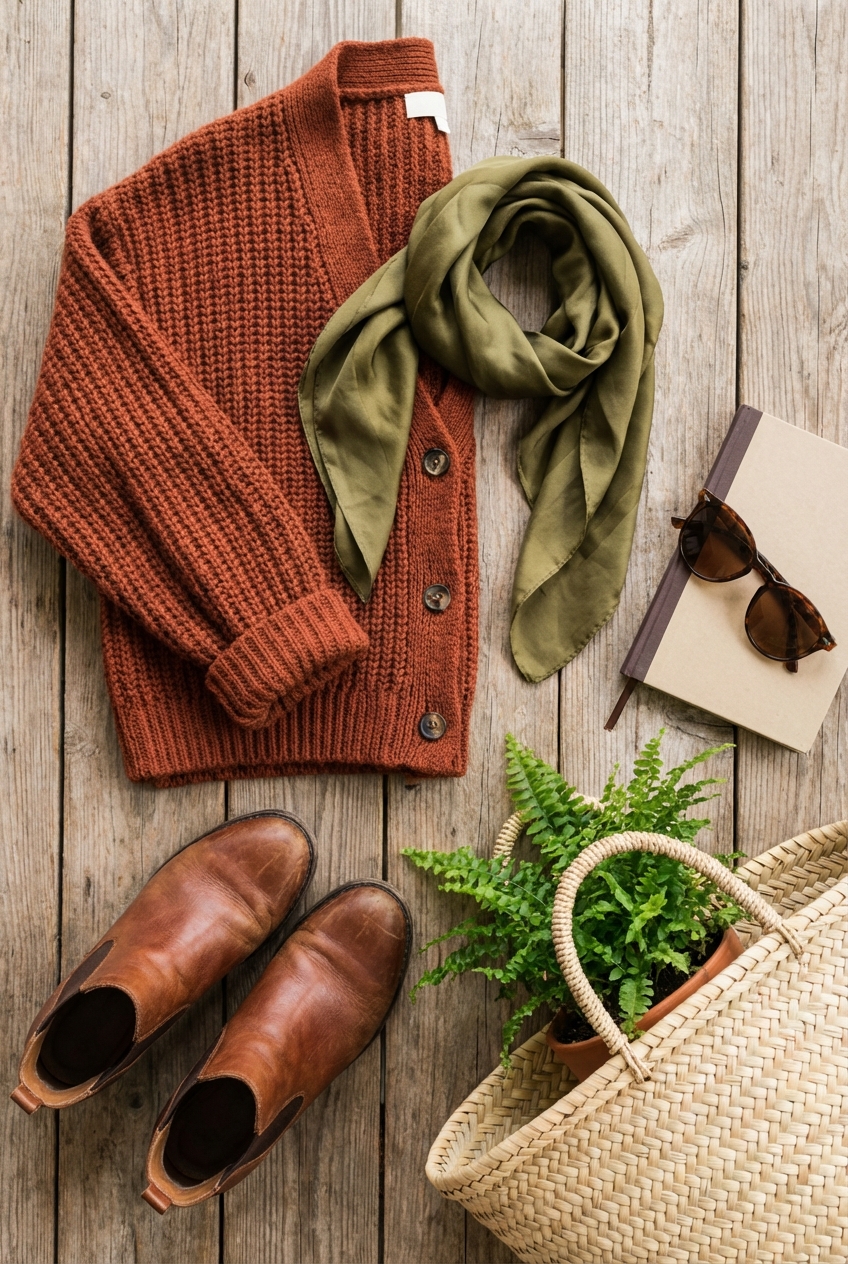
Picture Gallery


