Embracing Spring With Pastel Palettes And Floral Prints A Guide To Refreshing Your Wardrobe 2
There is a distinct shift in the air when the vernal equinox finally arrives. It is not just about the temperature rising; it is a psychological signal to shed the heavy, protective layers of winter and embrace lightness. As a stylist, I see this transition as the most crucial time of the year for wardrobe maintenance and reinvention.
Moving from dark wools and navies into pastels and florals requires more than just buying a new dress. It requires a strategic evaluation of your current assets and a thoughtful approach to color theory. You want to curate a collection that feels fresh and airy without crossing the line into costume territory.
This guide will walk you through the high-end approach to integrating spring elements into your daily rotation. We will cover fabric choices, print scaling, and the precise tailoring adjustments needed for lighter garments. We have curated a specific Picture Gallery at the end of the blog post to visualize these concepts.
Understanding The Nuance of Pastel Color Theory
Many clients hesitate to embrace pastels because they fear looking juvenile. The secret to wearing pastels as a sophisticated adult lies in the undertone and saturation of the hue. We are not looking for simple “Easter egg” colors; we are looking for complex, dusty, or icy shades.
When selecting a pastel palette, you must first identify your skin’s undertone. If you have cool undertones (veins appear blue), opt for “icy” pastels. Think glacier blue, lilac, or a crisp mint green. These colors have a blue base that will brighten your complexion rather than washing you out.
If you have warm undertones (veins appear green), gravitate towards “dusty” or “earthy” pastels. Look for sage green, butter yellow, apricot, or a warm blush pink. These shades harmonize with the golden hues in your skin.
Designer’s Note: The Anchor Color Rule
In my years of styling, the biggest mistake I see is pairing pastels with harsh black accessories. Black is too heavy and creates a jarring visual contrast that cheapens the look.
What I do instead:
I anchor pastel outfits with mid-tone neutrals. Instead of black, use charcoal grey, cognac brown, or navy. If you are wearing a lilac blouse, pair it with charcoal trousers. If you are wearing a pale blue dress, opt for tan leather sandals. This softens the transition and looks significantly more expensive.
Mastering the Scale of Floral Prints
Floral prints are groundbreaking only when executed with correct proportion and placement. In high-end fashion, we categorize florals by scale: ditsy (micro), botanical (medium), and abstract/painterly (large).
The rule of thumb for scale is inversely related to the desired focal point. A large, bold print expands the visual space, making that area appear larger. A tiny, dense “ditsy” print tends to recede and act almost like a solid texture from a distance.
For a professional setting, avoid chaotic, multi-colored tropical prints. Stick to botanical prints that feature no more than three colors. Two-tone florals (like a white flower on a navy background) are the safest and most chic bet for office wear.
Common Mistakes + Fixes: Print Overload
Mistake: Wearing a floral top and a floral skirt that clash in size and color, creating a “busy” visual that distracts the eye.
The Fix: Apply the “60/30/10” rule used in design. Let 60% of your outfit be a solid neutral (like a beige trench coat or white trousers). Let 30% be the floral print (a blouse or silk scarf). Let 10% be your accent color pulled from the print (shoes or bag).
Fabric Weights and Material Transition
Spring is a transitional season, meaning temperature regulation is key. You cannot simply switch to linen immediately, or you will freeze during the morning commute. The goal is to move from heavy weight (400gsm+) fabrics to mid-weight (150-250gsm) natural fibers.
Silk and silk blends are your best investment for this season. Silk offers thermal regulation, keeping you warm in a breeze but cool in the sun. When shopping for silk, look for a “sandwashed” finish for daywear. It is less shiny and more durable than a satin finish.
Cotton poplin is another essential. It provides structure and crisp lines, which is necessary when wearing lighter colors. Light colors in flimsy fabrics can look unkempt; crisp cotton maintains a tailored silhouette.
A Note on Sheerness
One of the practical constraints of wearing white and pastel pants is opacity.
- The Hand Test: When shopping, place your hand behind the fabric. If you can see your skin tone clearly, the garment will require a slip or lining.
- Pocket Linings: Ensure the pocket linings of white trousers are nude or beige, not white. White pocket bags show through white fabric, creating ugly outlines on your thighs.
The Architecture of Layering Light Colors
Layering in spring is different from winter. In winter, you layer for survival; in spring, you layer for dimension. Since pastels can sometimes look flat, adding texture is non-negotiable.
Monochromatic dressing is a powerful tool here. Wearing a single shade of mint green from head to toe elongates the frame. However, to prevent it from looking like a uniform, vary the textures.
What I’d do in a real project:
If I am styling a client in a monochromatic blush pink look, I would combine:
1. A silk slip skirt (shine/smooth).
2. A chunky cotton or cashmere knit sweater (matte/textured).
3. Suede shoes (soft/napped).
This mix of textures creates depth and luxury, even if the color is identical.
Designer’s Checklist for Proportion
When layering lighter fabrics, volume control is essential.
- The Rule of Thirds: Avoid cutting your body in half (50/50). Your top should take up one-third of the visual length, and your bottom two-thirds, or vice versa.
- Tucking: With flowy floral skirts, always semi-tuck or fully tuck your top to define the waist. Without this definition, the print can swallow your figure.
Footwear: The Heavy-to-Light Switch
Nothing ruins a delicate floral dress faster than clunky, winter-beaten boots. However, it is often too cold for bare sandals. You need the “in-between” shoe.
Loafers in lighter leathers (cream, tan, metallic) are excellent for anchoring a pastel outfit without weighing it down. The structure of a loafer adds a masculine touch that balances the femininity of florals.
Slingbacks are the other high-end staple. The exposed heel offers a hint of skin that signals spring, but the closed toe remains practical for variable weather. Look for a pointed toe to extend the leg line, especially when wearing midi-length skirts.
Maintenance for Light Shoes
Constraint: Light suede and leather ruin easily in spring showers.
The Fix: Before you wear new beige or pastel shoes, treat them with a water-repellent nano-spray. Do this outdoors and let them cure for 24 hours. Keep a suede eraser in your bag for immediate spot cleaning of mud splashes.
Tailoring: The Fit Imperative
Dark colors hide fit issues; light colors highlight them. A navy blazer can be a half-inch too big in the shoulders and go unnoticed. A powder blue blazer with the same fit will look sloppy.
When you refresh your wardrobe for spring, take your key pieces to a tailor.
- Hemlines: Trousers worn with loafers need a different hem than those worn with winter boots. Aim for a “no-break” hem (fabric just touches the shoe) for a clean, modern look.
- Sleeve Length: Spring coats and blazers look better with slightly shorter sleeves (bracelet length) to show off wrists and jewelry. This reduces the visual “weight” of the garment.
- Lining Check: Ensure the linings of your spring coats are breathable (acetate or viscose, not polyester). You will overheat in a polyester-lined trench coat when the humidity rises.
Finish & Styling Checklist
Before you walk out the door, run through this quick mental checklist to ensure your spring look is polished and purposeful.
- Undergarment Check: Are you wearing nude (skin-tone) seamless underwear? White underwear will show through white pants; nude will not.
- Texture Balance: Do you have at least two different textures in your outfit (e.g., denim + silk, cotton + leather)?
- The Third Piece: Have you added a third element (belt, scarf, blazer) to complete the look?
- Jewelry Tone: Does your metal hardware match the “temperature” of your clothes? (Silver usually pairs better with icy pastels; gold with warm florals).
- Fabric condition: Pastels show wrinkles aggressively. Did you steam your garment? Ironing is often too harsh for silks; steaming is preferred.
FAQs
Can I wear florals and stripes together?
Absolutely. This is a classic “power clash.” The key is scale. If the floral print is large and organic, the stripe should be thin and graphic. Ensure they share at least one common color to tie the look together.
How do I clean silk garments without dry cleaning?
Check the care label first. If it says “Hand Wash,” use cool water and a pH-neutral delicate detergent. Do not wring the fabric. Roll it in a clean towel to press out water, then lay it flat to dry away from direct sunlight. Direct sun can fade pastel dyes rapidly.
What is the best coat for floral dresses?
A classic trench coat in beige or stone is the universal answer. It neutralizes the print and adds structure. For a trendier look, an oversized denim jacket works for casual settings, or a structured cream blazer for formal occasions.
How do I stop my pastel skirt from clinging to my legs?
Static is the enemy of light fabrics. Avoid synthetic fabrics like polyester when possible. If you must wear them, run a metal hanger over the inside of the skirt or use an anti-static spray. keeping your skin moisturized also reduces static buildup.
Conclusion
Refreshing your wardrobe for spring is about more than following trends; it is about curating a mood. By understanding the science of color, the geometry of prints, and the importance of fabric quality, you can build a closet that feels uplifting and luxurious.
Remember that confidence comes from comfort and fit. Invest in natural fibers that breathe, tailor your pieces to your exact measurements, and do not be afraid to experiment with the lighter side of the color spectrum. Spring is the season of renewal—let your wardrobe reflect that energy.
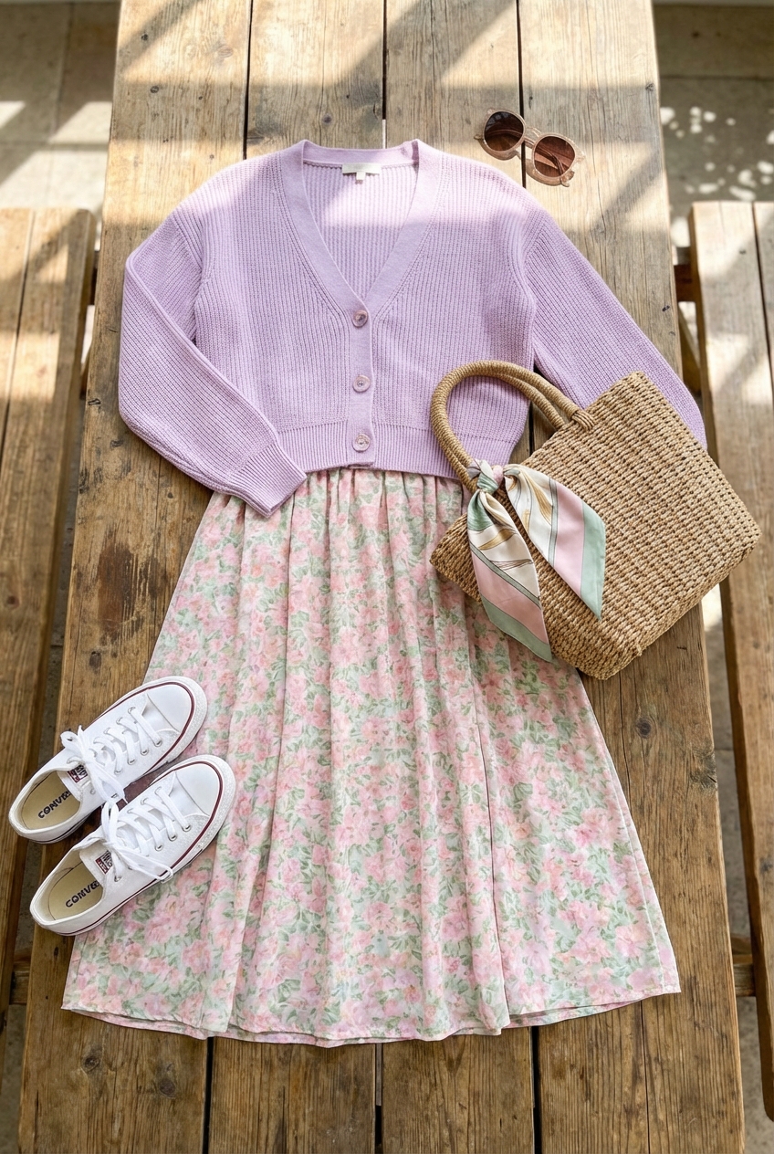
Picture Gallery


