Fun Dance Class Outfits With Playful Prints Move Freely With Style And Personality
Walking into a dance studio is about more than just breaking a sweat; it is about stepping into a heightened version of yourself. When you catch your reflection in those floor-to-ceiling mirrors, your outfit should make you feel powerful, capable, and ready to move. While basic black leggings have their place in a capsule wardrobe, a dance class is the perfect environment to experiment with vibrant energy.
Playful prints do not just add visual interest; they actually change how you carry yourself during a routine. A bold leopard print might encourage a fiercer attack in a jazz class, while soft, watercolor florals can inspire fluidity in contemporary movement. Fashion is functional psychology, and what you wear directly impacts your performance and confidence levels.
I have spent years curating high-end activewear collections, and I have learned that the secret to pulling off loud prints is balancing high-performance fabrics with smart styling. For a visual feast of inspiration, be sure to visit our extensive Picture Gallery at the end of the blog post.
1. Understanding the Psychology and Scale of Prints
When selecting a print for activewear, the first thing to consider is the scale of the pattern relative to your frame. In high-end fashion styling, we use scale to direct the eye and create balance. A massive, oversized floral print acts differently on the body than a micro-dot or tight geometric pattern.
Larger prints generally expand visual space, making them a bold choice for areas you want to highlight. If you love your strong legs, a large-scale abstract print on your leggings celebrates that power. Conversely, smaller, denser prints tend to act like a neutral, blurring the lines of the body and providing a flattering, smoothing effect.
Color contrast within the print also dictates the vibe. High-contrast prints (like black and white stripes) demand attention and are great for high-energy classes like Zumba or Hip Hop. Low-contrast prints (like tonal greens or muted tie-dye) offer a sophisticated, subtle approach suitable for Barre or Pilates.
Designer’s Note: The “Squat Proof” Print Test
In my experience, one specific issue ruins a look faster than anything else: the print distorting or becoming white when stretched. This is called “grinning.”
When you try on printed leggings, do a deep squat in front of a mirror. If the print turns white or the pattern stretches so much it becomes unrecognizable, the fabric quality is too low or the size is too small. High-quality prints are dyed deep into the fiber or sublimated onto a base color that matches the print, not just white.
2. Fabric Composition: The Foundation of Movement
A cute print is useless if the fabric suffocates you or slides down mid-pirouette. As a fashion expert, I prioritize the technical specifications of the textile above the aesthetic. For dance, you need a specific blend that offers four-way stretch and moisture-wicking capabilities.
Look for fabrics that contain a significant percentage of Spandex, Lycra, or Elastane. For high-impact dance, a blend of 75% Nylon and 25% Spandex is the gold standard. Nylon offers a soft, cool-to-the-touch feel that is more luxurious than Polyester, while the high Spandex content provides necessary compression.
Polyester blends are generally more durable and hold prints better (meaning the colors stay vibrant longer), but they can feel hotter. If you are taking a heated dance class, stick to Nylon blends or specialized technical fibers designed for extreme heat.
Common Mistakes + Fixes
- Mistake: Buying 100% cotton leggings for dance.
Fix: Cotton absorbs moisture and gets heavy. Always choose synthetics for sweat-heavy activities. - Mistake: Ignoring the “hand feel.”
Fix: If the fabric feels slick or plastic-like, it will likely trap heat. Look for a “brushed” finish for comfort. - Mistake: Disregarding seam placement.
Fix: Ensure the leggings have a gusset (a diamond-shaped piece of fabric in the crotch area). This prevents the fabric from riding up and allows for a full range of motion.
3. Silhouette Strategy for Different Dance Genres
Not all dance classes require the same silhouette, and your print choice should reflect the genre. The culture of the dance style often dictates the fashion, and leaning into that aesthetic helps you feel part of the community. Here is how I style prints for specific classes.
Ballet and Barre:
In these classes, instructors need to see your alignment, specifically your knees and ankles. Avoid baggy sweats. Opt for form-fitting leggings or unitards. Prints here should be sophisticated—think marble textures, ombre, or delicate botanicals. A printed leotard paired with solid pink or black tights is a classic, elevated look.
Hip Hop and Street Styles:
Here, the silhouette shifts to oversized and relaxed. You want movement in the fabric itself. I love styling a tight, loud-print crop top with oversized, solid cargo joggers. Alternatively, wear baggy printed harem pants with a sleek, solid bodysuit. The contrast in volume creates a dynamic look that looks great in motion.
Contemporary and Lyrical:
These styles bridge the gap between structure and flow. A wide-leg pant in a soft, jersey print moves beautifully during turns. Look for “earthy” prints—tie-dye, abstract landscapes, or celestial themes—that complement the emotional nature of the dance.
4. Mixing Prints Without Chaos
The concept of “power clashing” is a high-fashion staple, but it can be intimidating to try in a dance studio. The goal is to look curated, not like you got dressed in the dark. The secret lies in connecting the pieces through color.
The Golden Rule of Print Mixing: Ensure both prints share at least one dominant color. If you are wearing leopard print leggings (black and tan), you can pair them with a striped top if the stripes are also black or tan. This anchors the look.
Play with Scale: Do not pair two prints of the exact same size. It creates visual vibration that is hard to look at. Instead, pair a large, bold floral legging with a micro-dot or thin pinstripe sports bra. The difference in scale allows the eye to rest.
What I’d Do in a Real Project
If I were styling a client for a dance workshop who wanted to mix prints, here is the checklist I would use:
- Bottoms: High-waisted leggings in a bold, geometric primary print.
- Top: A sports bra in a secondary print that is 50% smaller in scale but shares the same background color.
- Layer: A sheer mesh top in a solid color to diffuse the patterns slightly.
- Shoes: Solid neutral sneakers to ground the outfit.
5. Layering Logic for Warm-Ups
Dance studios are notoriously freezing before class starts and tropical rainforests by the end. Your outfit needs to handle this thermal transition. Layering over prints requires a bit of strategy to avoid looking cluttered.
If you are wearing a printed set (matching top and bottom), break it up with a solid layer. A cropped hoodie or a shrug is perfect because it keeps your arms warm without hiding the waistline you are checking in the mirror. Look for fabrics like bamboo or modal for your layers; they drape elegantly and breathe well.
For a retro 80s vibe, which is currently trending in high-end activewear, use leg warmers. If your leggings have a busy print, choose solid leg warmers in a color pulled from the print. If your leggings are solid, this is a great place to introduce a fun patterned accessory without committing to a full outfit.
6. Durability and Care for Technical Prints
High-quality activewear is an investment. I often see clients ruin expensive leggings by washing them incorrectly. Technical fabrics and vibrant prints are sensitive to heat and friction.
Washing Temperature: Always wash activewear in cold water. Hot water breaks down the elasticity of Spandex fibers, leading to sagging knees and waistbands. It also causes prints to fade prematurely.
Detergent Choice: Avoid fabric softeners at all costs. Softeners coat the fibers with a waxy residue that blocks the moisture-wicking capabilities. Your “sweat-wicking” leggings will essentially become plastic bags if you use softener. Use a gentle, sport-specific detergent.
Drying: Never put printed activewear in the dryer. The heat is the enemy of Lycra and prints. Lay them flat to dry. Hanging them while wet can sometimes cause heavy fabrics to stretch out vertically, so flat drying is the safest bet for longevity.
Finish & Styling Checklist
Before you head to your next class, run through this quick styling and functional checklist to ensure your outfit is ready for performance.
- The Bend Test: Bend over in bright light. Is the fabric opaque?
- The Waistband Check: Jump up and down. Does the waistband stay in place or slide? High-waisted with a drawstring is usually best for high impact.
- Seam Comfort: Are the seams flat-locked? Raised seams can cause chafing during repetitive movements.
- Support Level: Does your sports bra match the intensity of the class? Don’t wear a yoga bra to a cardio hip-hop class.
- Print Placement: Check where the pattern falls. Sometimes awkward placement of circular patterns can be unflattering.
- Shoe Grip: Ensure your footwear (or bare feet) is appropriate for the floor surface.
FAQs
Should I size down in printed leggings to keep them tight?
No. Sizing down actually causes the fabric to overstretch, which makes the print fade (grin) and creates transparency issues. It can also cause the waistband to dig in, creating uncomfortable friction. Always buy your true size, or size up if you are between sizes in high-compression fabrics.
Can I wear animal prints to a classical ballet class?
While traditional ballet etiquette is strict (pink tights, black leotard), many adult open classes are more relaxed. However, read the room. If you want to wear animal print, try a subtle snakeskin in a neutral tone rather than a neon leopard print. Alternatively, keep the wild print to your warm-up booties or skirt.
How do I stop my printed leggings from pilling?
Pilling is caused by friction. Avoid washing your leggings with abrasive items like denim, zippers, or velcro. Wash them inside out in a mesh laundry bag. Also, be mindful of rough surfaces; sitting on concrete or jagged wooden benches will ruin the finish of the fabric immediately.
Are light-colored prints flattering?
Yes, but they require higher quality fabric. Light colors show texture more easily than dark colors. Look for textured fabrics (like ribbed or jacquard knits) or prints with a busy pattern, as these hide bumps and sweat marks better than solid light colors.
Conclusion
Embracing playful prints in your dance class wardrobe is about more than just following a trend; it is a tool for self-expression and motivation. When you wear an outfit that makes you feel vibrant and dynamic, that energy translates directly into your movement. Whether you prefer the subtle elegance of a marble print or the high-octane energy of neon geometrics, there is a pattern that fits your dance persona.
Remember that high-end style is always rooted in quality. Prioritize the feel of the fabric, the integrity of the fit, and the opacity of the print. When you feel secure in your gear, you stop fidgeting with your waistband and start focusing on the choreography. Dance is a celebration of what your body can do—dress it in a way that honors that joy.
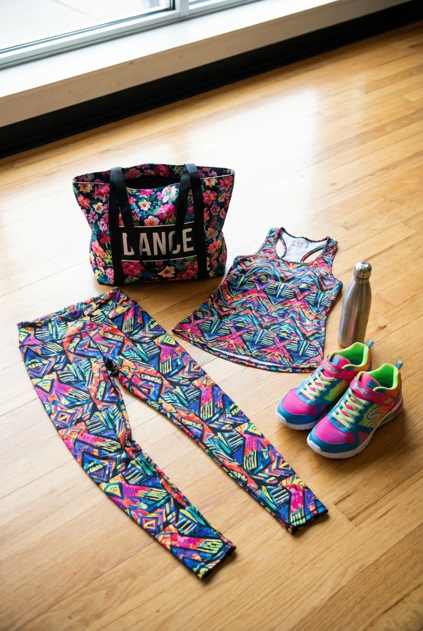
Picture Gallery


