Gold And Burgundy Combinations For Rich Formal Looks
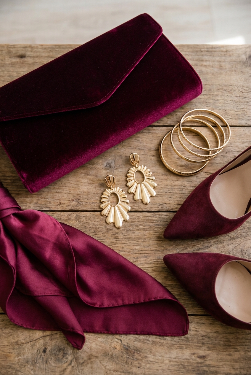
There is a specific moment in fashion history that always stays with me. It is the image of deep oxblood velvet walking down a couture runway, punctuated by heavy, sculptural gold jewelry. It screams opulence, confidence, and a refusal to blend into the background.
Translating that same high-fashion energy into interior design is one of my favorite challenges. Burgundy and gold are not just colors; they are a mood. When executed correctly, this combination creates a space that feels like a jewelry box—intimate, expensive, and incredibly flattering to everyone who enters it.
However, this pairing walks a fine line. Done poorly, it can look like a dated hotel lobby from the 1990s. The secret lies in the undertones, the textures, and the restraint used in application. If you are just looking for visual inspiration, you can skip to the Picture Gallery at the end of the blog post.
1. The Foundation: Selecting the Right Burgundy
In fashion, we know that not all reds suit all skin tones. The same logic applies to your walls. A primary red with bright yellow gold feels fast-food cheap. You want burgundy that leans toward plum, aubergine, or deep wine. It needs to have a “muddy” quality to it, which adds sophistication.
When painting a room this dark, the finish is everything. I almost always recommend a matte or flat finish for dark walls. High-gloss dark walls show every imperfection in the drywall, much like tight satin shows every line on the body.
Matte paint absorbs light, making the walls feel like velvet. This creates an infinite depth where corners seem to disappear. If you are worried about durability in high-traffic areas, look for a “washable matte” formulation.
Designer’s Note: Lighting the Void
Dark walls absorb light, so your standard single overhead fixture will not work. You need to calculate roughly 20 to 30 lumens per square foot for a dining room, but in a dark burgundy room, I bump that up by 20%.
You must rely on layers. Sconces at eye level, lamps on consoles, and picture lights are essential. Without them, your rich burgundy room will just feel like a black hole.
2. The Jewelry: Mastering Gold Finishes
Think of the hardware and light fixtures in your room as the jewelry that completes an outfit. In a high-end formal look, you would never mix cheap, shiny yellow gold with a luxurious wool coat. You would choose heavy, brushed brass or antique gold.
Avoid “chrome-gold” or highly reflective, yellow-tinted finishes. These tend to look plastic against deep red tones. Instead, opt for unlacquered brass, burnished gold, or champagne bronze. These finishes have a warmth and patina that implies age and value.
When selecting a chandelier for a formal dining room or living area, scale is non-negotiable. A common mistake is choosing a fixture that is too small, which looks like a delicate necklace on a heavy sweater.
The Rule of Thumb for Lighting Scale
- Measure the width and length of the room in feet.
- Add those two numbers together.
- The sum, in inches, is the approximate diameter your chandelier should be.
- Example: A 12×14 room needs a fixture around 26 inches wide.
3. Textiles: The Couture Gown of the Room
If the walls are the backdrop and the hardware is the jewelry, the upholstery is the gown. To keep burgundy and gold from looking archaic, you must focus on texture rather than pattern.
I usually avoid damask or heavy floral brocades in this color scheme, as they instantly age the room by fifty years. Instead, lean into solids with rich hands. Mohair, cotton velvet, and bouclé are excellent choices.
For a formal living room, a burgundy velvet sofa is a showstopper. However, practicality matters. If you have children or pets, look for “performance velvet.” These are 100% polyester but woven to mimic cotton velvet, and they can be cleaned with water and mild soap.
Drapery Logic
Your window treatments are the trench coat of the room—they pull everything together. In a gold and burgundy room, I prefer the drapes to match the wall color closely (tonal) or be a heavy neutral linen.
Measurements are critical here. Curtain rods should be hung at least 4 to 6 inches above the window frame, or ideally, just below the ceiling crown molding. This elongates the walls.
The fabric must touch the floor. For a formal look, I like a “trouser break.” This is where the fabric hits the floor and buckles just slightly, extending about 1 to 2 inches onto the floor. It looks tailored and expensive.
4. Flooring and Rugs: Anchoring the Space
A dark room needs a floor that offers contrast or richness. If you have light oak floors, they will provide a beautiful, modern contrast to burgundy walls. If you have dark walnut floors, the room will feel moodier and more masculine.
The rug is where you can introduce pattern. Since we kept the furniture solids, a rug with a traditional Persian or Oushak motif works beautifully here. Look for rugs that incorporate deep reds, creams, and golds.
Common Mistakes + Fixes
Mistake: The rug is too small, creating a “floating island” look.
Fix: In a formal living room, the rug should be large enough that at least the front legs of all sofa and chairs sit on it. Ideally, all legs should be on the rug. Leave about 12 to 18 inches of bare floor visible around the perimeter of the room.
5. Editing and Styling: The Art of Restraint
In fashion, Coco Chanel famously said to take one thing off before leaving the house. In a burgundy and gold room, you might need to take three things off.
Because the colors are so strong, you do not need a lot of knick-knacks. Clutter kills elegance. Use the “Rule of Three” for accessories, but scale them up.
Instead of ten small gold figurines, choose one large, sculptural gold bowl. Instead of a gallery wall of tiny photos, choose one massive piece of art with a substantial gold frame.
What I’d Do in a Real Project
- Mirrors: I would place a large, antiqued gold mirror opposite the window. This bounces natural light around the dark room and doubles the visual space.
- Botanicals: Deep rooms need life. I would use tall branches (like cherry blossoms or quince) in a heavy vase. The height draws the eye up.
- Books: Remove the dust jackets from your hardcover books. The fabric spines usually look much more timeless and textured on a shelf.
6. Bringing it Together: Practical Luxury
We need to talk about living in these rooms. Formal does not have to mean uncomfortable. If a room is too precious, no one will use it, and it becomes a museum exhibit.
Ensure your seating has the right dimensions for lounging. For a main sofa, I look for a seat depth of at least 22 to 24 inches. If you go shallower, it feels like a waiting room.
Incorporate side tables within reach of every seat. A guest should never have to stand up to set down their drink. A small gold drink table with a marble top is a perfect, functional accessory that adds a hit of metal without overwhelming the space.
Finish & Styling Checklist
Before you declare the room finished, run through this mental checklist. These are the details that separate a DIY project from a designer space.
- The Dimmer Test: Are all overhead lights on dimmer switches? This is mandatory for mood setting.
- The Eye-Level Check: When sitting on the sofa, is the artwork hung at a comfortable viewing height? The center of the art should be 57 to 60 inches from the floor.
- The Metal Mix: Do you have too much gold? If it feels overwhelming, add some black metal or dark bronze to ground the palette.
- The Texture Balance: Do you have a mix of soft (velvet), hard (brass), and organic (wood/plants)? If you miss one, the room will feel flat.
FAQs
Can I use burgundy and gold in a small room?
Absolutely. Dark colors actually blur the edges of a room, making it hard to tell where the walls end. This can make a small powder room or library feel infinite rather than cramped. Just ensure your lighting is strategic.
Is gold hardware dated?
Shiny, yellow-orange gold from the 80s is dated. Brushed brass, unlacquered brass, and champagne bronze are timeless classics. They act as a neutral metal in design, much like a gold watch works with any outfit.
How do I stop the room from looking like Christmas?
This is the biggest risk. To avoid the holiday vibe, avoid true forest greens. If you need green, go for teal or olive. Also, ensure your burgundy is purple-leaning (plum) rather than fire-engine red.
What is the best white paint to pair with this?
Avoid cool, blue-based whites. They will look stark and clinical against the warm burgundy. Choose a creamy white like Swiss Coffee or White Dove for trim and ceilings.
Conclusion
Designing with burgundy and gold is an exercise in confidence. It requires you to commit to the drama and trust that the elements will balance each other out.
Treat your room like you would a black-tie ensemble. Ensure the tailoring (upholstery) is perfect, the jewelry (lighting) is substantial but not gaudy, and the attitude is unapologetic. When you get the balance right, you create a space that wraps around you—warm, rich, and undeniably chic.
Picture Gallery


