How To Match Lavender And Mint For A Dreamy Look
There is a specific moment in spring fashion shows when the heavy wools of winter are swept away, replaced by the ethereal lightness of pastels. I vividly remember a vintage runway collection that paired structured mint blazers with flowing lavender silk skirts. It wasn’t just a color combination; it was a mood that balanced fresh energy with soothing romance.
Bringing this sartorial concept into interior design requires the same delicate hand we use when styling an outfit. Lavender and mint are technically opposing colors on the wheel, which provides high contrast, but their pastel nature softens the blow. The danger, however, is veering into “Easter egg” territory where the room feels more like a nursery than a chic, high-end living space.
To master this look, we must focus on texture, grounding neutrals, and proper scale. If you are looking for visual inspiration to guide your renovation, I have curated a stunning Picture Gallery at the end of the blog post.
1. Establishing The Palette: Grounding The Pastels
The biggest mistake I see when homeowners attempt this pairing is using the colors at full saturation without a “bridge.” In high fashion, we rarely wear head-to-toe pastel without a neutral shoe or bag to anchor the look. Your home requires the same grounding elements.
You cannot simply paint walls mint and buy a lavender sofa without considering the floor and architectural elements. You need a third “silent” color to absorb the visual weight. I always recommend warm greys, creamy whites, or pale blonde woods.
The goal is to let the mint and lavender act as the stars, while the neutrals provide the stage. If your flooring is dark wood, you are already halfway there, as the contrast will make the pastels pop elegantly.
Designer’s Note: The 60-30-10 Rule
When working with two distinct pastels, I adhere strictly to the 60-30-10 rule to maintain maturity in the space.
- 60% Grounding Neutral: Walls (if white/cream), rugs, or large furniture pieces in beige, grey, or white.
- 30% Primary Pastel (Mint or Lavender): Choose one to be dominant. This could be the wall color or the sofa.
- 10% Accent Pastel (The counterpart): Throw pillows, art, vases, or a side chair.
If you try to do 50% mint and 50% lavender, the room will feel chaotic and unanchored.
2. Living Room Layouts and Upholstery Choices
In the living room, texture is your best friend. A flat cotton lavender sofa can look cheap, but a lavender velvet sofa looks regal and expensive. The sheen of the velvet catches the light, creating depth that flat fabrics lack.
If you choose a mint wall color, keep it dusty. A “toothpaste” mint is too clinical for a lounge area. Look for mint shades with grey undertones, often called “sage-adjacent” or “mist.”
When arranging furniture, spacing is critical for flow. A floating sofa should be anchored by a rug that is large enough for the front legs of all furniture pieces to rest on it.
Pro-Tip: Rug Sizing and Placement
Nothing kills a luxury vibe faster than a “postage stamp” rug. Here are the measurements I use for my clients:
- Standard Living Room: Use a 9×12 rug. This allows the sofa and side chairs to sit comfortably on the texture.
- Small Apartment: An 8×10 might suffice, but ensure there is at least 12 to 18 inches of bare floor visible around the perimeter of the room.
- The Look: A jute or sisal rug creates a perfect earthy base for lavender and mint, bringing down the “sweetness” of the colors.
Common Mistakes + Fixes
Mistake: Using small, ditsy floral prints in lavender and mint.
Fix: Switch to solids or large-scale geometric patterns. A large abstract painting featuring these colors looks modern; a tiny floral print looks like a grandmother’s quilt. Keep the lines clean and tailored.
3. The Bedroom: Creating a Serene Sanctuary
The bedroom is perhaps the easiest place to execute this palette because both colors are inherently calming. Lavender has long been associated with sleep and relaxation, while mint promotes a sense of freshness.
I prefer to keep the walls in a soft, cloud-like lavender for bedrooms. It flatters the skin tone when reflected by warm lighting. Pair this with crisp white bedding and a mint green upholstered headboard.
Lighting temperature is absolutely vital here. If you use cool-white bulbs (4000K+), your lavender walls will turn blue and your mint will look hospital-green. Always use bulbs in the 2700K to 3000K range.
What I’d Do in a Real Project
If I were styling a master suite tomorrow, this is exactly what I would specify:
- Walls: A pale, grey-washed lavender paint (flat finish).
- Curtains: Floor-to-ceiling mint velvet drapes, hung 4 inches below the ceiling molding to elongate the room.
- Nightstands: White lacquer or light oak, measuring 24-28 inches high to match the mattress top.
- Bedding: High-quality white percale sheets with a mint green duvet folded at the foot of the bed.
4. Kitchen and Dining: Retro Charm or Modern Cool
Mint in the kitchen is a classic choice, evoking the charm of the 1950s but with a modern twist. If you are renovating, mint lower cabinets with white upper cabinets is a sophisticated way to introduce color without overwhelming the space.
Lavender is trickier in the kitchen as it isn’t traditionally an “appetizing” color. However, it works beautifully as an accent in dining chairs or table linens. A set of lavender velvet dining chairs around a marble table is the height of chic.
For lighting over a dining table or island, the scale is crucial. A chandelier or pendant should generally be about one-half to two-thirds the width of the table it hangs over.
Hardware Finishes
The metal finishes you choose will dictate the era of the room.
- Brass/Gold: This warms up the cool mint and lavender, making the space feel vintage and luxurious. This is my top choice for this palette.
- Chrome/Nickel: This creates a very cool, icy look. It works for ultra-modern spaces but can feel a bit sterile with these specific colors.
- Matte Black: This adds a graphic punch and modernizes the pastels instantly. It provides a necessary edge.
5. Bathrooms: The Spa Aesthetic
Bathrooms are ideal for high-impact tile choices. A mint glass subway tile in a shower is refreshing and clean. To incorporate lavender, look to accessories, towels, or even a painted vanity.
In a powder room, you can afford to be bolder. I love the idea of a wallpaper featuring large-scale lavender botanicals on a mint background. Since you don’t spend hours in a powder room, high-pattern density is acceptable.
When selecting mirrors for a bathroom with these colors, go frameless or choose a thin brass frame. Heavy wood frames can look clunky against such airy colors.
Designer’s Note: Grout Matters
If you choose mint tile, do not use bright white grout unless you want a very clinical look. I often specify a pale grey grout. It highlights the shape of the tile without being jarring and hides grime much better than white.
6. Landscaping and Outdoor Living
Bringing this palette outdoors is seamless because these colors occur naturally in the garden. This is where the lines between interior design and landscape architecture blur beautifully.
Planting real lavender is a must. It is drought-tolerant, smells divine, and provides that signature purple hue. Pair this with “Silver Falls” dichondra or Lamb’s Ear, which have silvery-mint foliage.
For outdoor furniture, avoid matching the cushions to the plants exactly. If you have a lot of purple blooms, choose mint green seat cushions for your patio set. It creates a visual dialogue between the hardscape and the softscape.
Outdoor Styling Specifics
- Pottery: Use terracotta or concrete planters. The raw material contrasts well with the delicate colors of the plants.
- Umbrellas: A mint green market umbrella is a lovely alternative to the standard beige or navy.
- Rug Durability: Ensure your outdoor rug is polypropylene. It resists fading, which is crucial for maintaining the vibrancy of pastel tones in direct sun.
Finish & Styling Checklist
Before you commit to purchases, run your design plan through this checklist to ensure a cohesive, high-fashion result.
- Test Paint Swatches: Paint a 2×2 foot square on the wall and watch it for 24 hours. Pastels change drastically from morning to night.
- Check The Undertones: Ensure your mint doesn’t lean too neon and your lavender doesn’t lean too pink. Grey undertones are the secret to sophistication.
- Add a Metallic: Every room needs a touch of metal to reflect light. Brass is best for this combo.
- Layer Textures: If the colors are soft, the textures must be hard or rough to compensate. Think rough linen, velvet, jute, and stone.
- Edit The Accessories: If it looks “cute,” remove it. We are aiming for “elegant.” Avoid ruffles or excessive fringe.
- Anchor With Black: A tiny touch of black (a picture frame, a lamp base) grounds the eye.
FAQs
Can I use this color palette in a room with little natural light?
Yes, but you have to be careful. In dark rooms, lavender can look muddy grey. You will need to rely on artificial lighting. Use warm LED bulbs and consider painting the walls a creamy white, using the lavender and mint in the fabrics instead of the walls.
Is this combination durable for a home with kids and pets?
Pastels show dirt more than navy or charcoal. However, performance fabrics have changed the game. Look for “Crypton” or high-performance velvet upholstery which resists stains. For rugs, choose washable options or wool, which naturally repels liquids better than synthetics.
What wood tones work best with lavender and mint?
Light white oak, birch, and bleached walnut are stunning. They keep the palette airy. Dark mahogany or cherry can feel too heavy and traditional, creating a clash of eras, unless you are going for a very specific “Grandmillennial” look.
How do I transition this look into fall and winter?
You don’t need to repaint. Simply swap out lighter linen throws for heavy chunky knits in cream or charcoal. Add darker accents, like a dark green velvet pillow or a plum throw, to deepen the palette for the colder months.
Conclusion
Pairing lavender and mint is a bold design choice that pays off when executed with a fashion editor’s eye. It moves away from the safety of neutral “greige” homes and offers personality, light, and joy. The key lies in the restraint—choosing dusty shades over neon ones, layering rich textures like velvet and linen, and always anchoring the look with substantial neutrals.
Treat your home like your wardrobe. If you wouldn’t wear a cheap, shiny polyester pastel suit, don’t put cheap, shiny pastel fabrics on your furniture. Invest in quality materials, pay attention to lighting, and trust your intuition. When you get the balance right, the result is a home that feels like an eternal spring—fresh, dreamy, and undeniably chic.
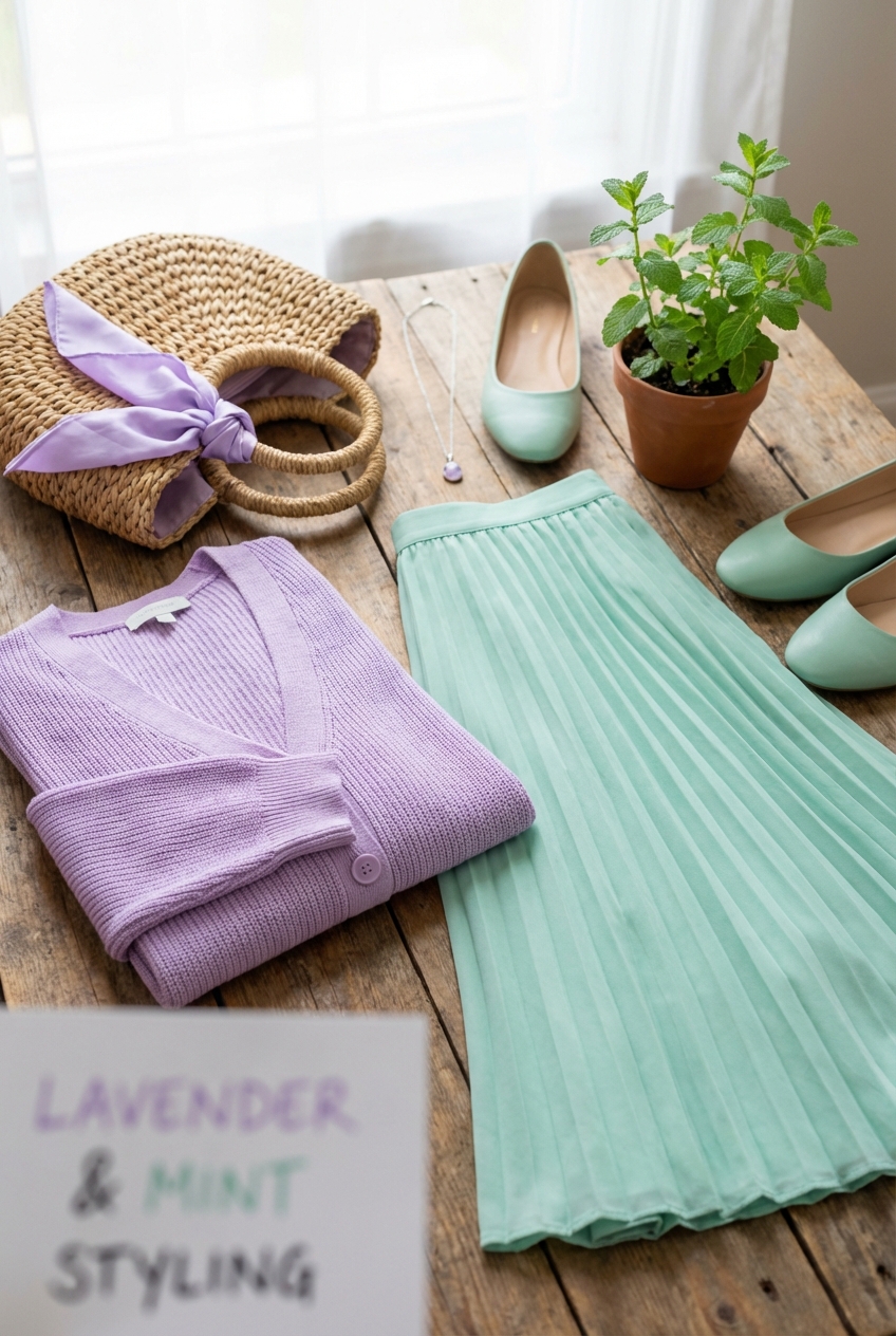
Picture Gallery


