How To Mix Jewel Tones In Evening Gowns For A Luxe Look
There is nothing quite as regal or commanding as walking into a room wearing a deep, saturated jewel tone. While the “Little Black Dress” is a safety net for many, jewel tones offer a depth and vibrancy that instantly elevates your presence. I remember styling a client for a winter gala who was terrified of leaving her neutral comfort zone; we put her in a deep amethyst velvet column gown with emerald drop earrings, and the transformation was electric.
Mixing these rich hues requires a specific eye for balance, texture, and saturation to ensure the look remains sophisticated rather than costumey. It is not just about picking two colors on the color wheel; it is about understanding how light hits the fabric and how different gem tones interact with your skin’s undertone. When done correctly, mixing these shades creates a dynamic, high-fashion aesthetic that exudes confidence and luxury.
In this guide, I will walk you through the precise rules I use when styling editorial shoots and private clients for black-tie events. We will cover everything from color theory basics to fabric weights and accessory coordination. If you are looking for visual inspiration, make sure to check out the curated Picture Gallery at the end of the blog post.
1. Understanding the Jewel Tone Palette
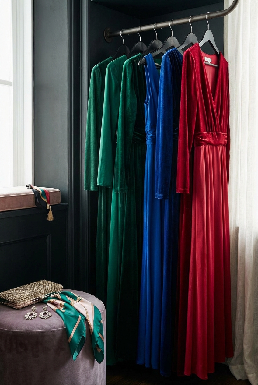
Before you can mix colors effectively, you must understand exactly what classifies a shade as a “jewel tone.” These are colors derived from precious gemstones, characterized by high saturation and deep value. They are never pastel, muted, or dusty; they are bold and unapologetic.
The primary jewel tones we work with in evening wear include:
- Emerald Green: A vivid, blue-based green.
- Sapphire Blue: A deep, cold royal blue.
- Ruby Red: A rich, blue-based red (distinct from warm brick reds).
- Amethyst Purple: A vibrant, royal purple.
- Citrine Yellow/Topaz: A deep, golden yellow or amber.
- Turquoise/Teal: A deep, saturated cyan.
The Saturation Rule
The most critical rule when mixing these colors is matching the intensity. You cannot pair a washed-out, low-quality purple fabric with a high-end, deep emerald silk. The disparity in color richness will make the lighter fabric look cheap. Both colors must be equally pigmented to stand up to one another.
Designer’s Note
I often see clients try to mix a “jewel tone” with a pastel, thinking it will balance the look. For example, pairing a ruby gown with blush pink shoes. In high-end styling, this often dilutes the power of the look. Commit to the richness. If you are wearing ruby, pair it with a deep plum or a sharp metallic, not a whisper of pink.
2. The Art of Color Blocking
Color blocking is the most direct way to mix jewel tones in evening wear. This involves wearing large, solid blocks of contrasting colors. This can be achieved through a two-tone gown or by separating your top and skirt pieces.
The Golden Ratio of Styling
When mixing two dominant colors, avoid a 50/50 split. Splitting your body perfectly in half visually cuts your height and can look unintentional. Instead, aim for a 70/30 or 60/40 split.
- The 70/30 Rule: Let one color dominate. For instance, an amethyst gown (70%) paired with a large emerald sash or shawl (30%).
- The 90/10 Rule: A sapphire gown (90%) styled with ruby red shoes and a matching ruby clutch (10%).
Analogous vs. Complementary Blocking
You have two main strategies for selecting your color pair.
- Analogous Mixing: Pairing colors that sit next to each other on the color wheel. This is the “safer” and often more elegant choice for black-tie. Think Sapphire Blue mixed with Amethyst Purple, or Ruby Red mixed with Citrine. It creates a harmonious, ombre-like effect without high contrast.
- Complementary Mixing: Pairing colors opposite each other. The classic example is red and green (Ruby and Emerald). However, in fashion, this can quickly look like holiday decor if the shades aren’t perfect. To make this work, ensure the fabrics are luxe (silk, velvet) and the cuts are modern.
3. Fabric Texture and Sheen
The fabric you choose dictates how the jewel tone is perceived by the eye. A cheap polyester satin will reflect light unevenly and can make a royal blue look like a prom costume. Natural fibers or high-quality blends absorb and reflect light in a way that enhances the depth of the color.
Velvet: The Ultimate Saturator
Velvet is the most effective fabric for jewel tones because the pile absorbs light, creating an incredibly deep, rich color. An emerald velvet gown will always look darker and more expensive than an emerald chiffon dress.
- Mixing Textures: If you are mixing colors, try mixing textures too. A sapphire velvet bodice paired with an emerald satin skirt creates a luxurious tactile contrast.
- Matte vs. Shine: Be careful mixing two high-shine fabrics in different colors (like two satins). It can be visually overwhelming and create glare in photos. A better approach is to mix a matte fabric (like crepe or velvet) with a shiny one (like silk charmeuse).
Common Mistake + Fix
Mistake: Wearing a jewel-tone satin dress that is too thin, showing every undergarment line and creating distinct highlights that look white in flash photography.
Fix: Always choose evening gowns with a lining or a heavier fabric weight. If the dress is satin, it should be “double-faced” satin or hammered silk, which diffuses light rather than reflecting it like a mirror.
4. Accessorizing with Contrasting Gems
If you aren’t ready to commit to a multi-colored gown, accessories are the most sophisticated way to introduce a secondary jewel tone. This allows you to stick to a monochromatic base while adding a pop of contrasting luxury.
The Shoe and Bag Combo
The old rule of “shoes must match the bag” is flexible here, but in formal evening wear, matching them helps ground the secondary color.
- The Look: A floor-length Citrine (mustard-gold) gown.
- The Mix: Deep teal velvet pumps and a matching teal rigid clutch.
- Why It Works: The teal anchors the brightness of the citrine. Since the shoes and bag match, the secondary color looks intentional, not accidental.
Jewelry Selection
This is where you can be quite literal with “jewel tones.” Do not feel pressured to wear clear diamonds.
- Green on Blue: If you are wearing a navy or sapphire gown, emerald jewelry is stunning. The green pops against the dark blue background.
- Purple on Yellow: For a bold citrine dress, amethyst jewelry provides a regal, historical aesthetic.
- Scale Matters: If the gown is simple, the jewelry should be substantial. If the gown has ruffles or heavy texture, keep the stone size moderate to avoid clutter.
5. Selecting the Right Metallic Accents
When mixing two jewel tones, you need a “neutral” to act as a buffer or frame. In evening wear, metallics are your neutrals. You generally shouldn’t introduce black or white, as they can be too harsh against rich colors.
Gold vs. Silver
The choice of metal depends on the warmth of your jewel tones.
- Gold: pairs best with warm tones like Ruby, Citrine, and warm Amethysts. It adds a sense of old-world royalty.
- Silver/Platinum: pairs best with cool tones like Sapphire, Teal, and cool Emeralds. It provides an icy, crisp finish.
- Rose Gold: This is tricky. It works beautifully with warmer Rubies and some varieties of purple, but can clash with Citrine or bright Green.
The “Bridge” Accessory
If you are struggling to make two colors connect, use a metallic belt or brooch. A gold belt on a dress that mixes ruby and sapphire can help bridge the gap, signaling to the eye that this is a cohesive outfit.
6. Styling for Skin Undertones
Not all jewel tones look good on all skin tones. When mixing colors, ensure the color closest to your face (the bodice or earrings) is the one that flatters your complexion the most. You can use the secondary, less flattering color in your skirt, shoes, or clutch.
Cool Undertones
If your veins appear blue and you look better in silver jewelry:
- Primary Colors: Sapphire, Amethyst, Cool Emerald.
- Styling Tip: Wear a Sapphire gown. Mix in Citrine through a handbag held away from the face, or shoes peeking out from the hem.
Warm Undertones
If your veins appear green and you look better in gold jewelry:
- Primary Colors: Ruby, Citrine, Warm Teal, Olive-toned Emerald.
- Styling Tip: A Ruby red dress will make your skin glow. Pair it with deep turquoise statement earrings for a contrast that vibrates with energy but doesn’t wash you out.
Designer’s Note
I always check a client’s “contrast level.” If you have high contrast (very dark hair and pale skin), you can handle high-contrast mixes like Ruby and Emerald. If you have low contrast (fair hair and fair skin, or deep skin and dark hair), tonal mixes like Sapphire and Teal will look more harmonious and less overpowering.
Finish & Styling Checklist
Before you head out the door, run through this “What I’d do in a real project” checklist to ensure the look is polished.
1. The Squint Test
Stand back from your mirror and squint. Do the two colors blend nicely, or does one section disappear? If the colors are too similar in value (darkness), they might look like a muddy mistake. You want distinct contrast.
2. Fabric Weight Check
Ensure your hemline isn’t bunching. If you are wearing a velvet gown, it is heavy. Make sure your shoes are substantial enough (no thin strappy sandals) to visually support the weight of the dress.
3. Grooming Coordination
- Manicure: Keep nails neutral (nude or sheer pink) or match the darker of the two jewel tones. Do not introduce a third bright color on your nails.
- Lipstick: If you are wearing Ruby, a matching red lip is classic. If you are wearing Sapphire or Green, a berry or mauve lip is usually safer than trying to match the dress.
4. The Flash Test
Take a photo of the outfit with the flash on. Jewel tones in satin or silk can sometimes reflect light in unflattering ways. Ensure the fabric maintains its rich color and doesn’t turn white/shiny in the photo.
FAQs
Can I wear black shoes with jewel tones?
Technically yes, but it is often the least inspired choice. Black can look like a void against vibrant ruby or emerald. A metallic shoe (gold, silver, bronze) or a matching jewel tone is almost always more high-end styling. If you must wear black, make sure it is patent leather or velvet to match the formal intensity of the gown.
Is mixing red and green too “Christmas” for a formal event?
It is a risk. To avoid the holiday connotation, vary the shades. Use a blue-based deep teal instead of pine green, and a burgundy-ruby instead of bright fire-engine red. Also, avoid velvet for this specific combination if it’s December; opt for silk or chiffon instead to distance the look from Santa’s suit.
Can I mix three jewel tones?
Proceed with caution. The “Rule of Three” exists in design, but in fashion, wearing a purple dress, green shoes, and a red bag can look chaotic. If you want a third color, make it a metallic or a very deep, blackened version of one of the other colors (e.g., deep midnight blue).
Do pastels ever work with jewel tones?
In high-fashion editorial, yes, we call it “acid brightness.” However, for a standard formal event, mixing pastels with jewel tones dilutes the “luxe” factor. It makes the jewel tone look harsh and the pastel look washed out. Stick to the same saturation level for a cohesive look.
Conclusion
Mixing jewel tones is one of the most effective ways to stand out at a black-tie event. It signals a confidence and a mastery of style that a simple black dress cannot convey. By respecting the rules of saturation, paying attention to fabric texture, and using metallics as your neutral ground, you can create combinations that are breathtakingly elegant.
Remember that luxury is in the details. It is the weight of the velvet, the precise shade of the emerald earring, and the intentionality of the color blocking that creates the “wow” factor. Do not be afraid to experiment with these rich hues; they are designed to make you shine.
Picture Gallery


