How To Mix Lavender And Olive Green For Balanced Looks
Introduction
In the world of high fashion, the most striking runway moments often come from unexpected pairings. We see this constantly in the spring collections from houses like Miu Miu or Dries Van Noten, where the utilitarian grit of military green is softened by the ethereal, romantic whisper of lilac. It is a study in contrasts: the sturdy versus the delicate, the grounded versus the airy.
Bringing this sartorial concept into your home requires the same eye for balance that you use when styling a structured blazer over a silk slip dress. Lavender and olive green are technically opposites on the color wheel’s complex tertiary spectrum, making them complementary, but they can quickly veer into “Easter decoration” territory if the saturation isn’t managed correctly. The secret lies in treating olive as your neutral—your “denim” or “leather”—and lavender as your silk accent.
When executed with a designer’s precision, this palette feels sophisticated, organic, and incredibly calming. It bridges the gap between masculine and feminine aesthetics, making it perfect for shared spaces. If you are looking for visual inspiration, keep reading because I have curated a stunning Picture Gallery at the end of the blog post.
1. The Art of Saturation: Matching Intensity
The first rule of mixing these two distinct hues is to ensure they share the same visual weight. In fashion, we call this tonal harmony. You wouldn’t pair a neon purple raver top with a muted, heritage hunting jacket; the clash would be jarring rather than intentional.
In interiors, this means looking at the “muddiness” of the colors. If you choose a dusty, gray-washed olive (think dried sage or army surplus), your lavender should also have gray undertones. This prevents the purple from looking juvenile.
If you prefer a deep, saturated forest olive, you need a punchier, stronger lavender, bordering on orchid, to hold its own. The goal is for neither color to bully the other. When I build a mood board, I always test paint swatches against fabric samples in natural light to ensure the undertones—whether warm or cool—are speaking the same language.
Designer’s Note: The “Dusty” Rule
I learned this lesson the hard way early in my career during a project for a client’s sunroom. We picked a rich, historic olive for the cabinetry but paired it with a clean, candy-colored lavender upholstery. The result looked cheap and disjointed.
We fixed it by swapping the fabric for a “dirty” lavender velvet—one that looked almost gray in the evening. Suddenly, the room felt expensive and curated. Always err on the side of “dusty” or muted shades when mixing these colors to keep the look high-end.
2. Materiality and Texture: The Fashion Approach
In my wardrobe, I rarely wear two flat cotton fabrics together. I mix leather with wool, or silk with denim. You must apply this same tactile philosophy to your room to keep the lavender and olive combination from feeling flat.
Olive green naturally lends itself to heavier, more grounded textures. Think of luscious mossy velvet sofas, heavy linen drapery, or even painted matte joinery. These materials absorb light, grounding the space.
Lavender, conversely, shines in lighter, reflective, or softer textures. I love using lavender in silk throw pillows, a high-pile wool rug, or a sheer curtain. This mimics the way light hits a flower petal.
Texture Pairing Checklist
- The Velvet Sofa: If you choose an olive velvet sofa, pair it with a lavender cashmere throw. The matte depth of the velvet makes the cashmere pop.
- The Rug: If you use a flat-weave olive rug (like a kilim or jute blend), contrast it with lacquered lavender accessories or a glossy ceramic lamp.
- Curtains: Avoid matching the texture of your drapes to your upholstery exactly. If the furniture is heavy, keep the window treatments airy.
3. The 60-30-10 Rule: Proportions Matter
One of the most practical guidelines in interior design is the 60-30-10 rule. This dictates that 60% of the room should be a dominant color, 30% a secondary color, and 10% an accent shade.
For a grounded, earthy look, let olive green take the 60% slot. This could be wall paint, large cabinetry, or the primary seating pieces. It acts as the “suit” of the room.
Lavender then becomes the 30%. This appears in accent chairs, rugs, or large-scale art. It provides the personality without overwhelming the senses.
The final 10% should be your “jewelry.” In this palette, I prefer crème, warm brass, or deep walnut wood tones. This prevents the two main colors from feeling locked in a binary struggle.
Common Mistakes + Fixes
Mistake: Using a 50/50 split.
If you paint the walls olive and buy a lavender sofa of equal visual weight, the room will feel split down the middle and unresolved.
Fix: Edit the room.
Add a large neutral area rug (cream or jute) to break up the color. Or, reduce the lavender to just throw pillows and a vase to shift the balance back to 60/10.
4. Wood Tones and Metallic Accents
Just as the right gold hoops can elevate an outfit, the hard finishes in a room dictate the vibe of your lavender and olive pairing. Because both colors exist in nature, they play exceptionally well with natural wood tones.
For a modern, Scandinavian-inspired look, pair this combo with white oak or light ash. The pale wood keeps the olive from feeling too heavy and complements the airy nature of lavender. This is ideal for smaller apartments or spaces with limited natural light.
For a moody, library-chic aesthetic, opt for walnut or mahogany. The dark wood merges with the olive to create a cozy cocoon, allowing the lavender pops to vibrate against the dark background.
Hardware Selection
- Unlacquered Brass: This is my top pick. The golden warmth bridges the gap between the cool purple and the warm green. It feels vintage and collected.
- Polished Nickel: Use this for a more contemporary, crisp look. It brings out the cool, blue undertones in the lavender.
- Matte Black: Be careful here. While modern, black can sometimes look too harsh against soft lavender. Use it sparingly, perhaps just in curtain rods or picture frames.
5. Lighting: The Kelvin Scale Factor
Lighting can make or break this color combination. Lavender is notoriously fickle; in cool lighting, it can turn steel gray, and in overly warm lighting, it can turn muddy mauve.
You must pay attention to the Kelvin rating of your lightbulbs. This is the measure of color temperature. For residential interiors, specifically with this palette, you want to aim for 2700K to 3000K.
2700K is a warm, soft white. It will enhance the cozy qualities of the olive green but might make the lavender look slightly pinker.
3000K is a brighter, neutral white. This is usually the sweet spot for keeping the lavender looking “true” to color without sterilizing the olive tones. Avoid 4000K or higher (often labeled “Daylight”) unless you are in a laundry room, as it will make your chic olive room look like a hospital.
Placement Strategy
- Table Lamps: Place a lamp with a warm shade near your lavender accents. The glow will soften the color.
- Natural Light: Observe the room at different times of day. North-facing rooms have cool blue light, which amplifies lavender. South-facing rooms have golden light, which flatters olive.
6. Room-Specific Application: Living vs. Bedroom
How you apply this palette depends heavily on the function of the room. A high-traffic living room requires different considerations than a serene master suite.
In a living room, prioritize durability. Olive green is an excellent color for hiding wear and tear, making it perfect for the main sofa or an area rug. If you have pets or children, choose a performance fabric (like Crypton velvet) in olive. Save the delicate lavender for throw pillows, artwork, or objects on a high shelf.
In a bedroom, you can flip the script. Lavender is known for its anxiety-reducing properties. Consider a pale, gray-lavender wash on the walls with olive green bedding. The result is a sleep sanctuary that feels like a field in Provence.
What I’d Do in a Real Project: The Bedroom Checklist
- Walls: Paint them a hushed lavender-gray (not pastel purple).
- Bedding: Crisp white sheets with a heavy olive green linen duvet cover at the foot of the bed.
- Rug: A vintage-style rug incorporating creams, olives, and hints of blush/lavender.
- Nightstands: Walnut wood to ground the space.
- Curtains: Floor-to-ceiling olive velvet, hung high and wide.
Finish & Styling Checklist
Before you finalize your room, run through this styling checklist to ensure the look is polished and cohesive. Think of this as the final glance in the mirror before leaving the house.
- Check the Undertones: Do your olive and lavender have the same level of gray/dustiness?
- Edit the Accessories: Do you have too many small lavender items? Group them or remove some to avoid clutter.
- Add a Third Neutral: Have you introduced cream, white, or beige to give the eye a place to rest?
- Verify Rug Sizing: Does your rug sit under the front legs of the sofa by at least 6-10 inches? This anchors the color palette.
- Test the Light: Have you checked the paint color at night with your artificial lighting?
FAQs
Is this color combination too feminine for a shared home?
Not at all. Olive green is traditionally a masculine, utilitarian color. It grounds the lavender effectively. To make it feel more gender-neutral, lean heavier on the olive, use dark woods, and choose geometric patterns rather than florals.
What white paint goes best with lavender and olive?
Avoid cool, blue-based whites. They will make the room feel cold. Look for a warm white with a creamy undertone, such as Swiss Coffee or White Dove. This warmth bridges the gap between the organic green and the floral purple.
Can I use this palette in a small room?
Yes, but be strategic. In a small space, painting the walls dark olive can make it feel smaller (though cozier). A better approach for small square footage is to keep walls neutral (cream or pale lavender) and use a large olive rug to ground the space without closing it in.
How do I mix patterns with these colors?
Treat it like mixing prints in an outfit. If you have a large-scale floral in lavender, pair it with a tight, small-scale geometric or stripe in olive. Varying the scale of the patterns prevents them from competing for attention.
Conclusion
Mixing lavender and olive green is a bold, fashion-forward choice that signals confidence and creativity. It moves beyond the standard gray and beige interiors we see everywhere, offering a home that feels personal and curated.
By paying attention to saturation levels, layering rich textures, and adhering to proper proportions, you can create a space that feels both balanced and dynamic. Remember, your home is an extension of your personal style. Don’t be afraid to experiment, edit, and refine until the room feels like the best version of your vision.
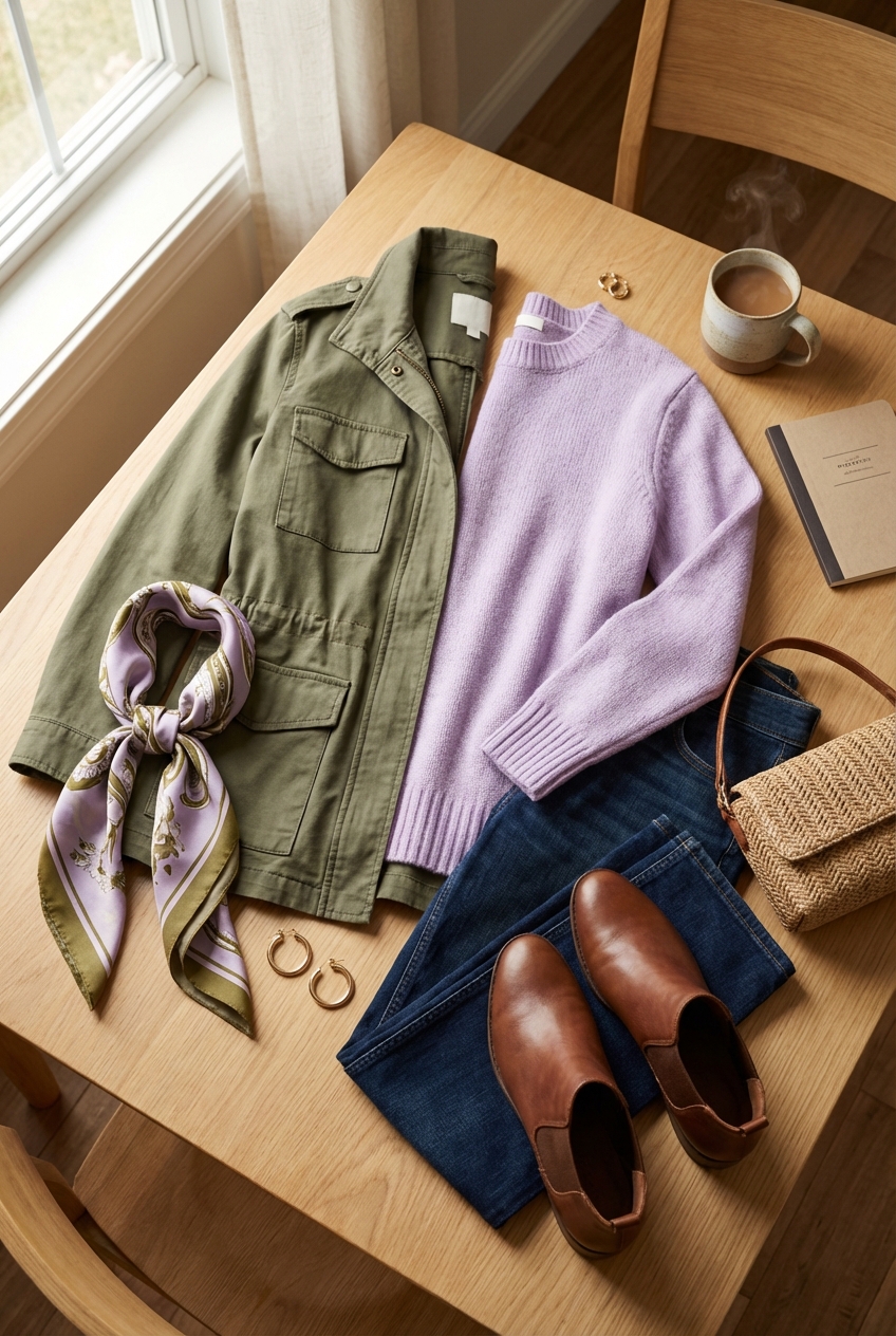
Picture Gallery


