How To Style Black And Gold For A Sophisticated Evening Look
There is a distinct energy that shifts when you trade a daytime sundress for a structured evening gown. The atmosphere changes from casual to electric, demanding a certain level of poise and drama. Designing a room with a black and gold palette requires that same mindset. It is the interior design equivalent of the perfect Little Black Dress paired with vintage gold jewelry—timeless, moody, and undeniably luxurious. However, just like evening wear, the line between “chic” and “costume” is razor-thin.
Many homeowners shy away from black because they fear it will make a space feel cavernous or depressing. On the flip side, gold is often avoided because one wrong move can turn a living room into a tacky hotel lobby. The secret lies in balance, texture, and the specific temperatures of the finishes you choose. When executed correctly, this combination creates an intimate, cocoon-like environment perfect for entertaining or unwinding after hours.
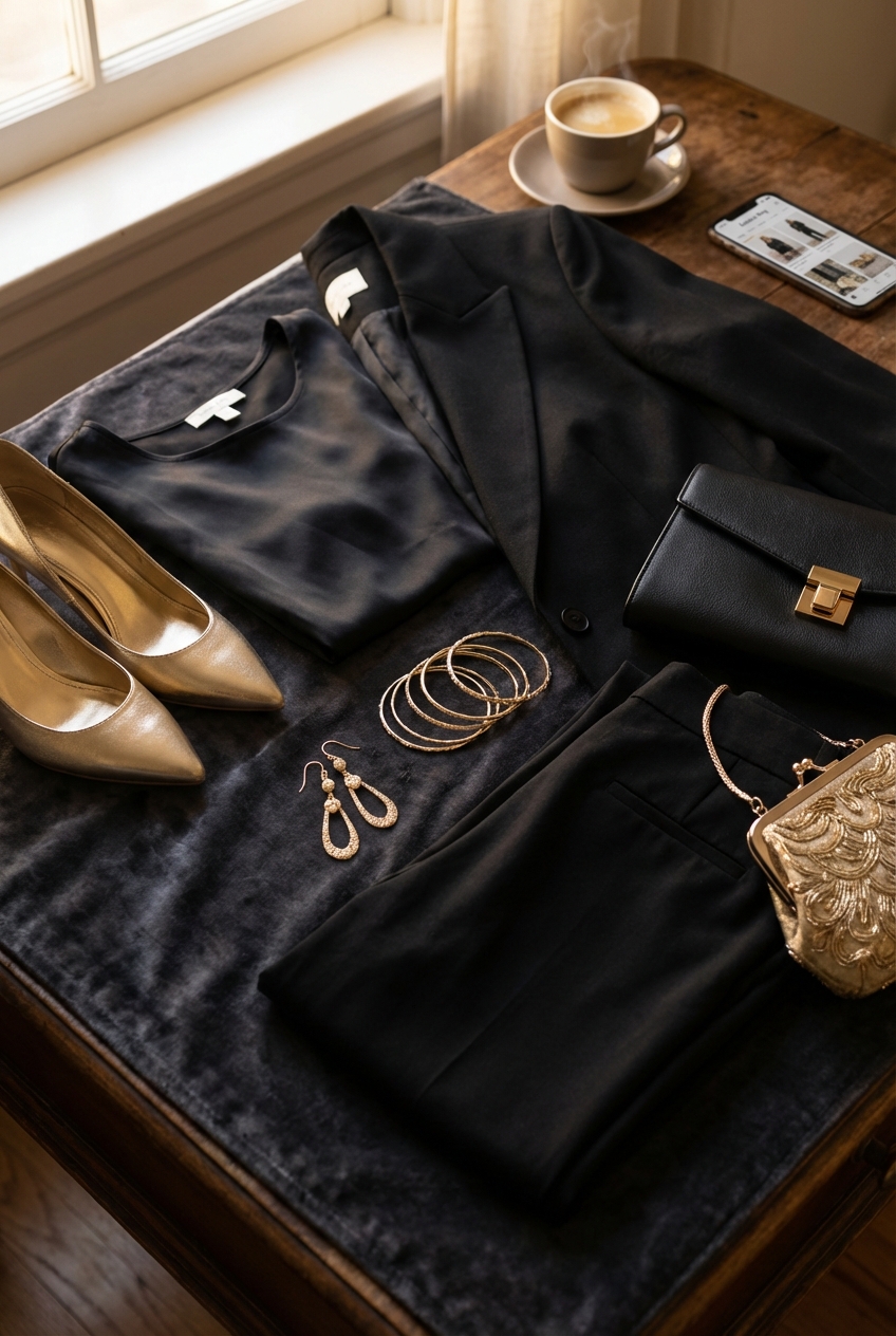
I have spent years curating spaces that balance these two bold elements, treating homes with the same scrutiny a stylist treats a runway collection. In this guide, I will walk you through the practical rules of bringing this aesthetic into your home without it feeling overwhelming. For visual inspiration on how these textures play together in real homes, be sure to check out the Picture Gallery at the end of the blog post.
The Foundation: Selecting the Right “Fabric” for Your Walls
In fashion, the cut of the dress matters less if the fabric looks cheap. In interiors, your walls are that fabric. If you are committing to the black and gold look, you generally have two routes: dark walls with gold accents, or neutral walls with black and gold furnishings. For a true “evening look,” I almost always recommend going dark on the vertical surfaces.
The biggest misconception about black paint is that “black is black.” This is false. Just like a wool suit reads differently than a silk slip, paint finishes change everything. For a sophisticated evening vibe, you want to absorb light, not bounce it around like a disco ball. High-gloss black can look spectacular, but it requires walls that are skim-coated to perfection because the sheen highlights every single bump and drywall seam.
For 90% of residential projects, I recommend a flat or matte finish for black walls. A matte finish creates a velvet-like effect that blurs the edges of the room, actually making a small space feel larger because your eye cannot define the corners. If you have kids or pets and worry about washability, look for a “washable matte” or a high-quality eggshell, but avoid semi-gloss at all costs.
Designer’s Note: The Undertone Trap
I once had a client paint a room “black” without testing it, only to find that in the morning light, the room looked navy blue. Most black paints have strong undertones of blue, green, or brown.
Cool Blacks: Have blue undertones. These look crisp but can feel cold.
Warm Blacks: Have brown or red undertones. These feel cozy and rich (think espresso).
True Black: Examples like Sherwin Williams Tricorn Black lack strong undertones and serve as a neutral void.
Always paint a 2-foot by 2-foot swatch on two different walls and watch it for 24 hours before committing.
The Jewelry: Curating Gold Hardware and Fixtures
Think of hardware, light fixtures, and furniture legs as the jewelry of the room. You wouldn’t wear a statement necklace, chandelier earrings, and ten bangles all at once. Similarly, you cannot have every single metal surface in the room screaming for attention.
The finish of the gold is paramount. To achieve a high-end look, avoid “yellow gold” or shiny brass that looks like plastic. You want metals that have depth and history. Unlacquered brass is the gold standard (pun intended) because it develops a patina over time, darkening in the crevices to show age. If that is out of budget or you prefer a cleaner look, opt for “champagne bronze” or “brushed gold.” These shades are softer and less jarring against dark backgrounds.
It is also crucial to mix your metals slightly to keep the room from looking like a showroom set. If your primary metal is gold, introduce small touches of matte black metal or even polished nickel to break up the monotony.
Common Mistakes + Fixes
Mistake: Using the exact same shade of gold for every fixture.
The Fix: Layer your metals. If your chandelier is a bright brushed brass, choose a darker, antique brass for the curtain rods. This adds dimension and feels curated rather than bought in a “room-in-a-bag” kit.
Texture and Textiles: Avoiding the “Flat” Look
A black room with gold metal can easily feel cold and sterile—like a bank vault. To make it livable and sophisticated, you must introduce warmth through textiles. This is where we bring in the “velvet and silk” of our evening wear analogy.
Texture is the antidote to the starkness of black. You need materials that catch the light differently. Velvet is a natural choice for this aesthetic because the pile of the fabric captures light, creating highlights and lowlights that add visual interest to a dark piece of furniture. A black velvet sofa looks infinitely more expensive and inviting than a black cotton or linen sofa, which can look flat and dull.
Leather is another power player here. A cognac or caramel leather chair provides a warm, organic bridge between the stark black and the metallic gold. It grounds the space and adds a masculine edge that prevents the gold from feeling too prissy.
Rug Sizing and Placement Rules
When working with dark floors or furniture, the rug acts as your stage.
The Anchor: In a living room, the rug needs to be large enough that at least the front legs of all seating pieces rest on it.
The Border: Leave 12 to 18 inches of bare floor visible around the perimeter of the room.
The Contrast: If you have dark floors and a black sofa, do not use a dark rug. You need a lighter, neutral rug (cream, grey, or a faded vintage pattern) to separate the furniture from the floor. Otherwise, your beautiful sofa will disappear into a “black hole.”
Lighting: Setting the Mood
Lighting is the most critical element in a black and gold room. Dark walls absorb light, meaning a single overhead fixture will leave the corners of the room in shadow, making the space feel gloomy rather than moody. You must layer your lighting to create pockets of warmth.
When light hits gold accents against a black backdrop, it creates a magical, glowing effect. Use this to your advantage. Place picture lights with a gold finish above artwork. Use sconces with gold interiors; the light reflects off the metal inside the shade, turning the light itself into a warm, golden hue.
Technical Specs for Lighting
Color Temperature: Never use daylight bulbs (5000K) in this aesthetic. It will make the black look grey and the gold look cheap. Stick to 2700K (warm white) or 3000K (soft white).
Lumens: You will need more lumens (light output) in a dark room than a white room. Plan for at least 3-4 sources of light: overhead, task (reading lamps), and accent (art lights).
Dimmers: Every switch should have a dimmer. This is non-negotiable for an “evening look.”
Furniture Silhouettes and Scale
Because black is visually heavy, the silhouette of your furniture matters immensely. A large, boxy black sectional can dominate a room and suck the energy out of it. To maintain sophistication, look for furniture with “legs.”
Sofa and chairs raised on slim legs (preferably gold or wood) allow light and air to pass underneath, making the piece feel lighter. This is particularly important in smaller homes or apartments. If you have a heavy black sofa, pair it with a glass coffee table with a gold frame. The transparency of the glass keeps the visual weight down and allows the rug underneath to show through.
What I’d Do in a Real Project
If I were designing a 15×20 living room with this palette, here is my formula:
1. Walls: Matte black (e.g., Benjamin Moore Cheating Heart).
2. Sofa: Charcoal or black velvet, raised on legs.
3. Chairs: Two vintage-style chairs with thin gold frames, upholstered in a pattern or lighter fabric.
4. Tables: A marble or glass coffee table to break up the dark masses.
5. Drapery: Floor-to-ceiling heavy drapes. Mount the rod 4-6 inches below the crown molding (or ceiling) to maximize height.
The Final Edit: Styling Surfaces
The difference between a cluttered room and a styled room is editing. Gold accessories are beautiful, but the “Midas Touch” is a real danger. You do not want everything to be gold.
When styling bookshelves or coffee tables, follow the rule of thirds. Group items in odd numbers (1, 3, 5). Mix your materials. If you have a gold decorative bowl, place it next to a stack of books and a matte ceramic vase. The matte finish of the ceramic will make the shine of the gold pop.
Include organic elements. A black and gold room can feel very manufactured. Always include fresh flowers, a jagged crystal, or a piece of driftwood. These natural imperfections break up the rigidness of the color scheme.
The 60-30-10 Rule
To keep the room balanced:
60% Main Color: This is likely your black (walls, large furniture).
30% Secondary Color: This provides relief (warm wood tones, cream rugs, grey textiles).
10% Accent Color: This is your gold. It should be the eyeliner, not the foundation.
Finish & Styling Checklist
Before you finalize your room, run through this checklist to ensure you have hit the right notes of sophistication and function.
Paint Test: Have you viewed your black paint sample at night with artificial light?
Finish Balance: Do you have a mix of matte and shiny surfaces? (Aim for 80% matte, 20% shine).
Metal Tone: Are your gold metals in the same tonal family (warm vs. cool)?
Texture Check: Do you have at least three different textures (e.g., velvet, metal, wood)?
Height Check: Are your curtains hung high and wide to frame the window without blocking light?
Greenery: Have you added a plant or organic element to breathe life into the space?
* Dimmer Check: Are your lights capable of being dimmed for atmosphere?
FAQs
Can I pull off black walls in a small rental apartment?
Absolutely. In fact, dark colors often work better in small, windowless spaces (like powder rooms or hallways) because they embrace the coziness rather than fighting it. If you cannot paint, use black peel-and-stick wallpaper or heavy black velvet curtains to create a “wall” of color.
How do I keep black furniture clean with a golden retriever?
This is a realistic constraint. If you have light-colored shedding pets, a black velvet sofa is a nightmare. Instead, flip the script: keep the walls black and the sofa a durable cognac leather or a textured grey tweed. Use black for the hard surfaces (side tables, lamps) that hair doesn’t stick to.
Does silver fit into this palette?
Yes, but be careful. Silver is cool, while black and gold are generally warm/neutral. If you introduce silver, make it purposeful. Polished nickel works well with gold because it has a warmer undertone than chrome. Chrome can look too harsh and commercial against a rich black background.
How do I stop the room from looking too masculine?
Black and gold can lean very “bachelor pad.” To soften it, focus on curved silhouettes (rounded sofas, circular mirrors) rather than sharp, boxy lines. Use floral or abstract patterns in your throw pillows, and ensure your lighting is warm and diffused.
Conclusion
Styling a home in black and gold is a bold declaration. It says you are not afraid of the dark, and you appreciate the finer details of design. It is a look that requires confidence, much like wearing a couture gown to a cocktail party. By focusing on matte finishes, layering your lighting, and treating gold as a precious accent rather than a main event, you can create a space that feels timelessly elegant.
Remember that sophisticated design is not about perfection; it is about intention. Every piece of hardware, every fabric choice, and every light bulb should be chosen with the atmosphere in mind. Embrace the moodiness, play with the contrast, and enjoy the luxury of your own private evening retreat.
Picture Gallery


