How To Style Bold Color Jewelry With Neutral Outfits
The most common misconception I hear from my private clients is that neutral clothing requires neutral accessories. They invest in beautiful cashmere sweaters in oatmeal, structured trousers in charcoal, or the perfect white silk blouse, only to finish the look with delicate gold studs or a simple pearl strand. While timeless, this approach misses the immense transformative power of styling.
A neutral wardrobe is actually the perfect gallery wall. Just as a white wall allows a vibrant abstract painting to sing, a monochrome or neutral outfit provides the negative space necessary for bold, colorful jewelry to take center stage without looking chaotic. I remember styling a client for a gallery opening who insisted on wearing a simple black slip dress. We added a chunky, architectural necklace in electric blue lapis and malachite. The look went from “safe” to “sartorial masterpiece” instantly.
Learning to balance visual weight, color temperature, and scale is the difference between looking dressed up and looking truly styled. This guide will walk you through the architectural principles of jewelry styling that I use in fittings every day. For a massive dose of visual inspiration, be sure to check out the Picture Gallery at the end of the blog post.
1. Establishing the Canvas: Fabric and Texture
Before we even touch a gemstone, we must assess the fabric of your outfit. High-end styling is largely about the interplay of textures. If you are wearing a flat, matte fabric like cotton poplin, you have the freedom to wear high-shine pieces.
However, if you are wearing something with a high pile, like angora or bouclé, you need to be careful with setting styles. Prongs on bold vintage rings or rough-cut raw gemstones will snag delicate knits. In these cases, I always opt for bezel-set stones or smooth enamel pieces that glide over the fabric.
The weight of the fabric dictates the visual weight of the jewelry. A heavy wool coat or a thick cable knit sweater can support massive, chunky resin or wood pieces. Conversely, a sheer linen blouse might look overwhelmed by a heavy bib necklace. In that instance, the fabric might physically sag under the weight, ruining the silhouette.
Designer’s Note: The “Snag Test”
I have seen too many four-figure sweaters ruined by a single bracelet clasp. Before you leave the house, run your jewelry over a scrap piece of similar fabric or an old t-shirt. If it catches, do not wear it with your silk or loose knits. For delicate fabrics, always prioritize smooth finishes like cabochon cuts or lucite.
2. Color Theory: Temperature and Undertones
Styling bold color is not about guessing; it is about physics and color theory. The first step is identifying the temperature of your neutral base. Neutrals are rarely truly neutral; they lean warm or cool.
Warm Neutrals: Camel, cream, oatmeal, olive, and chocolate brown.
Cool Neutrals: Crisp white, slate grey, silver-grey, and cool navy.
True Neutrals: Black (though some blacks can lean blue or brown) and pure charcoal.
Once you know your base, you have two choices: harmony or contrast. For a harmonious, sophisticated look, pair warm gems with warm neutrals. Think Citrine, Amber, or Carnelian paired with camel and beige. This creates a rich, tonal continuity that looks very expensive.
For a high-impact, editorial look, use contrast. Pair cool-toned gems like Sapphire, Amethyst, or crisp Emerald against warm neutrals like tan or brown. The visual vibration between the cool jewel tone and the warm fabric creates energy. My personal favorite combination for summer is turquoise jewelry styled against chocolate brown linen.
Common Mistakes + Fixes
Mistake: Wearing neon or bright acrylics with “muddy” neutrals like greige or taupe.
Fix: Bright, synthetic colors (neon pink, lime green) need crisp, clean neutrals like stark white or jet black. Earthy neutrals need earthy bold colors like terracotta, deep turquoise, or moss agate.
3. Scale and Silhouette: The Rule of Thirds
In fashion, as in architecture, scale is everything. When introducing a bold color piece, you must consider where it sits on the body and how it dissects your silhouette. We want to guide the viewer’s eye, not confuse it.
If you are wearing a bold statement necklace, it becomes the focal point. It draws the eye up to the face. This is excellent for Zoom calls or dinner parties where you remain seated. However, ensure the neckline supports the piece.
V-Necks: These elongate the torso. A pendant that mimics the V shape works best here.
Crew Necks: These act as a solid background. A bib necklace or a short, chunky collar sits beautifully over the fabric, effectively becoming part of the garment.
Turtlenecks: These are ideal for long opera-length chains (30 inches or more) with heavy, colorful pendants. The length breaks up the expanse of fabric on the torso.
If you choose bold, colorful earrings, you must ensure they don’t battle your collar. If you are wearing a high-collared coat or a scarf, skip the chandelier earrings. They will visually clutter the neck area and physically tangle.
What I’d do in a real project
When I style a client, I use the “One Hero” rule.
- The Hero: A massive emerald-green collar necklace.
- The Supporting Cast: Simple gold bands or small diamond studs.
- The Outcome: The eye goes exactly where I want it. If I added big green earrings, the look would veer into costume territory.
4. Materiality: Mixing Gemstones with Synthetics
High-end style is about the mix. You do not need to stick to precious stones to make a statement. In fact, some of the most chic women I know mix fine jewelry with bold costume pieces. The key is the quality of the material.
Enamel: This is my favorite way to introduce solid blocks of saturated color. An electric blue enamel cuff looks incredibly modern against a white suit. It provides a sleek, flat color that sparkles don’t offer.
Resin and Lucite: These materials allow for massive volume without the heavy weight. You can wear a bracelet the size of a donut, but if it is high-quality resin, it remains comfortable. Look for resin with depth and transparency, rather than flat, opaque plastic which can look cheap.
Natural Stones: Lapis Lazuli (blue), Malachite (green), Rhodochrosite (pink), and Onyx (black) offer natural, complex patterns. Because these are earth materials, they pair exceptionally well with natural fibers like linen, silk, and wool.
When mixing these, keep the metal finishes consistent. If your bold enamel bracelet has gold hardware, ensure your rings and earrings also feature gold tones. This ties the disparate elements together into a cohesive suite.
5. Context and Occasion: Day vs. Night
The lighting in which you will be seen matters immensely for colored jewelry. What looks vibrant in daylight can disappear or look muddy in low evening light.
Daytime/Office: Natural light favors opaque stones and solid colors. Turquoise, coral, and matte enamel look stunning under the sun. For a professional setting, stick to one impact point. A bold red necklace over a grey shift dress is powerful but professional. Avoid anything that makes noise (like stacked bangles) when you type or move.
Evening/Events: Artificial dim lighting requires sparkle or translucence to catch the eye. This is where faceted gemstones shine—literally. Rubies, emeralds, and sapphires (or their high-quality crystal equivalents) rely on light refraction.
For evening wear, you can push the boundaries of scale. A neutral evening gown is a blank check for drama. I often layer multiple necklaces of varying lengths for a “neck mess” look, provided they share a color story.
Real-World Constraint: Comfort
For a gala or wedding where you will be dancing, heavy earrings are a liability.
The 10-Gram Rule: If a single earring weighs more than 10 grams, it will become uncomfortable after 2 hours.
The Fix: Use lobe support patches (clear stickers that go behind the ear) to distribute the weight. I never send a client to an event in heavy statement earrings without a pack of these in her clutch.
6. Curating the Stack: Wrists and Rings
Rings and bracelets are the easiest entry point for those afraid of color near their face. Because our hands move, these pieces catch the eye dynamically.
The Bracelet Stack:
Start with a neutral metal base (a gold watch or a silver cuff). Add a bold color element, like a chunky red resin bangle. Then, sandwich it with another thinner metal textured bangle. The metal frames the color and makes it feel intentional.
Cocktail Rings:
A giant cocktail ring is the ultimate conversation starter. When styling these, give the ring space. If you are wearing a massive amethyst ring on your right ring finger, leave the pinky and middle finger bare.
Do not match your nail polish to your ring. It looks too contrived. If you are wearing a bold green ring, a nude, dark red, or even black manicure looks much more sophisticated than trying to find a matching green polish.
Finish & Styling Checklist
Before you walk out the door, run through this mental checklist. This is the exact process I use to sign off on a look.
1. The Squint Test:
Stand back 5 feet from the mirror and squint. Does the bold jewelry stand out as a defined shape, or does it look like a blob? If it’s undefined, the background fabric might be too patterned or the color contrast too low.
2. The Noise Check:
Shake your wrists and turn your head. Do your earrings click against a necklace? Do your bangles clang? In a quiet office, this is distracting. In a loud bar, it’s fine. Adjust accordingly.
3. The Anchor Point:
Do you have one “Hero” piece? If you are wearing a necklace, earrings, and bracelets that are all equally bold and colorful, remove one. Let the eye rest.
4. The Color Echo:
Is the bold color repeated anywhere else? It doesn’t have to be in the clothes. It could be a subtle detail—a thread in a scarf, a tone in your lipstick, or the hardware on your bag. Just one subtle echo ties the look together.
5. The Hardware Match:
Check the clasps. Are you wearing silver earrings with a gold-clasped necklace? While mixing metals is trendy, when you add bold color, it is safer to keep the hardware uniform to avoid visual clutter.
FAQs
Can I mix silver and gold jewelry when wearing bold colors?
Yes, but with caution. Mixed metals are a look in themselves. When you add a third element—bold color—it can get busy. If you want to mix metals, keep the colored gemstone the dominant focus and ensure the metals are similar in weight and style (e.g., both brushed or both polished).
Should my shoes match my jewelry?
Please, no. Matching shoes, bag, and jewelry to the exact same bold shade (the “dyed-to-match” look) is dated. If you are wearing bright blue earrings, wear nude, black, or metallic shoes. Let the jewelry be the star.
How do I style neon jewelry without looking childish?
The key is structural severity. Pair neon pieces with very sharp, tailored neutrals. Think a neon yellow geometric necklace with a sharp charcoal grey blazer and a crisp white shirt. The structure of the clothes elevates the playfulness of the neon.
What is the best necklace length for a button-down shirt?
You have two best options. Option A: A short choker (14-16 inches) that sits inside the open collar against the skin. Option B: A longer pendant (20-24 inches) that sits under the collar but hangs over the fabric near the second or third button. Avoid lengths that hit right at the collar bone where the shirt folds; it will look messy.
Conclusion
Styling bold color jewelry with neutral outfits is the hallmark of a confident personal style. It shows that you are not hiding behind your basics, but using them strategically to frame your personality.
Start small if you are nervous. A pair of emerald studs or a single red bangle can change your mood and your outfit. Remember that neutrals are the stage, but the jewelry is the performance. By paying attention to scale, texture, and color temperature, you can turn even the simplest beige sweater into a high-fashion moment.
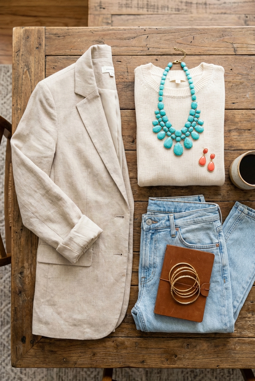
Picture Gallery


