Layered Neutrals For Cozy Fall Aesthetics
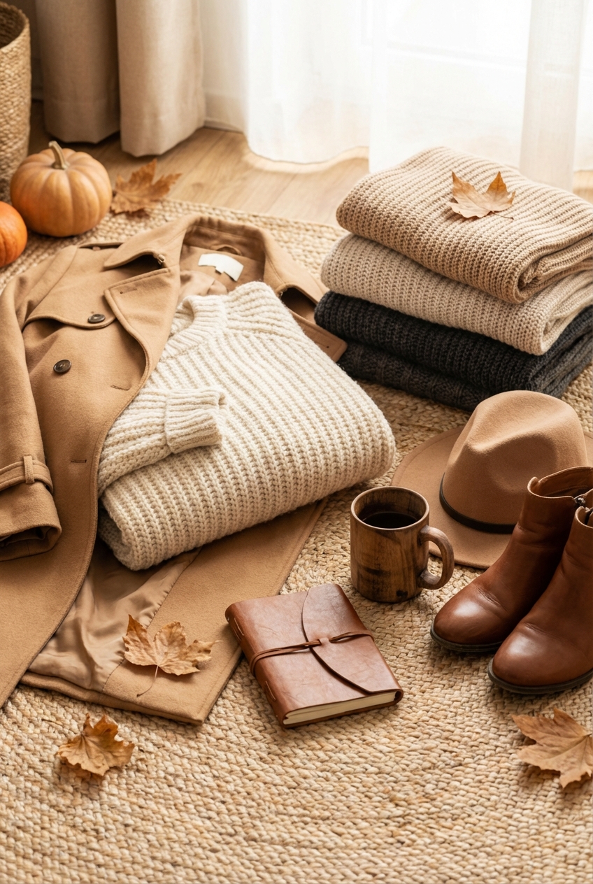
As we transition from summer into the cooler months, my mind immediately goes to the concept of the capsule wardrobe. In fashion, we know that a monochromatic look in shades of oatmeal, camel, and cream is the epitome of “quiet luxury.” It looks expensive not because it is loud, but because the cuts are precise and the materials are lush. The exact same principle applies to your home interiors.
Creating a cozy fall aesthetic isn’t about tossing a few orange pumpkins on the porch and calling it a day. It is about translating the feeling of a cashmere sweater or a wool trench coat into your living space. We are looking for depth, warmth, and a tactile experience that makes you want to curl up and stay awhile. It requires a sophisticated approach to layering textures, managing lighting, and selecting the right “whites” that don’t feel sterile.
I have spent years curating spaces that feel both high-end and lived-in, and the secret always lies in the mix. In this guide, I will walk you through exactly how to build a layered neutral palette that feels rich rather than boring. If you are looking for visual inspiration to bring these concepts to life, please note that the Picture Gallery is at the end of the blog post.
1. The Foundation: Selecting Your “Greige”
In fashion, we know that “nude” is not a single color; it is a spectrum. The same applies to neutrals in interior design. If you paint a room stark white and fill it with grey furniture, you don’t get cozy; you get clinical. To achieve that warm, enveloping fall feeling, we need to lean into warm undertones.
I always start with the walls. For a fall refresh, you want a paint color that changes with the light. I prefer “greige” (grey-beige) or warm off-whites that have a yellow or pink base, rather than a blue base. A blue-based white will feel cold, especially as the winter sun gets lower in the sky.
Designer’s Note: The Paint Swatch Rule
Never trust a paint chip in the store. The lighting there is fluorescent and lies to you. Buy a sample pot and paint a large 2-foot by 2-foot square on two different walls in your room: one that gets direct light and one that stays in shadow. Watch how the color changes over 24 hours before committing.
Common Mistakes + Fixes
- The Mistake: Matching everything perfectly. You buy a beige sofa, beige rug, and beige walls that are all the exact same shade.
- The Fix: Tone-on-tone variance. If your sofa is a deep oatmeal, your walls should be a lighter cream, and your rug should perhaps be a darker taupe. You need contrast within the same color family to create dimension.
2. The Fabric Mix: Texture is Key
When you remove bold colors from a room, texture becomes the most important element. Without texture, a neutral room falls flat. Think of an all-black outfit: it works because you mix a leather jacket with denim jeans and a silk camisole. The interest is in the light reflection and absorption.
For fall, we want heavy, tactile fabrics. I love introducing boucle, mohair, velvet, and heavy linens. These fabrics physically hold heat and visually soften the hard edges of architecture and furniture frames.
What I’d Do in a Real Project:
If I am styling a living room for autumn, I immediately swap out the throw pillows. I follow a specific formula for a standard sofa:
- Back Layer: Two 24-inch square pillows in a solid, heavy texture (like velvet).
- Middle Layer: Two 22-inch square pillows with a subtle pattern or weave (like a thick wool blend).
- Front Layer: One rectangular lumbar pillow in a statement texture (like shearling or boucle).
This “2-2-1” formation creates a luxurious, sinking-in look that mimics the layers of high-end fall fashion.
3. Rug Layering: Grounding the Space
Flooring is the shoes of the room. You wouldn’t wear flimsy flip-flops with a trench coat, so don’t let your floors look cold and bare. Layering rugs is one of my favorite styling tricks to add instant coziness and define a zone within an open-plan space.
The base layer should be a natural fiber rug, such as jute or sisal. These provide a rough, organic texture and are generally durable. They should be large enough to encompass all your furniture. A common rule of thumb is that at least the front feet of all seating furniture should sit on the rug.
The “Vintage” Topper
On top of the natural fiber rug, place a smaller, softer rug. This could be a vintage Turkish rug with faded neutral patterns, a faux hide, or a high-pile Moroccan wool rug. This top layer adds softness underfoot where you actually sit and rest your feet.
Measurement Guide for Layering
- Base Rug: Usually a 9×12 or 8×10 for a standard living room. It needs to provide a border of about 12 to 18 inches off the wall.
- Top Rug: Should be roughly two sizes down. If the base is 9×12, the top rug works well as a 5×8 or 6×9.
- Placement: Center the top rug under the coffee table, ensuring it floats in the middle of the base rug with visible borders of the jute showing on all sides.
4. Lighting: The Jewelry of the Room
As the days get shorter, lighting becomes the single most critical factor in how a room feels. Overhead lighting (the “big light”) is the enemy of cozy aesthetics. It creates harsh shadows and flattens your beautiful neutral textures.
You need to think about lighting in layers: ambient, task, and accent. For a cozy vibe, we want warm light. Check your lightbulbs; you want a color temperature of 2700K (Kelvin). Anything higher than 3000K will look like a dentist’s office.
The Triangle of Light Rule
In any room, try to have at least three sources of light at eye level, forming a loose triangle around the seating area. This might include:
- A floor lamp next to a reading chair.
- A table lamp on a side table.
- A picture light or sconce on the wall.
When these are illuminated simultaneously, they create a warm perimeter that draws people into the center of the room. It feels intimate and safe, which is exactly the psychological effect we want in autumn.
5. Organic Elements: Bringing the Outdoors In
Neutrals can feel synthetic if you aren’t careful. To ground the space, you must introduce organic materials. Wood tones act as a neutral color but add necessary warmth. Whether it is a walnut coffee table, oak flooring, or a teak side stool, wood is essential.
For fall styling, dry botanicals are a fashion-forward alternative to fresh flowers. They last all season and provide sculptural interest. I love styling with oversized branches. Go to your backyard or a local florist and find tall branches with turning leaves or interesting bark.
Styling the Coffee Table
Your coffee table is a major focal point. Here is a foolproof formula for styling it:
- Something Flat: A stack of large coffee table books (fashion or architecture books work best).
- Something Tall: A vase with dried hydrangeas or branches.
- Something Sculptural: A stone bowl, a wooden chain link, or a ceramic object.
- Something flickering: A candle in a textured vessel (alabaster or concrete).
Group these items using a tray to contain them, or arrange them in an asymmetrical grid. The goal is to have varying heights to keep the eye moving.
6. Practical Constraints: Kids, Pets, and Real Life
I hear this constantly: “I love the layered neutral look, but I have a golden retriever and a toddler. I can’t do white.”
As a designer, I challenge that. You can do neutrals, but you have to choose the right neutrals. You cannot buy a linen sofa if you have a chocolate-loving toddler. However, fabric technology has come a long way. This is where we merge high fashion with high function.
Performance Fabrics
Look for “performance” fabrics when buying upholstery. Brands like Crypton or Sunbrella make fabrics that look like linen or velvet but repel liquids. Red wine rolls right off. If you are renting or on a budget, slipcovers are your best friend. A white denim slipcover can be bleached, making it cleaner than a brown sofa that hides dirt.
Rug Durability
If you have pets, avoid loop-pile rugs (like berber) as claws will snag them. Cut-pile wool is naturally stain-resistant due to the lanolin in the fibers. Synthetic blends (polypropylene) are excellent for high-traffic areas as they can often be scrubbed vigorously without damage.
Renter-Friendly Hacks
If you hate your rental floors, use large area rugs to cover 80% of the surface. If you can’t paint walls, focus on window treatments. Hanging heavy, neutral velvet curtains floor-to-ceiling covers a lot of vertical space and instantly warms up a room without losing your security deposit.
Finish & Styling Checklist
Before you consider your room “finished” for the season, run through this quick checklist to ensure you have hit all the sensory notes.
- The Squish Test: Sit on your sofa. Do you sink in? If your pillows are flat, replace the inserts with feather-down or a down-alternative that is 2 inches larger than the pillow cover.
- The Lighting Check: Turn off the overhead lights at 5:00 PM. Is the room bright enough to read a book using only lamps? If not, add one more table lamp.
- The Texture Scan: Look around the room. Do you have at least three distinct textures (e.g., wood, wool, metal)? If everything is smooth, add a chunky knit throw.
- The Scent Layer: Design isn’t just visual. A cedar, sandalwood, or amber scented candle adds an invisible layer of “fall” to the room.
- Window Treatments: Ensure your curtains touch the floor or “kiss” it. Floating curtains (high-water pants for your windows) make a room look cheap and unfinished.
FAQs
How do I keep a neutral room from looking boring?
Contrast is the answer. Use high-contrast neutrals. Pair a very pale cream with a deep charcoal or a rich chocolate brown. Also, focus on sculptural shapes. If the colors are quiet, the furniture shapes should be interesting and conversational.
Can I mix gold and silver metals?
Absolutely. In fashion, we mix metals all the time. The key is to have a dominant metal (say, unlacquered brass for warmth) and an accent metal (matte black or polished nickel). Avoid using a 50/50 split. A 70/30 ratio usually feels most intentional.
What is the best way to transition this look into Winter/Holiday?
The beauty of a neutral base is its versatility. To transition to winter, you simply swap the dried branches for evergreen clippings and add more metallic accents (brass candlesticks, silver bowls). The foundation remains the same; you just accessorize differently.
My room is small. Will layers make it feel cluttered?
Not if you keep the color palette tight. Visual clutter often comes from too many colors fighting for attention. Monochromatic layering actually expands a space because the eye flows uninterrupted. Stick to larger, fewer pieces rather than many small knick-knacks.
Conclusion
Creating a layered neutral aesthetic for fall is about more than just chasing a trend. It is about curating an environment that supports your well-being. Just as putting on a structured coat and a soft scarf makes you feel put-together and protected against the elements, dressing your home in layers of texture and warm light creates a sanctuary.
Don’t be afraid to mix high and low, or to prioritize comfort alongside style. The most chic interiors are the ones that look effortless, inviting you to drop your keys, take off your shoes, and exhale. By focusing on tactile materials, warm lighting, and a cohesive palette, you can achieve a space that feels as luxurious as your favorite fall ensemble.
Picture Gallery


