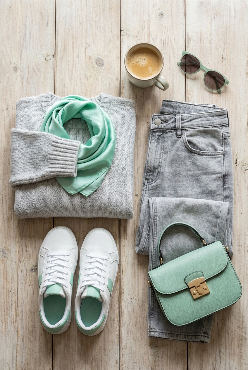
Light Grey And Mint Green Combinations For Fresh Looks A Perfect Blend Of Sophistication And Softness
In the world of high fashion, we often talk about the “capsule wardrobe”—that perfect foundation of neutrals that allows statement pieces to shine. When translating runway sensibilities to interiors, light grey acts as that impeccably tailored cashmere sweater. It is versatile, timeless, and provides a quiet textural backdrop. Mint green, then, is the silk scarf or the structured handbag that breathes life into the ensemble. It offers a whisper of color that feels fresh without screaming for attention.
I recall a specific project for a client who worked in editorial fashion. She was terrified of color, having lived in stark white apartments her whole life, but she felt her home lacked “soul.” We introduced a pale, dove grey as the primary canvas and layered in varying textures of mint—from velvet cushions to a lacquered side table. The result wasn’t just a room; it was a mood. It felt serene, expensive, and incredibly curated.
This color pairing works because it balances temperature. The cool, crisp nature of mint cuts through the potential muddiness of grey, while the grey grounds the mint so it doesn’t drift into “nursery” territory. It is a sophisticated dance of softness and structure. If you are looking for visual inspiration to guide your own renovation, I have curated a stunning Picture Gallery at the end of the blog post.
The Foundation: Understanding Undertones and Lighting
Before buying a single can of paint or swatch of fabric, you must understand the “fabric” of your room: the light. Just as a dress looks different in a dressing room than it does on the street, mint green and light grey shift dramatically based on natural and artificial light.
Light grey is rarely just grey. It usually carries blue, green, or violet undertones. To make this combination work, I almost always opt for a “cool grey” with blue undertones. If you choose a “warm grey” (greige) that leans yellow or beige, the mint green can start to look sickly or clash. You want the grey to feel like a crisp cloud, not a sandy beach.
Lighting temperature is the accessory that makes or breaks this look. For this palette, stick to bulbs in the 3000K (soft white) range. Anything cooler (4000K+) will make the room feel like a hospital, while anything warmer (2700K) will turn your lovely mint green into a muddy yellow-green.
Designer’s Note: The 50% Rule
When testing paint colors, never paint a swatch directly on the wall. The existing wall color will distort your perception. Instead, paint a large poster board, leaving a white border. Move this board around the room for 24 hours to see how the grey and mint interact in morning sun versus evening lamps.
The Living Room: Creating a Tailored “Day Look”
In the living room, we treat the furniture arrangement like a well-structured suit. The sofa is the jacket—the main event. A light grey sofa in a performance fabric (like a crypton linen weave) is practical for families but looks high-end. It hides lint and pet hair far better than charcoal or white.
Introduce mint green through “accessories” rather than the main pieces. Think of two accent chairs upholstered in a mint mohair or velvet. The texture difference is key here. If the grey sofa is a flat weave, the mint chairs need sheen or pile. This creates depth.
The Rule of Scale and Spacing
For a sophisticated look, your rug needs to be large enough. A common mistake is a “postage stamp” rug. All front legs of your furniture should sit on the rug. If your room is standard sized, an 8×10 or 9×12 rug is usually required. In this palette, I prefer a grey rug with a subtle geometric pattern or a vintage-wash Oushak that incorporates hints of mint and cream.
Coffee Table Clearance
Functionality is luxury. Ensure you have 14 to 18 inches between the edge of your sofa and the coffee table. This is enough legroom to be comfortable but close enough to set down a drink without leaning forward awkwardly.
The Kitchen: The Culinary Catwalk
Kitchens are shifting away from the all-white trend, and light grey cabinetry is the perfect successor. It feels cleaner and more modern. However, we can use mint to create a “jewelry box” effect.
I recommend using light grey for the perimeter cabinets and reserving mint green for the island. This grounds the space while adding a focal point. If you aren’t doing a full renovation, painting just the island is a weekend project that transforms the room.
Hardware as Jewelry
The metal finish you choose changes the entire vibe.
- Polished Nickel: Creates a cool, icy look. Very modern and sharp.
- Unlacquered Brass/Gold: Adds warmth. This is my preferred choice for this palette. The gold pops against the mint and warms up the grey, making the kitchen feel lived-in and luxe.
Common Mistakes + Fixes
Mistake: Using a dark granite countertop with this light palette. It creates a visual black hole.
Fix: Opt for quartz or marble with grey veining. You want the surface to reflect light, keeping the “fresh” aesthetic intact.
The Bedroom: Layering for Serenity
In the bedroom, softness is the priority. We are moving away from the structured look of the living room into something more draped and relaxed. Here, the walls can take on the color.
A very pale, dusty mint paint on the walls induces calm. It is scientifically proven that green reduces anxiety, making it ideal for sleeping quarters. To prevent it from feeling juvenile, keep the ceiling a crisp bright white and the trim a high-gloss light grey. This subtle contrast is incredibly chic.
Bedding Layers
Treat your bed like a couture gown. Start with crisp white sheets—always. Then, layer a light grey duvet cover. Finally, add a chunky knit throw in mint at the foot of the bed.
The Nightstand Rule
For a polished look, your nightstand should be level with the top of your mattress, or up to 2 inches higher. Never lower. It looks visually unbalanced and is annoying to reach. With mint walls, opt for white oak or light grey painted nightstands to keep the palette cohesive.
The Bathroom: A Spa-Like Retreat
Small spaces like powder rooms or bathrooms are where you can take bigger fashion risks. Because you don’t spend hours here, you can be bolder with your mint saturation.
I love using a vertical stack bond tile layout (where rectangular tiles are stacked directly on top of each other rather than staggered). Use a glossy mint tile in the shower or as a vanity backsplash. It feels retro yet modern.
The Vanity
A light grey vanity with a marble top is timeless. To elevate it, swap the standard mirror for something with a unique shape—an arch or a pill shape—framed in brass.
What I’d Do in a Real Project
If this were my client’s bathroom, I would install wainscoting on the bottom third of the wall painted in semi-gloss light grey. Above that, I would use a wallpaper that features botanical prints in mint and cream. It adds pattern and movement without overwhelming the small space.
Outdoor Living: Bringing the Runway Outside
Interior design doesn’t stop at the back door. The light grey and mint palette is naturally reflected in landscape design, creating a seamless transition from indoors to outdoors.
For the “grey” element, look to hardscaping. Bluestone pavers or weathered teak furniture naturally turn a beautiful silver-grey over time. Concrete planters are also excellent, affordable options that fit the aesthetic.
The Botanical Mint
You don’t paint plants, but you select them. “Lamb’s Ear” is a favorite of mine; it has fuzzy, soft leaves that are a perfect dusty mint-grey. Eucalyptus, Lavender, and certain varieties of Hosta also provide that cool, blue-green foliage that mimics mint.
Styling the Patio
Use outdoor rugs in grey tones to define the seating area. Add mint green outdoor cushions. Just ensure the fabric is solution-dyed acrylic (like Sunbrella) so the mint doesn’t fade to white in the sun.
Finish & Styling Checklist
When executing this look, keep this “cheat sheet” handy to ensure you stay on the path of high-end design rather than mismatched chaos.
Materials & Textures
- Velvet & Mohair: Use for mint accents to add depth.
- Linen & Wool: Use for grey foundational pieces (sofas, rugs) for durability.
- Metals: Unlacquered brass or brushed gold adds necessary warmth. Polished chrome keeps it cool.
- Wood Tones: White oak or bleached walnut works best. Avoid red-toned woods like cherry or mahogany, as they clash with mint.
Proportions & Layout
- The 80/20 Rule: The room should be roughly 80% neutrals (grey, white, wood) and 20% mint green.
- Curtains: Hang them high and wide. The rod should be 4-6 inches above the window frame (or at the ceiling) and extend 8-12 inches past the frame on each side. Use light grey linen curtains to frame the view.
- Rug Size: When in doubt, go bigger. A rug that is too small makes the room look cheap.
FAQs
Is mint green too trendy? Will I get tired of it?
Mint had a moment in the 50s and is having one now, but it is considered a “near-neutral” when used in dusty, muted tones. To ensure longevity, keep your expensive items (tile, sofa, flooring) in light grey or white. Use mint for paint, throw pillows, and art—things that are easy and affordable to change in five years if your tastes shift.
How do I keep light grey furniture clean with kids or pets?
This is the number one concern I hear. The answer is fabric selection, not color selection. You must choose “performance fabrics.” Look for solution-dyed acrylics or crypton fabrics. Liquids bead up on these surfaces rather than soaking in. Also, choose a grey that has a “heathered” weave (multiple tones woven together) rather than a solid flat color; it hides stains much better.
Can I mix other colors with grey and mint?
Yes, but be selective. Navy blue is a stunning third color for a more masculine or nautical look. Blush pink creates a very soft, feminine “pastel” vibe. For a high-fashion edge, a touch of black (in picture frames or lamp bases) adds necessary contrast and grounds the airy colors.
Conclusion
Adopting a light grey and mint green palette is much like building a wardrobe of high-quality basics with signature accessories. It requires an eye for undertones, a dedication to texture, and the restraint to know when enough is enough.
By grounding your space in sophisticated greys and lifting it with airy mints, you create a home that feels open, clean, and undeniably stylish. It is a look that breathes. It doesn’t demand attention with loud shouting; it commands it with a whisper.
Treat your home with the same care you would a fine garment. Check the lighting, feel the fabrics, and ensure the fit—the layout—is tailored to your life. When you get the balance right, the result is timeless.
Picture Gallery


