Mastering Color Blocking Bold Combinations To Make Your Outfit Stand Out
There is a moment in every fashion lover’s journey when they look at their wardrobe—likely a sea of safe neutrals, black blazers, and denim—and decide they crave something more. I remember my first real styling gig in New York; the client had a closet full of greige and wanted to feel “powerful.” We didn’t buy a new suit; we simply introduced a cerulean blue belt over a navy dress and paired it with rust-colored boots. The shift in her energy was palpable.
Color blocking is not just about wearing bright clothes; it is a strategic method of styling that uses distinct blocks of solid color to shape the body and dictate the mood of an outfit. It requires a distinct understanding of the color wheel, but more importantly, it requires the confidence to be seen. When done correctly, it elevates your look from “getting dressed” to “curating an ensemble.”
If you are ready to step away from the safety of monochrome black and embrace the vibrancy of the spectrum, you are in the right place. For those who want visual inspiration, I have curated a stunning Picture Gallery at the end of the blog post.
Understanding the Color Wheel: The stylist’s toolkit
Before you can break the rules, you have to master the fundamentals. In high-end styling, we don’t guess which colors go together; we use the color wheel as our architectural blueprint. This ensures that the boldness looks intentional, not accidental.
There are three primary methods I use when color blocking for clients. The first is “Monochromatic Blocking.” This is the safest entry point. You take one hue—say, emerald green—and wear different shades and textures of that same color. Think of a mint sweater paired with a dark forest green skirt. It lengthens the body and looks incredibly chic.
The second method is “Analogous Blocking.” This involves pairing colors that sit next to each other on the color wheel. Red and pink is the most classic fashion example of this. It feels harmonious to the eye but offers much more depth than a single shade. It creates a low-contrast look that is vibrant without being jarring.
The third, and most daring, is “Complementary Blocking.” This pairs colors directly opposite each other on the wheel, like blue and orange or purple and yellow. This creates high contrast and high energy. The trick here is managing saturation; if you choose a neon blue, you need a neon orange. If you choose a pastel purple, pair it with a buttery pastel yellow.
Proportions and The Rule of Thirds
One of the biggest misconceptions about color blocking is that it simply means wearing a red shirt and blue pants. As a stylist, I can tell you that splitting your body in half with a hard color line is rarely flattering. It visually cuts you in two and can make you look shorter.
Instead, we apply the “Rule of Thirds.” This is a golden ratio in fashion. Your outfit should be broken into a 1:2 ratio. For example, high-waisted trousers (taking up 2/3 of your visual length) paired with a tucked-in blouse (1/3 of your visual length).
When you color block, apply the bolder or brighter color to the area you want to highlight, and the darker or deeper block to the area you want to streamline. If you are wearing a bright fuchsia wide-leg trouser (the 2/3 block), pair it with a sleek, fitted navy bodysuit (the 1/3 block). This maintains a long, lean vertical line while still delivering that punch of color.
Texture is the Secret Ingredient
When you are working with solid blocks of color, the fabric becomes the star of the show. If you wear a cotton red shirt with cotton blue pants, the outfit can look flat or even costume-like. In luxury fashion, we use texture to break up the light and add sophistication.
Mixing materials elevates the color blocking instantly. Try pairing a chunky wool knit in mustard yellow with a sleek, liquid-satin skirt in violet. The contrast between the matte, heavy wool and the shiny, fluid satin adds a tactile dimension that makes the colors sing.
Leather is another excellent texture for blocking because it holds dye with a unique richness. A burgundy leather skirt has a weight and sheen that cotton simply cannot replicate. Pairing that with a sheer silk chiffon blouse in blush pink creates a tension between “hard” and “soft” that makes the outfit look expensive.
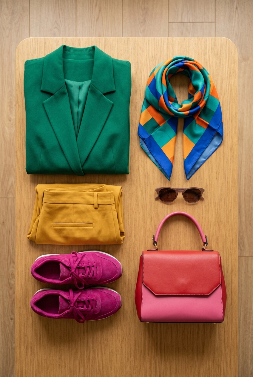
Accessories as Color Anchors
You do not need to wear head-to-toe color to master this trend. In fact, some of the most sophisticated color blocking happens through accessories. This is often the best strategy for a corporate environment where a neon suit might be too aggressive.
Think of your accessories as punctuation marks. You might wear a beautifully tailored camel suit—a neutral base—and block it with electric blue pumps and a matching structured bag. The accessories become the color blocks against the neutral canvas.
Another high-impact, low-risk strategy is the “sandwich method.” This is where your shoes match your top, “sandwiching” a different colored bottom. For instance, a cherry red blouse, grey trousers, and cherry red heels. This ties the look together cohesively and looks incredibly purposeful styling-wise.
Navigating Saturation and Temperature
A common error I see in DIY color blocking is mixing “temperatures” indiscriminately. Colors generally have cool undertones (blues, silvers, icy greens) or warm undertones (golds, oranges, warm reds).
While you can mix warm and cool, it is advanced territory. For a harmonious look, stick to one temperature family. Pair a warm tomato red with a warm sunny yellow. Pair a cool icy blue with a cool lavender. This ensures the colors vibrate on the same frequency.
Saturation—the intensity of the color—is equally important. You generally want to pair muted tones with other muted tones (jewel tones with jewel tones, pastels with pastels). A “dusty” rose pink will look washed out and accidental next to a neon lime green. However, it will look stunning next to a sage green or a terracotta, as they share the same level of muted intensity.
The Neutral Breaker
Sometimes, two bold colors fighting for attention can be overwhelming to the eye. This is where we introduce a “neutral breaker.” This is a third element that separates the bold colors, giving the eye a place to rest.
White, black, denim, and camel are your best friends here. Let’s say you want to wear a bright orange blazer and hot pink trousers. That is a lot of look. By adding a crisp white t-shirt underneath the blazer, you break up the intensity near the face and add a fresh, modern element.
Denim acts as a supreme neutral in modern fashion. A Canadian tuxedo (denim shirt and jeans) can actually serve as a base block for bright accessories. Alternatively, blue jeans can ground a very loud top, allowing you to color block with your shoes and bag instead of your main garments.
Designer’s Note: The “Skin Tone” Factor
Here is a lesson from the fitting room that I learned the hard way early in my career. I once styled a client in a stunning chartreuse and magenta combination. On the hanger, it was editorial perfection. On her, it was a disaster. Why? The chartreuse was too close to her skin’s olive undertones, making her look sickly.
The Lesson: When color blocking, the color closest to your face matters the most. It reflects light onto your skin.
If you love a color that doesn’t love you back (like mustard yellow on certain complexions), wear it as the bottom block (skirt or trousers) or as an accessory. Keep the colors that make you glow—usually jewel tones or specific pastels—near your face. Always check your outfit in natural daylight before leaving the house; artificial store lighting lies.
Common Mistakes + Fixes
Mistake: The “Traffic Light” Effect
This happens when you wear three distinct, highly saturated primary colors (like Red, Yellow, and Green) in equal proportions. It looks like a costume.
The Fix: Limit your outfit to two main bold colors and let the third be a neutral or a different shade of one of the main colors. Alternatively, vary the proportions so one color is dominant.
Mistake: Ignoring the Shoe Color
People often put immense effort into blocking their clothes and then throw on a pair of basic black boots that drag the whole look down visually.
The Fix: Use “nude” shoes that match your skin tone to elongate the leg, or choose a shoe color that is present in the outfit (or complementary to it). A metallic shoe (gold or silver) often works better than black as a neutral in colorful outfits.
Mistake: Over-Accessorizing
Color blocking is a loud statement. Adding heavy jewelry, patterned scarves, and hats can make the look chaotic.
The Fix: Let the color be the jewelry. Keep actual jewelry minimal—simple gold hoops or a delicate chain. Avoid prints when you are first starting out with blocking; solid colors are much easier to control.
What I’d Do in a Real Styling Project
If I were styling you for a spring event and we decided on color blocking, here is the exact mental checklist and process I would follow:
- Assess the “Hero” Piece: I would ask you to pick the one colorful item in your closet you love but rarely wear. Let’s say it’s a pair of wide-leg lavender trousers.
- Consult the Wheel: I would look at the color wheel. For a soft look, I’d find a mint green silk camisole (split-complementary). For a bold look, I’d grab a canary yellow structured top.
- Check the Fabric Weight: I would ensure the top isn’t heavier than the pants. Heavy bottoms and lighter tops create a balanced silhouette.
- Define the Waist: I would ensure the top is tucked in or cropped to maintain that 1/3 to 2/3 ratio. If the waist looks undefined, I’d add a belt in a shade darker than the trousers (deep purple).
- Select the Shoe: If you are petite, I’d choose a nude heel to extend the leg line. If you are tall, I might choose a mint green shoe to bookend the outfit with the top.
- Final Edit: I would have you stand back. If the outfit feels too “sweet,” I would throw a structured white blazer over the shoulders to add a sharp, architectural edge.
Finish & Styling Checklist
Before you head out the door, run through this final check to ensure your look is polished and cohesive.
- The Squint Test: Look in the mirror and squint your eyes. Do the blocks of color look balanced, or is one section overwhelming the rest?
- The Wrinkle Check: Solid blocks of color show wrinkles much more aggressively than prints do. Steam your garments perfectly.
- Undergarment Check: Ensure your undergarments are nude (matching your skin tone), not white. Bold colors can be slightly sheer, and visible bra lines ruin the clean aesthetic of color blocking.
- Grooming Anchor: A bold lip can often balance a bold outfit. If you are wearing strong colors, a “bare” face might look washed out. A swipe of lipstick or defined brows helps your face stand up to the clothes.
FAQs
Can I color block if I am petite?
Absolutely. The key for petite frames is “Column Dressing.” Try monochromatic blocking (different shades of the same color) to create a single vertical line. If you do contrast blocking, keep the waistline high to elongate your legs. Avoid horizontal blocks at the widest part of your calves.
Is color blocking professional enough for the office?
Yes, but you must play with the saturation. Instead of neon pink and orange, try deep burgundy and navy, or camel and forest green. These are classic, authoritative colors that still offer the visual interest of blocking without breaking dress codes.
Can I mix prints with color blocking?
Yes, this is advanced styling. The rule of thumb is that the solid block of color should match one of the minor colors within the print. If you have a floral skirt with tiny flecks of red, pair it with a solid red top. This pulls the look together.
What is the best color combination for beginners?
Pink and Red. It is universally flattering, high-fashion, and very difficult to mess up. Another great entry point is Navy and Black—yes, you can wear them together! It is a very chic, French-girl approach to blocking.
Conclusion
Mastering color blocking is less about memorizing a textbook and more about training your eye to see possibilities beyond the mannequin. It is a declaration of confidence. It says you are not afraid to take up space and capture attention.
Start small. Maybe tomorrow you wear your usual beige trench coat, but you pair it with an electric blue bag and matching scarf. Maybe next week, you try the pink and red combination. Fashion is intended to be a playground, not a prison of rules. Use the color wheel as your map, but let your personal taste be the compass.
Picture Gallery


