Mixing Soft Lavender And Deep Charcoal In Casual Looks
In the world of high-end fashion, few things are as satisfying as the juxtaposition of a structured, masculine wool coat layered over a delicate, ethereal silk slip dress. It is that tension between the hard and the soft, the moody and the light, that creates a truly memorable style moment. When we translate this concept to interior design, mixing soft lavender and deep charcoal offers that same level of sophisticated contrast. It takes the casual home environment and elevates it into something tailored yet incredibly relaxing.
For years, I have watched clients shy away from purple tones, fearing their living room might end up looking like a nursery or a teenager’s bedroom. However, when you anchor a whisper-light lavender with a grounding, substantial charcoal gray, the narrative changes completely. The charcoal acts as the “little black dress” of the room—timeless, slimming, and forgiving—while the lavender acts as the statement accessory that brings personality and freshness.
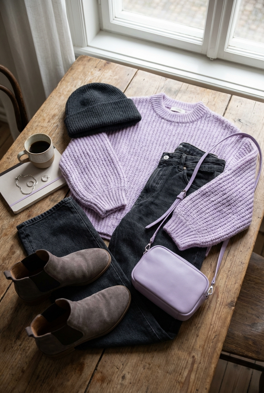
This color pairing is particularly effective for casual spaces because it balances cozy depth with airy brightness. It works just as well in a sun-drenched coastal rental as it does in a moody city apartment. Make sure to browse the curated Picture Gallery at the end of this blog post for visual inspiration.
The Philosophy of The Palette
Before we start moving furniture, we need to understand why this specific combination works on a color theory level. Lavender is essentially a tint of violet, sitting opposite yellow on the color wheel. This makes it inherently calming. Charcoal, on the other hand, is a shade of black often softened with blue or brown undertones.
When you put them together, you create a “high contrast, low chroma” environment. The contrast draws the eye, but because the lavender is desaturated (grayed out) and the charcoal is matte, the result is soothing rather than jarring.
Designer’s Note: The “Easter Egg” Mistake
The most common error I see is choosing a lavender that is too saturated or “candy-colored.” In fashion, we call this the difference between a neon pastel and a dusty pastel. For interiors, you want a lavender that has a significant amount of gray in it. When you hold the paint chip against a white sheet of paper, it should look almost gray until you put it next to the charcoal. If it screams “purple” immediately, it is likely too bright for a sophisticated, casual look.
Anchoring the Living Room
In a casual living space, comfort is king. The easiest way to introduce this palette is through the largest piece of furniture in the room: the sofa. A deep charcoal sofa is arguably the most practical investment you can make. It hides denim dye transfer, pet hair, and the occasional wine spill far better than beige or cream ever could.
Once you have the charcoal sofa, you layer in the lavender through textiles. Think of this like accessorizing a suit. You wouldn’t wear a lavender suit with a charcoal shirt; you wear the charcoal suit with the lavender silk scarf.
Rug Sizing and Placement
To keep the look casual but high-end, the rug needs to be expansive. A postage-stamp rug makes a room feel cheap and disjointed.
The Rule: Your rug should be large enough that at least the front two legs of your charcoal sofa sit on it.
The Measurement: Ideally, the rug should extend 6 to 10 inches past the ends of the sofa on both sides.
The Look: I recommend a vintage-wash rug that incorporates both charcoal and cream, or a solid textured wool rug in a soft heather gray. Avoid a solid lavender rug here; it grounds the room incorrectly.
Coffee Table Spacing
Functionality is key in casual spaces. Ensure you have 14 to 18 inches of clearance between the edge of your charcoal sofa and your coffee table. This is close enough to set down a drink but far enough to walk through without hitting your shins.
A Moody Yet Soft Bedroom Sanctuary
The bedroom is where you can take more risks with the “soft” side of this equation. While I usually advise against lavender walls in main living areas, a bedroom can handle a dusty lavender wall beautifully, provided the finish is matte.
If painting the walls feels too permanent, flip the script. Use a charcoal wall paint behind the bed to create a focal point. Dark walls recede visually, which can actually make a small bedroom feel larger and more infinite.
Bedding Layers
Treat your bed like an outfit.
1. Base Layer: Crisp white or very pale gray sheets.
2. Middle Layer: A charcoal duvet cover in washed linen. Linen offers a relaxed, casual texture that prevents the dark color from feeling too severe.
3. Top Layer: A chunky knit throw or a quilt in soft lavender folded at the foot of the bed.
Lighting Considerations
Lighting changes everything with this palette. Charcoal absorbs light (it has a low Light Reflectance Value), while lavender reflects it.
Color Temperature: Use bulbs with a temperature of 2700K to 3000K. This warm white light keeps the charcoal from looking cold and blue, and it keeps the lavender from looking sickly gray.
Wattage: Because of the dark elements, you may need to increase your lumen output. Aim for at least 800 lumens per lamp in a room with charcoal walls.
Kitchens and Dining Spaces
We are seeing a massive shift away from all-white kitchens toward moodier cabinetry. Charcoal lower cabinets with white uppers is a fantastic way to ground a kitchen. It feels architectural and tailored.
Where does the lavender come in? In the kitchen, keep it impermanent. A lavender glazed ceramic bowl on the counter, lavender tea towels, or even fresh lilac stems when in season.
Dining Chairs and Durability
For a casual dining area, consider dining chairs upholstered in a charcoal performance velvet. Velvet is surprisingly durable and cleans easily with water if it is a synthetic blend.
Clearance Rule: Allow 24 to 30 inches of width per person at the dining table to avoid elbow wars during dinner.
Walkways: Ensure there is at least 36 inches of clearance behind occupied chairs so people can slip past behind guests.
Texture is the Secret Ingredient
In fashion, wearing a monochromatic outfit works because of texture. Leather, wool, silk, and cotton mix to create interest. The same applies here. A flat charcoal wall with a flat charcoal sofa and flat lavender pillows will look one-dimensional and dull.
You need to mix materials to make the “casual” vibe feel expensive.
Velvet: Use deep charcoal velvet for a touch of luxury and light absorption.
Linen: Use lavender linen for curtains or throw pillows. The slubby texture of linen makes the pastel feel grown-up and relaxed.
Metal: Matte black hardware disappears into charcoal, while brushed brass warms up the lavender. I usually prefer brushed brass or warm nickel with this palette to prevent it from feeling too cold.
Wood: Walnut wood tones bridge the gap perfectly. The warmth of the wood cuts through the coolness of the gray and purple.
Practicality for Real Life (Pets, Kids, Renters)
One of the reasons I champion this palette for families and pet owners is the forgiveness factor.
The Pet Factor
If you have a dog or cat, charcoal upholstery is a lifesaver. It hides shadows and dirt. However, if you have a white shedding pet, you might want to opt for a heathered charcoal fabric (a weave with light and dark threads) rather than a solid dark color, as it disguises hair better.
Renter-Friendly Solutions
If you are renting and stuck with “landlord beige” walls, you can still execute this look.
Curtains: Hang floor-to-ceiling charcoal curtains. To make the window look larger and the ceiling higher, install the rod 4 to 6 inches above the window frame (if allowed) or use tension rods inside the frame if not.
Art: Use large-scale art with heavy charcoal matting or black frames to introduce the dark tones without painting.
Slipcovers: If you have a generic sofa, buy a loose-fit linen slipcover in charcoal. The loose fit adds to that “casual luxury” aesthetic we are aiming for.
Common Mistakes + Fixes
Even with a great palette, things can go wrong. Here are the most frequent issues I see in client homes and how to correct them quickly.
Mistake 1: The room feels too dark and cave-like.
The Fix: You likely have too much charcoal and not enough reflective surfaces. Add a large mirror opposite a window. Introduce metallic accents in brass or silver. Swap heavy curtains for sheer lavender-tinted white ones.
Mistake 2: The lavender looks like a child’s playroom.
The Fix: You missed the “dusty” requirement. If you can’t change the item, layer a gray throw over it to mute the color. Ensure your lighting is warm (2700K), which tends to neutralize the blue tones in purple.
Mistake 3: The room feels disjointed.
* The Fix: You need a “bridge” fabric. Find a pillow or a piece of art that contains both the specific shade of charcoal and the specific shade of lavender you are using, along with a third neutral like cream. This ties the two distinct colors together.
What I’d Do: A Project Checklist
If I were styling a living room for a client tomorrow using this palette, this is the exact workflow I would follow.
1. The Shell: Paint walls a soft, warm white (like Benjamin Moore Swiss Coffee) to keep it airy, or commit to a charcoal accent wall for drama.
2. The Anchor: Select a sofa in a dark charcoal performance fabric.
3. The Grounding: Lay down a large rug (9×12 for most standard living rooms) in a heathered gray or vintage pattern.
4. The Softness: Add two large (22-inch) square pillows in charcoal velvet to the corners of the sofa.
5. The Accent: Layer two slightly smaller (20-inch) pillows in dusty lavender linen in front of the velvet ones.
6. The Lumbar: Add a long lumbar pillow in a pattern that mixes cream, charcoal, and a hint of lavender.
7. The Warmth: Introduce a walnut coffee table and a brass floor lamp.
8. The Life: Place a large green plant (like a Ficus or Monstera) in a charcoal pot. Greenery is essential to stop this palette from feeling sterile.
FAQs
Can I mix other colors with lavender and charcoal?
Absolutely. This palette loves a third wheel. Mustard yellow offers a vibrant, mid-century modern pop that contrasts beautifully with purple. Sage green pushes the look toward an organic, garden-inspired vibe. For a chic, monochromatic look, simply add silver and white.
Is this palette suitable for small rooms?
Yes, but be careful with the charcoal. In a small room (under 12×12 feet), keep the charcoal below eye level—use it for rugs, ottomans, and the sofa base. Keep walls and curtains light (lavender or white) to draw the eye upward and expand the space.
What kind of wood finish goes best with this?
Avoid red-toned woods like cherry or mahogany, as they can clash with the purple tones. Stick to ash (very pale) for a Scandi look, or walnut (medium dark) for a mid-century or transitional look. Black-stained wood is also an excellent choice if you want to lean into the moodiness.
Conclusion
Mixing soft lavender and deep charcoal is about balancing the masculine and the feminine, the heavy and the light. It breaks away from the safety of “all beige” interiors without screaming for attention like brighter color schemes do. It creates a home that feels like a well-curated wardrobe: tailored, comfortable, and effortlessly chic.
By focusing on texture, getting your measurements right, and choosing the correct dusty shades of purple, you can create a casual look that feels high-end and intentional. Trust the process, test your paint swatches, and don’t be afraid of the dark.
Picture Gallery


