Mixing Textures Creating Interest With Varied Material Combinations
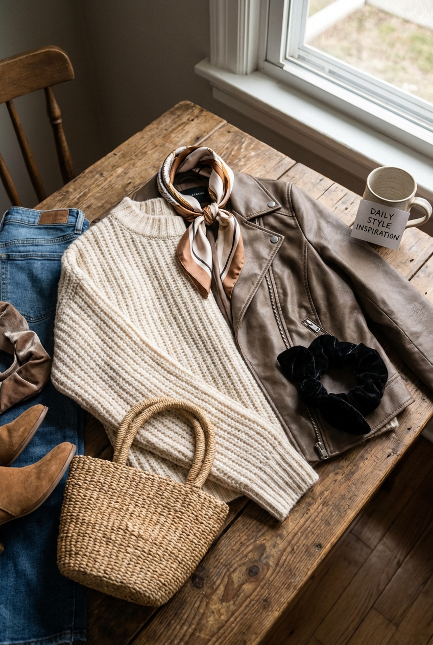
Think about your favorite outfit for a moment. It is rarely just one flat fabric from head to toe. You might pair a chunky knit sweater with sleek leather trousers, or wear a silk slip dress under a structured wool blazer.
We understand intuitively that fashion relies on tension. The magic happens when rough meets smooth, or when matte meets high-gloss. Designing your home follows the exact same principles of layering and juxtaposition.
If a room feels “flat” or boring despite having expensive furniture, it is usually a texture problem, not a color problem. If you are looking for visual inspiration, we have curated a stunning Picture Gallery at the end of the blog post to help you visualize these concepts.
The Vocabulary of Texture: Visual vs. Tactile
In the fashion world, we talk about “hand-feel” and “drape.” In interiors, we categorize texture into two distinct buckets: visual texture and tactile texture. Understanding the difference is critical for a balanced room.
Tactile texture is what you physically feel when you touch a surface. This includes the roughness of a jute rug, the cool slide of a marble countertop, or the plush give of a velvet sofa. These elements dictate the comfort level of the space.
Visual texture creates an illusion of depth. A wallpaper with a faux-shagreen pattern might feel smooth to the touch, but it adds a perceived grittiness to the eye. You need both types to make a room feel complete.
Designer’s Note: The Monochromatic Trap
I see this happen constantly with clients who love the “neutral aesthetic.” They buy a beige sofa, beige walls, and a beige rug.
If all those items are a flat cotton weave, the room will look like a hospital waiting area. If you want a monochromatic palette, you must exaggerate the textures. Pair a heavy boucle cream sofa with a smooth travertine coffee table and a high-pile wool rug to create necessary separation.
The Fabric “Rule of Three”
Just as you wouldn’t wear a denim jacket with denim jeans and a denim shirt without very careful styling, you cannot upholster a whole room in the same weight of fabric.
I use a “Rule of Three” when selecting fabrics for a living space. This ensures enough variation to keep the eye moving.
- The Base (The Suit): This is your sofa or largest upholstery piece. It should be a tight, durable weave like a performance linen, velvet, or heavy cotton canvas. It grounds the room.
- The Contrast (The Shirt): This is for accent chairs or ottomans. Use a texture that opposes the base. If the sofa is matte linen, make the chairs leather or a nubby wool.
- The Accent (The Jewelry): This is for throw pillows and blankets. Go wild here. Mongolian fur, heavy cable knits, or embroidered silk.
Common Mistakes + Fixes
Mistake: Using only synthetic, shiny fabrics (like cheap polyester blends) which reflect light identically.
Fix: Introduce organic, light-absorbing materials. Add a raw wood side table, a clay vase, or a linen throw to suck up that excess shine.
Hard Surfaces: Mixing Wood, Stone, and Metal
Texture isn’t limited to soft goods. The “bones” of the room need to interact with each other. A common amateur error is matching all wood stains and metal finishes perfectly.
In high-end design, we aim for a “curated” look, not a “catalog” look. This means mixing wood tones. You can mix a dark walnut floor with a white oak coffee table, provided the undertones (warm vs. cool) align.
Metals also need to be mixed to create depth. If your cabinet hardware is unlacquered brass, try a matte black faucet or a polished nickel light fixture.
Pro-Level Rules for Mixing Metals
- Pick a Dominant Metal: This should comprise about 70% of the fixtures (e.g., brushed gold).
- Pick an Accent Metal: This takes up the remaining 30% (e.g., matte black).
- Avoid Clashing Tones: Do not mix brushed nickel with chrome. They are too similar but just different enough to look accidental.
Layering for Depth: Rugs and Window Treatments
The floor and the windows are the largest surface areas in a room after the walls. They are the background of your “outfit.”
Layering rugs is a fantastic way to introduce texture, especially in large rooms where a single rug feels floating. A common, high-end trick is using a large, natural fiber rug (like sisal or jute) as the base layer.
On top of that, place a smaller, softer vintage wool or hide rug. The rough base frames the soft top layer, much like a structured coat over a soft dress.
Specific Measurements for Rug Layering
- Base Rug Sizing: The bottom rug should be large enough that the front legs of all furniture sit on it. Leave 12 to 18 inches of bare floor visible around the perimeter of the room.
- Top Rug Sizing: The top rug should be roughly 2/3 the size of the base rug. It centers the conversation area.
- Texture Consideration: The base rug must be flat-woven. You cannot layer a rug on top of a high-pile shag; it will bunch and create a tripping hazard.
Window treatments act like the hem of a pant. They dictate how formal or casual the room feels.
For a relaxed, textural vibe, I love a “puddle” or “break” in the curtain. This means the fabric is 1 to 2 inches longer than the distance to the floor. It creates a soft fold at the bottom.
If you prefer a tailored, suit-like look, the curtain should “kiss” the floor. This requires precise measurement—usually hovering 1/4 inch above the ground.
Lighting: The Texture Multiplier
You cannot see texture without light. The way you light a room changes how your materials read.
Direct downlighting (recessed cans) tends to flatten texture. It washes out the grain in wood and the weave in fabrics.
To highlight texture, you need “grazing” light or ambient layers. A table lamp with a linen shade casts a warm, diffused glow that emphasizes the weave of the sofa underneath it.
What I’d Do in a Real Project
- Use Dimmer Switches: Every light source needs a dimmer. Texture looks richer in lower, warmer light (2700K to 3000K color temperature).
- Highlight Rough Surfaces: If you have a stone fireplace or a brick wall, install a small uplight on the floor or a picture light above it. The shadows created by the light grazing the rough surface add immense drama.
- Mix Shade Materials: Don’t use white linen shades on every lamp. Try a metal shade for a task lamp (shiny/hard) and a pleated silk shade for a floor lamp (soft/traditional).
Practical Constraints: Kids, Pets, and Rentals
As much as we love the look of a silk velvet sofa or a white boucle armchair, real life involves red wine, muddy paws, and sticky fingers.
Fashion has “performance wear,” and so does interior design. You do not have to sacrifice texture for durability.
Performance Fabrics
Look for fabrics labeled “Crypton” or “Performance Velvet.” These are tightly woven synthetics that mimic the feel of natural fibers but repel liquid.
Performance velvet is my secret weapon for pet owners. Cats generally do not like to scratch it because there is no loop in the weave to catch their claws. It is also incredibly easy to wipe clean.
Rental Hacks for Texture
If you are renting, you likely cannot change the flooring or the countertops. You are working with a pre-set “canvas.”
- Peel-and-Stick Grasscloth: This is a game-changer. It adds physical texture to smooth drywall and can be removed when you move out.
- Oversized Art: A large canvas with heavy impasto brushstrokes adds texture to the walls without construction.
- Removable Rugs over Carpet: Yes, you can put a rug over wall-to-wall carpet. Use a flat-weave wool rug to anchor your furniture and hide the rental beige carpet.
Room-by-Room Texture Guides
Different rooms serve different functions, and the texture palette should shift to reflect that.
The Living Room
This is the space for high contrast. You want conversation and energy.
- Sofa: Performance Velvet (Soft/Durable).
- Coffee Table: Marble or Glass (Hard/Sleek).
- Side Tables: Raw Wood or Ceramic (Organic/Rough).
- Throw: Chunky Knit or Cashmere (Plush).
The Bedroom
This space is for rest. The textures should be softer, quieter, and more analogous.
- Bedding: Washed Linen or Percale Cotton (Breathable/Crisp).
- Headboard: Upholstered in wool or linen (Soft).
- Flooring: High-pile wool rug or sheepskin beside the bed (Warm).
- Nightstands: Wood or lacquered finish (Solid).
The Kitchen
Kitchens are inherently full of hard, cold surfaces (tile, stone, steel). You must aggressively introduce softness.
- Runner: Use a vintage Turkish runner between the island and the sink. It adds wool texture to a sea of tile.
- Window Treatment: Add a roman shade in a woven wood or fabric to break up the cabinetry.
- Accessories: Use wooden cutting boards and ceramic crocks to counter the coldness of stainless steel appliances.
Finish & Styling Checklist
When I am doing the final install for a client, I run through this mental checklist to ensure the textures are balanced. Use this “What I’d Do” list for your own home.
- Check the “Cold” Factor: If the room feels chilly, add a woven element. A wicker basket for blankets or a rattan tray on the coffee table usually solves this.
- The Pillow Test: Do you have at least two different fabrics on your sofa pillows? If they are all the same, swap two covers for something with a raised pattern or embroidery.
- Review the sheen: Look at the room at noon and at 8 PM. If everything is shiny, swap a lamp or a vase for a matte finish.
- Organic Injection: Does the room have something from nature? A plant, a branch, a piece of driftwood, or fresh flowers. Organic shapes break up the rigid lines of manufactured furniture.
- Scale Check: Ensure you aren’t using only “small” textures. If you have a small print on the curtains and a small weave on the rug, you need a large, solid surface to anchor the eye.
FAQs
How do I mix wood tones without it looking messy?
The secret is looking at the undertone. Woods generally fall into warm (red/orange/yellow undertones) or cool (gray/ash undertones). Try to keep your woods in the same undertone family. However, you can mix light and dark. A dark walnut and a light white oak work beautifully together because they provide contrast.
Can I mix silver and gold metals in the same room?
Absolutely. This is the interior equivalent of wearing a silver watch with a gold wedding band. It looks chic and effortless. Just make sure the finishes are deliberate. I prefer mixing unlacquered brass (gold tone) with polished nickel (warm silver tone). Avoid mixing cheap shiny chrome with yellowy gold.
What is the best texture for a small room?
In small spaces, avoid overly heavy or “shaggy” textures on large pieces, as they can visually shrink the room. Stick to smoother, tighter weaves for the sofa (like linen) and use mirrors (glass texture) to reflect light and expand the space. Save the heavy textures for small accents like pillows.
How many textures are too many?
If the room starts to feel chaotic or cluttered, you have likely gone too far. A good rule of thumb is 3 to 4 distinct textures per visual plane. If you look at the sofa, you should see the sofa fabric, the pillow fabric, the throw blanket, and perhaps the rug underneath. Any more than that in one glance can be overwhelming.
Conclusion
Mixing textures is the difference between a house that looks like a showroom and a home that feels curated and lived-in. It is the tactical application of style.
As a fashion enthusiast, you already possess the eye for this. You know that a leather jacket needs a soft t-shirt, and a sequin skirt needs a matte heel. Trust that same instinct when arranging your living room.
Start small. Add a woven tray to your glass table. drape a velvet throw over your linen chair. Step back and feel the difference. The goal is to create a space that engages your senses, welcoming you in not just with how it looks, but with how it feels.
Picture Gallery


