Monochromatic Outfits For Falls Sleekest Trend
There is a common misconception that wearing a single color from head to toe is the easy way out. In my years styling high-end clients for editorial shoots and everyday wardrobes, I have found the opposite to be true. Monochromatic dressing requires a sharper eye for detail than mixing prints ever will. When you remove the distraction of contrasting colors, the focus shifts entirely to cut, texture, and silhouette.
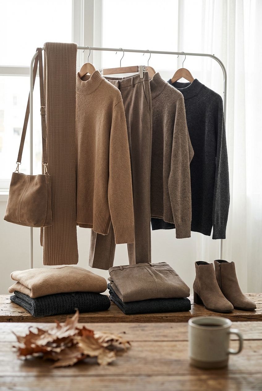
I remember a specific consultation with a client who insisted that an all-beige outfit would wash her out and look flat. We moved her away from trying to color-match every piece perfectly and instead focused on variance—pairing a chunky oatmeal cable knit with sleek, ecru silk trousers. The result wasn’t boring; it was architectural. It elongated her frame and looked incredibly expensive, despite being comfortable enough for a coffee run.
Mastering this trend is about understanding that “monochrome” does not mean “monotony.” It is about creating depth through fabric tension and subtle tonal shifts. If you are looking for visual inspiration on how to execute these looks, I have curated a stunning Picture Gallery at the end of this blog post.
The Golden Rule of Texture Mixing
If you take only one piece of advice from this guide, let it be this: never wear an entire outfit made of the same fabric unless it is a suit. Flatness is the enemy of monochrome. When light hits an outfit that is 100% cotton or 100% polyester, the eye glazes over because there is no visual break.
To make a single color interesting, you must create friction between materials. You want a dialogue between the items you are wearing. I always aim for a minimum of three distinct textures in any fall look. This interaction catches the light differently and creates shadows, which adds the necessary dimension to your silhouette.
Designer’s Note: The Trio Method
When I build a look for a client, I use a simple formula to ensure depth. I combine something soft, something sleek, and something rough.
- Soft: Cashmere, mohair, or angora.
- Sleek: Silk, satin, patent leather, or coated denim.
- Rough: Wool bouclé, corduroy, suede, or heavy tweed.
For example, if you are wearing a black wool coat (rough/matte), pair it with a black silk slip skirt (sleek) and a black cashmere turtleneck (soft). This combination works because the light absorbs into the wool and bounces off the silk, differentiating the blacks even if they are the exact same dye lot.
The Art of Tonal Layering
One of the biggest mistakes people make is thinking monochrome means finding the exact same Pantone shade for every garment. Not only is this nearly impossible to achieve, but it also creates a “uniform” look that lacks sophistication. The most successful monochromatic outfits rely on a gradient.
Think of your outfit as a paint swatch card. You want to utilize the full range of that color family. If you are dressing in gray, mix charcoal with slate, heather gray, and silver. If you are doing camel, layer in biscuit, tan, and dark chocolate.
Common Mistakes + Fixes
- The Mistake: Wearing mismatched undertones. For example, pairing a cool-toned, blue-based red sweater with warm-toned, orange-based red trousers. This creates a visual clash that feels “off.”
- The Fix: Check your garments in natural daylight before leaving the house. Hold the items next to each other. If one item makes the other look dirty or washed out, the undertones are clashing. Stick strictly to all warm or all cool tones within the color family.
When layering, I generally recommend keeping the darkest shades on the areas you want to minimize or streamline. Darker colors recede visually, while lighter shades advance. If you are pear-shaped and want to balance your proportions, try a lighter top in the color family with a darker shade on the bottom.
Proportions and Silhouette Management
Because you don’t have color blocking to break up your body, the silhouette becomes the primary focal point. Monochromatic dressing creates a long, continuous vertical line, which is fantastic for looking taller and leaner. However, if the volume isn’t managed, you can look like a shapeless blob of fabric.
You must highlight the waist or play with volume contrast. If you are wearing a voluminous oversized knit, the bottom half needs to be streamlined—think a pencil skirt or straight-leg trousers. Conversely, if you are wearing wide-leg palazzo pants, the top needs to be fitted or tucked in to reveal your structure.
Key Measurements for Fall Layering
In fashion styling, millimeters matter. Here are the specific spacing rules I use when tailoring clients’ fall wardrobes:
- Coat vs. Skirt Length: If you are wearing a midi skirt with a long coat, the coat should either be 2 inches shorter than the skirt or 2 inches longer. Avoid having them hit at the exact same line, as it adds bulk.
- The Boot Gap: When wearing cropped trousers with ankle boots, you have two choices. Ideally, the pant hem should overlap the boot shaft by at least 1 inch for a seamless column of color. Alternatively, show 1 to 1.5 inches of skin. Anything in between looks like the pants shrunk in the wash.
- Sleeve Length: To keep heavy fall layers from swallowing you, ensure your coat sleeves end exactly at the wrist bone. Showing the hands and perhaps a sliver of wrist keeps the look intentional and tailored.
Anchoring the Look with Footwear
In a monochromatic look, shoes serve one of two purposes: they either extend the leg line or provide a deliberate punctuation mark. For the sleekest possible result—the kind that makes you look five pounds lighter and three inches taller—match your shoe color to your trousers or tights.
This is particularly effective with fall boots. If you are wearing burgundy leather trousers, a burgundy boot creates an unbroken visual line from waist to toe. This is an old stylist trick, but it remains the most effective way to change a client’s silhouette instantly.
However, you can also use footwear to introduce a neutral breaker. If an all-green outfit feels too intense, a nude or camel shoe can soften the blow. Just be wary of wearing a dark outfit with a stark white shoe, as it draws the eye immediately to your feet and cuts off your height.
What I’d Do for a Client: The Texture Swap
If I am styling a client in a head-to-toe matte outfit (like a wool suit), I will almost always put them in a patent leather or metallic shoe.
- Why? The shine on the shoe reflects light, preventing the outfit from looking heavy or dragging on the ground.
- Example: A matte navy cashmere dress looks infinitely more chic with a navy patent croc-embossed boot than with a matching suede boot.
Selecting the Right Color for Your Environment
While black is the default for many, it is not always the most flattering or the most “fashion-forward” choice for fall. This season, we are seeing a shift toward rich, earthy tones that mimic the landscape.
When choosing your color lane, consider practicality and maintenance. Light monochrome (creams, whites, oatmeals) is undeniably luxurious. It signals to the world that you don’t take public transportation and you don’t walk through puddles. It is a “status” palette. However, for a realistic lifestyle, it requires vigilance.
The Fall Color Palette Hierarchy
- Chocolate Brown: The new black. It is softer on the complexion than severe black but just as slimming. It pairs beautifully with gold jewelry.
- Forest Green: A fantastic alternative to navy. It reads as a neutral but adds character.
- Burgundy/Merlot: Deep reds are massive this season. They evoke warmth and pair well with heavy leather textures.
- Slate Blue/Grey: A cool-toned alternative that looks exceptionally sharp in office environments.
Real-World Lesson: The Weather Factor
I once styled a client in a stunning all-cream wool trouser set for a November event in Seattle. I failed to account for the wet pavement. Within ten minutes, the “wicking” effect had pulled dirty rainwater up the hem of her trousers.
The Fix: If you love light monochrome in fall, opt for cropped trousers tucked into leather boots, or ensure your hem is a strictly tailored 1 inch off the ground. Always Scotchgard your light-colored wools and suedes before the first wear.
Accessories and Hardware Consistency
When the clothes are simple, the accessories must be significant. In monochromatic styling, jewelry and hardware act as the “lighting fixtures” of the outfit. They provide the sparkle and polish that brings the room—or in this case, the look—to life.
Consistency is key here. If your bag has gold hardware, your belt buckle, earrings, and coat buttons should ideally read gold as well. Mixing metals can be done, but in a monochromatic look where simplicity is the goal, matched metals look more coherent and high-end.
Belting Strategy
Belts are a secret weapon for breaking up a long block of color without breaking the palette.
- The Match: A belt in the exact same color as the dress adds structure without cutting you in half.
- The Contrast: A belt in a darker tone of the same color family (e.g., a dark brown belt on a camel dress) emphasizes the waist more aggressively.
- Scale: For bulky fall layers, avoid skinny belts. They get lost in the fabric. Opt for a medium-to-wide belt (1.5 to 2.5 inches) to hold its own against chunky knits.
Finish & Styling Checklist
Before you head out the door, run through this quick mental checklist to ensure your monochromatic look is polished, not messy.
- Texture Check: Am I wearing at least three different fabric finishes (e.g., knit, leather, silk)?
- Lint Roll: Monochromatic darks (navy, black) show every speck of dust and pet hair. Keep a roller in your bag.
- Hemlines: Are my trousers dragging? If the fabric bunches at the shoe, the sleek line is ruined.
- Undertones: Did I check my reds/creams in natural light to ensure they don’t clash?
- Structure: Is there a defined waist or a deliberate play on volume? Avoid “sack” silhouettes.
- Hardware: Are my metals (zippers, jewelry, bag chain) consistent?
FAQs
Can petite women wear monochromatic oversized trends?
Yes, but with modifications. Monochrome is naturally lengthening, which helps petites. However, avoid oversized pieces on both top and bottom. If you wear an oversized sweater, pair it with a fitted mini skirt and matching tights. Showcasing the wrists and ankles also helps keep the frame from being overwhelmed.
How do I do monochrome with denim?
Denim on denim (the “Canadian Tuxedo”) is a classic monochromatic look. To elevate it, vary the washes slightly. A chambray shirt (lighter) tucked into dark indigo straight-leg jeans is chic. Add a navy blazer to finish the tonal look. Avoid matching the denim washes perfectly unless it is a coordinated set.
Does leopard print count in a monochromatic outfit?
Technically, no, but it acts as a neutral. If you are doing an all-camel or all-brown look, a leopard print shoe or bag fits seamlessly into the color family and adds a fantastic “pattern texture” without breaking the tonal theme.
What is the best fabric for monochromatic outfits?
Wool and cashmere are the best for absorbing color deeply, making them look rich. Synthetic fabrics like polyester can sometimes have a cheap shine that distorts the color. When doing monochrome, natural fibers almost always look more expensive.
Conclusion
Monochromatic dressing is the ultimate sartorial hack. It suggests you have your life together, even if you threw the outfit together in five minutes in the dark. It is a strategy that transcends trends because it focuses on the fundamental elements of style: proportion, texture, and fit.
As we move deeper into fall, resist the urge to hide in dull layers. Embrace the power of a single hue. Whether you choose a deep, moody burgundy or a crisp, clean winter white, playing within one color family allows you to appreciate the quality and cut of your clothing in a whole new way. It is sleek, it is sophisticated, and when done right, it is effortless.
Picture Gallery


