Neutral Beige And Black Color Ideas For Layered Looks
Introduction
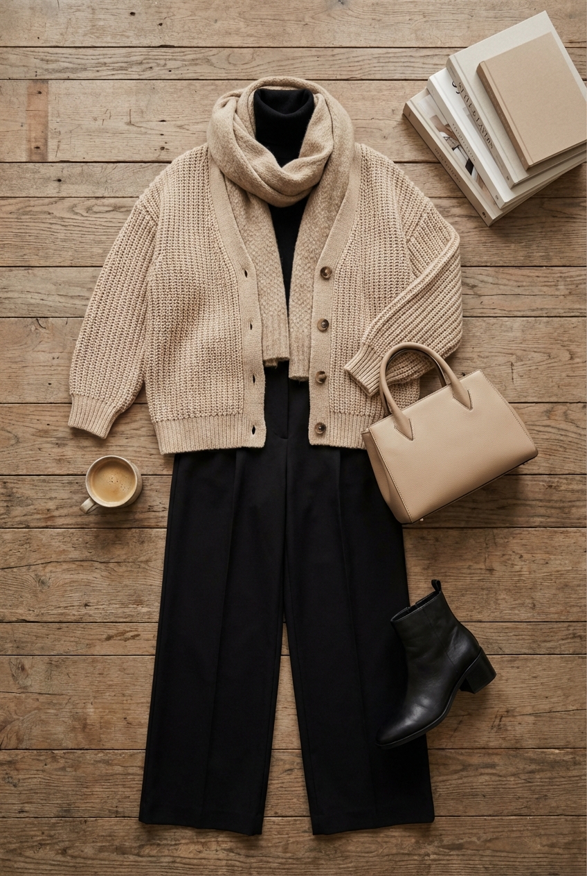
Think of the most timeless outfit in your closet. For many of us in the fashion world, it is the impeccable combination of a structured black blazer layered over a soft, cashmere camel sweater. It is effortless, chic, and commands attention without screaming for it. This exact philosophy applies to interior design when we blend neutral beige with deep black.
When you translate this color palette into a home, you are essentially building a “capsule wardrobe” for your living space. Beige provides the warm, inviting canvas that makes a room feel livable and airy, while black acts as the eyeliner, defining the architecture and grounding the furniture. It is a balancing act between the soft and the sharp, ensuring the space feels curated rather than cluttered.
In this guide, I will walk you through how to layer these tones to create a home that feels high-end yet approachable, with practical tips on fabrics, measurements, and layouts. If you are looking for visual inspiration, we have curated a stunning Picture Gallery at the end of the blog post to spark your creativity. Let’s dive into the tailored world of neutrals and noir.
The Foundation: Selecting the Right Undertones
In fashion, we know that not all nudes are created equal. The same rule applies to paint and textiles. Beige is rarely just “beige.” It carries undertones of pink, yellow, green, or grey that can drastically change how a room feels once the sunlight hits it.
If you pair a yellow-based beige with a sharp, cool black, the beige can suddenly look dirty or dated. For a modern, layered look, I almost always recommend “greige” or a beige with a subtle green undertone. These shades read as sophisticated neutrals and bridge the gap between warm and cool tones seamlessly.
Before committing to a gallon of paint, test your swatches on different walls. Observe them in the morning light, at high noon, and under artificial evening light. The black accents you introduce later will intensify the contrast, so your base beige needs to be solid and soothing.
Designer’s Note: The “50% Rule”
I learned this the hard way during a penthouse renovation. If a beige looks perfect on a small swatch, it will often look two shades darker and more intense when painted on all four walls.
- The Fix: Ask the paint store to mix your chosen color at 50% strength. This gives you the nuance of the hue without the heaviness, keeping the room airy enough to handle bold black accents.
Anchoring the Room: Black as a Definition Tool
Black is the strongest color in the designer’s toolkit, and like a statement belt, it needs to be placed correctly to define the silhouette of the room. A common mistake is using black randomly, which can make a space feel polka-dotted or chaotic.
Instead, use black to “ground” the room. This usually means applying it to pieces that sit lower to the floor or have significant visual weight. A black coffee table, the legs of a sofa, or a dark charcoal rug can physically anchor the seating area.
Once the ground is set, carry the eye upward with thinner black lines. This could be slim picture frames, a curtain rod, or the arm of a sconce. This technique creates vertical rhythm, moving the viewer’s eye through the space just as a well-cut dress guides the eye down the body.
Common Mistakes + Fixes
- Mistake: Buying a bulky, black leather sofa for a small room. This creates a “black hole” that absorbs all the light and makes the room feel heavy.
- The Fix: Opt for a beige or oatmeal sofa in a performance fabric. Introduce black through throw pillows, a throw blanket, or a sleek side chair. This keeps the visual weight balanced.
Texture is the New Pattern
When you limit your color palette to two main hues, texture becomes your best friend. In the fashion industry, an all-black outfit works because of the mix of materials: leather, silk, wool, and denim. In your home, flat beige walls and flat black furniture will look like a doctor’s waiting room.
You need to layer materials to create depth. Think about mixing a chunky beige wool rug with a smooth matte black metal side table. Pair a velvet accent chair with linen drapery. The friction between rough and smooth, matte and shiny, is what makes a neutral room feel expensive.
I particularly love introducing natural textures into this palette. A woven jute rug or a rattan chair painted black adds organic irregularity. These imperfections break up the rigidity of the color scheme and make the home feel lived-in and welcoming.
What I’d Do in a Real Project
- Base Layer: Wide-plank white oak floors or a large sisal rug.
- Middle Layer: Bouclé or linen upholstery on the main seating pieces.
- Top Layer: A black marble coffee table (honed finish, not polished) and a cashmere throw.
- Accents: blackened steel hardware and ceramic styling objects.
Living Room Layouts and Furniture Scale
The living room is usually where this color palette shines brightest, but the layout is critical for flow. In a beige and black room, spacing dictates the vibe. Too much clutter ruins the clean aesthetic we are aiming for.
Start with your rug. It is the foundation of the “outfit.” A common error is choosing a rug that is too small, making the furniture look like it is floating on an island. Ensure the front legs of all your seating pieces sit on the rug. Ideally, leave about 12 to 18 inches of bare floor visible around the perimeter of the room to frame the space.
For coffee tables, spacing is key for comfort. You want about 14 to 18 inches between the edge of the sofa and the coffee table. If you are using a black coffee table, this negative space is crucial so shins don’t bump into the hard edge, and visually, it allows the beige sofa to breathe.
Practical Constraints: Pets and Kids
I often hear clients say, “I can’t do beige, I have a golden retriever,” or “I can’t do black, I have a white cat.” Here is the reality of durable design:
- For Beige: Use Crypton or high-performance velvet. These fabrics are virtually stain-proof and clean up with water. Avoid linen in high-traffic areas as it holds stains.
- For Black: Avoid high-gloss black surfaces if you have kids; fingerprints will drive you crazy. Stick to matte black or wood grain stained black, which hides dust and smudges much better.
The Kitchen: High Contrast Culinary Spaces
The “Tuxedo Kitchen” concept is timeless, but we are seeing a shift away from stark white and black toward warm beige/putty and black. This feels more organic and less sterile.
Try using black for the lower cabinetry and a warm beige for the uppers or the walls. This grinds the kitchen, making it feel substantial. If black cabinets feel too risky, keep the cabinetry putty-colored and use black for the hardware, faucet, and light fixtures.
Pay attention to your metal finishes. In a beige and black kitchen, unlacquered brass or polished nickel looks stunning. The metallic sheen acts like jewelry against a black dress. Just ensure you mix metals intentionally—don’t use chrome, brass, and copper all in one space.
Designer’s Note: Lighting Temperature
In a high-contrast kitchen, lighting color temperature matters immensely.
- The Rule: Stick to 2700K to 3000K LED bulbs.
- Why: Anything cooler (4000K+) will turn your warm beige cabinets pink or grey and make your black accents look harsh and commercial. Warm light preserves the cozy factor.
Bedroom Sanctuary: Softening the Edges
In the bedroom, we want to dial back the high-contrast energy to create a restful environment. While the living room can handle sharp black lines, the bedroom should feature softer, diluted versions of this palette.
Instead of a stark black wall, consider a charcoal upholstered headboard against a sandy beige wall. The texture of the fabric softens the visual impact of the dark color. Use black for smaller accents like bedside lamps or the legs of a bench.
Bedding is the easiest place to layer. I prefer white or oatmeal sheets as the base. Layer a heavy, textural beige duvet at the foot of the bed, and use black piping on pillows or a thin black throw blanket to tie the scheme together. It’s tailored but conducive to sleep.
Window Treatments
- The Look: Floor-to-ceiling drapery makes ceilings look higher.
- The Strategy: Use beige linen curtains with a blackout liner. To incorporate black, use a matte black curtain rod. This draws a clean, architectural line across the room without overwhelming the window.
- The Height: Mount the rod 4-6 inches above the window frame (or just below the crown molding) to maximize height.
Finish & Styling Checklist
Ready to execute this look? Here is the checklist I run through mentally before finalizing a room design. If you can check these off, your space will feel professionally curated.
The Basics
- Wall color tested in morning, noon, and night light.
- Rug is large enough (front legs of furniture are on it).
- Lighting temperature is consistent (warm 2700K-3000K).
The Balance
- Is there a mix of textures? (e.g., wood, metal, fabric, stone).
- Is the black distributed evenly? (Not all in one corner).
- do you have enough negative space? (The room isn’t overcrowded).
The Fashion Touches
- Added a “jewelry” element (brass, nickel, or glass).
- Included something organic (wood, plant, clay).
- Softened hard lines with textiles (throws, pillows).
FAQs
Will painting a room black make it feel smaller?
Not necessarily. Black walls can actually blur the corners of a room, creating an illusion of infinite space, much like the night sky. However, if you are nervous, start with a powder room or a single accent wall behind a bed. Lighting is crucial here—a dark room needs excellent ambient light.
Is beige boring?
Beige is only boring if it is flat. If you buy a beige sofa, beige rug, and paint the walls the same beige, yes, it will look flat. The secret is “tone-on-tone” layering. Mix oatmeal, sand, camel, and cream. The subtle differences create sophistication.
What wood tones work best with black and beige?
White oak and walnut are the top contenders. White oak keeps the palette Scandi and airy, blending well with the beige. Walnut adds richness and stands up well against black accents without disappearing. Avoid woods with heavy red or orange undertones (like cherry), as they clash with the modern vibe.
How do I keep black furniture from showing dust?
This is the main drawback of black furniture. To minimize this, choose materials with a grain or texture, such as black-stained oak or brushed metal. Avoid black glass or high-gloss lacquer, which highlight every speck of dust. Also, keep a microfiber cloth handy!
Conclusion
Merging neutral beige with bold black is the interior design equivalent of the perfect capsule wardrobe. It is reliable, versatile, and undeniably elegant. By respecting the rules of scale, prioritizing texture over pattern, and strategically placing your dark accents, you can create a home that feels both grounded and expansive.
Remember that your home should serve you, not the other way around. Choose fabrics that can handle your lifestyle and layouts that encourage conversation and comfort. Fashion is about expression, and your home is the most personal expression of all.
Picture Gallery


