Pastel Color Combinations That Look Polished in Outfits
- Words by
- Julio Arco
- Published
- Reading
- 4 min
The pastel pairings that look most polished are the ones that share a similar softness and are anchored by a neutral: lavender with dove grey, mint with soft beige, powder blue with crisp white, blush pink with caramel. Keep every color light and slightly muted, then let one neutral do the grounding.
That restrained approach is what gives pastels an old money feel. Below you will find the pairings, how to wear them in clothes and dresses, and how fabric changes the result.
What pastel colors go well together?
Pastels are tints: colors with white added. As the CAES Field Report on color theory puts it, "When white is added to a color it becomes lighter and is called a tint." Because every pastel carries that same dose of white, almost any two of them sit comfortably together. The trick is keeping their lightness matched, so neither shade looks dirty or loud beside the other.
The same publication, written by Bodie V. Pennisi, notes that "Value is the lightness or darkness of each color." In outfit terms: two pastels with a similar value look intentional. One pastel and one mid-tone look mismatched.
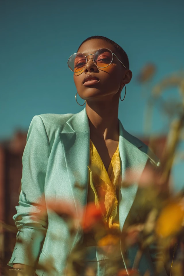
Five pastel color combinations to wear
- Lavender and dove grey. Calm and quiet, good for knitwear and tailoring.
- Mint green and soft beige. Fresh but warm, which suits linen and cotton.
- Powder blue and crisp white. The easiest pairing to get right, for shirts, trousers and light jackets.
- Blush pink and caramel. The caramel adds depth, so the pink reads grown-up rather than sweet.
- Butter yellow and cream. Low contrast and soft, best in a single tonal outfit.
Pastel pink and mint green
This is the classic two pastel color combination, and it can tip toward candy-shop if both colors are equally strong. Let one lead. A blush pink blazer over a pale mint blouse works, as does a mint skirt with a cream knit and a touch of pink in a scarf.
Add a neutral like ivory or tan between them if you want a more restrained result.
Pastel blue and lavender
Both are cool colors, and the CAES Field Report says green and blue are cool colors that evoke relaxed and calm feelings. Together, blue and lavender make a quiet, low-contrast outfit. Try a powder blue shirt with lavender trousers, or a lavender cardigan over a pale blue dress.
Because the two are close in temperature, add a little white or grey so the look does not blur into one flat wash.
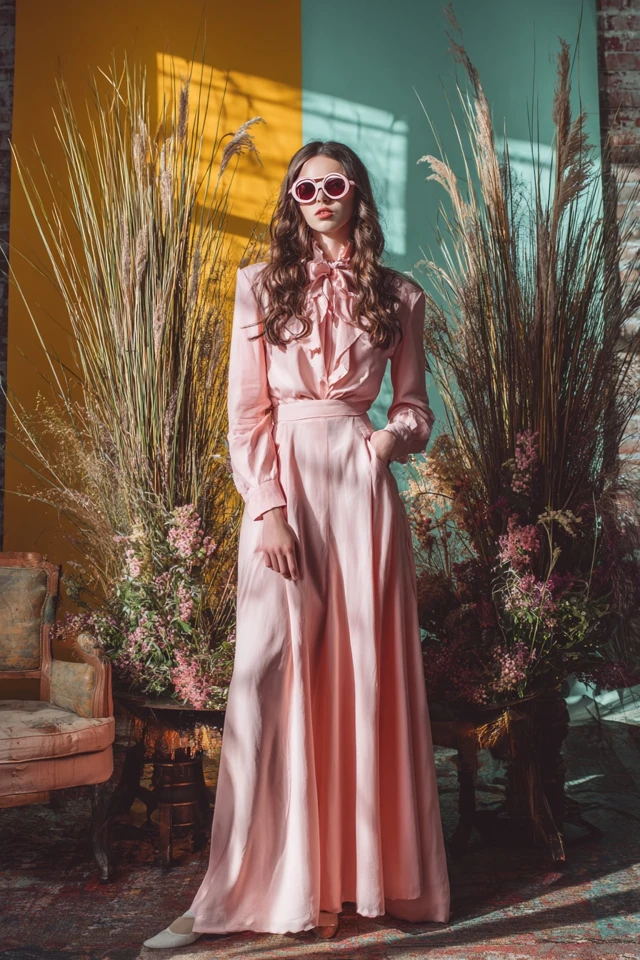
Pastel color combinations for clothes and dresses
For separates, put the lighter pastel near your face and the other lower down, or match a pastel top with neutral trousers. Tonal dressing, such as pale pink with slightly deeper dusty pink, is the simplest route and looks expensive.
A pastel color combination dress is usually easiest as one base color with a second in the details: a mint dress with a beige belt and bag, or a lavender dress with grey shoes and a cream cardigan. Printed dresses that mix two pastels work best when the background is white or cream.
Use neutrals as the anchor
Cream, taupe, white, soft grey and camel keep pastels from drifting into costume. Gold or pearl accessories and leather loafers or a structured bag in a neutral finish the look. For more ideas on this restrained approach, see old money bright colors styling tips and the old money capsule wardrobe.
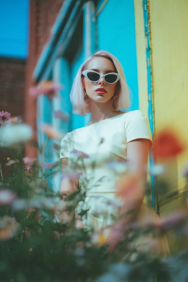
How fabric changes a pastel
Through the lens of evidence-based design, I'd think about texture before hue. A matte cashmere and a glossy satin in the same pale pink do not read as the same color, because the surface changes how light reaches your eye. Matte knits look softer and more subdued. Shiny fabrics brighten the color and add contrast.
Silk, fine cotton, linen and cashmere drape well and keep pastels looking calm. Mixing two textures, such as a knit with a woven skirt, prevents a head-to-toe pastel outfit from looking flat.
Which pastels suit you?
Hold a garment near your face in daylight. If your skin looks tired or sallow, try a cooler or warmer version of the same color. Cooler undertones often like blues, lilacs and mint, and warmer undertones often like peach and creamy yellow, though this is a starting point, not a rule. Neutral undertones can try most of them.
As an architect trained in evidence-based design, I'd treat the neckline as the first thing the eye reads, so the shade closest to your face matters most.
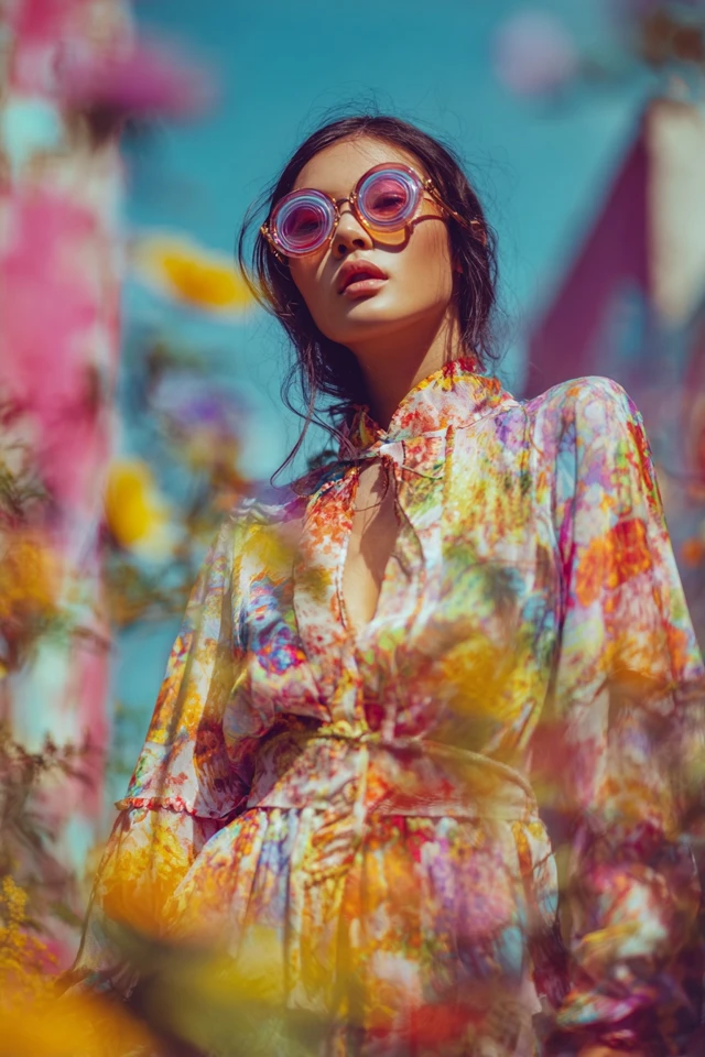
Care and shopping tips
- Pastels show stains and yellowing easily. Wash gently with mild detergent and check the care label.
- Choose natural fabrics and solid construction over quantity.
- Layer a white or cream piece under pastel outerwear, such as a white blouse under a pale pink blazer.
- For occasions, see romantic old money outfit ideas and the old money wedding guest style guide.
Frequently asked questions
What are two pastel colors that would look good together?
Powder blue and white is the safest, and lavender with dove grey is a close second. Pastel pink and mint green also works if one of the two leads.
Which pastel color is best?
There is no single best one. Pick the shade that makes your skin look clear in daylight, and keep it in the same lightness as whatever you pair it with.
What are the trending pastel colors for 2026?
Trend lists change often and cannot be predicted with certainty. Soft blue, butter yellow, blush and mint are common pastels, and neutral anchors keep them wearable beyond one season.
Filed under Outfit Ideas