Pairing Rich Burgundy With Cream For Elegant Winter Looks
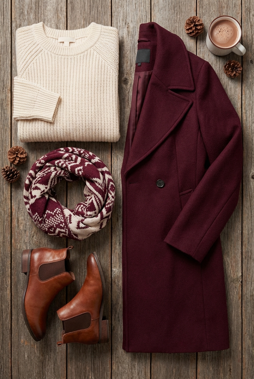
There is a specific moment in the fashion calendar when we trade our linen blazers for cashmere coats, and the color palette inevitably shifts toward depth and warmth. Just as a deep oxblood leather handbag elevates a monochromatic cream outfit, introducing rich burgundy into a cream-based interior creates an instant sense of luxury. It is a pairing that feels historic yet incredibly current, striking a balance between the “Old Money” aesthetic and modern minimalism.
In my years working between high fashion editorial and interior styling, I have found that this specific color combination is the interior equivalent of a perfect winter coat. It provides structure, warmth, and a sophisticated focal point without overwhelming the senses. The cream offers a breath of fresh air and reflects winter light, while the burgundy grounds the space, adding the visual weight necessary for the colder months.
However, executing this look requires more than just tossing a red pillow on a white sofa. It requires a nuanced understanding of undertones, texture layering, and scale. If you are looking for visual inspiration to guide your project, please note that a curated Picture Gallery is available at the end of the blog post.
Understanding The Undertones: The Palette Foundation
The success of this pairing relies entirely on selecting the right shades. In fashion, we know that not all reds suit all skin tones; in interiors, not all burgundies suit all creams. If you select a burgundy with too much purple, it can look dated. If your cream is too yellow, the room feels muddy.
You want to aim for a “warm” profile for both colors. Your burgundy should lean toward deep wine, merlot, or brownish-red (think dried blood orange or cordovan leather). Avoid bright cherry reds or cool-toned violets. These warmer burgundies possess an inherent earthiness that makes a room feel settled and established.
For the cream, look for “whipped butter” or “oatmeal” tones rather than stark bright whites. A bright white creates too much contrast against deep burgundy, resulting in a harsh, clinical look reminiscent of a candy cane. Cream with a subtle taupe or beige undertone softens the transition between the light and dark elements, creating a cohesive envelope for the room.
Designer’s Note: The 60-30-10 Rule
One of the most valuable lessons I learned early in my career is the 60-30-10 rule. It works for styling an outfit, and it is critical for a room.
- 60% Main Color (Cream): This is your walls, large rugs, and perhaps the main sofa. It keeps the room feeling expansive.
- 30% Secondary Color (Burgundy): This is your visual interest. Think accent chairs, drapery, or a painted architectural feature like a bookshelf.
- 10% Accent (Metallics or Wood): Unlacquered brass or dark walnut wood tones bridge the gap perfectly.
Texture Strategy: The “Winter Coat” Approach
When we dress for winter, we don’t just add color; we add weight. A silk cream blouse reads differently than a chunky cream cable-knit sweater. To make this color palette feel expensive and designed, you must mix opposing textures. If everything is flat and cotton, the room will look like a budget catalog.
For the burgundy elements, prioritize fabrics that absorb light. Velvet is the gold standard here. A burgundy velvet armchair invites touch and changes color slightly as the light hits the pile, giving the furniture dimension. If velvet feels too formal, look for a heavy boiled wool or a nubby bouclé in that deep wine shade. These fabrics mimic the feel of a high-end winter coat.
For the cream elements, you want textures that reflect a soft glow or provide architectural structure. A linen blend, a heavy canvas, or a high-pile Moroccan rug works beautifully. The goal is to ensure that even if the lights were off, your hand could tell the difference between the surfaces.
Common Mistakes + Fixes
Mistake: Using “shiny” burgundy fabrics like cheap satin or faux silk.
Fix: High-sheen dark fabrics often look inexpensive and show every wrinkle. Always opt for matte finishes like linen, wool, velvet, or matte leather.
Mistake: Ignoring the durability of cream upholstery.
Fix: If you are renting or have pets, do not buy standard cotton cream furniture. Invest in “Performance Fabrics” (like Crypton or Sunbrella) which are stain-resistant and cleanable with water.
Living Room Layouts and Large Scale Furniture
The living room is usually the easiest place to introduce this scheme because it naturally accommodates layers. The layout should encourage conversation and coziness, which complements the warm palette.
If you are styling a standard 12×14 or 14×16 living room, I recommend grounding the space with a large cream rug. This acts as your canvas. The rug should be large enough that the front legs of all your seating furniture sit on it. For a typical sofa setup, this usually means an 8×10 or 9×12 rug.
A Pro Tip on Spacing:
The coffee table is the anchor. It should be positioned 14 to 18 inches from the edge of your sofa. This is close enough to set down a drink but far enough to walk through. If you choose a burgundy ottoman as a coffee table substitute, this adds a massive block of color to the center of the room. Ensure you style it with a large cream tray to break up the visual mass.
What I’d Do in a Real Project
If I were designing a client’s living room tomorrow with this palette, here is the exact formula I would use:
- Walls: A warm, limestone-colored paint in a matte finish.
- Sofa: A structured, cream performance linen sectional.
- Accent Chairs: Two vintage-inspired club chairs in deep burgundy mohair or distressed oxblood leather.
- Drapery: Floor-to-ceiling cream wool curtains with a burgundy leading edge (a vertical strip of fabric sewn on the inner edge). This is a custom detail that looks incredibly high-end.
Dining and Entertaining: The Tablescape
Winter is the season of dinner parties, and a burgundy and cream dining room sets a theatrical stage for entertaining. This is where you can take bolder risks because people spend less time here than in a living room or bedroom.
Consider painting the walls or just the wainscoting in the deep burgundy. Dark walls in a dining room create intimacy. Under candlelight, burgundy walls recede, making the room feel infinite and cozy simultaneously. If painting feels too permanent, use the color in your table linens.
For the table itself, a cream tablecloth in heavy linen serves as the base. Layer this with burgundy napkins and unlacquered brass candlesticks. The mix of the deep red with the gold tones of brass is timeless.
Lighting Rules of Thumb
The color burgundy dies in poor lighting. It turns into a muddy brown if the light is too cool (blue) or too dim.
- Bulb Temperature: Always use bulbs with a color temperature of 2700K (Warm White). This enhances the red undertones and makes cream feel cozy, not yellow.
- Fixture Height: Your dining chandelier should hang 30 to 36 inches above the table surface. This creates a focused pool of light on your centerpiece and food, enhancing the drama of the dark colors.
Bedroom Sanctuary: Layering for Warmth
In the bedroom, the goal is tranquility. While burgundy is a high-energy color (associated with passion and appetite), it can be restful if used in deep, muted tones and in limited quantities.
I prefer to keep the “shell” of the bedroom cream. This includes walls, carpet, and large window treatments. This ensures that waking up in the morning feels bright and optimistic. The burgundy comes in through the “dressing” of the bed—the headboard or the throw blankets.
A tufted burgundy velvet headboard is a stunning statement piece. It anchors the bed and provides a soft surface to lean against while reading. If you have a neutral headboard, use a grand, oversized euro-sham pillow arrangement in burgundy to achieve a similar effect.
The Bedding Equation
To achieve that fluffy, “hotel” look, you need specific layers.
- Sheets: Crisp cream percale or sateen.
- Duvet: Cream, folded halfway down the bed.
- Coverlet/Quilt: Burgundy, tucked tightly around the mattress foundation for a tailored look.
- Throw Blanket: A chunky knit cream throw draped casually across the corner.
Paint and Hard Finishes
Selecting paint is often the most paralyzing part of the process. For this look, you are likely painting the walls cream and using burgundy as accents, or painting a moody burgundy study.
When choosing a cream paint, always test it on two different walls (one that gets direct light, one that is shadowed). Observe it at three times of day: morning, noon, and night. Cream paints have undertones of yellow, pink, or green. For this winter palette, you want a yellow or orange undertone (warmth) rather than a green or gray undertone (coolness).
For hard finishes like metals and woods, this palette craves warmth.
- Metals: Aged brass, oil-rubbed bronze, or polished nickel (if you want a sharper, more modern contrast). Avoid chrome; it is too cold.
- Woods: Walnut, mahogany, or warm oak. Avoid gray-washed woods or very pale birch, which can look washed out against the strong burgundy.
Landscape Connection
Don’t forget the view outside your window. If you have a patio or balcony visible from your living space, carry the theme out. A cream outdoor sofa with a heavy burgundy wool blanket allows you to use the space on crisp winter days. Furthermore, planting winter-hardy evergreens in cream ceramic pots ensures that the view remains lush even when the trees are bare.
Finish & Styling Checklist
Before you consider your room complete, run through this final styling checklist. These are the small details that stylists use to finish a shoot.
- The Pillow Chop: Ensure your down-filled pillows have a “karate chop” in the center. This proves they are high-quality inserts, not stiff foam.
- The Greenery: Every room needs something living. In winter, opt for structural branches (like bare magnolia or berry branches) in a tall cream vase. The height adds drama.
- The Art Height: A common error is hanging art too high. The center of your artwork should be 57 to 60 inches from the floor (eye level). If it’s above a sofa, leave 6 to 8 inches of breathing room between the sofa back and the frame.
- The Scent: Luxury is multisensory. For this palette, a candle with notes of cedar, sandalwood, or fig complements the visual warmth.
FAQs
Q: Will painting a room burgundy make it look smaller?
A: Technically, dark colors absorb light, which can make a room feel cozier and more enclosed. However, this often blurs the corners of the room, creating an illusion of infinite space. If you are worried, paint the ceiling the same color as the walls to lift the visual height.
Q: Can I mix other colors with burgundy and cream?
A: Absolutely. Navy blue is a classic partner (think menswear), and forest green works beautifully for a holiday vibe. For a softer look, add touches of blush pink; it is essentially a diluted version of burgundy and bridges the gap to the cream.
Q: How do I keep cream rugs clean in winter?
A: This is a practical reality. I recommend instituting a “no shoes” policy. Alternatively, choose a rug with a very subtle micro-pattern or heathering. A solid cream rug shows everything; a cream rug with a beige weave hides lint and footprints much better.
Q: Is gold or silver better with this palette?
A: Gold or unlacquered brass is the natural choice because it shares the warm undertones of the burgundy. However, polished nickel can look very chic and tailored if you prefer a cooler metal.
Conclusion
Pairing rich burgundy with cream is a declaration of style. It steps away from the safety of all-gray or all-beige interiors and embraces a boldness that is both comforting and commanding. It reminds us that winter is not just a season to endure, but a season to curate.
By respecting the rules of scale, prioritizing authentic materials like wool and velvet, and paying close attention to your lighting, you can create a space that feels as timeless as a well-tailored coat. This palette invites you to slow down, pour a glass of wine, and enjoy the sanctuary you have created.
Picture Gallery


