Pastel Outfits For Spring Soft Colors To Refresh Your Look
Introduction
There is a specific moment in early March when the heavy wool coats and charcoal gray trousers start to feel oppressive. As a stylist, I wait for this shift. It is the time when we stop dressing for survival against the cold and start dressing for the light. Spring fashion isn’t just about lighter fabrics; it is about a complete reset of the palette.
For years, I avoided pastels because I associated them with children’s clothing or Easter Sunday clichés. I learned the hard way that the difference between “juvenile” and “high-fashion” lies entirely in the silhouette and the fabric quality. When styled correctly, soft hues like pistachio, powder blue, and butter yellow project a sophisticated, serene confidence that darker neutrals simply cannot achieve.
In this guide, I will walk you through exactly how to build a pastel wardrobe that feels grounded, expensive, and modern. We will cover fabric choices, color theory for skin tones, and the precise tailoring adjustments needed to keep these light colors looking sharp. For visual inspiration on how to execute these combinations, make sure you scroll all the way down because I have curated a stunning Picture Gallery at the end of the blog post.
The Modern Pastel Palette: Choosing Your Shade
The first step in refreshing your look is understanding that not all pastels are created equal. In high-end fashion, we look for “dusty” or “muted” pastels rather than sugary, saturated candy colors. A muted tone has a bit of gray or brown mixed in, which grounds the color and makes it versatile enough for professional settings.
If you are new to this palette, start with “new neutrals.” These are colors like sage green, pale terracotta, and slate blue. These shades act exactly like beige or gray in an outfit but offer far more visual interest. They are the safest entry point because they pair effortlessly with the denim and white tees you already own.
Designer’s Note: The Undertone Rule
I often see clients reject pastels because they feel “washed out.” This usually happens because they are wearing a cool tone (like icy blue) on warm skin, or a warm tone (like peach) on cool skin.
- If you have cool undertones (veins look blue): Opt for lilac, powder blue, and cool mint.
- If you have warm undertones (veins look green): Lean toward peach, butter yellow, and coral pink.
- If you are neutral: You can generally pull off blush pink and pistachio green with ease.
Fabric Matters: Avoiding the Cheap Look
The margin for error is much smaller with light colors than with dark ones. Black can hide cheap synthetic fabrics; pale pink cannot. When light hits a low-quality polyester pastel blouse, it reflects in a way that looks plastic and inexpensive.
To achieve a high-end look, prioritize natural fibers. Matte fabrics are your best friend. Linen, cotton poplin, and cashmere absorb light, making the pastel color look rich and deep. If you want shine, opt for high-quality silk or viscose blends that drape heavily against the body.
The Transparency Test
One practical constraint we face with pastels is opacity. Before buying any white or pastel bottom:
- Place your hand inside the fabric against a light source.
- If you can see the outline of your fingers clearly, you will see your pockets and undergarments.
- For trousers, look for lined options or heavyweight crepe fabrics.
- For skirts, a lining is non-negotiable unless you plan to wear a separate slip.
The Monochrome Moment: Head-to-Toe Color
Wearing a single pastel shade from head to toe is the fastest way to look expensive. This styling technique, known as tonal dressing, elongates the figure and creates a clean, intentional vertical line. It is a favorite trick during Fashion Week for a reason.
The key to mastering this is texture variance. If you are wearing a monochromatic lilac outfit, do not wear the same fabric on top and bottom. Pair a chunky lilac knit sweater with a sleek lilac silk skirt. The difference in texture creates depth and prevents the outfit from looking like a uniform or a jumpsuit.
Styling Checklist: The Tonal Look
- Top Layer: Cashmere or mohair knit (soft, fuzzy texture).
- Bottom Layer: Satin, leather, or tailored wool (smooth, structured texture).
- Shoes: Nude or metallic. Do not try to match the shoe color to the pants perfectly unless they are a custom set; a near-miss match looks messy.
Anchoring with Neutrals
If a full pastel look feels too bold, use the “Anchor Theory.” This involves taking one pastel piece and grounding it with a strong, masculine neutral. This contrast creates a balanced look that is perfect for the office or city living.
My go-to formula for clients is the “Sandwich Method.” Wear a pastel top, but “sandwich” it between a neutral jacket and neutral bottoms. For example, a mint green blouse looks incredibly chic under a camel trench coat paired with dark wash denim. The neutral tones strip the sweetness away from the pastel, leaving you with a look that feels adult and sharp.
Common Mistakes + Fixes
Mistake: Pairing pastels with black.
Why it fails: The contrast is often too harsh. A soft baby blue next to a stark black can make the blue look sickly and the black look dusty.
The Fix: Swap black for charcoal gray, navy blue, or chocolate brown. These dark neutrals are softer on the eye and harmonize much better with light spring hues.
Tailoring and Fit: The Inch That Matters
Light colors expand visually. This is a fundamental rule of optics. While black recedes and slims, white and pastels advance. This does not mean you cannot wear them if you aren’t a sample size; it simply means the fit must be impeccable.
When wearing pastel trousers or blazers, tailoring is mandatory. Baggy or ill-fitting pastel clothes can make you look larger and sloppier than the same cut in a dark color.
Specific Measurements to Watch
- Pant Hem: For wide-leg pastel trousers, the hem should hit exactly 0.25 to 0.5 inches off the floor when you are wearing your intended shoes. Any dragging will result in dirty, stained hems within minutes.
- Sleeve Length: A blazer sleeve should hit right at the wrist bone. If it extends to the thumb knuckle, the light color creates a visual block that makes your arms look short.
- Waist Definition: Because light colors blur body lines, define your waist. Use a belt or choose high-waisted cuts to re-establish your proportions.
Accessories: Subtle vs. Statement
Accessories can make or break a spring look. When wearing soft colors, heavy black leather bags or chunky black boots can look like weights dragging the outfit down. You want to lighten your leather goods to match the season.
Switch your accessories to tan, beige, cream, or metallics. Gold jewelry pairs beautifully with warm pastels (peach, yellow), while silver adds a crisp, modern edge to cool pastels (blue, lilac).
What I’d Do in a Real Styling Session
If I were styling a client for a spring brunch or daytime event, I would focus on the “Third Piece Rule.”
- Base: A butter-yellow slip dress (midi length).
- Layer: An oversized beige blazer thrown over the shoulders.
- The Third Piece: A sculptural gold cuff bracelet or a structured woven leather bag.
The structured bag adds rigidity to the flowy dress, and the blazer provides the necessary coverage for variable spring temperatures.
Footwear: Leaving Winter Behind
The transition to spring footwear is tricky because the weather is unpredictable. You aren’t ready for sandals, but winter boots look too heavy with pastels.
The solution is the loafer, the mule, or the light-colored sneaker. A white leather sneaker is the ultimate casualizer for a pastel suit. It takes a look that could be “corporate Easter” and turns it into “Scandi-cool girl.”
For a dressier approach, nude pumps are a classic for a reason. They extend the leg line, which is helpful when wearing light-colored midi skirts that cuts the leg visually.
Pastels for the Professional Environment
Can you wear pink to a boardroom? Absolutely, but the shade and silhouette matter. In a corporate setting, opt for “Power Pastels.” These are slightly deeper, dustier shades like steel blue or dried sage.
Stick to structured garments. A pink ruffle blouse might not convey authority, but a sharp, double-breasted blazer in dust pink commands attention. Pair it with gray trousers rather than the matching pink pants to keep the look grounded in business attire.
Maintenance Reality Check
Before investing in a high-end pastel wardrobe, be honest about your lifestyle.
- Dry Cleaning: Light wools and silks will likely require professional cleaning. Water spots show up easily on light silk.
- Commute: If you take public transit or walk through a dirty city, floor-length pastel pants are a risk. Opt for cropped trousers or midi skirts instead.
- Kids/Pets: If you have toddlers or muddy dogs, reserve your pastels for times you are out of the house. Do not wear your $400 cream cashmere sweater to cook dinner.
Finish & Styling Checklist
Before you walk out the door, run through this quick professional checklist to ensure your look is polished.
- Check the opacity: Did you do the lighting test? Are you wearing nude, seamless undergarments?
- Inspect for spots: Light clothes show everything. Check for makeup transfers on the collar or coffee drips.
- Steam, don’t iron: Pastels show wrinkles aggressively. Steam your garments to relax the fibers without flattening the texture like an iron does.
- Balance the shoe: Does your shoe feel too heavy? If yes, swap for a nude pump or a white sneaker.
- Edit the jewelry: If the color is the statement, keep the jewelry minimal.
FAQs
Q: Can I mix more than two pastels together?
A: Yes, but keep the saturation levels consistent. You can mix a pale mint with a pale lavender because they share the same intensity. Do not mix a neon bright pink with a muted sage green; the clash will be jarring.
Q: Are pastels appropriate for evening wear?
A: Definitely. For evening, swap cottons for satins and metallics. A silver slip dress or a champagne silk suit is essentially a metallic pastel. It reads very elegant and formal.
Q: How do I clean a stain off light-colored silk?
A: Do not rub it with water; this often creates a permanent water ring. Blot the excess and take it to a dry cleaner immediately. Point out the stain so they can treat it specifically.
Q: I’m plus-size, will pastels make me look bigger?
A: No, wearing the wrong fit makes you look bigger. A well-tailored pastel suit that nips in at the waist and falls cleanly over the hips is incredibly flattering. Focus on structure and vertical lines (like long lapels or creases in trousers).
Conclusion
Refreshing your look for spring does not require a total wardrobe overhaul. By introducing a few high-quality pastel pieces in fabrics like linen, silk, or lightweight cashmere, you can completely shift your energy for the season.
Remember the golden rules: prioritize matte natural fabrics, anchor the look with neutrals if you are unsure, and always ensure your tailoring is precise. Soft colors demand a sharp fit. Embrace the lightness of the season. It is time to pack away the heavy wools and let your style breathe.
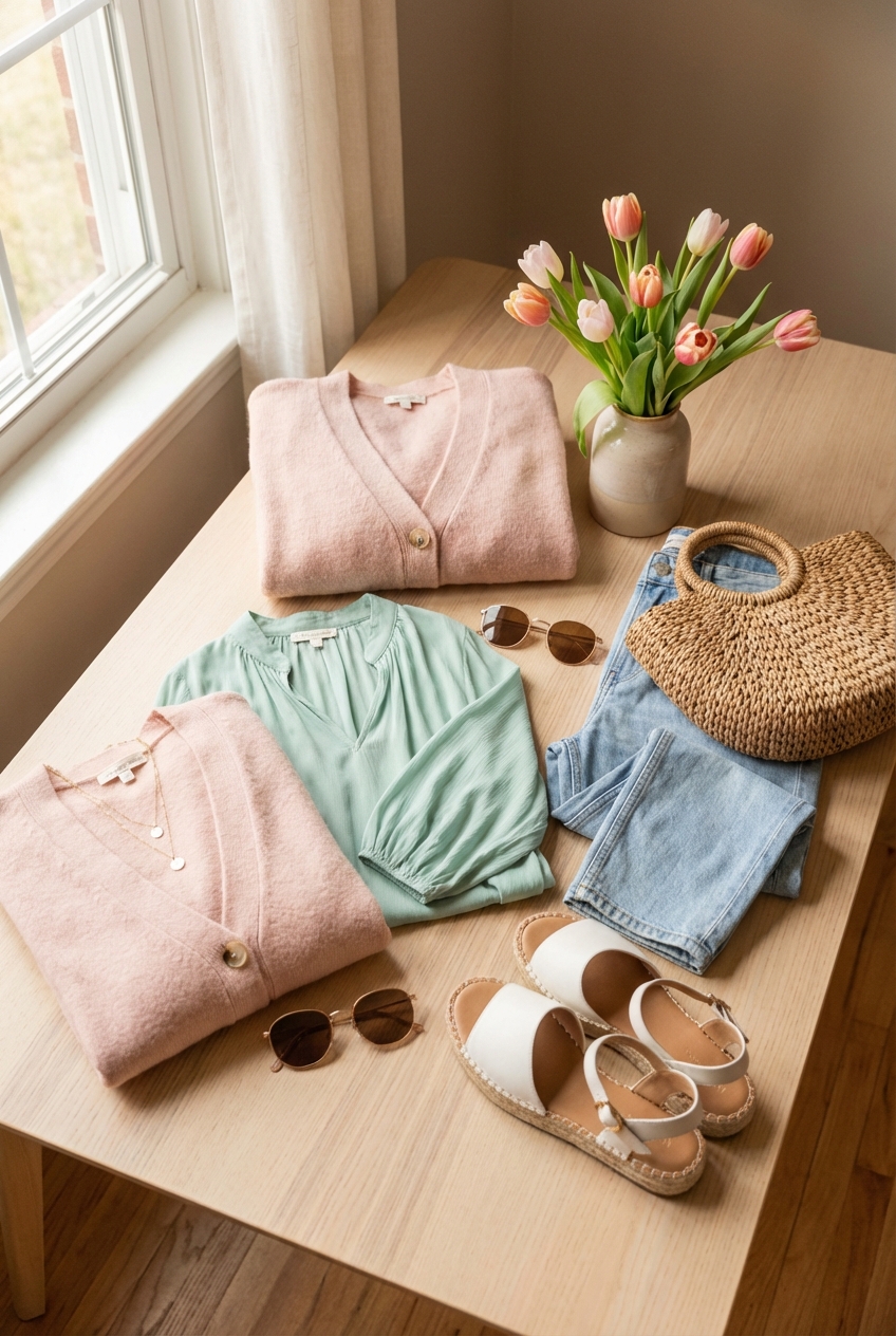
Picture Gallery


