Perfect Pastel Color Combinations For Summer Dresses
There is a precise moment every year when the heavy wool coats and dark charcoal knits get packed away, and the world suddenly feels ready for color. As the temperature rises, our wardrobes naturally shift toward lighter fabrics and softer hues that reflect the blooming landscapes around us. Summer dressing is not just about staying cool; it is about capturing a mood of ease, elegance, and optimism.
In my years styling high-profile clients for everything from Hamptons garden parties to Amalfi Coast weddings, I have learned that pastels are far more complex than they appear. Many women avoid them for fear of looking too sweet or “childish,” but when styled correctly, pastels are the epitome of sophistication. The secret lies entirely in how you combine them. A single pastel shade is lovely, but a curated combination of tones is what elevates an outfit from simple to editorial.
Finding that perfect balance requires a bit of color theory and a lot of attention to texture. We are going to explore exactly how to mix these soft shades to create high-impact looks. If you need immediate visual inspiration for your next outfit, be sure to check out the Picture Gallery at the end of the blog post.
Understanding Undertones: The Foundation of Pastel Styling
Before we start mixing colors, we need to address the canvas: your skin tone. The biggest mistake I see clients make is choosing a pastel that washes them out. Because pastels have low saturation and high white content, they can easily blend into the skin or make you look tired if the undertone clashes.
If you have cool undertones (veins look blue), you will shine in icy pastels. Think powdered blue, lavender, and cool mint. These colors harmonize with the pink or blue notes in your skin rather than fighting against them.
If you have warm undertones (veins look green), look for “sun-baked” pastels. Peach, coral, butter yellow, and warm sage are your best friends. These shades bring out the golden glow in your complexion and prevent that sickly pallor that can happen with cooler tones.
Designer’s Note: The “White Paper” Test
In the studio, when a client is unsure about a pastel fabric, I hold a stark white sheet of paper next to the dress. This instantly reveals the true tint of the color. A “nude” pink might actually read as muddy beige against white, or a “mint” might look shockingly neon. Always check your pastels in natural daylight to see their true character.
Combination 1: Lilac and Butter Yellow
This combination is having a massive moment in high fashion right now. It is unexpected, fresh, and undeniably cheerful. Lilac sits opposite yellow on the color wheel, making this a complementary pairing, but the desaturated nature of pastels softens the contrast.
The key here is to keep the saturation levels similar. You want a soft, milky lilac paired with a creamy butter yellow. If one color is neon and the other is muted, the outfit will feel disjointed.
How to Style It
I love a lilac slip dress paired with a structured butter-yellow blazer over the shoulders. This mixes the feminine fluidity of the dress with the masculine cut of the jacket. It is a power move that feels soft yet assertive.
For accessories, keep it neutral. Nude sandals or clear PVC heels work wonders here because they elongate the leg without introducing a third color that might clutter the palette. If you must add a third element, a white structured bag serves as a palate cleanser.
Common Mistakes + Fixes
- Mistake: Adding black accessories. Black is too harsh for this airy duo and will drag the eye down.
- Fix: Swap black for tan, cognac, or metallic gold. These warm neutrals support the yellow tones without dominating the look.
Combination 2: Sage Green and Blush Pink
This is nature’s most classic pairing. It mimics the aesthetic of a rose bush or a peony garden. It is inherently romantic and incredibly easy to wear because red (the base of pink) and green are complementary colors.
However, to keep this from looking like a bridesmaid dress from 2010, you need to play with texture. Flat polyester in these colors looks cheap. You want natural fibers that breathe and have surface interest.
Material Matters
I recommend looking for sage green in linen or silk textures. The natural slub of linen gives the green an earthy, grounded feel. Pair a sage linen midi skirt with a silk blush camisole. The contrast between the matte, rougher linen and the smooth, shiny silk adds a layer of luxury that color alone cannot achieve.
For a more modern approach, try a sage green utility dress—something with pockets and structure—and pair it with soft pink sneakers or a pink leather crossbody bag. This juxtaposes the utilitarian silhouette with a traditionally “girly” color.
What I’d Do in a Real Project
- The Dress: A sage green wrap dress with a high slit.
- The Shoe: A strappy sandal in a dusty rose suede.
- The Jewel: Rose gold. It bridges the gap between the pink and green perfectly.
Combination 3: Sky Blue and Tangerine/Peach
This combination captures the essence of a sunset over the ocean. It is vibrant yet soothing. Sky blue is universally flattering, while peach or light tangerine adds a punch of warmth that screams summer.
This pairing works best when you use color blocking. A dress that features large panels of blue and peach is a statement piece. Alternatively, separates work beautifully here.
Proportions and Scale
If you are petite, avoid breaking your body in half with a 50/50 color split. Instead, go for a monochromatic blue dress and add the peach tone through significant accessories, like a silk scarf tied at the neck or a waist-cinching belt.
For taller silhouettes, a wide-leg peach trouser paired with a fitted sky-blue halter top creates a stunning, elongated line. The volume on the bottom balances the fitted top, and the colors play off each other dynamically.
Designer’s Note: Handling Sheerness
Peach and pale blue fabrics are notorious for being sheer. Always check the lining. In my styling kit, I always carry seamless, skin-tone undergarments (not white!). White underwear will beam through peach fabric like a lighthouse. Match your undergarments to your skin tone, not the dress.
Combination 4: Mint Green and Periwinkle
This is a cool-toned masterpiece. It is refreshing, crisp, and ideal for the hottest days of July and August. Because both colors sit next to each other on the cool side of the spectrum, they create a serene, analogous harmony.
This look implies an “icy” sophistication. It is less playful than the yellow/lilac combo and more elegant, making it perfect for summer evening events or gallery openings.
Adding Metallic Accents
Because this palette is so cool, silver jewelry is the non-negotiable choice. Gold can sometimes clash with the icy undertones of mint. A stack of thin silver bangles or a statement silver choker elevates the look instantly.
I recently styled a client in a mint green maxi dress made of chiffon. We paired it with a periwinkle structured clutch and silver metallic heels. The result was ethereal but grounded enough for a formal event.
Texture Play
- Mint: Look for eyelet lace or crochet textures. This adds a bohemian touch.
- Periwinkle: This color looks incredible in satin or heavier cotton poplin.
- The Mix: A periwinkle poplin shirt dress with a mint green sweater tied loosely around the shoulders is the ultimate “preppy chic” summer vibe.
Combination 5: Lemon Yellow and Dove Grey
While grey isn’t technically a pastel, dove grey acts as one in the summer palette. It is a softer alternative to white and much more interesting than beige. Pairing a sunny lemon yellow with a cool, sophisticated grey creates a look that is modern and urban.
This is a fantastic combination for workwear or city living. The grey grounds the yellow, preventing it from looking too “resort wear,” while the yellow prevents the grey from looking like a winter corporate suit.
The Corporate Summer Look
Try a lemon yellow sheath dress paired with a lightweight grey blazer. It is professional but celebrates the season. Alternatively, a grey pleated skirt with a yellow silk blouse is feminine and powerful.
When choosing the grey, ensure it is a light, heathered grey. Dark charcoal will create too much contrast and look like a bumblebee. You want the values (lightness/darkness) to be relatively close.
Combination 6: All-Over Pastel (The Monochromatic Look)
Sometimes, the best combination is different shades of the same color. Monochromatic dressing elongates the frame and looks expensive. The trick is variance in tone and texture.
If you choose pink, mix a pale blush skirt with a slightly deeper rose top. If you choose blue, pair powder blue with a soft chambray.
Breaking Up the Block
To prevent looking like a giant marshmallow, you need to show some skin. Summer dresses are perfect for this. Off-the-shoulder cuts, high slits, or open backs break up the block of color.
You also need to mix fabric weights. A heavy cotton skirt with a sheer chiffon blouse in the same shade adds depth. If everything is the same fabric and same color, the outfit looks like a uniform.
Finish & Styling Checklist
Before you walk out the door, run through this quick mental checklist. These are the final touches that separate a “nice outfit” from a “styled look.”
- The Steamer Test: Pastels show wrinkles more than dark colors. A wrinkled lavender dress looks messy, not chic. Give your dress a quick steam.
- The Hemline Check: Ensure your dress length works with your shoe choice. Midi dresses should hit at the slimmest part of your calf. If the dress is too long, it can drag visually.
- Hardware Harmony: match your metals. If your bag has gold hardware, wear gold earrings. Clashing metals can make a pastel outfit look busy.
- Makeup Balance: With pastels near your face, you might need a slightly brighter lip or blush to avoid looking washed out. A pop of coral lipstick works wonders with most pastel outfits.
- The Undergarment Audit: Check one last time in bright lighting to ensure nothing is showing through. Pastels are unforgiving.
Frequently Asked Questions
Can I wear pastels to a formal evening wedding?
Absolutely. The key is the fabric. Pastel cotton looks casual; pastel silk, chiffon, or crepe looks formal. Opt for floor-length gowns in mint, lilac, or pale blue. Avoid blush pink if it is too close to white or bridal champagne tones, just to be safe.
What shoes should I wear if I don’t want to wear nude heels?
Metallics are the best neutral alternative. Gold, silver, and rose gold sandals act as neutrals but add glamour. White shoes can work, but they can sometimes look a bit retro or “medical” if not styled carefully. For a bold look, color block your shoes (e.g., pink shoes with a green dress).
Do pastels work for plus-size figures?
Yes, 100%. The old rule that “black is slimming and light colors make you bigger” is outdated. Fit is what matters, not color. A well-tailored pastel dress that skims the body is infinitely more flattering than an ill-fitting black sack. Look for structured fabrics that provide support and defined waists.
How do I transition summer pastels into early fall?
Layering is the secret. Take your summer pastel dress and throw a chunky knit cardigan in a camel or oatmeal shade over it. Swap your sandals for suede ankle boots in a neutral tone. This anchors the light colors and makes them appropriate for cooler weather.
Conclusion
Embracing pastel color combinations is about allowing yourself to be playful while maintaining elegance. It is a shift away from the safety of black and navy into a world that feels lighter and more joyful. Whether you opt for the romantic pairing of sage and blush or the bold contrast of lilac and yellow, the most important accessory is your confidence.
Remember that fashion is experimental. Use the rules of thumb regarding skin tone and fabric texture as your guide, but do not be afraid to try a combination that speaks to you. Summer is fleeting, so wear the dress, mix the colors, and enjoy the season.
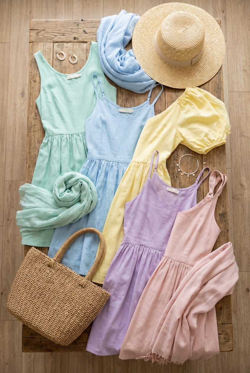
Picture Gallery


