Print Mixing 101 Combining Patterns And Colors Confidently
Introduction
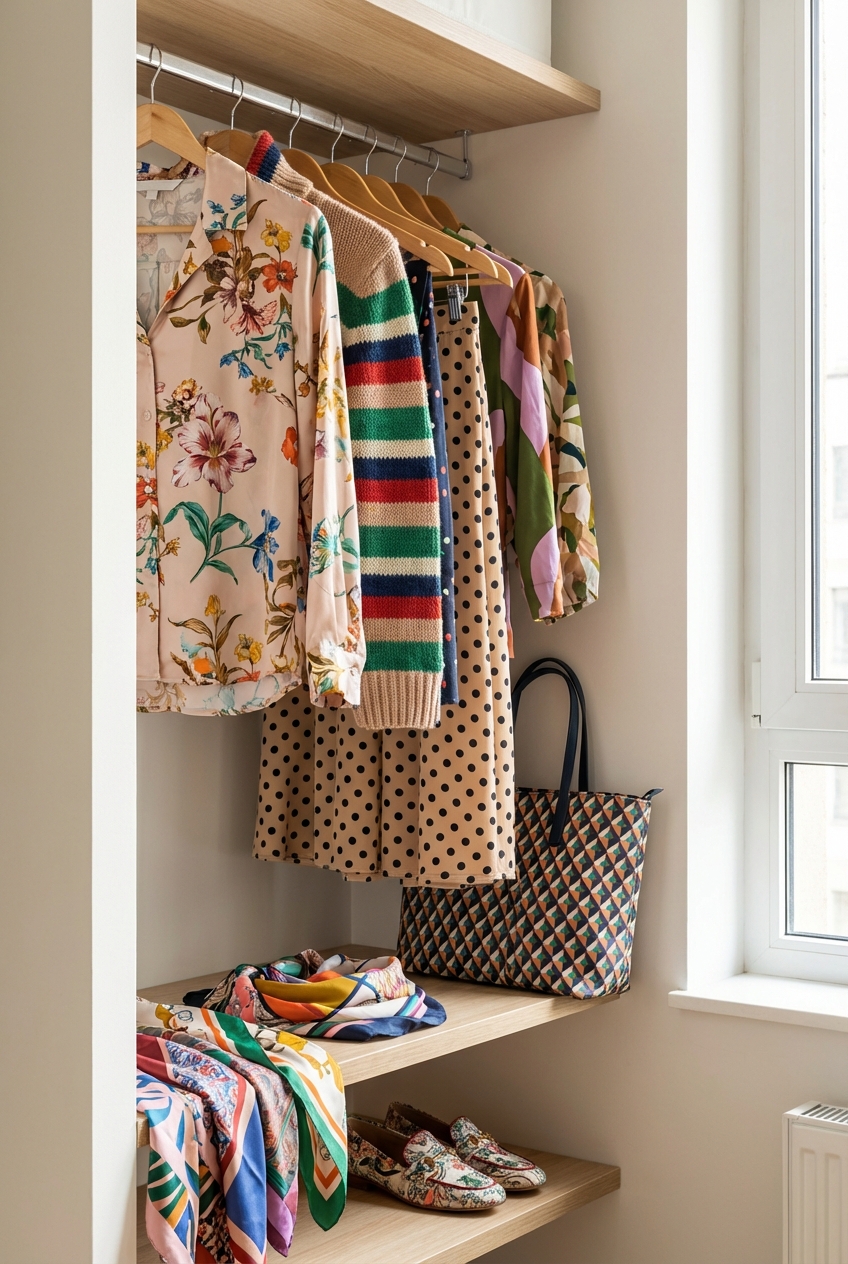
Approaching interior design should feel exactly like curating a high-fashion wardrobe. Just as you wouldn’t hesitate to pair a structured pinstripe blazer with a fluid silk floral skirt, you shouldn’t fear mixing patterns in your living space. The ability to layer prints is what separates a showroom catalog look from a home that feels bespoke, collected, and deeply personal. It creates a visual narrative that looks expensive and intentional rather than chaotic.
However, I often see clients freeze when it comes to their homes, even if they are incredibly adventurous with their personal style. They worry that a leopard print rug will clash with their ikat curtains, or that wallpaper makes a room feel smaller. The truth is that the principles of sartorial styling—balance, scale, and color theory—apply perfectly to upholstery and finishes.
In this guide, I will break down the formula I use to mix prints with the same confidence I have when styling a runway look. We will cover the mechanics of scale, the importance of a cohesive color story, and how to ground the look so it feels sophisticated. If you need visual inspiration after reading the rules, be sure to check out the curated Picture Gallery at the end of the blog post.
The Foundation: Mastering the Art of Scale
The single most common mistake in print mixing is using patterns that are all the same size. In fashion, you wouldn’t wear a polka dot top and a polka dot skirt of the exact same size unless it was a deliberate matching set. The same logic applies to your living room.
You need a hierarchy of prints to guide the eye. If every pattern is shouting at the same volume, the room becomes visually exhausting. We want harmony, not noise.
The Rule of Three Scales
To achieve balance, categorize your prints into three distinct scales: large, medium, and small.
- The Hero Print (Large Scale): This is your statement piece, much like a designer coat. It sets the tone for the room. This pattern should have a large repeat (usually 18 to 24 inches). Great applications for this are area rugs, wallpaper, or floor-to-ceiling drapery.
- The Supporting Print (Medium Scale): This pattern should differ in style from the hero print but share similar colors. The scale should be about half the size of your hero print. This works perfectly for armchairs, ottomans, or large euro-sham pillows.
- The Blender Print (Small Scale): This acts almost like a texture. From a distance, it might read as a solid color. Think small geometrics, tiny florals, or ticking stripes. Use this for throw pillows, lampshades, or a bench at the foot of the bed.
Designer’s Note: The Squint Test
When I am on a project site, I often use the “squint test” to verify scale. Step back ten feet from the fabric samples and squint your eyes.
If the patterns blur together and look indistinguishable, they are too similar in scale. You want to be able to clearly see the geometry of the large print while the small print fades into a textural background.
The Common Thread: Establishing a Color Story
Successful print mixing relies heavily on a unified color palette. In high-end fashion, we often use a “link color” to tie different pieces together. This is the hue that appears in nearly every pattern you select, creating a thread of continuity.
Without a shared color story, mixing patterns looks accidental. With a shared color story, it looks curated and high-concept.
The 60-30-10 Logic
I apply the classic 60-30-10 rule to keep the patterns from overwhelming the space.
- 60% of the room should be your dominant color or background tone. This is usually your wall color, large furniture pieces (like a sofa), and flooring. In a pattern-heavy room, this provides the “white space” the eye needs to rest.
- 30% of the room is your secondary color. This is often where your “Hero Print” lives. It adds depth and interest without taking over the entire visual field.
- 10% of the room is your accent color. This is the bold pop found in your “Blender Prints” or accessories. It adds the jewelry to the outfit.
Real-World Application
If your hero print is a large-scale botanical featuring navy, emerald, and cream, your strategy is clear. Your walls and main sofa (the 60%) could be cream or a textured navy linen. Your secondary patterns (the 30%) should pull the emerald green. Your accents (the 10%) can utilize a metallic gold or a deep burgundy that contrasts with the botanical.
Stripes and Geometrics: The Neutrals of the Pattern World
In a fashion capsule wardrobe, a Breton stripe shirt is considered a neutral. It goes with florals, plaids, and even animal prints. The same is true in interior design.
Stripes and geometric grids are the palate cleansers of pattern mixing. They provide structure and order to organic, flowing prints like florals or paisleys.
Why They Work
Organic patterns (florals, toiles, ikats) have movement and curves. Stripes and plaids have rigid lines. This contrast creates dynamic tension that feels modern and sophisticated.
If you have a busy floral wallpaper, a striped headboard or rug will instantly ground the space. It stops the room from feeling too sweet or grandmotherly.
Placement and Direction
- Vertical Stripes: These draw the eye up, making ceilings feel higher. They are excellent for drapery or wallpaper in low-ceilinged rooms.
- Horizontal Stripes: These widen a space. A rug with horizontal stripes can make a narrow hallway or galley kitchen feel significantly wider.
- Grid/Check Patterns: A buffalo check or windowpane plaid is incredibly versatile. It bridges the gap between masculine and feminine styles effectively.
Materiality: Fabric Weight and Texture
A common mistake is focusing only on the visual print and ignoring the texture. In fashion, you wouldn’t pair a heavy wool tweed with a cheap, shiny polyester. The weights must make sense together.
Mixing prints is also about mixing materials. If all your patterns are printed on flat cotton, the room will look flat and cheap. You need variety in the “hand” of the fabrics.
Texture Combinations That Work
- Velvet: Adds depth and luxury. A patterned velvet absorbs light, making the colors appear richer. It works beautifully for the “Hero Print.”
- Linen/Cotton: These are breathable and matte. They work well for the “Supporting Prints” or drapery because they hang beautifully but don’t compete with the sheen of velvet.
- Wovens: Instead of a printed pattern, use a woven pattern (like a herringbone or houndstooth). This adds physical texture that you can feel, adding complexity to the design.
Common Mistakes + Fixes
Mistake: Using high-sheen fabrics for every pattern.
Fix: Limit shiny fabrics (silks, satins, polished cottons) to one or two accents. Balance them with matte textures like wool, jute, or linen.
Navigating Constraints: Renters, Pets, and Kids
High-end design does not have to be fragile. In fact, patterns are often more practical than solids because they hide life’s little messes. A pristine white sofa is a risk; a patterned rug is a shield.
For Families and Pet Owners
Patterns are your best friend if you have dogs or toddlers. A “busy” rug or a heathered fabric hides pet hair and small stains far better than a solid color.
What I’d do in a real project: For a family room, I would choose a high-performance Crypton fabric for the sofa in a woven texture. Then, I would layer a vintage-style Persian rug (the complex pattern hides everything) and use removable pillow covers in bold prints that can be washed.
For Renters
If you cannot hang wallpaper, you can still embrace pattern mixing through textiles and rugs.
- Peel-and-Stick Wallpaper: The technology has improved drastically. Use a bold print in a powder room or an entryway for a low-risk, high-reward moment.
- Layering Rugs: If you are stuck with generic beige rental carpet, layer a large patterned area rug on top. It defines the zone and distracts from the bland flooring.
- Curtains: Replace standard rental blinds with floor-to-ceiling patterned drapery. Just ensure you patch the screw holes when you move out.
Spacing and Layout Logic
Even with the right prints, the wrong placement can throw off the room. You want to distribute the patterns around the room so the visual weight is balanced.
If all your patterns are on one side of the room (e.g., patterned curtains next to a patterned chair), that side will feel “heavy,” and the room will feel tilted.
Triangulation
Imagine a triangle in your room. Place your three main pattern moments at the points of that triangle.
1. Point A: The area rug.
2. Point B: The drapery or a piece of art on the wall.
3. Point C: Throw pillows on the sofa opposite the drapery.
This forces the eye to bounce around the room, taking in the full scope of the design.
Distance and Negative Space
Give your patterns room to breathe. I recommend leaving at least 3 to 5 inches of solid color space between different patterns.
For example, if you have a patterned sofa and a patterned rug, break them up. Ensure the sofa has visible solid wood legs, or use a solid color rug binding to create a border. Alternatively, use a solid color throw blanket draped over the sofa seat to create a visual buffer.
Finish & Styling Checklist
When I am finalizing a room, I run through this mental checklist to ensure the mix feels “fashion-forward” rather than “flea market.”
1. Check the Scale:
Do I have one large, one medium, and one small print? If two look the same size, I need to swap one out.
2. Verify the Color Link:
Is there one specific color (like navy, terracotta, or sage) that appears in at least three different places in the room?
3. The Solid Grounding:
Is there enough solid color (60%) to let the eyes rest? If the room feels claustrophobic, I likely need to remove one patterned element and replace it with a solid.
4. The Nature Check:
Have I included an organic shape? If everything is geometric (stripes, checks, triangles), the room will feel rigid. Add a floral, an animal print, or a paisley to soften the lines.
5. The Metal Mix:
While not a print, metals act as “jewelry.” Ensure your metals (lamps, table legs) don’t clash with the undertones of your prints. Warm prints (reds, oranges) look best with gold/brass. Cool prints (blues, grays) pair well with silver/nickel. Black metal works with everything.
FAQs
Can I mix metals with mixed prints?
Absolutely. In fact, mixing metals adds another layer of sophistication. Treat metals like you treat solid colors. If your prints are warm (golds, browns, reds), unlacquered brass is a natural fit. If your prints are cool (blues, grays), polished nickel or chrome works well. Matte black is the universal neutral that grounds any palette.
How do I mix prints in a small room without overwhelming it?
In small spaces, keep the background neutral. Keep your walls and largest furniture pieces solid. Use patterns on the floor (rugs) and in accents (pillows/art). Also, stick to a tighter color palette—perhaps just two colors (like blue and white) mixed in various patterns. This is called a monochromatic pattern mix and is very chic.
What if I love a print but it doesn’t fit my color scheme?
Treat it as an outlier or “pop.” In fashion, this would be a red handbag with an all-black outfit. However, if you do this, make sure it is the only outlier. If you have too many random colors, the room loses its cohesion.
Is animal print considered a pattern or a neutral?
In the high-fashion world, leopard and snake prints are widely considered neutrals. Because they are comprised of earth tones (black, brown, tan, cream), they act as a base. You can easily pair a leopard rug with a floral sofa, provided the scale is different.
Conclusion
Mixing prints is the ultimate expression of personal style. It shows that you trust your eye and aren’t afraid to take up space. Just as you layer textures and colors in your wardrobe to create an outfit that feels uniquely “you,” your home should reflect that same complexity and depth.
Start small. Swap out your solid throw pillows for a mix of stripes and florals. Layer a vintage runner over your neutral sisal rug. As you get more comfortable with the rules of scale and color, you will find that breaking them becomes the most fun part of the process. Trust your instincts, respect the measurements, and create a home that feels as curated as your closet.
Picture Gallery


