Introduction
On a bright spring morning, I found myself rummaging through my grandmother’s vintage trunk, the scent of cedarwood mingling with the soft rustle of fabric. Among delicate floral prints and vibrant knitwear, I was struck by how timeless and captivating retro style could be. It wasn’t just nostalgia—it was a powerful reminder that fashion is cyclical, and the color palettes of the past have the ability to invigorate our present wardrobes with warmth, personality, and confidence.
This moment sparked a deep curiosity about how retro spring styling, particularly its color palette, influences not only what we wear but how we feel and are perceived by others. From the buttery pastels of 1960s mod fashion to the bold corals and teals of the 1970s, these hues carry emotional resonance. Understanding this intersection of color, style, and psychology empowers us to craft looks that are both expressive and flattering.
Why does this matter? Because fashion is more than fabric and thread; it is a visual language of identity and mood. When you master retro spring color palettes and styling, you don’t just get dressed—you curate a daily experience that energizes your style confidence and leaves an unforgettable impression. Let’s explore how to harness these vibrant, nostalgic colors to refresh your spring wardrobe and transform your personal style.
Foundational Concepts
Before diving into specific retro trends and color combos, it is essential to explore three foundational pillars that shape successful styling: color psychology, trend forecasting, and dressing to impress. Each provides a framework for understanding not only what looks good but why it looks good and how it can boost your confidence.
Color Psychology
Color psychology examines how colors influence emotions and behaviors. Research in this field shows that different hues can evoke feelings such as calm, excitement, trust, or creativity. For example, soft lavender creates a sense of calm, while a vibrant tangerine sparks energy and optimism. This is crucial when considering retro spring palettes because these colors often carry distinct emotional messages shaped by cultural and historical associations.
In my own experience studying this academically, I found that wearing colors aligned with my mood or intent helped me feel more authentic and empowered. When you wear retro pastels or rich jewel tones, you tap into a subconscious language that can improve your social interactions and self-esteem.
Trend Forecasting
Trend forecasting involves predicting the direction of fashion and color trends based on cultural shifts, consumer behavior, and past cycles. Retro styles, particularly those from the 50s to 70s, often resurge because they resonate with societal desires for nostalgia and sustainability. Understanding this can guide you to invest wisely in pieces that feel fresh yet timeless.
For instance, current spring trends embrace muted earth tones mixed with bold retro hues, offering versatility. As a designer and stylist, I encourage clients to look at how past palettes are reinterpreted with modern cuts and fabrics to create sophisticated, wearable looks.
Dressing to Impress
“Dressing to impress” extends beyond formal occasions; it is about aligning clothing choices with your goals and lifestyle to command presence and confidence every day. Knowing how retro color palettes can harmonize with your skin tone and personality lets you communicate confidence effortlessly. When you dress to impress, you harness fashion as a tool to influence perception—whether in the boardroom, a casual brunch, or a creative gathering.
Picture Gallery


Color Psychology & Emotional Impact
Colors profoundly impact our mood and how others perceive us. The science of first impressions indicates that color is often one of the initial visual signals people interpret, influencing judgments about trustworthiness, competence, and warmth. Retro spring palettes, rich in both soft pastels and vibrant primaries, have unique emotional impacts worth exploring.
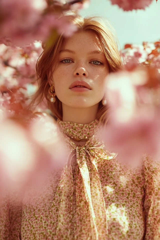
Pastel Shades: Soft pinks, baby blues, mint greens, and buttery yellows evoke calmness, approachability, and freshness. These hues psychologically suggest gentleness and optimism—perfect for spring renewal. When wearing these colors, you are likely to appear open and friendly.
Bright Retro Hues: Colors like coral, turquoise, and sunflower yellow stimulate creativity and vitality. They’re associated with enthusiasm and confidence, helping wearers to stand out in a crowd. These shades can be mood-lifters, making you feel more energized and project warmth.
Earthy Retro Tones: Mustard, burnt orange, olive green, and warm browns suggest groundedness and reliability. These colors convey a sense of stability and maturity, balancing more playful tones within a retro palette. They work beautifully as foundation pieces to anchor your look.
Wearing colors that resonate emotionally with you can enhance self-confidence and improve social interactions. When choosing retro spring palettes, consider how you want to feel and be perceived—this alignment elevates your overall presence.
Personal Style & Body Type Considerations
Every individual’s style journey is deeply personal and should celebrate their unique body shape and complexion. Retro spring color palettes provide a versatile range of hues that flatter diverse skin tones and silhouettes, but choosing the right combinations is key.
Silhouettes and Fabrics
- Hourglass: Emphasize waist with fitted tops and flared skirts in vibrant or pastel retro colors to highlight curves beautifully.
- Rectangle: Create dimension with layered retro prints and textured fabrics like lightweight knits or organza to add softness.
- Pear: Opt for lighter or brighter shades on top balanced with muted earth tones below to draw attention upward.
- Apple: Choose structured fabrics and A-line dresses in calming pastels to provide definition and elegance.
Complexion and Color Matching
Skin tone influences how retro spring colors look on you:
- Cool undertones: Best with lavender, powder blue, and pastel green for harmonious contrast.
- Warm undertones: Shine in coral, mustard yellow, and olive green that warm up the complexion.
- Neutral undertones: Versatile with both bright retro hues and muted pastels.
Quick Checklist: Which Retro Spring Colors Suit You?
- Do muted, soft tones make your skin glow or wash it out?
- Do you feel energized wearing bright, bold colors or overwhelmed?
- Does your complexion appear warmer or cooler under different lights?
- Which retro colors prompt compliments or positive reactions?
Answering these questions will help you select retro palettes that enhance your natural beauty and boost confidence.
Current Trends & Timeless Classics
This spring, retro styles flourish in both runway collections and streetwear, blending nostalgia with modern sensibility. Trending colorways include soft lilacs, coral pinks, sunny yellows, and teal accents—each rooted in vintage inspirations but refreshed through contemporary fabrics and cuts.
Trending Retro-Inspired Pieces: Think puff sleeves in pastel hues, high-waisted trousers in bold oranges, and cropped knit tops in mint green. These styles affirm the cyclical nature of fashion, allowing you to channel retro vibes without feeling dated.
Timeless Classics: Meanwhile, some pieces remain perennial favorites—such as A-line skirts, fitted cardigans, and tailored jackets in mustard, navy, or cream. Combining these with trending colors creates a balanced look that is both current and enduring.
To blend trends with classics, try pairing a retro floral blouse with high-waisted, solid-colored trousers, or layer a pastel pastel cardigan over a timeless shift dress. This approach ensures your wardrobe remains versatile and personal.
Practical Tips & Recommendations
Implementing retro spring color palettes into your wardrobe should be fun and practical. Here are actionable tips to help you shop, maintain, and style these vintage-inspired hues:
- Smart Shopping: Prioritize quality over quantity by investing in statement pieces in your chosen retro colors. Look for sustainable fabrics such as organic cotton or linen blends that are breathable and durable.
- Wardrobe Maintenance: Store delicate pastels away from direct sunlight to prevent fading. Use gentle detergents designed for color preservation to keep your garments vibrant.
- Layering: Use contrasting colors to add dimension. For example, layer a mint-green blouse under a mustard sweater vest or pair coral trousers with a cream jacket.
- Accessorizing: Retro accessories like cat-eye sunglasses, chunky bracelets, and headscarves in coordinating colors can elevate your look instantly.
- Color Combos to Try: Pair pastel pink with olive green for a fresh spring vibe. Combine teal with burnt orange for a bold retro statement. Match sunflower yellow with navy for a sophisticated classic.
Visual aids suggesting these palettes might include swatches of pastel mint, coral, and mustard with alt text such as “Vintage-inspired spring fashion color palette swatches in pastel and bold tones.”
FAQs
- Q: How do I find my signature retro spring color?
A: Start by testing a range of retro pastels and vibrant hues against your skin tone to see which shades enhance your complexion and mood. Personal comfort and compliments often guide you toward your signature. - Q: Can I incorporate retro styling on a budget?
A: Absolutely. Focus on key retro pieces such as scarves or blouses in signature colors and pair them with neutral staples. Thrift stores and online resale marketplaces offer affordable vintage finds. - Q: How do I maintain retro-colored garments’ vibrancy?
A: Use cold water washes, avoid harsh detergents, and keep items out of prolonged direct sunlight. Store clothes in breathable garment bags to reduce color fading over time. - Q: What are some capsule wardrobe essentials for retro spring styling?
A: Consider pastel cardigans, high-waisted trousers, A-line skirts, retro prints, and versatile layering pieces in earthy tones. These create a coherent, mix-and-match wardrobe. - Q: How do I balance retro colors with modern trends?
A: Blend vintage-inspired hues with contemporary silhouettes and accessories. For example, pair a mustard vintage blouse with sleek modern jeans or wear pastel cropped tops with trendy sneakers for a fresh, cohesive look.
Conclusion
Exploring retro spring styling and its vibrant color palettes reveals a beautiful synergy between nostalgia, psychology, and modern fashion. By understanding color psychology, body types, and current trends, you can create looks that not only flatter but uplift your spirit and presence.
The true power of fashion lies in its ability to foster self-expression and confidence. I encourage you to experiment boldly with retro hues—mix pastels with earth tones, layer textures, and don’t shy away from playful combinations. Style is your personal statement, and the retro spring palette offers endless inspiration to make it uniquely yours.
Feel inspired? Share your retro spring styling stories and favorite color combos in the comments below. Don’t forget to subscribe for more expert fashion insights and tips to help you dress to impress every season.