Seasonal Color Analysis Choosing Capsule Wardrobe Colors That Suit You
I recall my first year working in high-end fashion styling, standing in a fitting room with a client who looked exhausted despite having slept eight hours. She was wearing a beautiful, expensive camel coat. We swapped it for a cool charcoal grey trench, and the transformation was instant. Her jawline looked sharper, the circles under her eyes vanished, and her skin glowed. It wasn’t magic; it was physics. The camel drained her cool undertones, while the charcoal harmonized with them.
Building a capsule wardrobe is about efficiency and cohesion, but if the foundation colors fight against your natural complexion, the wardrobe will never feel quite right. Seasonal color analysis is not just an old trend from the 80s; it is the cornerstone of a functional closet. When you curate a capsule based on your specific season, every item mixes and matches effortlessly, and you look vibrant in everything you own.
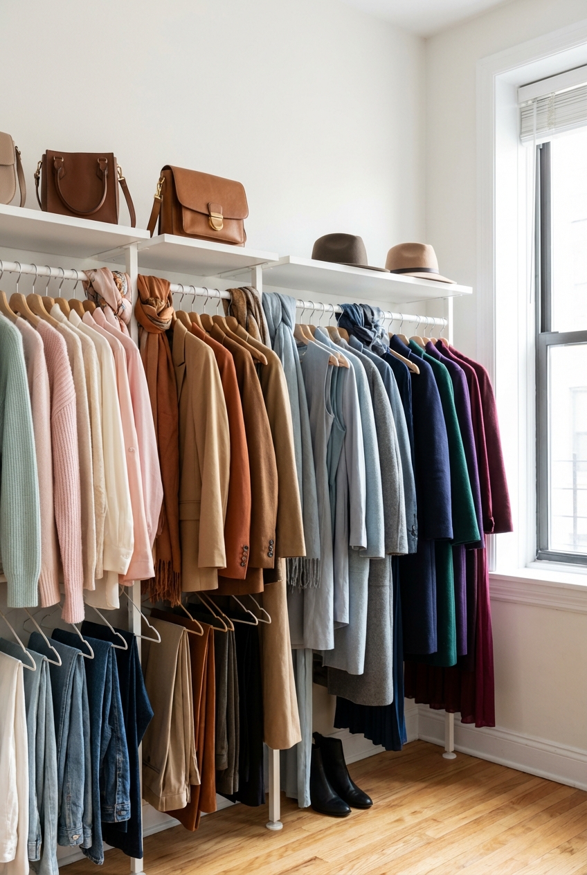
In this guide, we are going to break down how to identify your season and, more importantly, how to translate that into a workable, chic capsule wardrobe. For visual examples of these color palettes in action, be sure to check out the Picture Gallery at the end of the blog post.
The Science of Undertones: It Starts Beneath the Surface
Many people mistake their overtone (the surface color of the skin, which can be fair, olive, or deep) for their undertone. This is the most common error in DIY color analysis. Your overtone can change with sun exposure or conditions like rosacea, but your undertone remains consistent throughout your life.
To build a lasting capsule wardrobe, we must determine if you lean Warm, Cool, or Neutral. Fashion professionals use draping to determine this, but you can do a preliminary check at home using a few reliable tests.
The Metal Test
Hold a piece of silver fabric and a piece of gold fabric under your chin in natural light. Do not look at which color you “like” more. Look at your jawline. Does the silver make your skin look clear and lifted (Cool), or washed out and grey? Does the gold make you look healthy and glowing (Warm), or sallow and feverish?
The Pure White vs. Cream Test
Hold a sheet of optical white paper or fabric against your face. If you are Cool, the white will look crisp and harmonious. If you are Warm, the white will make you look slightly yellow or dull, while an unbleached cream or ivory fabric will make your complexion sing.
Designer’s Note:
Lighting is everything. Never attempt to find your undertone in a bathroom with yellow bulbs or fluorescent office lighting. These artificial sources cast color casts that skew the results. Stand directly in front of a North-facing window around noon for the most accurate read.
Decoding the Four Seasons
Once you understand your undertone (Warm vs. Cool) and your contrast level (the difference in depth between your hair, skin, and eyes), we can slot you into one of the four main seasons. This is the blueprint for your capsule.
Winter (Cool + High Contrast)
Winters generally have cool undertones and a high intensity of contrast. Think of Snow White: dark hair, pale skin, or deep skin with very white teeth and bright eyes. The palette is sharp, icy, and bold.
- Neutrals: Black, True White, Charcoal, Navy.
- Accents: Royal Blue, Emerald Green, Hot Pink, True Red.
- Avoid: Earth tones, beige, orange, and gold.
Summer (Cool + Low Contrast)
Summers also have cool undertones but are much softer than Winters. There is less contrast between the hair and skin. The overall vibe is muted and dusty, like a landscape viewed through a misty morning.
- Neutrals: Soft White, Rose Beige, Slate Grey, Taupe.
- Accents: Lavender, Powder Blue, Mauve, Mint Green.
- Avoid: Black (too harsh), orange, and bright yellow.
Autumn (Warm + Low Contrast)
Autumns have a warm, golden undertone with a rich, earthy quality. This season is often associated with red or warm brown hair and hazel or warm brown eyes. The colors are deep and muted.
- Neutrals: Cream, Camel, Chocolate Brown, Olive Khaki.
- Accents: Burnt Orange, Mustard, Terracotta, Forest Green.
- Avoid: Pastels, shock pink, and cool grey.
Spring (Warm + High Contrast)
Springs are warm but bright and clear. Unlike Autumns, whose colors are muddy and rich, Springs shine in colors that look like a fresh garden. They often have bright blue or green eyes and golden-blonde or light brown hair.
- Neutrals: Ivory, Golden Tan, Warm Navy, Dove Grey.
- Accents: Coral, Turquoise, Bright Yellow, Poppy Red.
- Avoid: Black, muddy browns, and dusty pastels.
The Draping Method: How to Test at Home
As a stylist, I never rely on a chart alone. The fabric must be near the face. Here is the exact process I use with clients to confirm their season before we buy a single garment.
- Prepare the Canvas: Tie your hair back completely. If your hair is dyed a color that doesn’t match your roots, cover it with a white towel. Remove all makeup. You need to see your skin in its raw state.
- Gather the Drapes: Find household items (towels, t-shirts, sheets) in specific colors: Orange (Autumn), Hot Pink (Winter), Muted Blue (Summer), and Bright Coral (Spring).
- The Mirror Test: Sit facing your natural light source with a mirror. Hold up the Orange. If you see dark shadows under your eyes or your skin looks uneven, you are likely Cool (Summer or Winter). If you glow, you are Warm (Spring or Autumn).
- Refine the Result: Once you determine Warm or Cool, test the intensity. Compare the Muted Blue (Summer) against the Hot Pink (Winter). Does the pink overpower you, wearing you instead of you wearing it? Then you are a Summer.
Common Mistakes + Fixes:
Mistake: Letting personal preference bias the result.
Fix: Ask a friend to be the judge. We often hate the colors that suit us best initially because we aren’t used to seeing ourselves so clearly. Trust the reaction of a neutral observer.
Building the Capsule: The 3-Color Hierarchy
A capsule wardrobe fails if it looks like a box of crayons. To make your seasonal palette work for a minimalist wardrobe, you need to structure your color usage. I use a hierarchy system to ensure mix-and-match capability.
Level 1: The Core Neutrals (50% of Wardrobe)
These are your investment pieces: coats, blazers, trousers, and leather goods. These items are worn multiple times a week and need to be the most versatile shades in your seasonal palette.
- Winter: Black and Navy.
- Summer: Grey and Navy.
- Autumn: Camel and Chocolate.
- Spring: Tan and Cream.
Level 2: The Key Colors (30% of Wardrobe)
These are your tops, knitwear, and day dresses. These colors should compliment your core neutrals but add life to your face. They are the workhorses of your style.
- Winter: Icy Blue, Ruby Red.
- Summer: Sage, French Blue.
- Autumn: Rust, Olive.
- Spring: Peach, Periwinkle.
Level 3: The Statement Accents (20% of Wardrobe)
This is where you have fun. Shoes, scarves, handbags, or a statement blouse. These can be the brightest or most intense version of your palette.
What I’d do in a real project:
For a professional client who is a Soft Summer, I would anchor her closet with a charcoal grey wool coat and navy trousers. We would add cashmere sweaters in dusty lilac and seafoam green. For her accents, I would choose a silk scarf in a deeper plum pattern. Every single item would match the charcoal coat.
Fabric and Texture: Where Color Meets Material
Color does not exist in a vacuum; it lives on fabric. The texture of the material changes how the color is perceived and how it interacts with your features. This is a crucial detail often missed in basic color guides.
Matte vs. Sheen
Shiny fabrics like silk, satin, and polished leather reflect light and make colors appear lighter and brighter. Matte fabrics like wool, linen, and cotton suede absorb light, making colors appear deeper and richer.
If you are a Soft Summer or Soft Autumn, you generally look better in matte textures. Highly reflective fabrics can look too harsh or “cheap” against muted coloring. Stick to cashmere, crepe, and suede.
If you are a Bright Spring or Clear Winter, you can handle sheen. A satin blouse or patent leather shoe harmonizes with the sparkle in your eyes. The reflection matches your natural high contrast.
Weave Density
Chunky knits distort color, creating shadows within the garment. This is excellent for Autumns, as it adds depth to earth tones. Fine gauge knits create solid blocks of color, which is preferable for Winters who need sharp, defined lines.
Translating Your Palette to Real Life
Knowing your colors is one thing; shopping for them is another. Stores do not organize clothes by “Deep Autumn.” You must train your eye to filter out the noise on the rack.
The “Cluster” Strategy
When shopping, don’t buy one-off pieces. Shop in clusters. If you find a blazer in your perfect Spruce Green, immediately look for a blouse and a pair of shoes in the store that coordinate with it. If you can’t create a mini-outfit in the store, that blazer will likely sit unworn in your closet.
Navigating Trends
Fashion trends often favor one season heavily. One year might be all neon (Winter/Spring), and the next all beige (Autumn). If the current trend is not your season, do not force it. Instead, buy that trend in an accessory worn away from the face, like a skirt or a handbag, or skip it entirely. A capsule wardrobe is about longevity, not trends.
Denim Selection
Even jeans have a temperature.
- Cool Seasons: Look for indigo washes, black denim, or pure white denim. Avoid vintage washes with yellow tinting.
- Warm Seasons: Look for vintage washes, creamy denim, or deep indigo that has a teal rather than purple cast.
Finish & Styling Checklist
Use this checklist to audit your current closet and plan your next shopping trip. This ensures you stay within your seasonal boundaries for maximum cohesion.
- The Vein/Jewelry Check: Have I confirmed my undertone (Gold/Warm vs. Silver/Cool)?
- The Daylight Test: Did I check my skin against colors in natural light, not bathroom lighting?
- The Face Frame: Are the colors nearest my face (scarves, tops, collars) in my best “Key Colors”?
- The Black Audit: If I am not a Winter, have I moved black away from my face to my lower body or accessories?
- The 3-Color Rule: Does my outfit consist of one neutral, one key color, and one accent?
- Texture Match: Does the fabric finish (matte vs. shiny) suit my contrast level?
FAQs
Can I ever wear black if I am not a Winter?
Yes, absolutely. However, if you are a Spring, Summer, or Autumn, black can look heavy and drain the life from your face. The stylist trick is to keep black away from your portrait area (neck and head). Wear black trousers, skirts, or shoes, but choose a top in your seasonal palette to bridge the gap between the black garment and your skin.
Does my season change when I get a tan?
No. Your season is determined by your undertones, not your surface color. A tan changes your overtone (making you look darker), but it does not change the fact that you are cool or warm. A Cool Summer with a tan is still a Cool Summer; she just might be able to wear slightly deeper versions of her cool colors.
What if I have grey hair now?
Going grey often softens your contrast. A woman who was a strict Winter in her 30s with black hair might transition into a Cool Summer as she embraces silver hair. The undertone remains cool, but the intensity required drops. You may find that harsh black now looks too severe, and charcoal or navy becomes your new power color.
Are there universal colors that suit everyone?
There are a few “unicorn” colors that tend to sit right in the middle of the spectrum. True Teal, Eggplant Purple, and Stone (a grey-beige mix) tend to look acceptable on almost all four seasons. If you are buying bridesmaid dresses or team uniforms, these are your safest bets.
Conclusion
Embracing seasonal color analysis for your capsule wardrobe is not about restriction; it is about liberation. It frees you from the confusion of walking into a store and feeling overwhelmed by thousands of options. When you know your palette, you can scan a rack and instantly eliminate 70% of the items that won’t work for you.
This focus allows you to invest your budget into pieces that provide a high return on investment. You will find that getting dressed in the morning becomes a joy rather than a chore because your clothes naturally harmonize with you. You stop looking for the “perfect” makeup to hide your tired skin because your clothes are doing the heavy lifting, making you look vibrant and rested effortlessly.
Picture Gallery


