Stunning Blue And Gold Pairings For Party Dresses
Introduction
There is something inherently regal about the combination of blue and gold. In my twenty years styling for high-profile galas and red carpet events, I have found that this pairing consistently outperforms almost any other color duo. It balances the cool, calming authority of blue with the warmth and opulence of gold. Whether you are aiming for the deep mystery of navy or the electric vibrance of royal blue, adding gold creates immediate contrast and luxury.
I recall a specific fitting for a winter charity ball where a client felt her midnight blue velvet gown was “too safe.” We didn’t change the dress; we changed the narrative. By adding a structural vintage gold belt and swapping her diamond studs for hammered gold statement earrings, the look transformed from quiet to commanding. The gold warmed up her complexion against the dark fabric, proving that the magic often lies in the metallic accents.
In this guide, I will walk you through exactly how to execute this look. We will cover color theory, fabric weights, accessory scaling, and how to choose the right shade of gold for your specific blue. For those seeking visual inspiration, I have curated a stunning Picture Gallery at the end of the blog post.
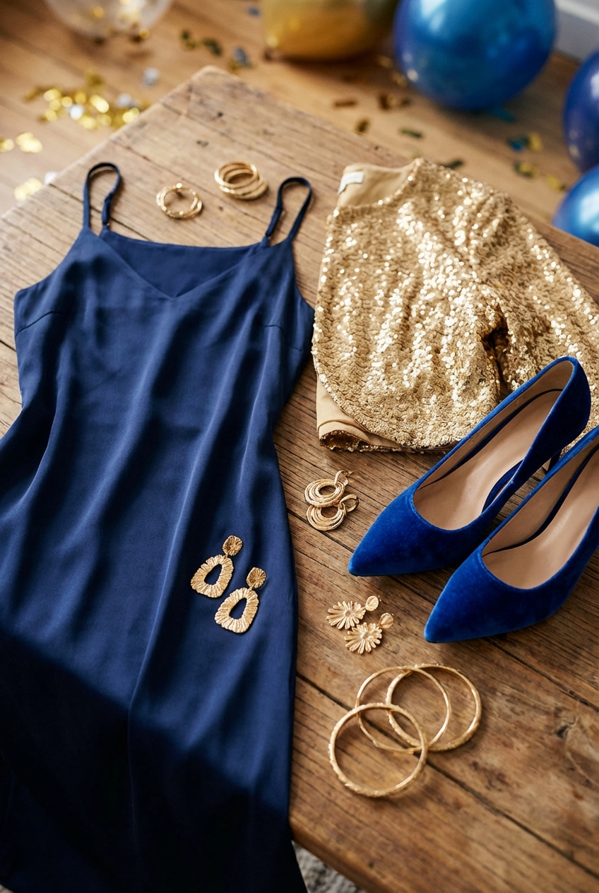
1. The Classic: Navy Blue and Antique Gold
When we talk about timeless elegance, navy blue is the anchor. It is the fashion equivalent of a neutral, functioning much like black but with more depth and warmth. Because navy is so dark, it requires a metallic that can stand up to its visual weight. Antique gold or brushed brass is the ideal partner here.
Bright, yellow gold can sometimes look cheap against a very dark, rich navy, especially under artificial evening lighting. Antique gold, with its slightly darker, warmer undertones, bridges the gap. It suggests heritage and sophistication rather than flashiness. This combination is particularly effective for black-tie weddings or corporate galas where the dress code is conservative but high-fashion.
Designer’s Note: The Fabric Factor
In my experience, the success of navy and gold depends entirely on texture. If you are wearing a matte fabric like crepe or wool blends, you need polished gold to add shine. However, if you are wearing navy velvet or satin, I recommend a matte or hammered gold finish. If both the dress and the accessories are highly reflective, they compete for attention rather than complementing each other.
2. The Statement: Royal Blue and Polished Yellow Gold
Royal blue is not for the faint of heart. It is a high-octane, saturated color that demands attention. Because the blue itself is so punchy and vivid, it needs a metal that is equally bright to hold its own. This is where polished yellow gold shines best.
The high contrast between electric blue and bright gold creates a look reminiscent of Art Deco opulence or Egyptian revival styles. It feels energetic and celebratory, making it perfect for cocktail parties, holiday events, or New Year’s Eve. The key here is to embrace the boldness without letting the outfit veer into costume territory.
Rules of Proportion
- The 60/30/10 Rule: In interior design and fashion alike, balance is key. Let the blue dress be 60% of the visual impact. Your skin and hair are 30%. The gold accents should remain at 10%.
- Avoid “The Christmas Tree Effect”: When wearing royal blue, do not scatter gold everywhere. Choose two focal points—perhaps a gold clutch and earrings—and leave the necklace and belt at home.
- Shoe Selection: With this combination, a nude shoe often works better than a gold one to elongate the leg, unless you are wearing a floor-length gown where the shoe is hidden.
3. The Ethereal: Powder Blue and Champagne Gold
Pastel blues, powder blues, and periwinkles are softer and more romantic. They are often associated with spring events or daytime garden parties. A heavy, dark gold or a bright yellow gold can look harsh and overpowering against these delicate hues.
The solution is champagne gold or soft rose gold. These lighter metallics have a lower saturation that blends seamlessly with the icy or airy tones of light blue. Champagne gold sits right on the border between silver and gold, offering a warmth that doesn’t clash with the cool undertones of a pastel dress.
Material Matters
When styling light blue, the fabric is usually lighter weight—think chiffon, tulle, or silk georgette.
- Jewelry Weight: You must match the physical weight of your jewelry to the fabric. Heavy, chunky gold chains will physically distort a delicate silk neckline.
- The Fix: Opt for filigree work, thin chains, or gold-set crystals. The accessories should look as airy as the dress feels.
- Color Harmony: If your powder blue dress has grey undertones, champagne gold is non-negotiable. Standard gold will look too orange.
4. The Modern Twist: Teal and Rose Gold
Teal sits on the border of blue and green. It is a complex, sophisticated color that works universally on almost every skin tone. While teal looks lovely with standard gold, pairing it with rose gold creates a contemporary, high-fashion aesthetic.
The pinkish hue of rose gold emphasizes the green undertones in the teal, creating a complementary color vibration that is visually pleasing. This combination feels fresh and unexpected. It is a favorite of mine for gallery openings, creative industry events, or non-traditional weddings.
Common Mistakes + Fixes
Mistake: Wearing rose gold that matches your skin tone too closely, making the jewelry disappear.
Fix: If you have pink undertones in your skin, rose gold can blend in. In this case, choose a piece with diamonds or gemstones set in the rose gold to define the edges, or opt for a “Russian gold” which is slightly redder and more distinct.
5. Mastering The Gold Shoe
One of the most frequent questions I get during styling sessions is: “If my accessories are gold, must my shoes be gold?” The answer is nuanced. A gold shoe is a statement piece, and it needs to be chosen with the same care as fine jewelry.
For a blue dress, the tone of the gold shoe is critical. A shoe that is too yellow can look brassy and inexpensive. Look for “gilded” or “foiled” textures rather than flat metallic leather. The texture diffuses the light and makes the gold look more expensive.
My “Real Project” Shoe Checklist
- Hemline Distance: If you are wearing a floor-length blue gown, the hem should skim the top of the toe box. The gold shoe should only peek out when you walk.
- Ankle Straps: If you have shorter legs, avoid a thick gold ankle strap with a knee-length blue dress. It cuts the leg line. Opt for a metallic pump instead.
- The “Nude” Alternative: If you have a busy gold necklace and heavy gold earrings, a gold shoe might be overkill. Switch to a nude sandal that matches your skin tone to let the dress and jewelry be the stars.
6. Makeup and Beauty Coordination
When you commit to a blue and gold palette, your beauty look becomes the third component of the design. You cannot treat makeup as an afterthought. The cool tones of the dress and the warm tones of the metal must be reconciled on your face.
For gold pairings, I almost always recommend leaning into warmer makeup tones. A cool, pink-toned foundation or blush can clash with the gold jewelry near your face. Bronzers and highlighters with gold flecks help tie the jewelry to the skin, creating a cohesive visual flow.
The Lip Color Debate
- The Red Lip: A classic red lip with a navy dress and gold jewelry is iconic. It creates a primary color triad (Blue, Yellow/Gold, Red) that is visually balanced and striking.
- The Nude Lip: For royal blue or teal, a red lip can sometimes look too “superhero.” A warm, peachy nude lip allows the intensity of the dress color to stand alone.
- The Eye Shadow: Avoid blue eyeshadow. It rarely matches the dress perfectly and looks dated. Instead, use copper, bronze, or gold shimmer on the lids to echo your jewelry.
Finish & Styling Checklist
Before you walk out the door, run through this mental checklist. These are the final touches I use on set to ensure a client looks polished rather than thrown together.
1. The Hardware Check
Check the hardware on your clutch or handbag. It must match your jewelry. You cannot carry a bag with silver clasps if you are wearing gold earrings. The clash is subtle, but it destroys the high-end feel. If you can’t match the gold tone exactly, opt for a bag with no visible hardware or covered hardware (like a satin clutch).
2. The “Sit Test”
Blue fabrics, especially satins and silks, show wrinkles aggressively. Put the dress on and sit down for five minutes before the event. If it creates deep creases across the lap, you need to know that now. A handheld steamer is your best friend. For stiff gold fabrics or belts, ensure they don’t dig into your ribs when seated.
3. Undergarment Strategy
Blue fabrics can be unforgiving with lines.
- Seamlessness: Laser-cut edges are mandatory for fitted blue dresses.
- Color: Never wear white undergarments under dark blue; they can reflect flash photography. Wear nude (closest to your skin tone) or black/navy.
- Structure: If the dress is flowy but the gold belt is heavy, you may need a slip to prevent the belt from gathering the fabric awkwardly at the waist.
4. The Flash Photography Test
If you are attending an event with photographers, take a photo of yourself with flash at home. Some blue dyes become translucent under intense light. Some gold accessories create a glare that washes out the face. It is better to adjust your powder or undergarments at home than to find out when the photos are tagged online the next day.
FAQs
Can I mix silver and gold with a blue dress?
Yes, but it requires a bridge. You need a piece of jewelry that contains both metals—like a watch with a two-tone band or a necklace with mixed links—to make it look intentional. Without that “bridge piece,” it often looks like you just grabbed whatever was clean.
What about rose gold with navy blue?
It is a beautiful, softer alternative to yellow gold. It gives navy a slightly vintage, feminine feel. It works exceptionally well for fall and winter weddings.
Is there a shade of blue that doesn’t work with gold?
Very few. However, certain “muddy” slate blues can look washed out by bright yellow gold. For grey-blues, stick to champagne gold or silver. The cleaner the blue (navy, cobalt, sky), the better it pairs with true gold.
How do I choose the right gold for my skin tone?
If your veins appear blue, you have cool undertones; champagne or pale gold is usually more flattering. If your veins appear green, you have warm undertones; you can handle deep, rich 24k gold tones. If you are neutral, you can wear any shade, including rose gold.
Conclusion
Pairing blue and gold is a design choice that signals confidence and sophistication. It moves beyond the safety of the “Little Black Dress” into territory that is expressive and memorable. Whether you choose the deep authority of navy with antique brass or the airy romance of powder blue with champagne shimmer, the success lies in the details.
Remember that fashion is architecture for the body. The fabric is your foundation, and the accessories are the lighting and decor. By paying attention to scale, texture, and color temperature, you can curate a look that feels effortless and expensive. Trust the combination; it has been a staple of royal wardrobes for centuries for a reason.
Picture Gallery


