Using Complementary Colors Harmonious Looks With The Color Wheel
Introduction
As a fashion expert, I often tell my clients that the most memorable runway moments aren’t born from playing it safe. Think of the iconic color-blocking trends that grace the streets of Milan or Paris fashion weeks. The electric tension between a cobalt blue coat and a tangerine handbag creates a visual vibration that is impossible to ignore. That same sartorial confidence translates perfectly into interior design, provided you understand the mechanics behind the magic.
Bringing complementary colors into your home isn’t about splashing neon paint on the walls and hoping for the best. It is a calculated exercise in balance, saturation, and scale. Just as you wouldn’t wear a head-to-toe outfit in two competing brights without a neutral to ground them, a room needs breathing room to let those colors sing.
In this guide, we are going to break down how to use the color wheel to elevate your living space from standard to editorial. We will cover the specific ratios, the textile choices, and the layout tricks that make high-contrast palettes feel sophisticated rather than chaotic. If you are looking for visual inspiration, be sure to scroll to the bottom because I have curated a stunning Picture Gallery at the end of the blog post.
The Science of Style: Why Opposites Attract
In fashion, we talk about “tension” to describe an outfit that feels interesting. In interiors, complementary colors—those directly opposite each other on the color wheel—provide that tension naturally. When placed side by side, these colors make each other appear brighter and more vivid.
However, the secret to a high-end look is rarely using the pure, primary versions of these colors. While red and green are complementary, a fire-engine red sofa on a kelly green rug reads more like a holiday explosion than a chic salon. The key is adjusting the value and saturation.
Instead of primary red and green, think of deep burgundy velvet paired with a moody sage or forest green. Instead of basic blue and orange, envision a dusty teal wall accented by cognac leather chairs. This shift in tone preserves the harmony of the complement while adding the nuance required for luxury living spaces.
Designer’s Note: The 80/20 Saturation Rule
The Lesson: A common amateur mistake is pairing two colors of equal intensity. This causes the eye to bounce back and forth, creating anxiety rather than energy.
The Fix: Let one color be the star and the other the supporting actor. I usually choose a muted, desaturated version for the dominant color (the walls or large upholstery) and a punchy, saturated version for the accent (pillows, art, or a side chair).
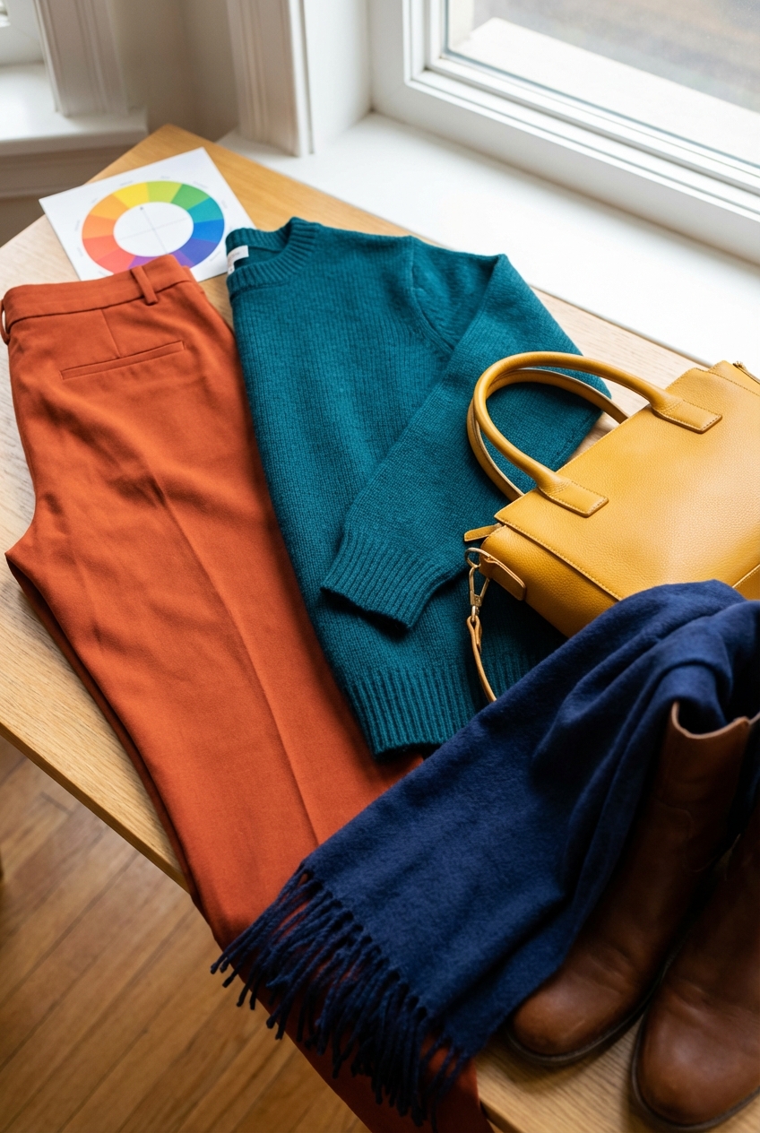
The Blue and Orange Dynamic: From Coastal to Cosmopolitan
Blue and orange is arguably the most versatile complementary pairing in the design world. It is the interior equivalent of a classic denim jean paired with a camel trench coat—timeless, effortless, and universally appealing. This combination works particularly well in living rooms and family spaces where you want a balance of calm and energy.
To execute this without it looking like a sports team theme, focus on texture. If your base is a deep navy blue sectional, introduce orange through natural materials. Terracotta pots, warm wood tones, and cognac leather all read as “orange” to the eye but bring an organic sophistication that bright plastic orange never could.
For a lighter, airier approach, look at the landscape for inspiration. Sky blue and soft peach create a serene, almost sunrise-like effect. This is lovely for bedrooms or nurseries. However, keep the scale in mind. If you go with pastel blue walls, ground the room with a rug that incorporates deeper rust tones to prevent the space from floating away.
Common Mistakes + Fixes
Mistake: Using bright royal blue and safety orange together in large doses.
Fix: Shift the blue to a moody slate or indigo. Shift the orange to copper, bronze, or rust.
Mistake: Forgetting the third wheel (neutrals).
Fix: Always bridge these strong colors with plenty of white, cream, or oatmeal to give the eye a place to rest.
Red and Green: Sophistication Beyond the Holidays
This is the pairing that scares people the most. In fashion, we know that a red lip with an emerald dress is a power move. In the home, red and green are actually nature’s most abundant pairing. Look at a rose bush: red blooms against green foliage. It is inherently harmonious if you mimic nature’s ratios.
The most successful high-end applications of this scheme often rely on the “pink and olive” variation. A dusty rose sofa set against olive green wainscoting feels vintage, eclectic, and incredibly warm. It evokes the vibe of a quirky British townhouse rather than a seasonal display.
If you prefer drama, look at “aubergine and chartreuse.” While technically moving toward purple/yellow, a deep wine red (leaning purple) paired with a sharp yellow-green (chartreuse) is high-fashion drama at its finest. This works exceptionally well in dining rooms or powder rooms where you want to create a jewel-box effect.
Real-World Project Checklist
- Test your greens: Green paint is notoriously tricky. It can read too yellow or too grey depending on the light. Always paint a 2-foot by 2-foot swatch on two different walls.
- Anchor with wood: Dark walnut wood tones help bridge the gap between red and green, making the look feel traditional and established.
- Watch the hardware: Brass gold hardware looks stunning with green and red, adding warmth that chrome or nickel might strip away.
Yellow and Purple: The Editorial Choice
This is the advanced class of color theory. It is bold, regal, and unapologetic. In the fashion editorial world, we might style a plum silk blouse with mustard wide-leg trousers. In the home, this combination usually translates to gold/ochre and plum/eggplant.
Because these colors are so distinctive, they work best when used in luxurious materials. Purple loves velvet and silk; these fabrics capture the depth of the color. Yellow shines in linen, wool, or actual metallic gold finishes.
Use this combination in spaces that don’t receive high traffic, like a formal sitting room or a master bedroom suite. A pale lavender wall color can actually act as a near-neutral, allowing you to bring in punchy mustard curtains or a gold velvet headboard. The result is fresh, unexpected, and very customized.
Lighting Considerations
Warm vs. Cool Bulbs: Yellow walls can turn sickly green if you use cool-white bulbs (4000K+). For a yellow and purple scheme, stick to warm white bulbs (2700K to 3000K). This enhances the gold tones and keeps the purple from looking grey.
The 60-30-10 Rule: Formulas for Success
Even the most avant-garde fashion looks rely on proportion. In interior design, we use the 60-30-10 rule to ensure complementary colors don’t fight for dominance. This creates a hierarchy of color that tells the eye where to look first.
60% Dominant Color: This is usually your walls, large area rugs, or the biggest piece of furniture. It sets the tone. In a complementary scheme, this should be the more muted or neutral version of your chosen color pair (e.g., a soft sage green).
30% Secondary Color: This is the upholstery, drapery, or accent walls. This is where you introduce the complement (e.g., a muted terracotta or dusty rose). It provides contrast but occupies half as much visual weight as the dominant color.
10% Accent Color: This is the jewelry of the room. Lamps, throw pillows, art, and accessories. Here, you can use the punchiest, most saturated versions of your colors, or introduce a metallic finish like unlacquered brass or polished nickel.
For Renters and Small Spaces
If you cannot paint, your “60%” becomes the wall color you are stuck with (usually white or beige). In this case, treat your neutrals as the dominant force. Your complementary colors then split the remaining 40%. For example, a navy blue rug (25%) and orange accent chairs (15%).
Texture and Materiality: The Fashion Expert’s Secret
Color does not exist in a vacuum; it lives on materials. As a fashion expert, I know that black cotton reads very differently than black leather. The same applies to your home interiors. When working with strong complementary colors, mixing textures is essential to keep the look expensive.
If you are doing a monochromatic blue room with orange accents, vary the blue surfaces. Use a matte paint for the walls, a velvet fabric for the sofa, and a high-gloss lacquer for a side table. These variations catch the light differently, adding depth so the room doesn’t look flat.
In landscape design, which is the exterior fashion of the home, this is easy. You pair the waxy, deep green leaves of a hedge with the delicate, papery petals of a red poppy. Inside, you must manufacture this contrast. Pair a nubby wool boucle (matte/coarse) with sleek silk cushions (shiny/smooth).
Scale and Pattern
- The Rug Rule: When using a bold colored rug, ensure it is large enough. The front legs of all furniture should sit on the rug. For a standard living room, an 8×10 or 9×12 is usually required. A too-small rug looks like a postage stamp and cheapens the color impact.
- Pattern Mixing: If you use a floral pattern containing both complementary colors, keep the other fabrics in the room solid or geometric to avoid visual exhaustion.
Finish & Styling Checklist: What I’d Do in a Real Project
If I were styling your home today using a complementary scheme, this is the exact workflow I would follow to ensure a magazine-worthy result.
1. Start with the “Hero” Piece
Find one item—a rug, a painting, or a patterned fabric—that contains both colors. This serves as your roadmap and ensures the specific shades actually work together.
2. Swatch the Paint in Context
Buy sample pots, not just paper strips. Paint large squares on the wall. Watch them in the morning light, noon sun, and artificial evening light. Colors interact; a red wall will cast a pink glow onto a white sofa.
3. Layer the Lighting
Overhead lighting can flatten color. I would ensure you have three light sources at eye level (table lamps, floor lamps, sconces). Use linen shades to diffuse light and soften the transition between bold colors.
4. Edit the Accessories
Gather all your accessories. Remove 20%. Negative space is crucial when using bold colors. Let the eye rest.
5. Add Life
Always finish with fresh flowers or greenery. A tall fiddle leaf fig or a vase of branches adds an organic sculpture that breaks up rigid color blocks.
FAQs
Can I use complementary colors in a small room?
Absolutely. In fact, a small powder room or study is the best place to go bold. Painting a small room a deep, rich color blurs the corners and can actually make it feel larger and more infinite, like a jewelry box.
How do I combine warm and cool colors?
Complementary pairings naturally mix warm and cool (e.g., blue is cool, orange is warm). The key is balance. If your room faces north and gets cool light, lean heavier into the warm color of the pair to counteract the chill.
Do I have to paint the ceiling white?
Not necessarily. For a high-fashion look, I often paint the trim and the ceiling the same color as the walls, just in a different sheen (flat for ceiling, eggshell for walls, semi-gloss for trim). This is called “color drenching” and looks incredibly expensive.
Conclusion
Using the color wheel to design your home is about more than following rules; it is about creating a feeling. Just as a perfectly tailored outfit changes the way you carry yourself, a harmonious home changes the way you live.
Don’t be afraid of the tension that complementary colors provide. That tension is the heartbeat of great design. Whether you opt for the classic cool of blue and orange or the daring drama of yellow and purple, remember that confidence is your best accessory. Start small if you need to, perhaps with pillows and art, and work your way up to the walls. Your home should be a reflection of your boldest, most stylish self.
Picture Gallery


