Vibrant Fiesta Looks With Bold Colors
There is a specific kind of energy that happens when you walk into a room that isn’t afraid of color. As a fashion expert, I often compare home design to assembling the perfect outfit. A neutral beige room is your safe, reliable trench coat, but a vibrant, fiesta-inspired space? that is your vintage Pucci gown or that statement structural blazer in electric blue. It commands attention, sparks conversation, and instantly elevates the mood of everyone inside.
I remember hosting a dinner party shortly after I redesigned my own dining room. I had moved away from safe grays and committed to a high-gloss, deep teal on the walls, paired with burnt orange velvet chairs. The moment my guests arrived, the dynamic changed. The bold backdrop didn’t just look good; it made people feel more alive, louder, and happier. That is the power of a fiesta aesthetic—it is not just about decoration; it is about curating an experience of joy.
Translating high-fashion color theory into interior design requires a bit of bravery and a lot of balance. You want the space to feel curated, not chaotic. In this guide, I will walk you through how to style your home with bold, fiesta-ready hues while keeping the look sophisticated and functional. Don’t forget to scroll to the end to see the full Picture Gallery for serious inspiration.
Color Blocking Your Space Like a Runway Look
In fashion, color blocking works because of proportion. The same rule applies to your living room. You cannot simply throw five bright colors into a room and hope they stick. You need a hierarchy. I like to use the 60-30-10 rule, but with a maximalist twist.
Your dominant color (60%) should be the walls or the largest furniture pieces. For a fiesta vibe, think terra cotta, warm mustard, or a deep ocean blue. Your secondary color (30%) provides contrast, like emerald green drapery against a pink wall. The final 10% is your accent—perhaps a neon sign, a bright vase, or a patterned throw pillow.
Designer’s Note: One lesson I learned the hard way involves paint swatches. Never paint a swatch directly on your existing wall color. Your current wall color will distort the new hue. Instead, paint a large poster board with your sample color and move it around the room at different times of day to see how the light hits it.
If you are renting or afraid to paint, color drenching can be achieved through furniture. A large sectional in a bold magenta acts as the anchor. It becomes the “little black dress” of the room, except it is loud and proud.
Common Mistakes + Fixes
- Mistake: Using colors that all have the same intensity, which makes the eyes tired.
- Fix: Mix saturation levels. If you have a bright fuchsia sofa, pair it with a deeper, moodier navy rug rather than a bright yellow one. Ground the brightness with depth.
Textiles: The Accessories of the Room
Think of rugs, throw pillows, and curtains as the jewelry and shoes of your home. You wouldn’t wear a couture gown with dirty sneakers, so don’t pair a beautiful sofa with a postage-stamp-sized rug. In a bold fiesta theme, textiles are where you can introduce global patterns, embroidery, and texture.
Scale is critical here. A common issue I see in DIY designs is the “floating rug” syndrome. Your rug needs to be large enough that at least the front legs of all major furniture pieces sit on it. For a standard living room, an 8×10 is usually the minimum; a 9×12 is often better.
When selecting fabrics for a vibrant look, durability is key, especially if you are actually hosting parties. I recommend performance velvets or high-quality wool. Wool is naturally stain-resistant and cleans up beautifully, while performance velvet gives you that luxe fashion look but can withstand a spilled margarita.
What I’d do in a real project:
- Curtains: Mount the rod 4 to 6 inches above the window frame (or all the way to the ceiling) to make the room look taller.
- Rug Distance: Leave 12 to 18 inches of bare floor visible around the perimeter of the room to frame the space.
- Pattern Mixing: Combine one large-scale print (like a geometric rug) with a smaller-scale print (like floral pillows).
Outdoor Living: The Landscape Fiesta
A true fiesta often spills outdoors. Whether you have a sprawling backyard or a petite balcony, the principles of flow and color remain the same. In landscape design for this aesthetic, we look to the courtyards of Mexico City or Seville for inspiration. We want lush greenery, potted citrus, and vibrant tile.
Furniture layout is vital for entertaining. You need to ensure there is flow. A good rule of thumb is to leave 30 to 36 inches of clearance behind dining chairs so guests can slide out without hitting a wall or a planter. If you are working with a small patio, opt for round tables; they save space and encourage better conversation.
For materials, move away from matching “sets” of brown wicker. Look for powder-coated aluminum in bright colors, or mix natural teak with vibrant Sunbrella cushions. Teak will silver over time, providing a beautiful, neutral backdrop for bright accessories.
Designer’s Note on Durability: If you live in a sunny climate, red and yellow fabrics fade the fastest. Invest in solution-dyed acrylic fabrics (like Sunbrella) where the color goes all the way through the fiber, like a carrot, rather than just sitting on top like a radish.
Lighting: Setting the Mood
You cannot have a fiesta with hospital lighting. In fashion, lighting is what sells the garment; in interiors, lighting is what sells the room. The goal is warm, layered illumination that makes everyone look beautiful and the colors pop without being harsh.
Avoid using the “big light” (the single ceiling fixture) as your only source. You need three distinct light sources in a room to create dimension: ambient (overhead), task (reading lamps), and accent (wall sconces or picture lights). For a fiesta look, consider pendants made of woven rattan, punched tin, or colored glass.
The Technical Spec: Pay attention to the Kelvin scale on your lightbulbs. For a warm, inviting living space, you want bulbs between 2700K and 3000K. Anything above 3500K will start to look blue and clinical, which will kill the vibe of your warm colors.
Pendant Placement Rules
- Dining Table: The bottom of your chandelier or pendant should be 30 to 36 inches above the table surface.
- Spacing: If hanging multiple pendants, space them about 24 to 30 inches apart (center to center).
- Scale: The fixture should be roughly one-half to two-thirds the width of the table.
Furniture with Personality
When I style a client for a gala, we look for a silhouette that stands out. Furniture acts as the silhouette of your room. For a vibrant, high-energy space, avoid boxy, matching showroom sets. They feel flat and impersonal.
Instead, mix eras and materials. Pair a mid-century modern credenza with a chunky, rustic wood coffee table. Use acrylic “ghost” chairs to let a bold rug shine through, or choose a statement armchair with fringe detailing. The friction between different styles creates energy.
Comfort is non-negotiable. A sofa can look stunning, but if it sits like a park bench, your guests will leave early. Look for seat depths of at least 22 to 24 inches for a lounge-worthy feel. If you are tall, go deeper.
Common Mistakes + Fixes:
- Mistake: Buying furniture that is too large for the room, making it feel claustrophobic.
- Fix: Tape out the dimensions of the furniture on the floor using blue painter’s tape before you buy. Walk around it for a few days to test the flow.
The Tablescape: Your Dinner Party Runway
The dining table is where the “fiesta” truly comes to life. This is a low-stakes area to take massive risks. Even if your room is neutral, your table can be a riot of color. I treat table setting like accessorizing a look—layering is everything.
Start with a patterned runner or tablecloth. Layer on chargers (decorative plates that sit under dinner plates) in a contrasting material like woven sea grass or lacquer. Mix colored glassware—amber tumblers with blue wine glasses look incredibly chic.
Don’t be afraid to mix high and low. I often mix expensive, hand-painted ceramic plates with affordable colored napkins. The mix makes the setting feel approachable and collected rather than stiff.
Designer’s Note: Fresh flowers are mandatory, but they don’t have to be expensive. A massive bunch of marigolds or even clipped greenery from your garden, placed in a sculptural vase, adds the necessary organic element. Keep centerpieces below 12 inches tall so guests can see each other across the table.
Finish & Styling Checklist
Here is exactly how I would finalize a room to ensure it feels “finished” and not just “full of stuff.”
- Edit the accessories: Remove 20% of the small items. Clutter kills design.
- Check the rug pad: Ensure you have a thick felt rug pad underneath. It extends the life of the rug and makes it feel expensive underfoot.
- Dimmer switches: Install them on every switch. It is the cheapest upgrade with the highest impact.
- The “Sit Test”: Sit in every seat in the room. Is there a place to set a drink within arm’s reach? If not, add a side table or garden stool.
- Greenery: Every room needs something living. A large Bird of Paradise plant fits the fiesta theme perfectly.
FAQs
How do I use bold colors in a small rental apartment?
Focus on what you can take with you. Use peel-and-stick wallpaper for a feature wall—it removes without damage. Invest in a high-quality, colorful rug and large-scale art. These items cover the bland rental finishes without forfeiting your security deposit.
Will bold colors make my small room look smaller?
Actually, deep or bold colors can blur the edges of a room and make it feel infinite. If you paint the walls, trim, and ceiling the same bold color, the boundaries disappear, creating a cozy, jewel-box effect rather than a cramped feeling.
How do I mix metals in a colorful room?
Treat metals as neutrals. I usually stick to a mix of two. Brass looks stunning with warm colors (reds, pinks, oranges), while chrome or matte black pairs well with cool tones (blues, greens). Matte black is a great “grounding” metal that works with almost everything.
Conclusion
Creating a vibrant, fiesta-inspired home is about embracing the joy of living. It is about rejecting the notion that sophisticated means beige and boring. Just as you dress to express your personality, your home should be a reflection of your most vibrant self.
Start with one bold choice—a rug, a wall color, or a piece of art—and build your outfit from there. Trust your gut, measure twice, and remember that the best rooms are the ones that make you smile the moment you walk through the door.
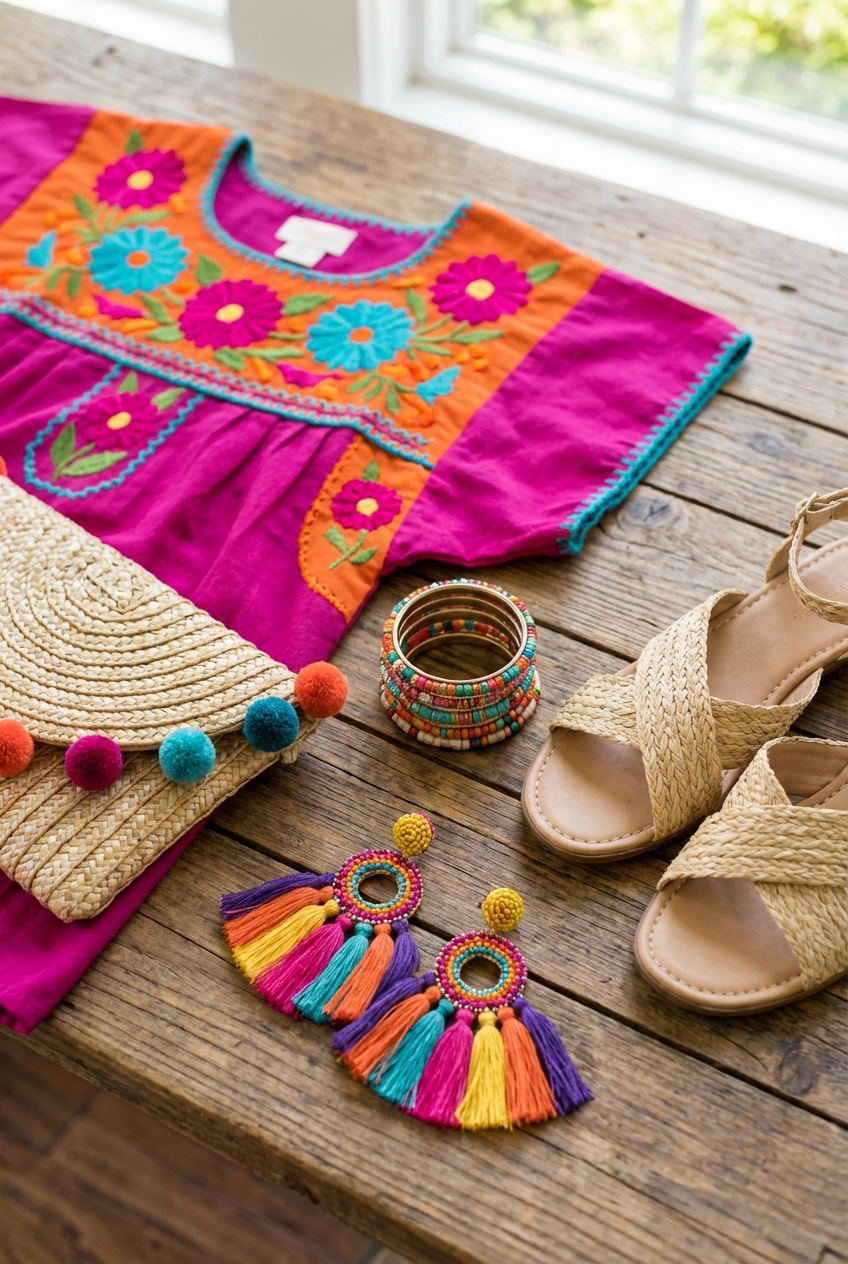
Picture Gallery


