Fall Color Trends Incorporating Jewel Tones Into Your Style
As the temperatures drop and we swap our linen blazers for cashmere coats, our attention naturally shifts indoors. Just as we layer textures and rich hues in our autumn wardrobes, our living spaces deserve the same seasonal update. There is something inherently luxurious about fall fashion—the weight of the fabrics, the depth of the colors—and this translates beautifully into interior design.
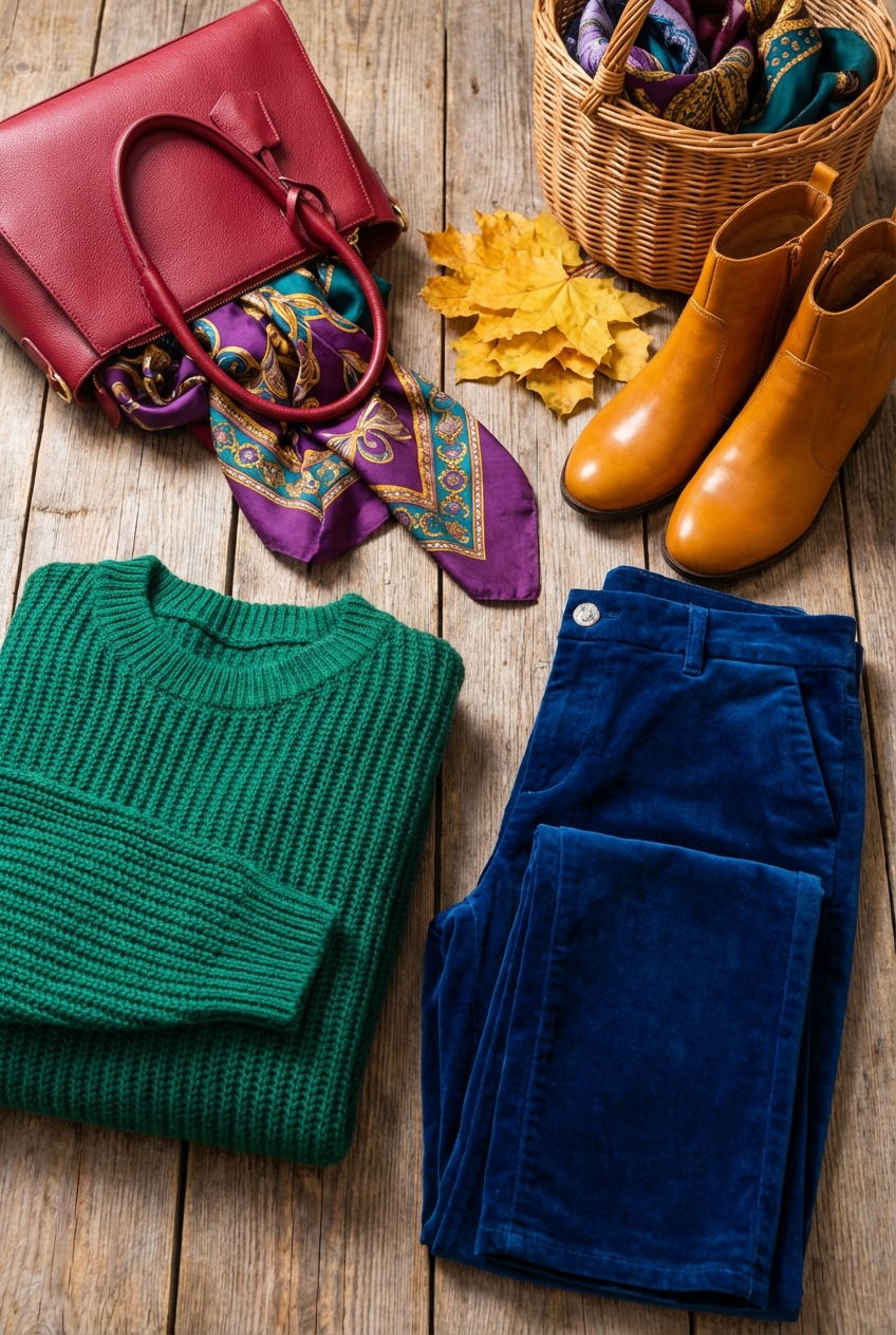
Jewel tones are the interior equivalent of a statement handbag or a pair of velvet loafers. They bring instant warmth, drama, and sophistication to a room without necessarily requiring a full renovation. Whether you are drawn to the deep allure of sapphire blue or the regal punch of emerald green, these shades possess a transformative power that neutrals simply cannot match.
In this guide, I will walk you through how to translate these runway trends into your home with the eye of a stylist and the practicality of a designer. For those of you who are visual learners, I have curated a stunning Picture Gallery at the end of this blog post to spark your imagination.
1. Understanding the Palette: The Fashion-Forward Approach
Before we start buying furniture or painting walls, we must define exactly what constitutes a jewel tone in a design context. Think of gemstones in their rawest, most vibrant forms: Amethyst (purple), Ruby (red), Emerald (green), Sapphire (blue), and Citrine (yellow-gold).
In high-end fashion, we often talk about saturation. Jewel tones are highly saturated, meaning they are pure hues with very little white or gray added to them. This is why they feel so opulent; they absorb light rather than reflecting it, creating a moodiness that is perfect for cozy fall evenings.
However, you rarely see a well-dressed woman wearing all five stones at once. The same rule applies to your living room. The key is to select one dominant “power color” and support it with neutrals or analogous shades.
Designer’s Note: The 60-30-10 Rule
When styling a room with bold colors, I always revert to the classic 60-30-10 rule to ensure balance.
- 60% Background Color: This is usually your neutral base (walls, large rugs, or main flooring).
- 30% Secondary Color: This is where your jewel tone comes in (sofas, curtains, or accent chairs).
- 10% Accent Color: This is your metallic finish or a contrasting pop (brass hardware, throw pillows, or art).
2. The Statement Piece: Upholstery and Furniture
In fashion, a great coat makes the outfit. In interiors, your sofa or armchair is that coat. If you are ready to commit, a velvet sofa in a deep jewel tone is the ultimate luxury statement. Velvet is the fabric of choice here because its pile naturally catches the light, creating dynamic highs and lows that flat weaves like linen or canvas cannot achieve.
When choosing a jewel-toned sofa, scale is critical. A dark color has more “visual weight” than a light color. A navy velvet sofa will look larger and heavier than a beige one of the exact same dimensions. To counter this, ensure your furniture has breathing room.
Practical Measurements for Layout
Common Mistakes + Fixes
Mistake: Choosing a delicate silk or rayon velvet for a high-traffic family room.
Fix: Opt for “performance velvet” (usually 100% polyester or a blend). It mimics the sheen and softness of high-end mohair but can withstand spills and pet claws. I have used this in homes with toddlers, and it cleans up with nothing but water and mild soap.
3. Drapery and Textiles: The Layering Game
If buying a ruby red sofa feels too permanent, think of textiles as the scarves and accessories of your home. They are lower commitment but high impact. Drapery, in particular, is a fantastic vehicle for jewel tones because the vertical lines draw the eye up, making the color feel grand rather than overwhelming.
For fall, swap out airy sheers for heavier weights. I love using unlined velvet or heavy linen in deep plum or peacock blue. The weight of the fabric adds insulation (functional) and dampens sound (sensory), making the room feel intimate.
Pro-Level Curtain Rules
4. Paint and Wallpaper: The Backdrop
Painting a room a dark color is daunting, but it is the single most effective way to change a room’s atmosphere. A powder room, study, or dining room painted in floor-to-ceiling Emerald or Navy is incredibly chic.
In the fashion world, we talk about monochrome looks elongating the silhouette. In design, painting your walls, trim, and baseboards the same jewel tone elongates the walls. It blurs the lines where the wall ends and the trim begins, making the room feel expansive rather than boxy.
Choosing the Right Finish
The finish of the paint matters as much as the fabric of a dress.
- Matte/Flat: Use this for walls. It absorbs light and hides imperfections in the drywall. Dark colors look velvety and rich in matte.
- Satin/Semi-Gloss: Use this for trim, doors, and baseboards. The slight sheen adds durability and a subtle contrast in texture against the matte walls, even if the color is identical.
- Ceilings: If you are feeling brave, paint the ceiling too. It creates a “jewelry box” effect. If you have low ceilings (under 8 feet), stick to a creamy white to keep the lid from feeling too heavy.
What I’d Do in a Real Project
If I were styling a rental or a temporary space, I would skip the paint and use peel-and-stick wallpaper in a jewel-toned botanical print. It acts like a feature wall without the labor. Focus on one wall—usually the one behind the bed or the sofa—to create a focal point.
5. Lighting: Illuminating the Gems
You cannot appreciate the depth of a jewel tone without proper lighting. Poor lighting will make Amethyst look like muddy black and Emerald look like swamp green. Lighting is the jewelry that makes the outfit shine.
When working with dark colors, you need to increase your lumen output (brightness) because dark walls absorb light. Relying on a single overhead fixture will result in gloomy corners. You need to layer light sources at different heights.
The Kelvin Temperature Rule
For residential interiors, specifically when enhancing warm fall colors, pay attention to the Kelvin (K) rating on your bulbs.
Hardware Finishes
Jewel tones pair exceptionally well with warm metals.
6. Styling Surfaces: The Final Polish
Once the major pieces are in place, we move to the accessories. This is equivalent to adding earrings, a watch, and rings. You want to echo your jewel tones in smaller items to create a cohesive thread throughout the room.
Coffee table styling is an art form. Start with a large tray to corral smaller items. On top of the tray, stack books (remove the dust jackets to see if the binding color matches your scheme). Add a sculptural object and something organic, like a vase with dried branches or fresh flowers.
The Rule of Three
Arrange accessories in odd numbers, typically threes. The human eye finds odd numbers more appealing and less forced than even pairings.
Don’t forget the power of “negative space.” In a fall palette, things can get heavy quickly. Leave some empty space on shelves and tables to let the eye rest.
Finish & Styling Checklist
Before you declare your room complete, run through this final styling checklist to ensure the look is polished and professional.
- Texture Check: Do you have at least three different textures? (e.g., Velvet sofa, wool rug, brass lamp).
- Color Balance: Is your jewel tone distributed around the room, or is it stuck in one corner? Repeat the color at least three times (e.g., Curtains, a pillow, a detail in a painting).
- Lighting Levels: Do you have at least three sources of light? (Overhead, table lamp, floor lamp).
- Rug Placement: Is the rug large enough? Are the furniture legs sitting on it properly?
- Natural Elements: Have you added wood, stone, or plants to ground the glamour?
- Scale Check: Does the artwork fit the wall? (Art should generally occupy 50-75% of the available wall space).
FAQs
Q: Can I mix multiple jewel tones in one room?
A: Yes, but proceed with caution. The easiest way to do this is to pick analogous colors (colors next to each other on the color wheel), like Blue and Green (Sapphire and Emerald). They blend naturally. If you want high contrast, like Purple and Yellow (Amethyst and Citrine), use one as the dominant color and the other as a small accent to avoid a chaotic look.
Q: Will dark colors make my small room look smaller?
A: This is a common myth. Dark colors actually blur the corners and edges of a room, creating an illusion of infinite space. However, this only works if you commit. Painting just one accent wall can visually “chop” the room in half. In small spaces like powder rooms or studies, wrapping the color around all four walls and the ceiling often makes it feel larger and more cozy.
Q: How do I keep jewel tones from looking dated or “heavy”?
A: Contrast is your best friend. If you have heavy velvet curtains and a dark rug, ensure your coffee table is glass or acrylic, or that your side tables have thin, leggy silhouettes. You need modern shapes to cut through the traditional weight of the colors. Also, incorporating plenty of white or cream in your accessories prevents the room from feeling like a dungeon.
Q: I have pets. Is velvet actually a good idea?
A: Surprisingly, yes. Tight-weave synthetic velvet (performance velvet) is one of the most pet-friendly fabrics available. Because there are no loops in the weave (like in bouclé or linen), cats have nothing to hook their claws into. Pet hair also tends to sit on top rather than weaving into the fibers, making it easy to wipe off with a damp rubber glove.
Conclusion
Incorporating jewel tones into your home is an exercise in confidence. It is about embracing the bold, the luxurious, and the dramatic—traits that define the most stylish women in the world. Whether you start small with a pair of ruby throw pillows or fully commit to a sapphire living room, these colors bring a warmth and vitality that fits the autumn season perfectly.
Remember, your home is the backdrop of your life. It should make you feel as confident and comfortable as your favorite fall outfit does. Do not be afraid to experiment, layer, and adjust until the balance feels right. Fashion is fluid, and your home design should be too.
Picture Gallery


