How To Incorporate Prints Into A Minimalist Capsule Wardrobe
Introduction
Many people mistakenly believe that adopting a minimalist capsule wardrobe means resigning yourself to a life of plain white t-shirts, beige trousers, and grey sweaters. While a cohesive color palette is the backbone of a functional closet, avoiding patterns entirely can strip the joy and personality right out of your style. As a fashion stylist who has curated wardrobes for high-powered executives and creative directors alike, I often see clients fearing that a print will “ruin” the clean aesthetic they have worked so hard to build.
The truth is that prints and minimalism are not mutually exclusive; in fact, the right pattern can actually elevate a capsule wardrobe by adding texture and depth that solids simply cannot achieve. The secret lies in intention. It is about choosing patterns that have longevity, understanding the scale relative to your body type, and ensuring the fabric quality supports the design. When done correctly, a striped breton top or a subtle floral midi skirt becomes just as versatile as your favorite denim.
In this guide, I will walk you through the precise architectural rules I use when introducing prints to a streamlined closet. We will cover scale, fabric choices, and the specific “rules of thumb” regarding color coordination that ensure your look remains expensive and polished. For visual inspiration on how to style these looks, scroll down to the Picture Gallery at the end of this post.
Understanding Scale and Visual Weight
The first rule of thumb in high-end styling is understanding how the scale of a print interacts with your physical frame. In design, we talk about “visual weight,” which refers to how heavy or demanding an element looks to the eye. A large, high-contrast geometric print has a heavy visual weight, while a micro-dot or thin pinstripe has a light visual weight.
For a minimalist wardrobe, you generally want to lean toward low-to-medium visual weight. This ensures the garment doesn’t overpower the rest of your capsule. If you are petite (under 5’4″), oversized prints can swallow your frame. I recommend sticking to patterns where the repeat is no larger than the size of a fist. If you are taller, you have the luxury of pulling off larger, more architectural prints without losing your presence.
However, negative space is equally important. A busy, cluttered print feels chaotic. A print with plenty of “ground” (the background color visible between the pattern) feels airy and intentional. Look for prints where the background color matches one of your core neutrals—black, navy, cream, or camel. This connects the print back to the rest of your closet seamlessly.
Designer’s Note:
One common mistake I see is clients buying “ditsy” florals (tiny, scattered flowers) thinking they are safe. Often, these can read as juvenile or “messy” from a distance. For a sharper, more expensive look, opt for geometric patterns or ordered prints like stripes, checks, or houndstooth. These provide structure rather than visual noise.
The Rule of Two Neutrals
To maintain that crisp, minimalist aesthetic while wearing patterns, I use the “Rule of Two Neutrals.” The concept is simple: the print you choose should ideally be comprised of two neutral colors that already exist in your wardrobe. A black and white windowpane check, a navy and cream stripe, or a camel and chocolate leopard print are perfect examples.
When a print is rooted in neutrals, it acts as a “connector piece.” It can bridge the gap between your black trousers and your beige trench coat. If you introduce a print with four or five different bright colors, it suddenly becomes a “standalone piece” that requires specific coordinates to work. That is the opposite of capsule wardrobe logic.
If you do want to introduce color, choose a “tone-on-tone” print. This is where the pattern is a slightly darker or lighter shade of the background color. Think of a slate blue shirt with a navy geometric overlay. This reads almost like a texture rather than a loud print, preserving the calm vibe of your minimalist style while adding necessary interest.
Fabric Choice: The High-End Differentiator
In interior design and fashion alike, the material dictates how the pattern is perceived. A print on cheap, synthetic fabric like thin polyester often looks shiny and flat because the dye sits on top of the fiber. This is the fastest way to cheapen a look.
For a luxury feel, focus on natural fibers. Silk and cotton poplin are exceptional for prints because they absorb dye deeply, resulting in rich, saturated colors. A silk blouse with a subtle print has a luster that catches the light, making the pattern feel dynamic. Linen is another favorite of mine for summer capsules; the natural slub and texture of the linen break up the print, making it feel organic and lived-in rather than rigid.
Pay attention to the “hand” (the feel and drape) of the fabric. A stiff fabric with a stiff print creates boxiness. A fluid fabric like viscose or silk crepe de chine allows the print to move with the body. When I am auditing a closet, I always check the lining. If you buy a printed skirt or dress, ensure it is lined. Unlined printed garments often show shadows of the legs in sunlight, which ruins the clean lines of the silhouette.
Strategic Placement and Body Architecture
Where you place a print is just as important as the print itself. The eye is naturally drawn to patterns before solids. This allows you to use prints as a tool for optical illusion, highlighting your favorite features and creating balance.
If you have a pear shape (wider hips), placing a print on your upper body—like a striped boatneck top or a patterned scarf—draws the eye upward, balancing your proportions against dark, solid trousers. Conversely, if you have an inverted triangle shape (broader shoulders), a printed A-line skirt can add necessary volume to your lower half, creating an hourglass effect.
For a minimalist approach, I rarely recommend “all-over” prints for maxis or jumpsuits unless the print is extremely subtle. Instead, I prefer the “broken column” technique. This involves wearing a column of color (like a black top and black pants) and breaking it with a printed third piece, such as a blazer or an open button-down shirt. This keeps the look grounded and elongated while offering a pop of personality.
Common Mistakes + Fixes:
Mistake: Wearing a printed top that ends at the widest part of your hips.
Fix: This creates a horizontal line that widens you. Tuck the top in, or have it tailored to hit at the high hip (about 2 inches below the waistbone).
The Classics: Prints With Longevity
A capsule wardrobe is built on the philosophy of “buy less, choose well.” Therefore, you must avoid trendy prints that stamp a date on your outfit. Tie-dye, galaxy prints, or neon abstracts usually have a shelf life of about two seasons before they look dated.
Instead, invest in the heritage prints that have survived decades of fashion cycles. The Breton stripe is non-negotiable; it channels Parisian chic and pairs with everything from denim to leather. Polka dots, when done in a classic scale (coin-sized or smaller), bring a feminine touch without being girlish.
Animal print, specifically leopard and snake, is widely considered a neutral in the fashion industry. A leopard print loafer or belt can enliven a camel coat and jeans outfit instantly. Plaid and houndstooth are essential for autumn and winter capsules. These menswear-inspired patterns bring a level of intellectual sophistication to a look. When choosing a plaid, look for “Prince of Wales” checks or “Glen Plaid” rather than bright, lumberjack-style tartans, which can be harder to mix.
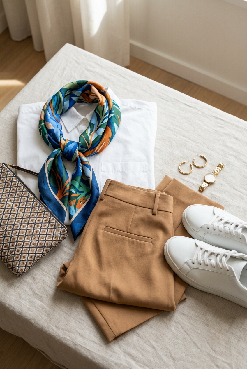
Accessories as the Gateway
If you are a strict minimalist who feels overwhelmed by the idea of a printed blouse, start with accessories. This is the lowest-risk way to incorporate pattern because accessories occupy less visual real estate. They provide a “wink” of style rather than a shout.
A silk scarf tied to the handle of a leather tote bag is a classic stylist trick. It softens the look of a structured bag and adds a dash of color. If you are feeling more adventurous, try wearing the scarf around your neck or as a headband.
Footwear is another excellent avenue. A snakeskin ankle boot acts as a textured neutral that pairs beautifully with black, white, and denim. It adds an edge to the outfit that plain black leather boots sometimes lack. Even a patterned sock peeking out from under tailored trousers shows that you have paid attention to the details.
Finish & Styling Checklist
When I am finalizing a look for a client, I run through a mental checklist to ensure the print feels integrated rather than accidental. Here is the process I use, which you can replicate at home.
What I’d do in a real project:
- Check the Anchor: Ensure at least one color in the print matches the solid color of the pants, skirt, or jacket exactly. If the print has black in it, wear black shoes or a black belt to “bookend” the outfit.
- Verify the Distance: Stand 6 feet back from the mirror. Does the print turn into a muddy blur, or does it maintain its definition? Good prints hold their structure from a distance.
- The Jewellery Test: Minimalist prints usually require minimalist jewelry. If the print is busy, skip the statement necklace. Opt for simple gold hoops or a delicate chain.
- Fabric Friction: Make sure the textures work. I love pairing a smooth silk print with a rougher wool or denim. The contrast makes the outfit look expensive.
- Tailoring Check: Prints can distort at the seams. Check the side seams of the garment. If the pattern doesn’t match up (e.g., stripes that are misaligned), it looks cheap. High-end garments will have pattern-matched seams.
FAQs
Can I mix prints in a minimalist wardrobe?
Yes, but proceed with caution. The safest way to mix prints while maintaining a minimal aesthetic is to keep them in the same color family (monochrome) but vary the scale. For example, a thin pinstripe shirt paired with a wider windowpane check blazer in the same navy tone works because the colors unify them.
Is animal print really a neutral?
Absolutely. Leopard print acts as a mixture of black and brown. Because it is organic and found in nature, our eyes are accustomed to it, so it doesn’t register as “clashing” with other colors. Treat a leopard print flat shoe just as you would a brown leather loafer.
How do I wash printed silk items?
Prints on silk are delicate. Detergents with high pH or enzymes can strip the color or cause the print to bleed. Always hand wash in cool water with a specialized pH-neutral wool/silk detergent, or dry clean. Never wring out printed silk, as this can break the fibers and create white crease marks in the pattern.
Conclusion
Incorporating prints into a minimalist capsule wardrobe is not about abandoning your aesthetic; it is about refining it. By selecting heritage patterns, prioritizing natural fabrics, and understanding the architecture of your own body, you can curate a closet that feels dynamic and fresh without feeling cluttered.
Remember that a capsule wardrobe is meant to serve you, not restrict you. A well-placed stripe, a sophisticated check, or a playful dot can bridge the gap between “getting dressed” and “having style.” Start with one piece—perhaps a scarf or a classic striped tee—and watch how it breathes new life into your existing favorites.
Picture Gallery


