The Elegance Of Neutrals Styling All Neutral Outfits For Effortless Sophistication
There is a pervasive myth in the fashion world that dressing in neutrals is the “safe” choice. People often mistake beige, cream, and gray for an absence of personality, assuming that bold prints or vivid colors are the only way to make a statement. As a stylist who has curated wardrobes for high-profile clients for over a decade, I can tell you that the opposite is true. Mastering a neutral palette is actually the ultimate power move in personal style because it relies entirely on the quality of your choices rather than the volume of your voice.
When you strip away bright colors, you are left with the raw elements of design: silhouette, texture, and proportion. This is where true sophistication lives. A head-to-toe neutral ensemble, often referred to as “quiet luxury,” signals a confidence that doesn’t need to shout to be heard. It is the sartorial equivalent of a well-designed minimalist living room; it feels expensive, intentional, and calming.
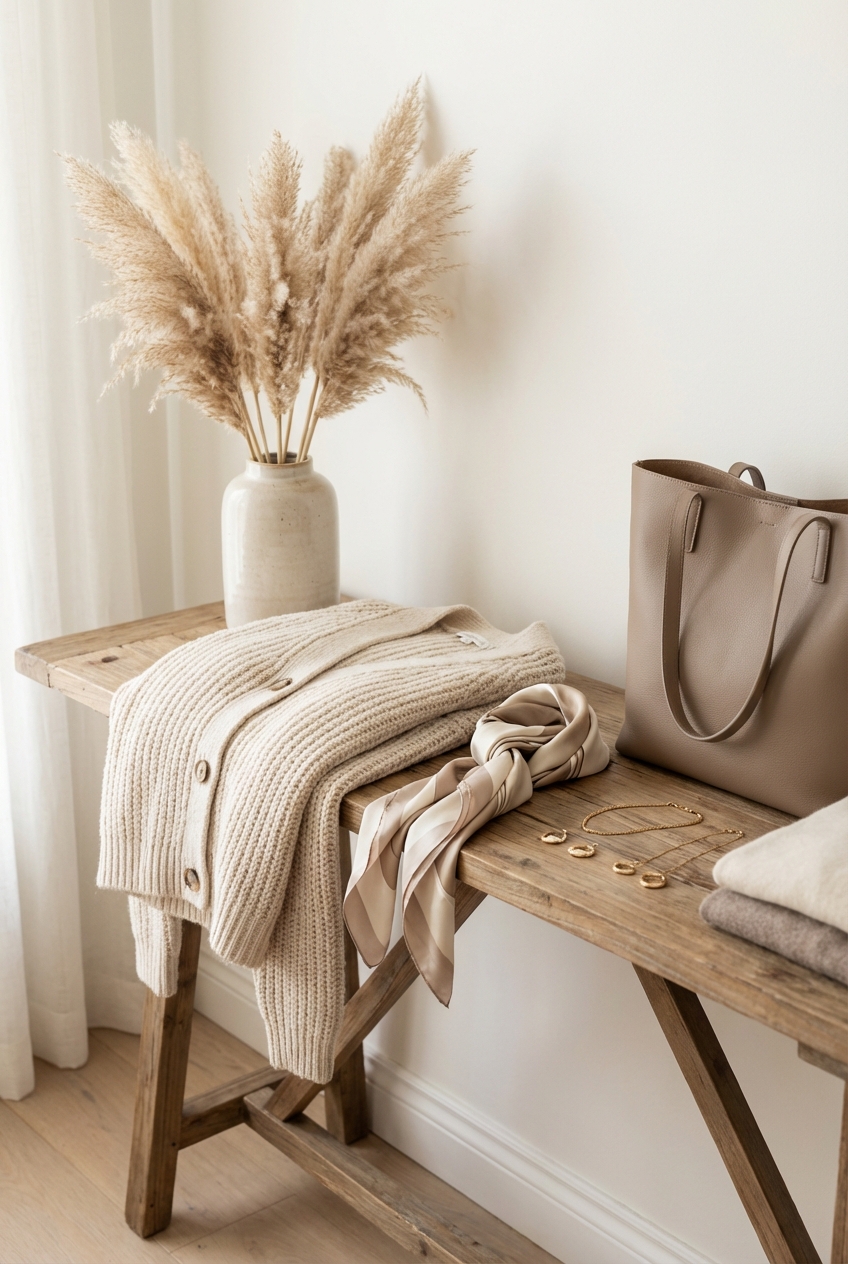
However, executing this look requires precision. Without the distraction of color, every seam, fabric choice, and fit issue becomes more visible. In this guide, I will walk you through the architectural rules of styling neutrals, moving beyond basic matching into the realm of professional layering. For specific examples of these combinations in action, make sure to look at the Picture Gallery at the end of the blog post.
Understanding Undertones: The Foundation of Your Palette
The most common mistake I see when clients attempt a monochrome look is mixing clashing temperatures. Neutrals are rarely just “plain.” They carry complex undertones that fall into two camps: warm and cool.
Warm neutrals contain yellow, orange, or red bases. Think of oatmeal, camel, cognac, cream, and olive. Cool neutrals contain blue, purple, or gray bases. Examples include slate, stark white, charcoal, and crisp silver-gray. While expert mixers can sometimes blend these, the golden rule for effortless sophistication is to stick to one temperature family per outfit.
When you mix a cool gray sweater with warm beige trousers, the outfit often looks “muddy” or accidental. Instead, aim for a tonal slide. Pair a rich camel coat with a lighter biscuit cashmere sweater and chocolate brown boots. This creates a cohesive “color column” that elongates the body and looks incredibly high-end.
Designer’s Note: The Wrist Test
To determine your best neutral temperature, look at the veins on your inner wrist in natural light. If they appear blue or purple, cool neutrals (gray, crisp white, black) will likely make your skin sing. If they appear green or olive, warm neutrals (cream, beige, tan) will give you a healthy glow. If you can’t tell, you are likely neutral and can wear both.
Texture Is Your New Color
When you remove color contrast from an outfit, you must replace it with texture contrast. If you wear a cotton beige top with cotton beige pants, you risk looking like you are wearing a uniform or scrubs. Flat fabrics in similar shades absorb light in the same way, creating a “dead” visual effect.
To create depth, you must mix materials that reflect light differently. This is the secret sauce of editorial styling. You want a conversation between the fabrics. For example, pair a chunky matte wool sweater with a slip skirt that has a satin sheen. The color might be exactly the same, but the difference in light reflection makes the outfit dynamic.
Here are three texture combinations that always work:
- Leather + Knitwear: The toughness of leather (or faux leather) breaks up the softness of wool or cashmere.
- Silk + Denim: A cream silk blouse elevates white denim, while the denim grounds the elegance of the silk.
- Linen + Suede: Perfect for transitional weather, the rough weave of linen contrasts beautifully with the soft nap of suede.
Common Mistake & Fix
Mistake: Wearing a full outfit of jersey or polyester blends in a single neutral shade.
Fix: Add a “hero” fabric. If you are wearing comfortable jersey basics, throw a structured wool blazer or a leather trench over the top. The structured layer tricks the eye into seeing a polished look.
Proportion and Silhouette Play
In interior design, we talk about “scale.” In fashion, we talk about silhouette. Because neutral outfits don’t break up the body with blocks of color, the outline of your body becomes the focal point. You have to be intentional about where you are creating volume and where you are creating definition.
The general rule of thumb is the “tight-loose” principle. If you are wearing a voluminous, oversized beige knit, keep your bottom half streamlined with slim trousers or a fitted skirt. Conversely, if you are wearing wide-leg cream trousers (a personal favorite for elegance), keep your top half fitted or tucked in to define the waist.
Measurements matter here. For wide-leg trousers, the hem should break exactly 1/4 inch off the floor while wearing your intended shoes. This creates a long, unbroken leg line. If the trousers bunch at the bottom, the sleek effect is ruined. For coats, pay attention to the sleeve length. A sleeve that hits right at the wrist bone looks tailored; a sleeve that covers the knuckles looks like a hand-me-down.
Designer’s Note: The Third Piece Rule
If your neutral outfit feels boring, you are likely missing a “third piece.” Your top is the first piece, your bottom is the second. The third piece is a jacket, a cardigan, or a substantial accessory like a scarf. This adds architectural interest to the silhouette.
The “50 Shades of White” Strategy
One of the most intimidating looks for my clients is the all-white or all-cream ensemble. Many women fear they can’t match their whites perfectly. Here is the liberation you’ve been waiting for: you shouldn’t match them perfectly.
Trying to match a white shirt to white pants usually fails because the dye lots will never be identical, making one item look dingy by comparison. The better strategy is to intentionally mix variations of white. Pair a stark white tee with ecru jeans and an oatmeal cardigan.
This gradient effect looks purposeful. It adds visual weight and richness that a perfectly matched set lacks. The key is to ensure enough contrast between the shades so that the difference looks like a style choice, not a laundry accident.
What I’d Do in a Real Project:
If I am styling a client for a summer event, I often start with “Stone” as the base color—a greyish beige. I will layer:
- A stone-colored linen trouser.
- A crisp white ribbed tank top.
- A creamy off-white blazer draped over the shoulders.
- Nude sandals that match the wearer’s skin tone.
This mix is soft, approachable, and photographs beautifully because it isn’t “washed out.”
Accessories as Anchors
In a neutral outfit, your accessories act as the punctuation marks. Because the clothing is understated, your shoes, bag, and jewelry take center stage. This is where you can dictate the vibe of the outfit—taking it from “cozy Saturday” to “power lunch.”
There are two schools of thought on accessorizing neutrals:
1. The Blend: Choosing shoes and bags in the same color family as the clothes. This elongates the frame. Nude pumps are the classic example here. They extend the leg line and keep the focus on the face.
2. The Contrast: Using accessories to add a sharp edge. Black accessories with an all-camel outfit is a very chic, very Parisian combination. It grounds the airy colors and adds authority.
Hardware is also critical. Gold jewelry tends to complement warm neutrals (camel, cream) beautifully, enhancing their warmth. Silver or platinum hardware looks striking against cool neutrals (grey, black, white), providing an icy, modern finish.
Common Mistake & Fix
Mistake: Wearing a heavy black belt with a delicate light-colored outfit.
Fix: Switch to a tan, cognac, or metallic belt. If you must wear a dark belt, ensure you have a dark shoe or bag to balance the visual weight so the belt doesn’t “cut you in half.”
Practicality: Living in Neutrals
I often hear, “I can’t wear neutrals; I have kids/pets/a messy life.” While it is true that a white silk skirt is risky around a toddler with spaghetti, living in neutrals is more possible than you think if you choose the right materials.
You do not need to sacrifice your lifestyle for your aesthetic. It comes down to fabric technology and patterns. Yes, patterns exist in neutral styling! A herringbone blazer, a houndstooth coat, or a tweed skirt acts as a neutral from a distance but hides stains and pet hair incredibly well up close.
For parents or commuters, I recommend focusing on “mid-tone” neutrals. Taupe, mushroom, and charcoal are forgiving shades. They are light enough to feel airy but dark enough to conceal a coffee splash until you can get to a sink. Furthermore, invest in treated fabrics. Many high-end brands now offer performance fabrics that repel liquids.
Designer’s Note: The Fabric Hierarchy
If you are renting or on a budget, prioritize natural fibers for your neutrals. Cheap synthetic satin or polyester has a high shine that looks plastic in light colors. Cotton, linen, and wool look expensive even at lower price points because they absorb light naturally.
Finish & Styling Checklist
Before you walk out the door, run through this mental checklist. I use this exact process during final fittings with clients to ensure the look is polished.
- Check the Undertones: Do all items belong to the same temperature family (warm vs. cool)? If not, does the mismatch look intentional?
- Verify Texture Contrast: Am I wearing at least two different fabric textures? (e.g., denim + cotton, wool + silk).
- The Lint Check: Neutrals, especially black and navy, show lint and hair. A quick roll is mandatory.
- Undergarment Audit: Are your undergarments invisible? Remember, nude (skin-tone) underwear is required under white clothing, not white underwear. White underwear shines through white pants like a beacon.
- Shoe Condition: Scuffs on light-colored leather shoes are very visible. A quick wipe with a magic eraser or leather cleaner keeps the look premium.
- The “Third Piece”: If the outfit feels flat, have I added a belt, a structured jacket, or statement eyewear?
FAQs
Q: Will wearing beige make me look washed out?
A: Only if you choose a beige that matches your skin tone too closely. If you are pale, choose a darker camel or cocoa shade to create contrast. If you have a deeper skin tone, lighter creams and pearls will look stunning. The goal is contrast between the fabric and your skin.
Q: Can I wear neutrals in the winter?
A: Absolutely. “Winter White” is a classic look. The key is fabric weight. Heavy wools, cashmeres, and shearlings in cream and gray look incredibly cozy and appropriate for winter. Just avoid thin linens or summer cottons which look out of place in the cold.
Q: How do I mix black and navy?
A: This used to be a fashion faux pas, but it is now considered very chic. To do it right, ensure the textures are different. A navy wool coat over a black leather skirt looks intentional. If the fabrics are too similar, it looks like you got dressed in the dark.
Q: What is the best investment piece for a neutral wardrobe?
A: A camel coat. It is the singular item that can be thrown over sweatpants or a cocktail dress and instantly elevate the look. Look for one with a high wool content and a defined shoulder.
Conclusion
Styling all-neutral outfits is about exercising restraint and focusing on the details that truly matter. It shifts the focus from “what” you are wearing to “how” you are wearing it. By mastering the balance of warm and cool tones, playing with rich textures, and paying attention to the architecture of your silhouette, you can create a wardrobe that feels timeless and effortlessly expensive.
Fashion is rarely about the price tag on the garment; it is about the intelligence of the styling. Neutrals give you the blank canvas to showcase that intelligence. Whether you are dressing for a boardroom or a brunch, a monochrome look tells the world that you are confident, composed, and in control.
Picture Gallery


